Strange Maps
A special series by Frank Jacobs.
Frank has been writing about strange maps since 2006, published a book on the subject in 2009 and joined Big Think in 2010. Readers send in new material daily, and he keeps bumping in to cartography that is delightfully obscure, amazingly beautiful, shockingly partisan, and more. "Each map tells a story, but the stories told by your standard atlas for school or reference are limited and literal: they show only the most practical side of the world, its geography and its political divisions. Strange Maps aims to collect and comment on maps that do everything but that - maps that show the world from a different angle."
featured
All Stories
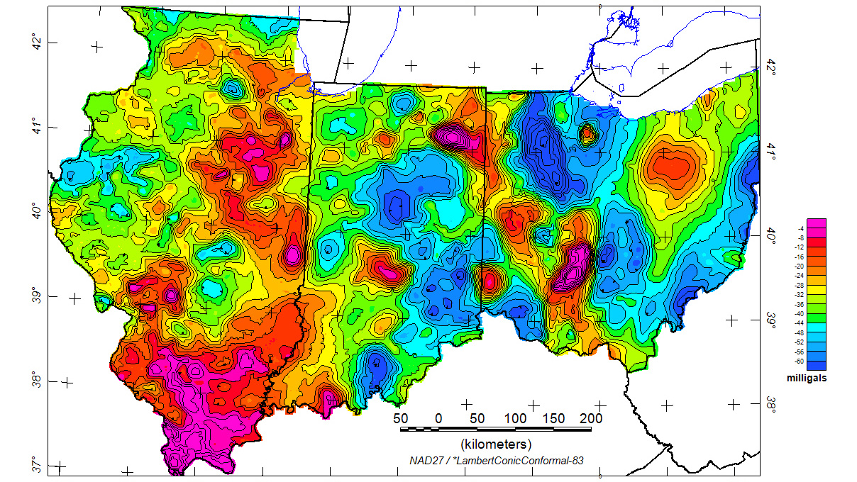
As this map of Bouguer’s gravity anomaly shows, the pull of the earth varies considerably by region.
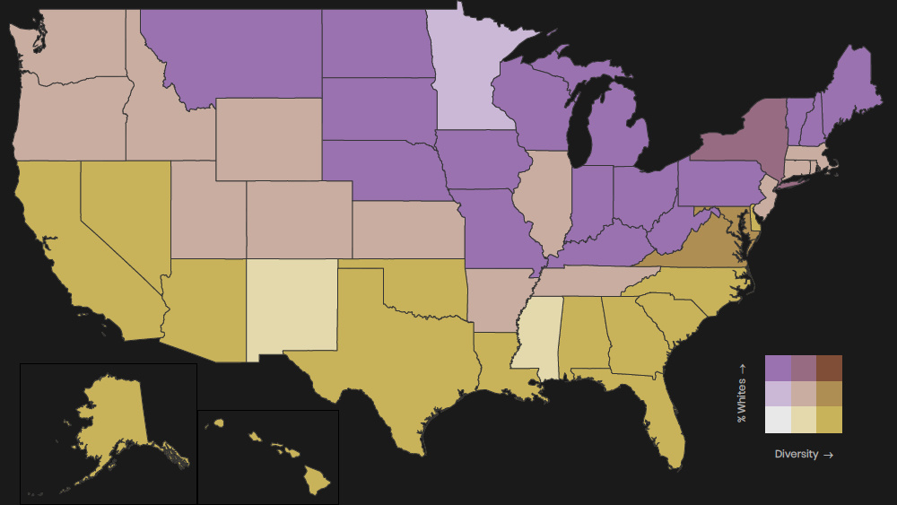
School diversity is less widespread in central and northern states
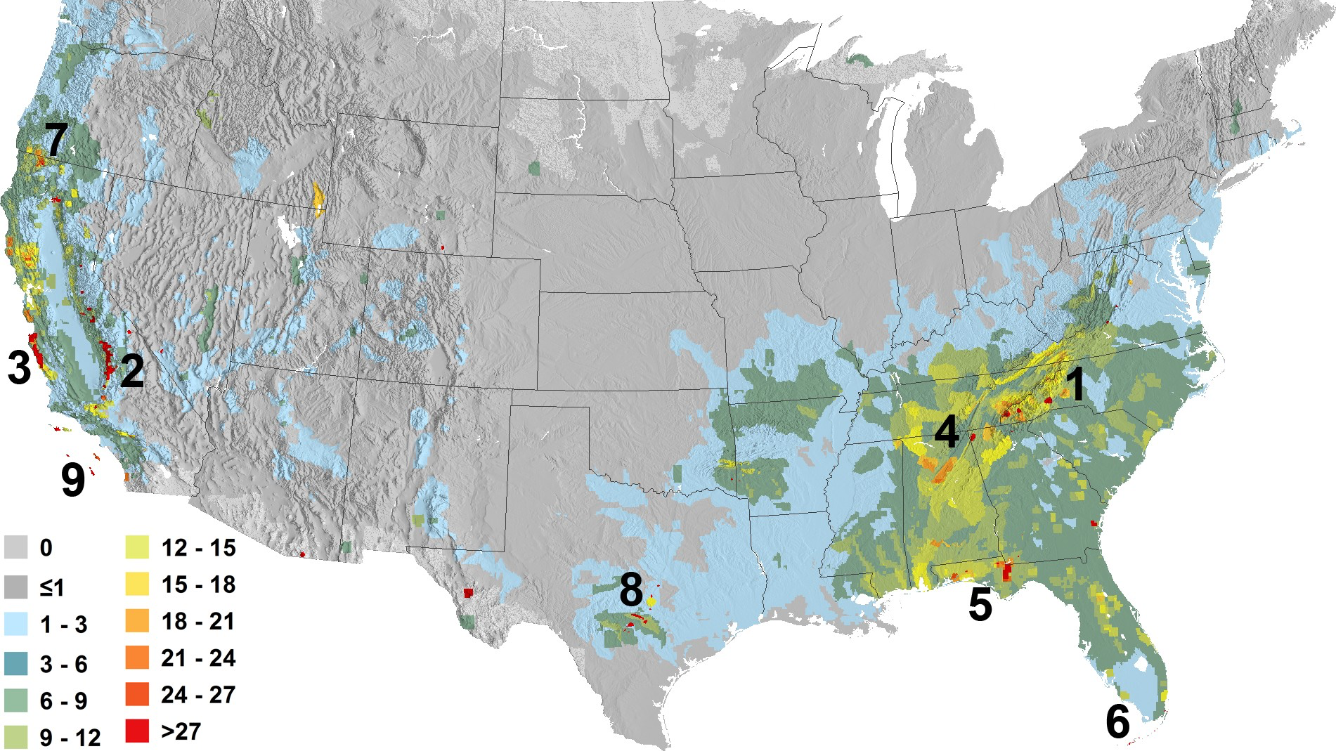
Project to map global ‘species richness’ highlights the variety of biodiversity itself
These maps show surprising juxtapositions of ancient and modern toponyms of the Mother Continent.
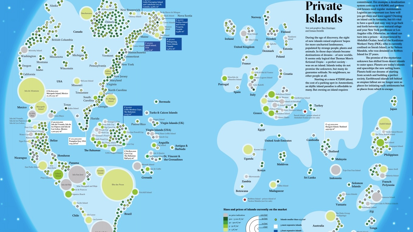
There’s something special about islands – in some cases, it’s the price tag
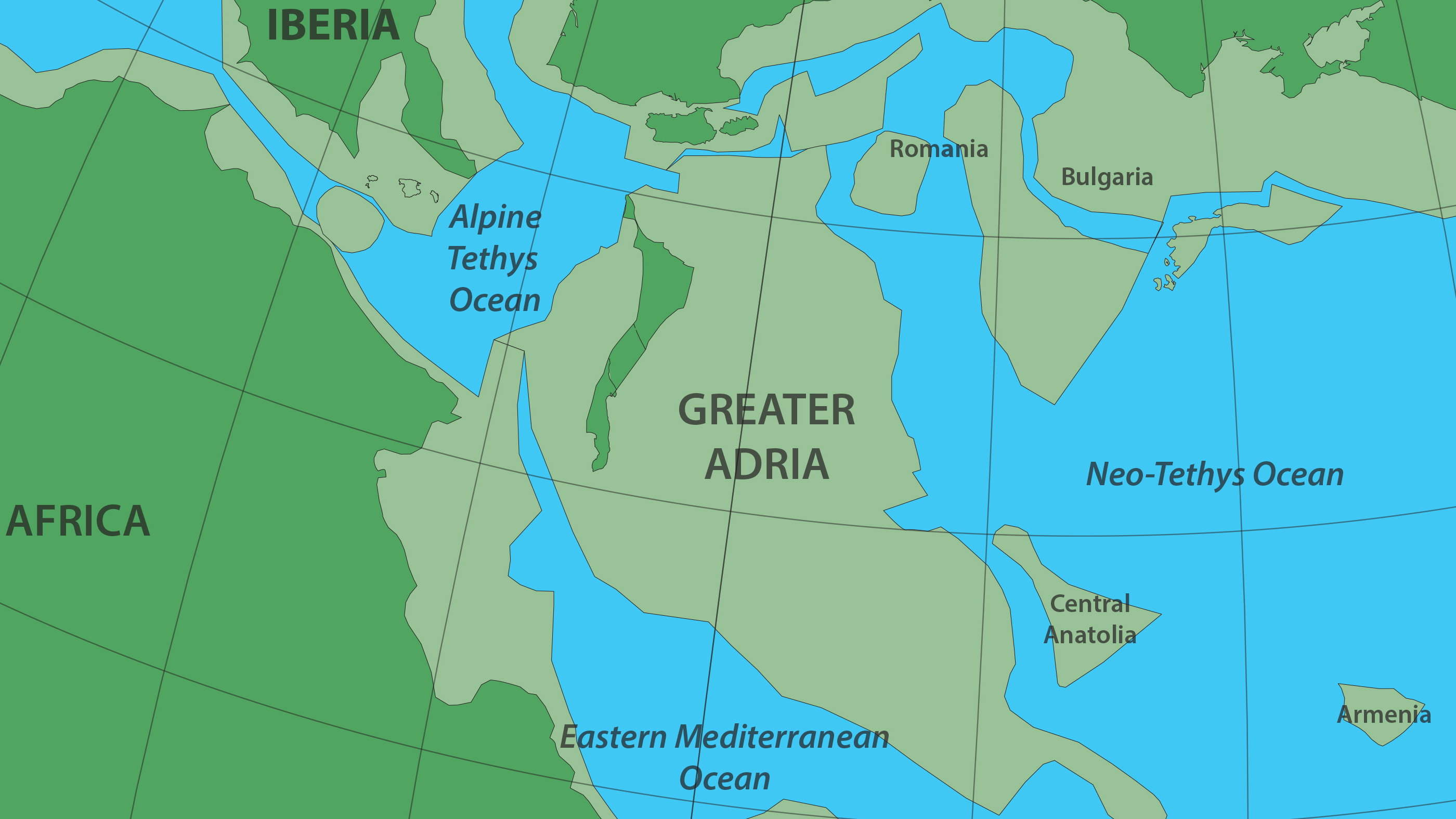
Most of it was eaten by Earth’s mantle, but scraped-off bits survive in the Alps and other mountain ranges.
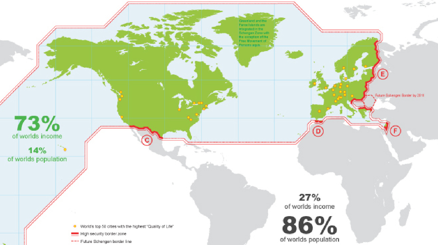
A review of the global “wall” that divides rich from poor.
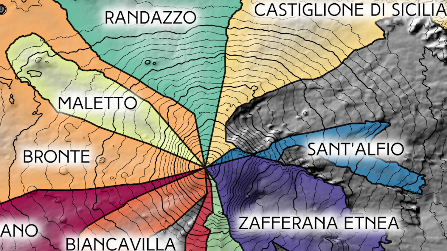
The summit of Europe’s most active volcano is also the world’s only decipoint.
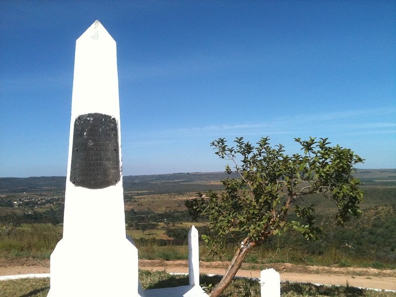
“Brasilia, the biggest paper town ever.”
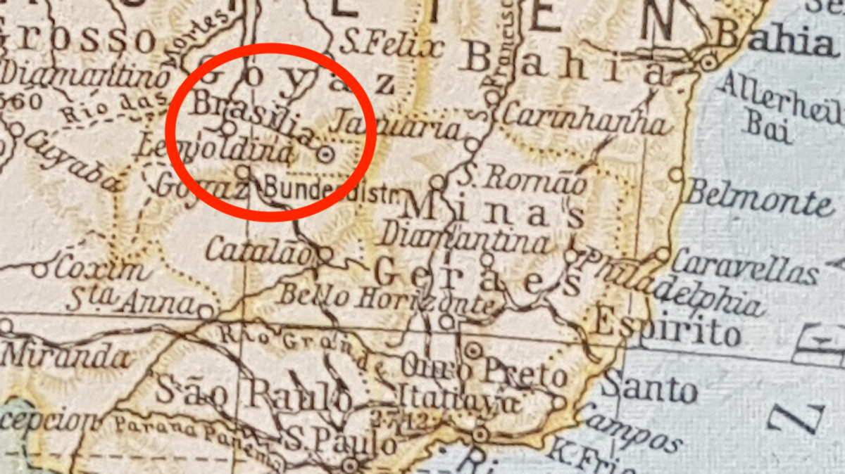
Forensic cartography 101: Explain what Brasilia is doing on this map of 1920s South America.
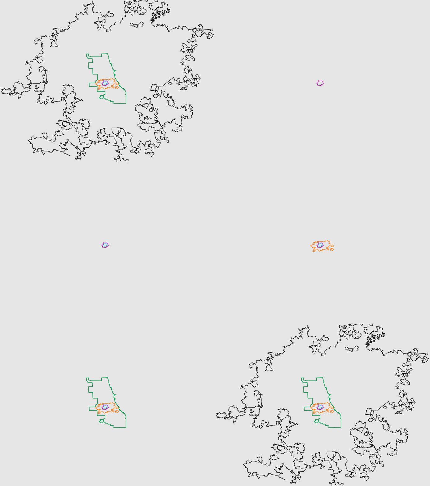
How the half-hour commute and motorised transport changed our cities into huge metropolises.
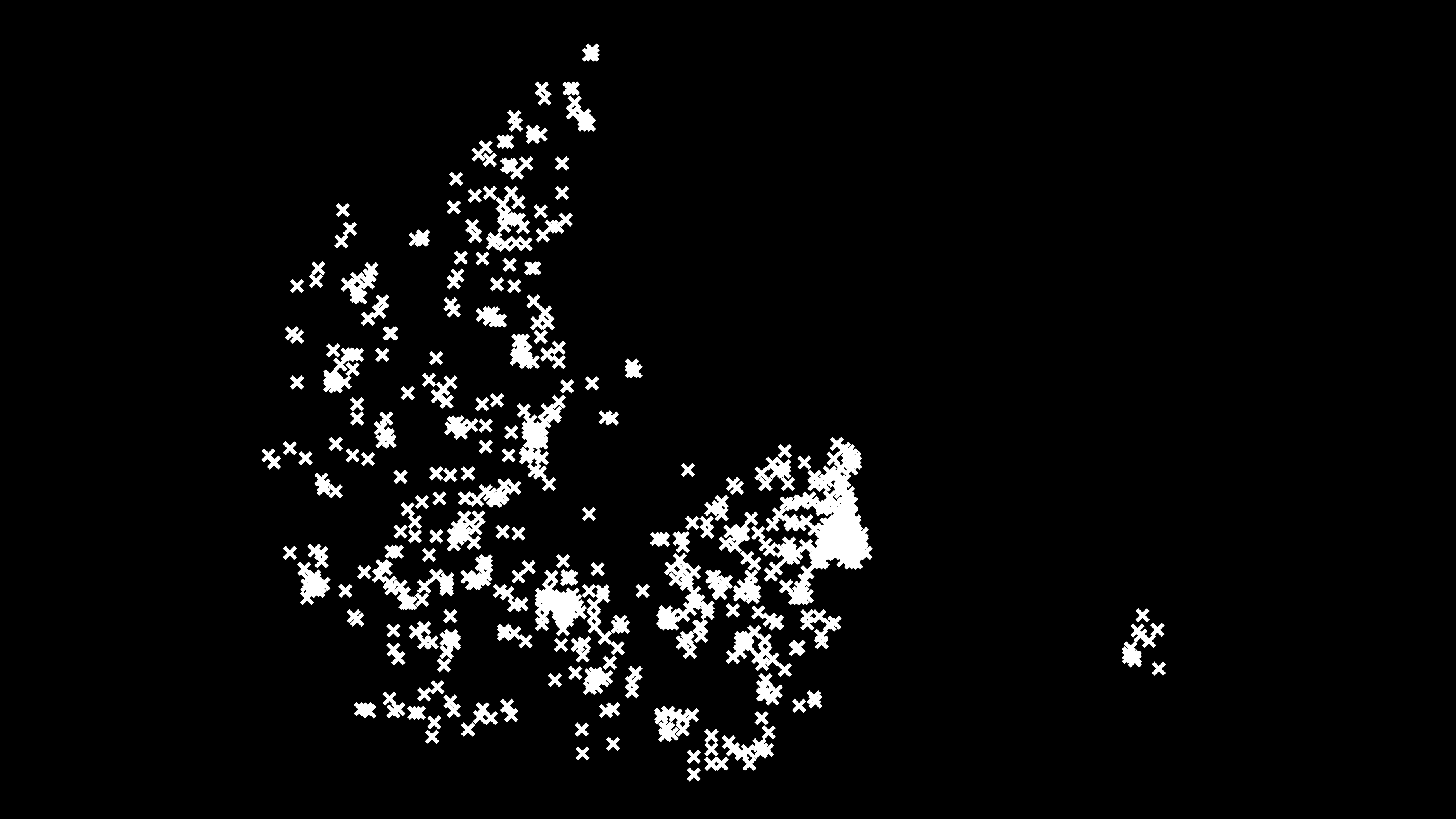
Lovers deadlier than gangsters, first comprehensive Danish homicide study since 1970s shows
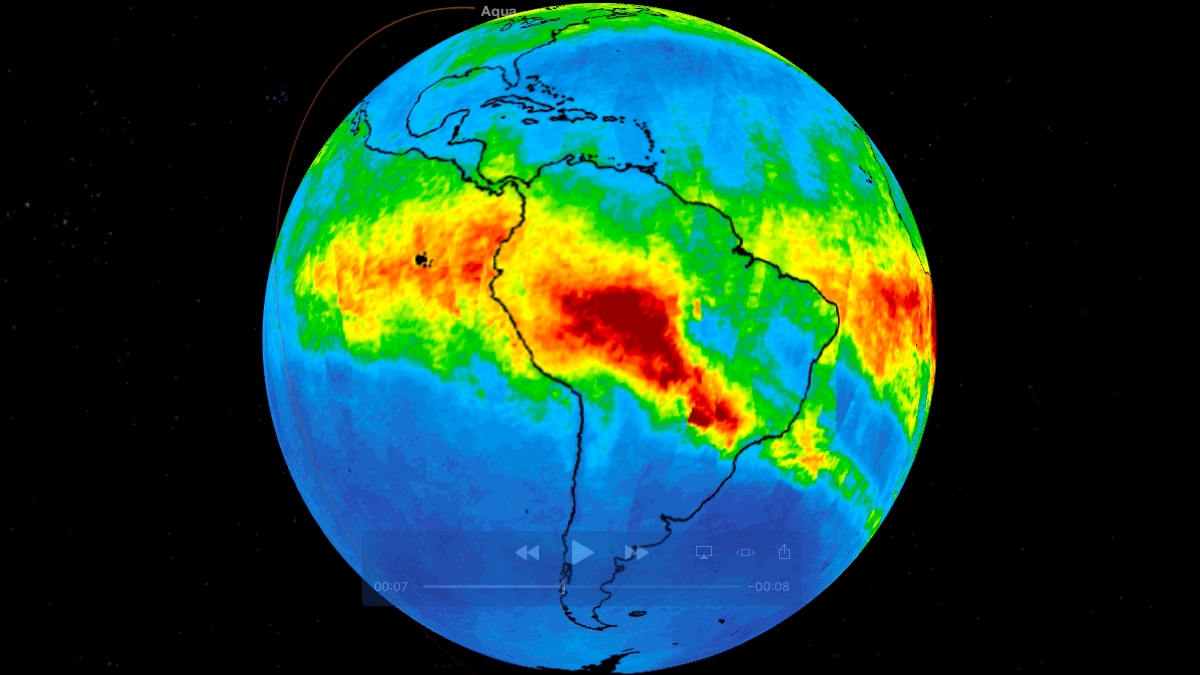
Satellite movie shows clouds of carbon monoxide drifting over South America.
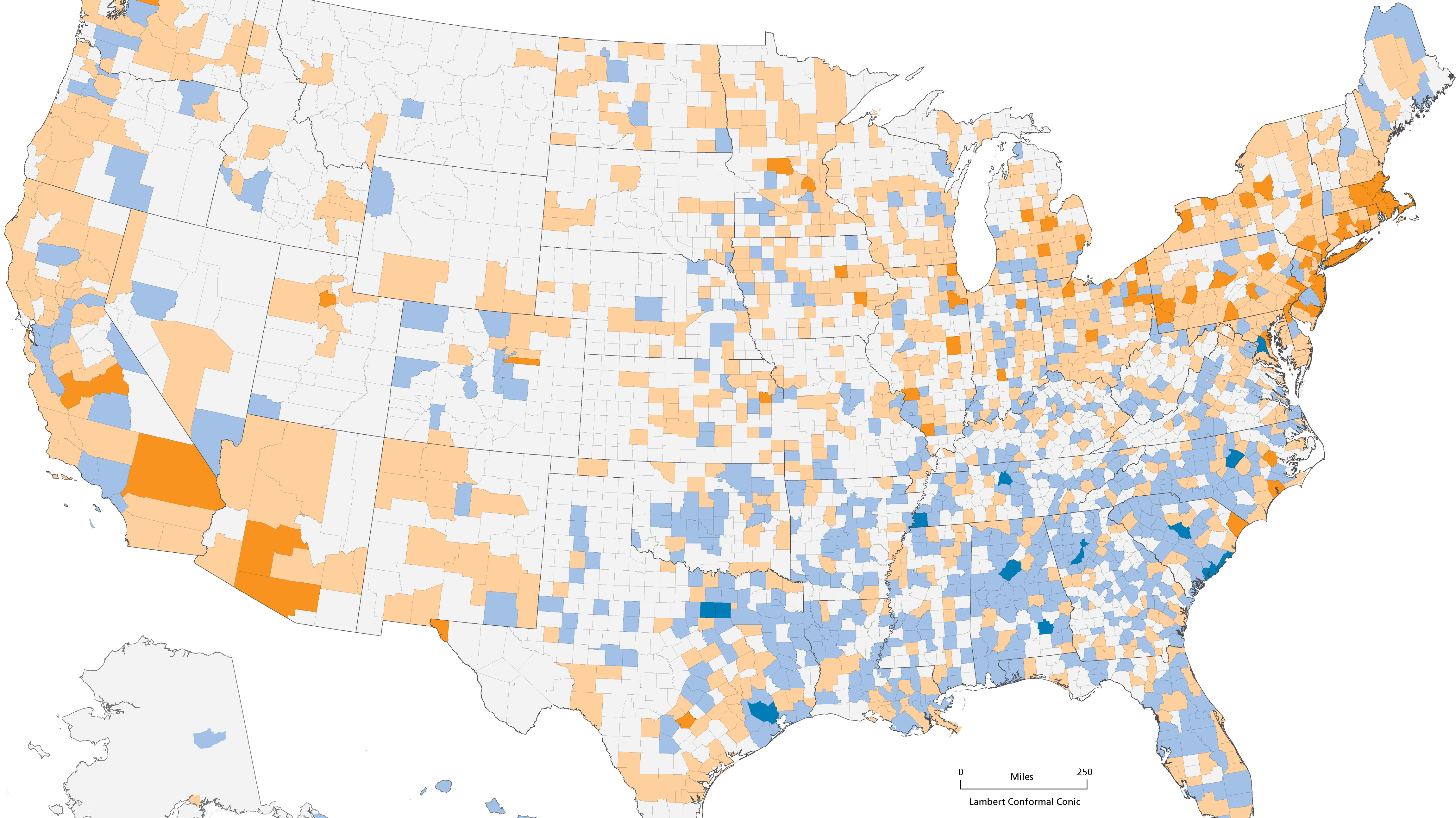
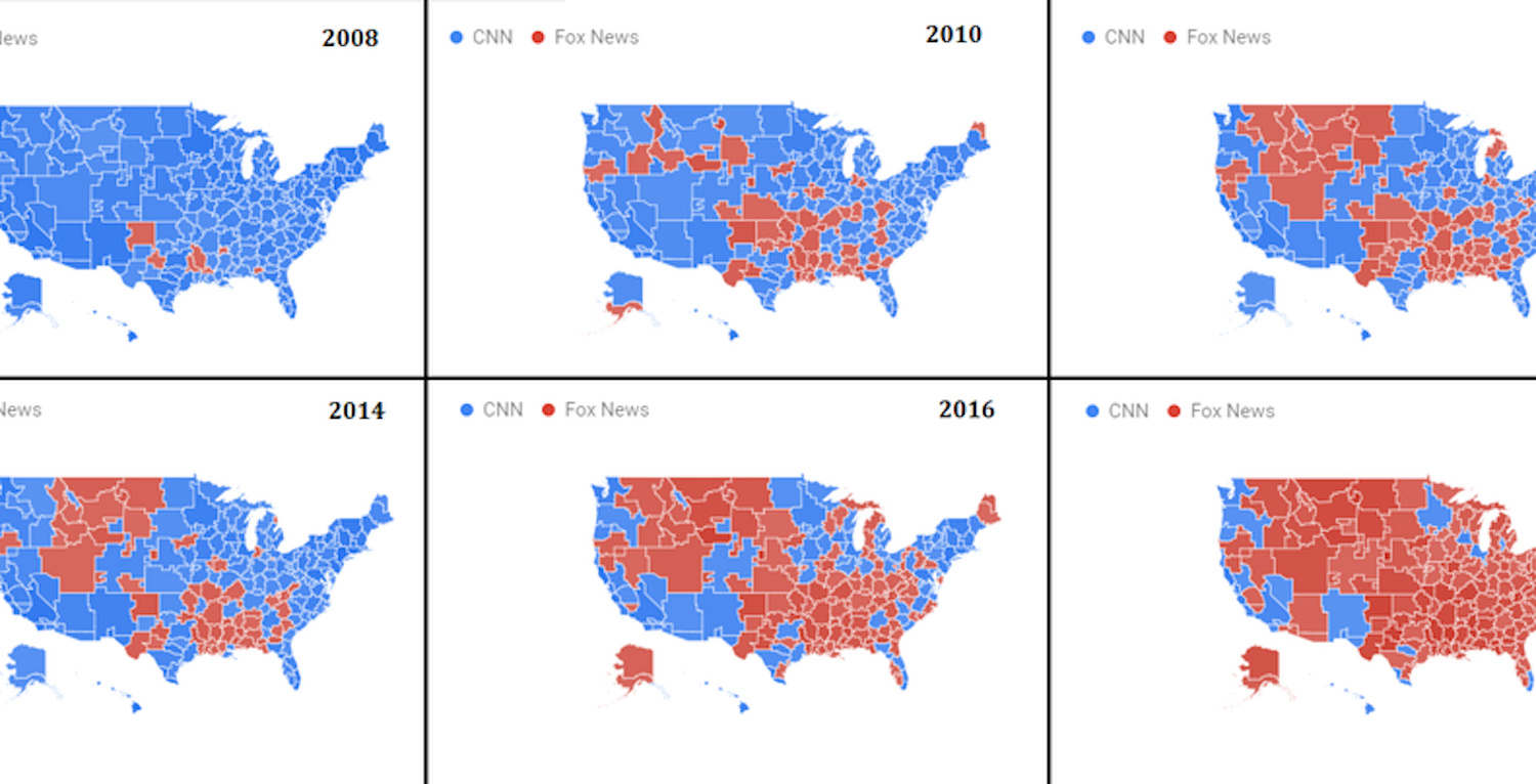
How deep are America’s cultural fault lines? Depends on which data you crunch.
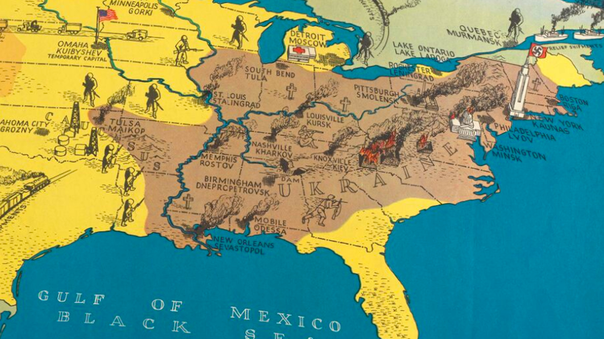
By transplanting Operation Barbarossa on a map of the US, it showed the devastating effects of the Nazi invasion
UNHCR data shows a small but intriguing flow of refugees from countries like France, Germany and the UK
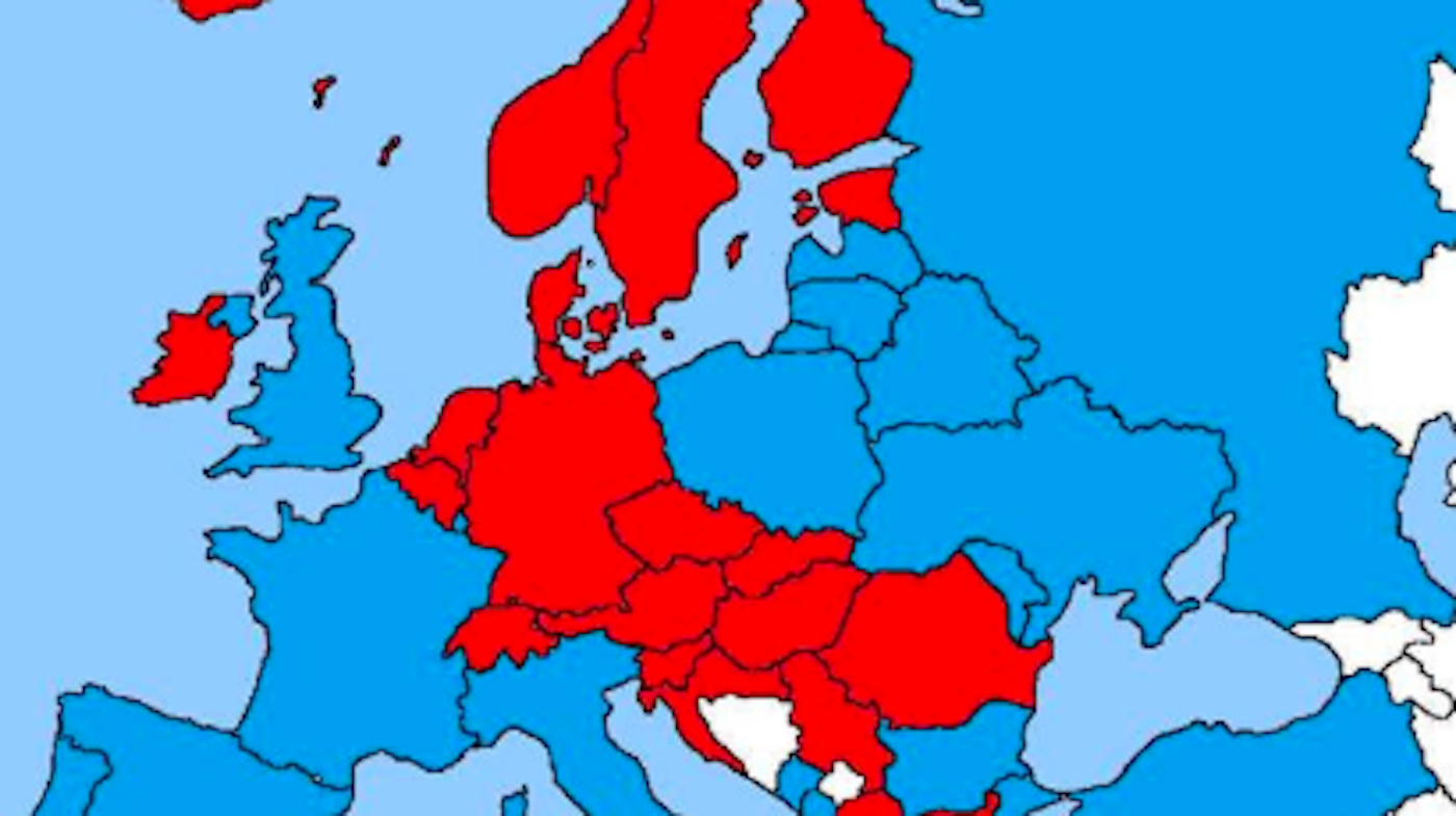
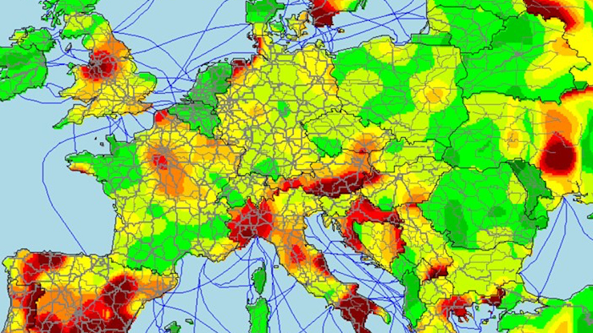
It shows Europe divided into two bafflingly unfamiliar blocs – what do red and blue stand for?
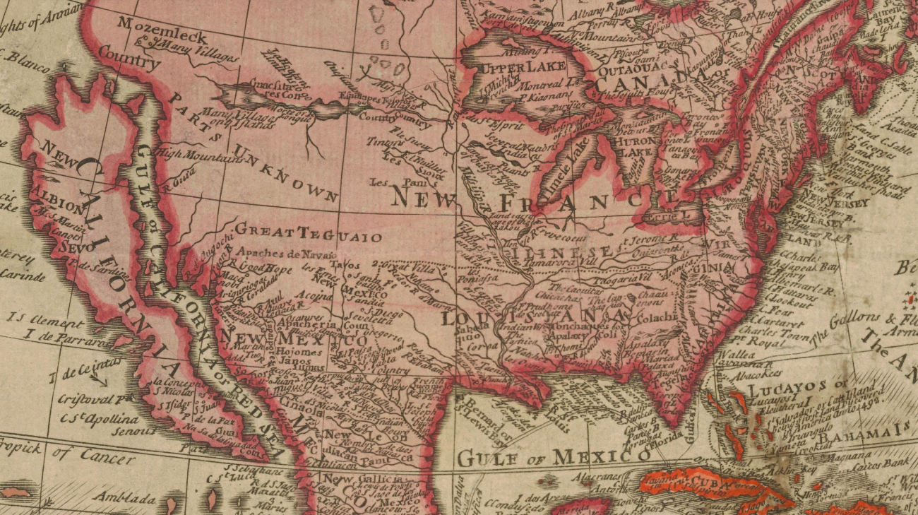
The Glen McLaughlin Collection brings together more than 700 historical examples of ‘California as an island’.
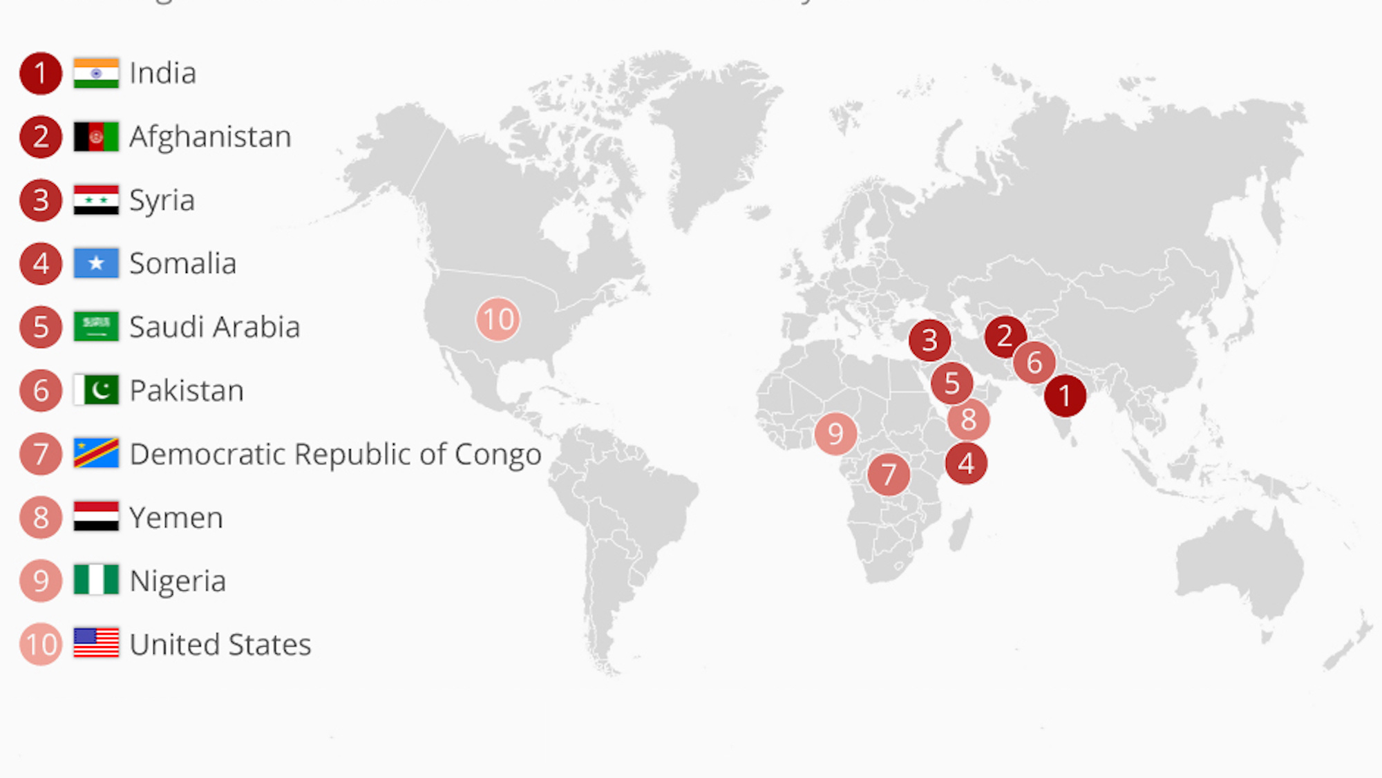
#MeToo and #TimesUp catapult America into the club of world’s most anti-women countries.
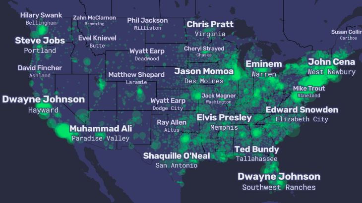
The ‘People Map of the United States’ zooms in on America’s obsession with celebrity
Average waiting time for hitchhikers in Ireland: Less than 30 minutes. In southern Spain: More than 90 minutes.
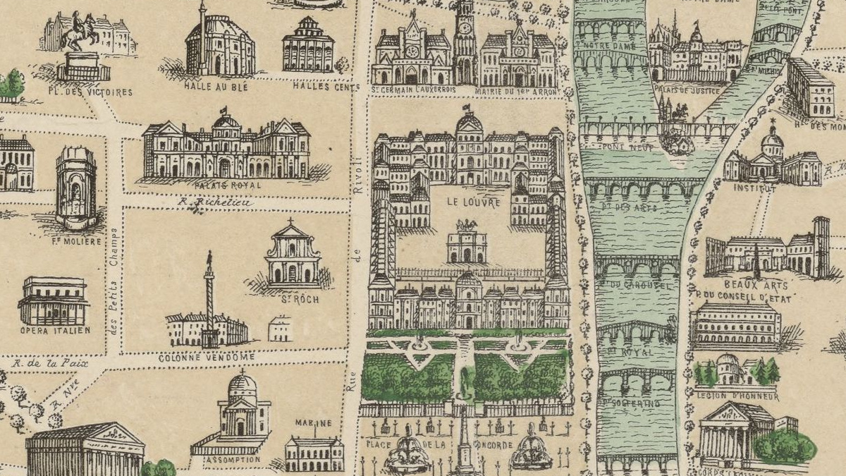
Notre Dame was almost torched in 1871, when Communards set Paris’ major buildings ablaze.
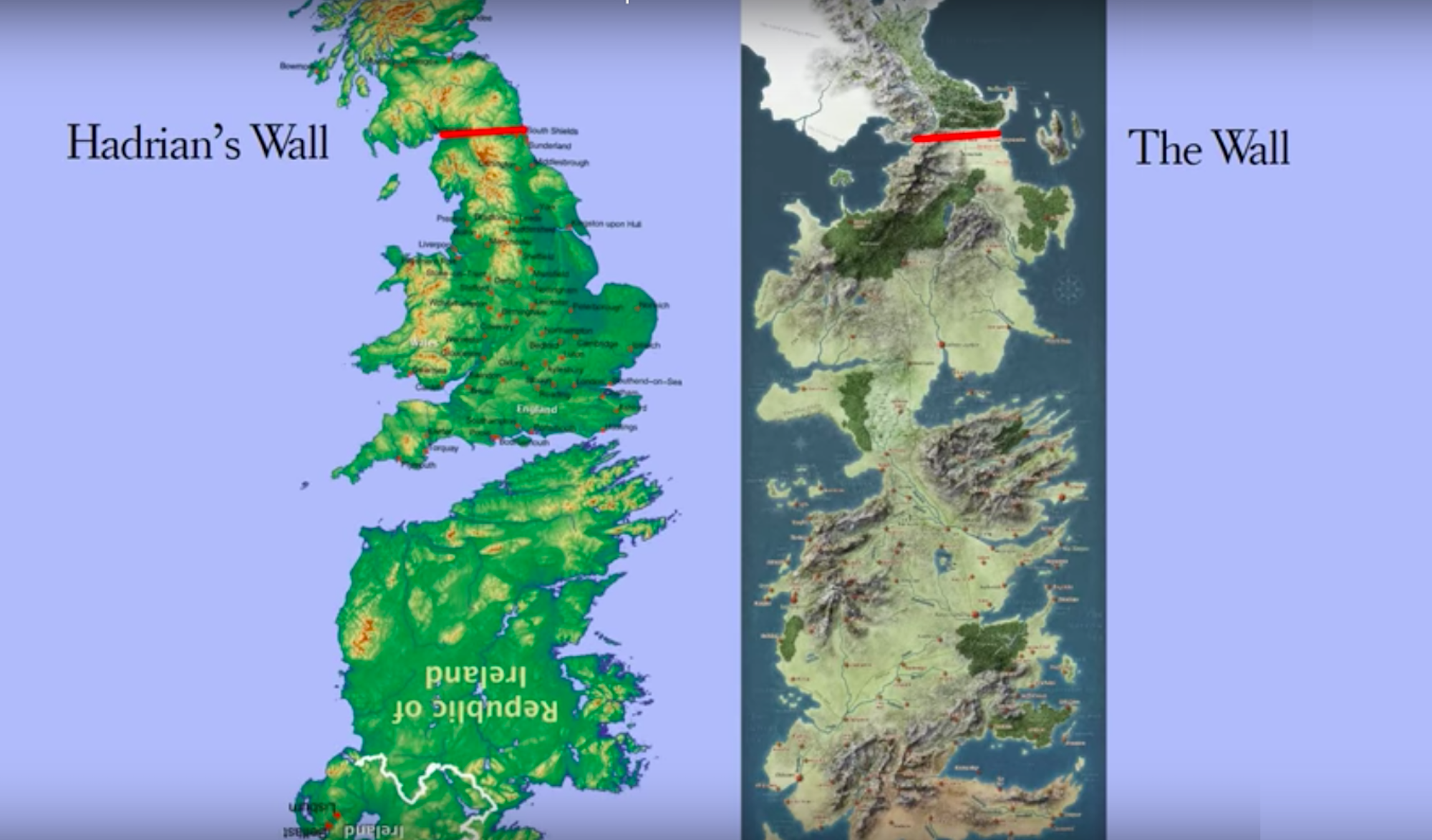
As Game of Thrones ends, a revealing resolution to its perplexing geography.
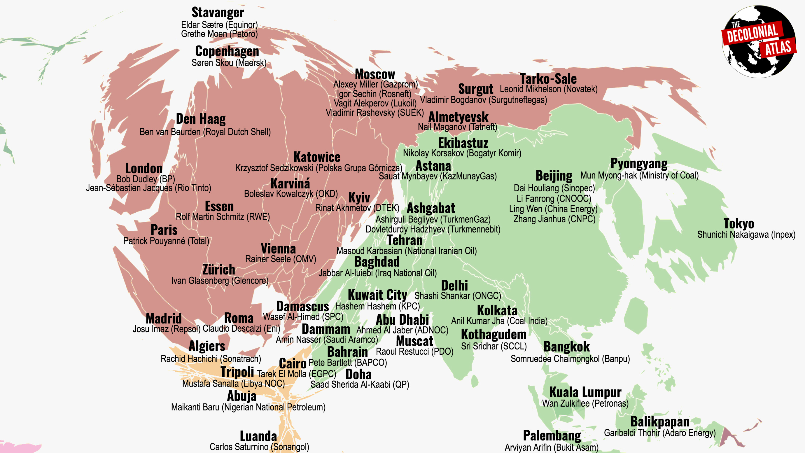
Controversial map names CEOs of 100 companies producing 71 percent of the world’s greenhouse gas emissions.
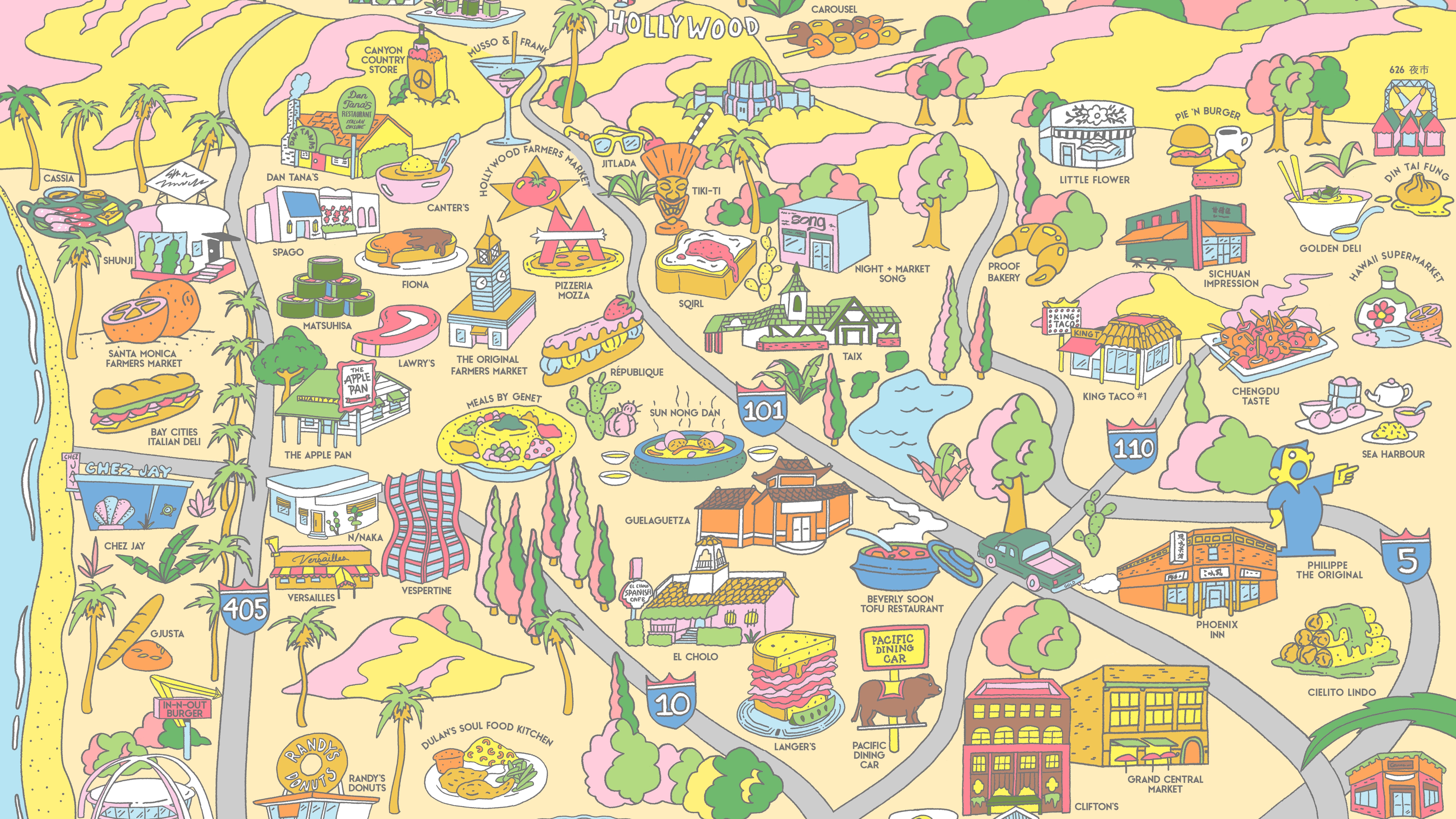
This culinary map of Los Angeles proves the city is more than just the world’s movie capital.
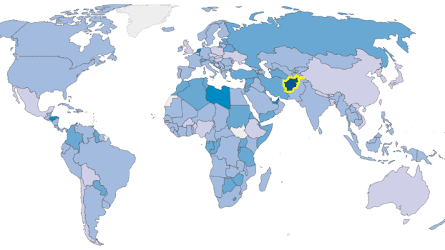
No, depression is not just a type of “affluenza” — poor people in conflict zones are more likely candidates
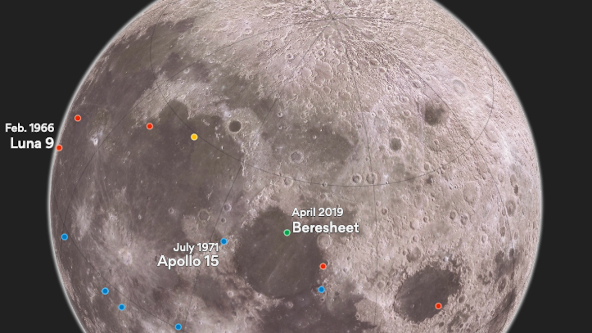
“Beresheet” is first privately-funded space ship ever to make a lunar touchdown
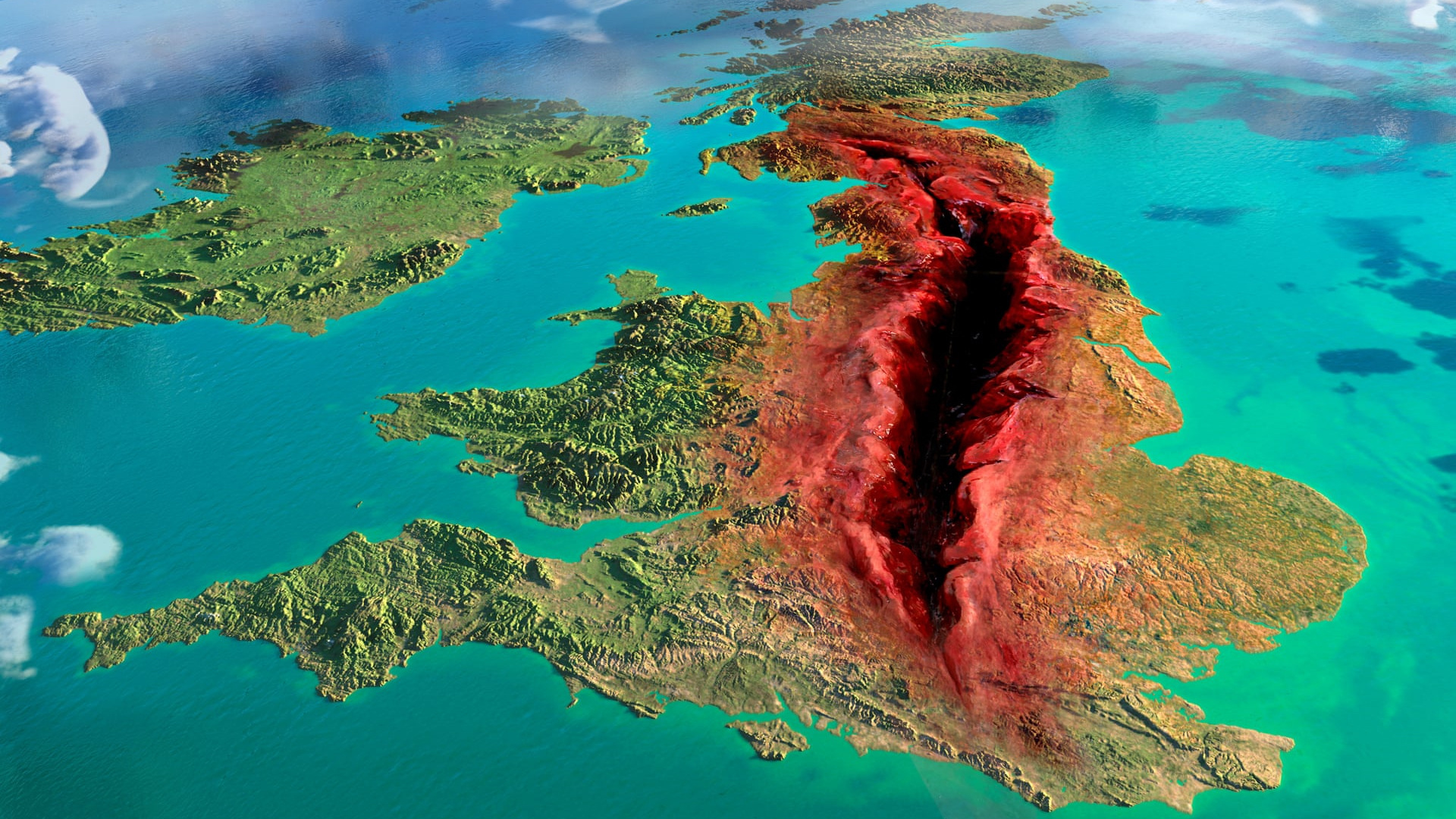
Artistic and statistic cartography projects show the U.K. divided like never before.
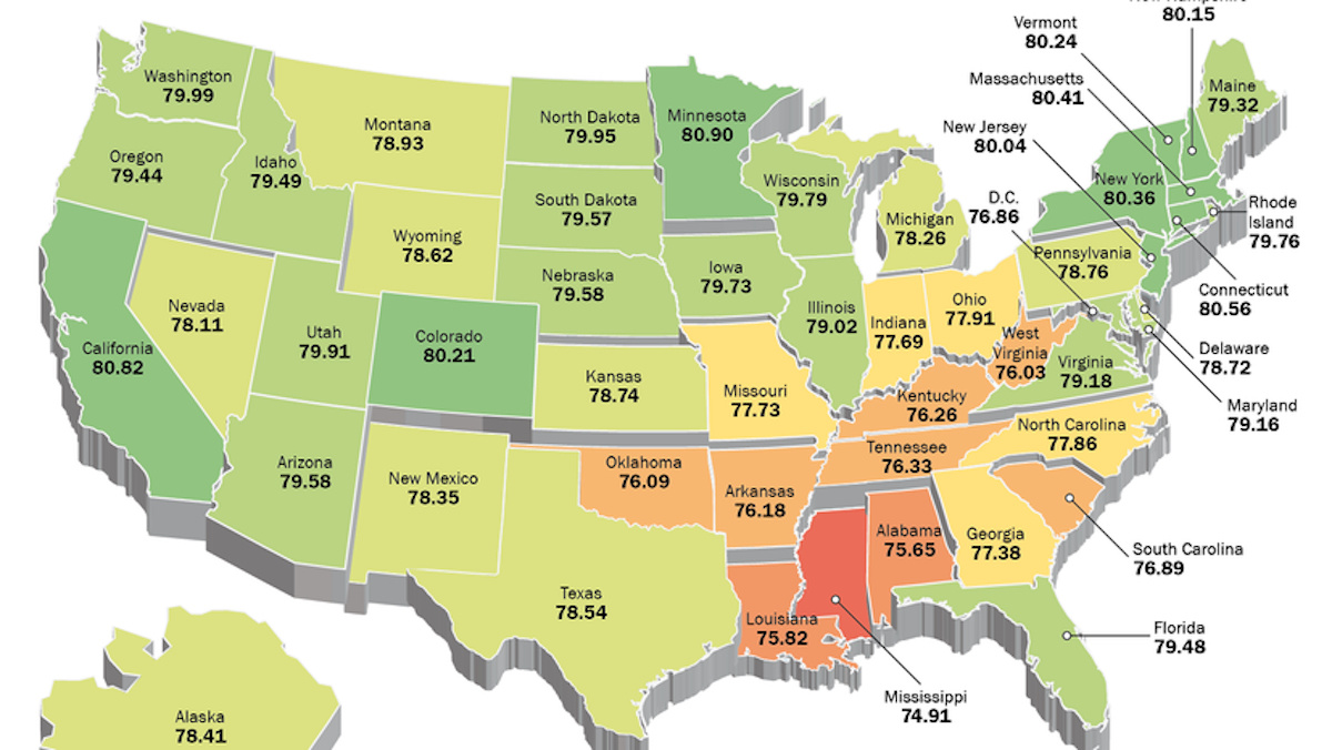
Two maps show two very different takes on the huge discrepancies in U.S. life expectancy
