maps
The global extent of the Revolutionary War surprises many Americans today — but it was crucial to independence.
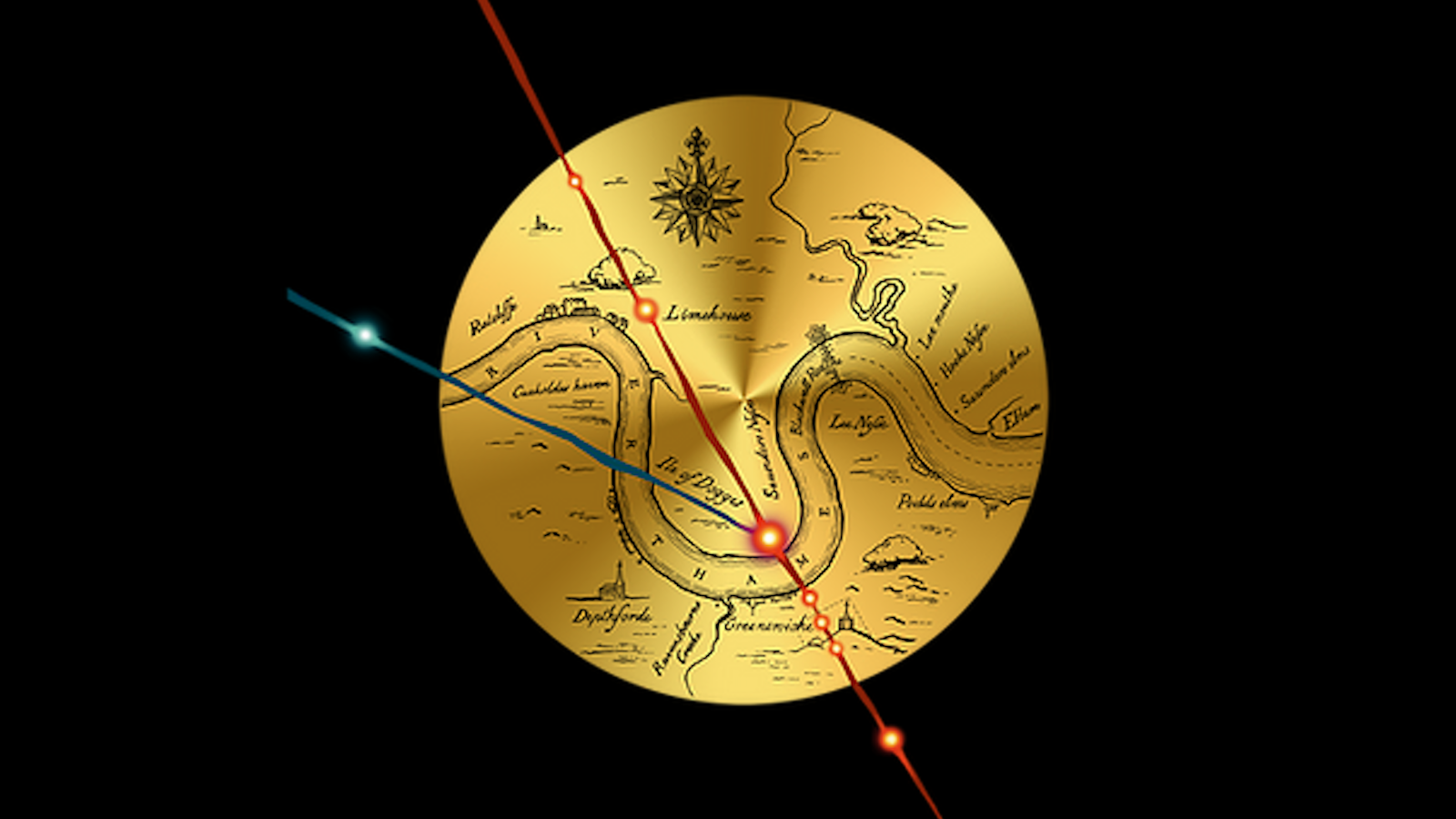
Esoteric evidence points to a ritual performed by Queen Elizabeth’s court magician John Dee.
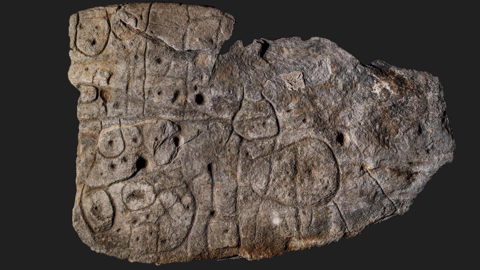
Discovered in 1900, the Saint-Bélec slab languished unrecognized in a castle basement for over a century.
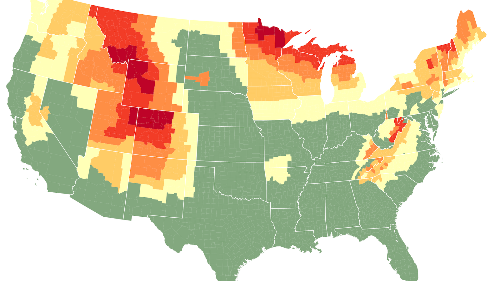
Starting just about now, leaves start changing color from north to south, high to low, light to dark.
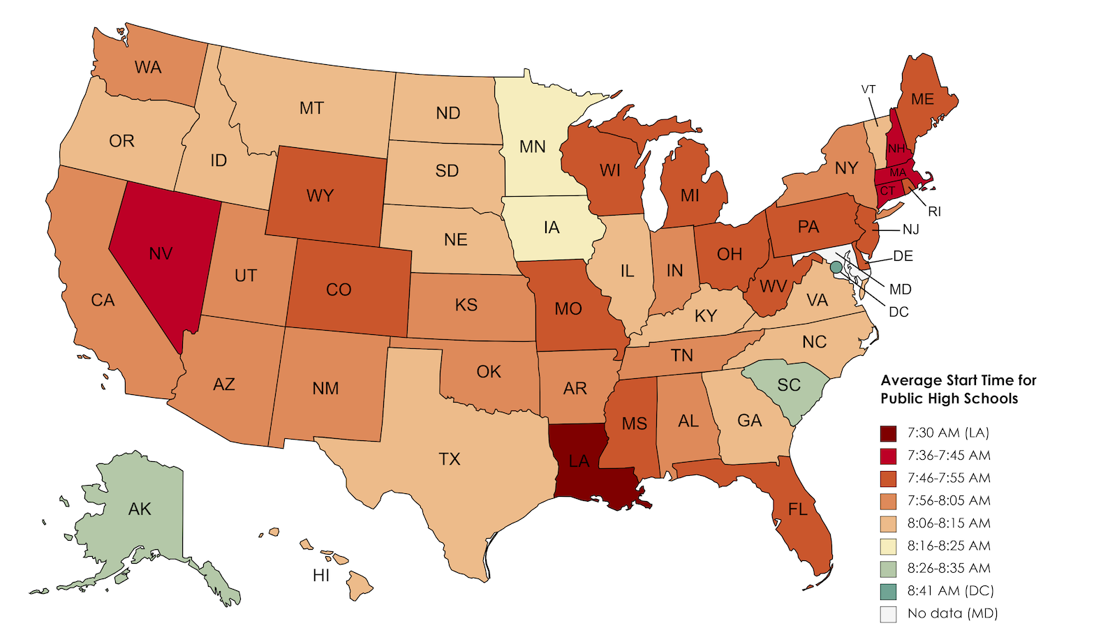
In Louisiana, high school starts at 7:30 am. Research shows that is at least an hour too early.
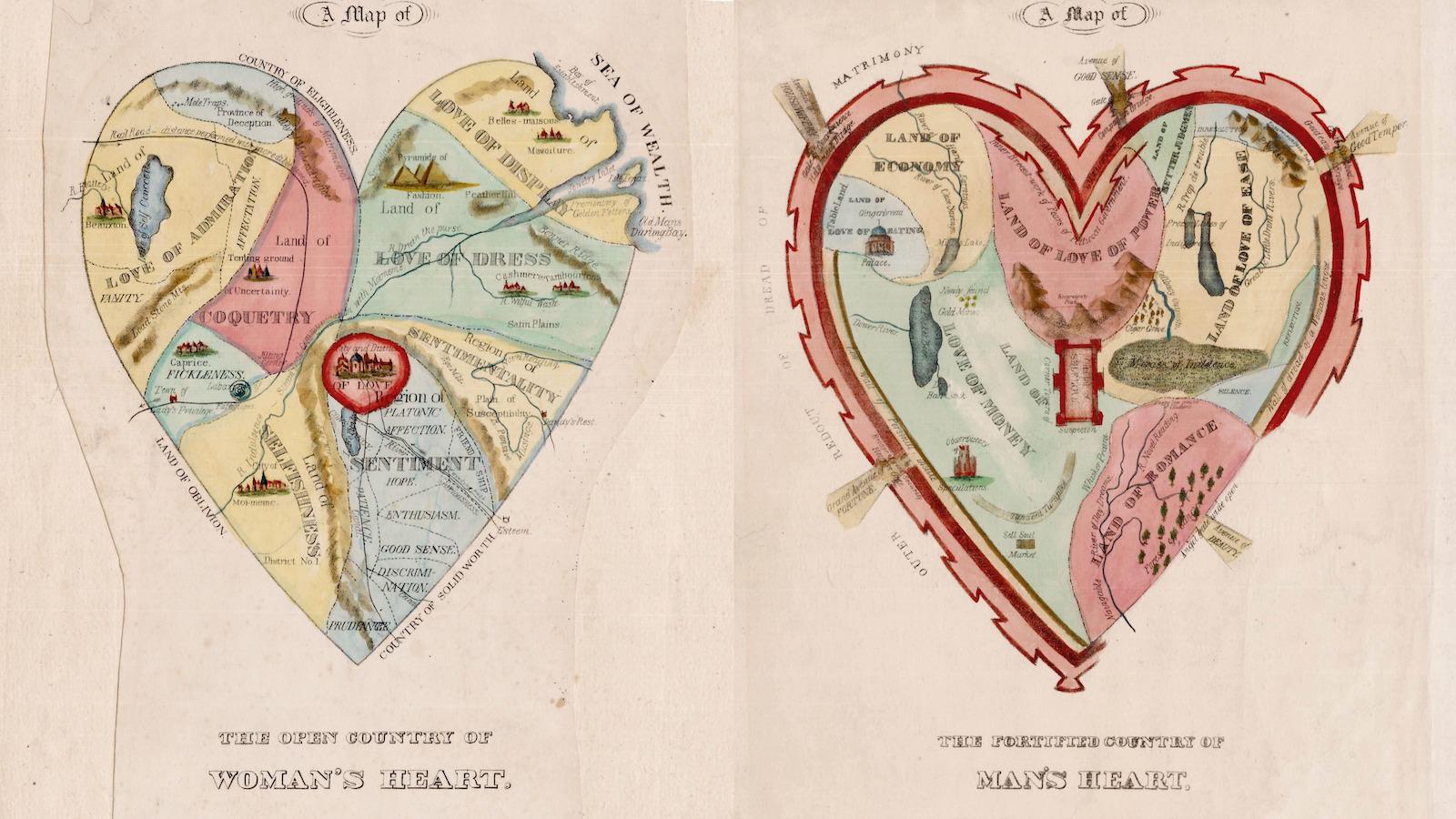
One of the best-known allegorical depictions of love has a rather pessimistic male twin.
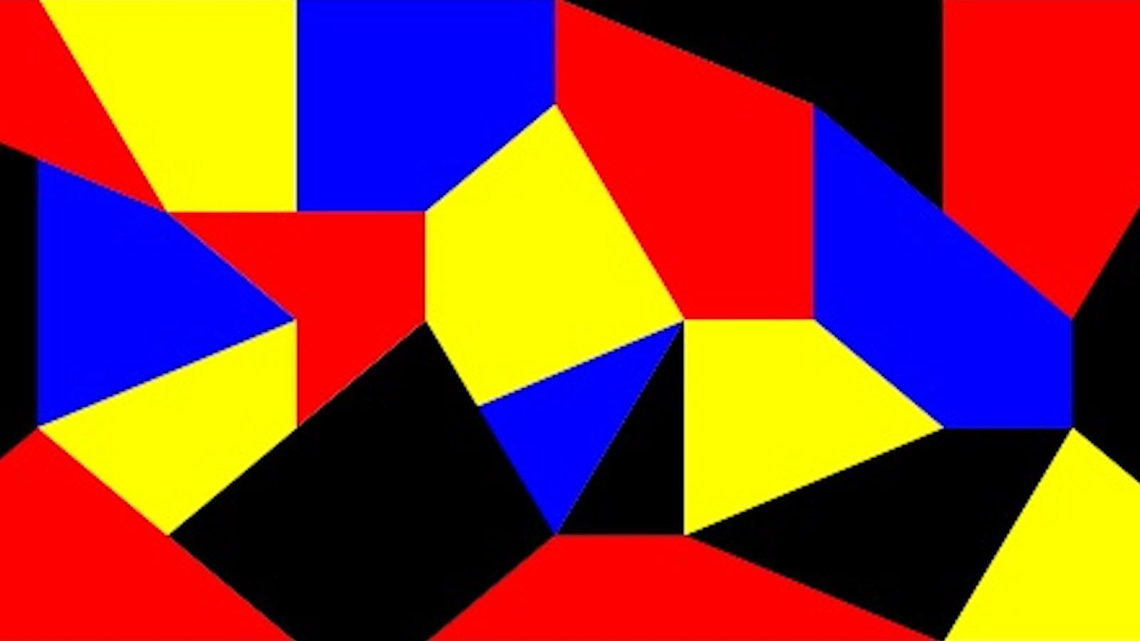
The four-color theorem was one of the past century’s most popular and enduring mathematical mysteries.

Even 1500 years after the fall of Rome, its western border can still be seen on German street maps.
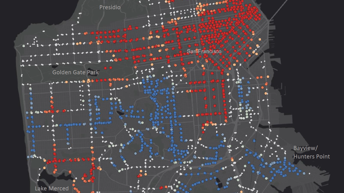
Americans don’t like to ride the bus. There are ways to fix that.
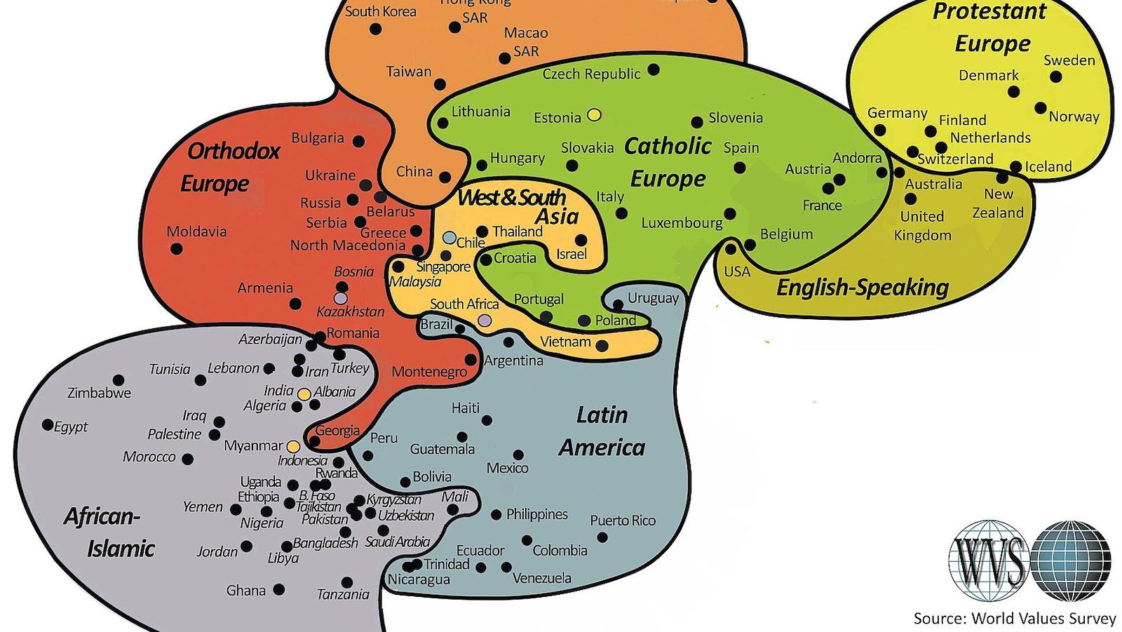
The Inglehart-Welzel World Cultural map replaces geographic accuracy with closeness in terms of values.
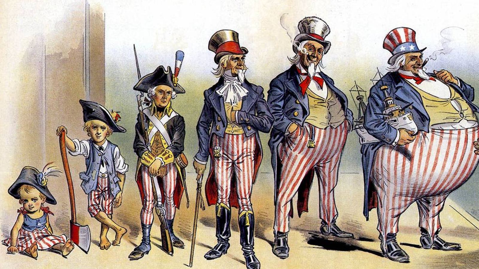
Opponents of 19th-century American imperialism were not above body-shaming the personification of the U.S. government.
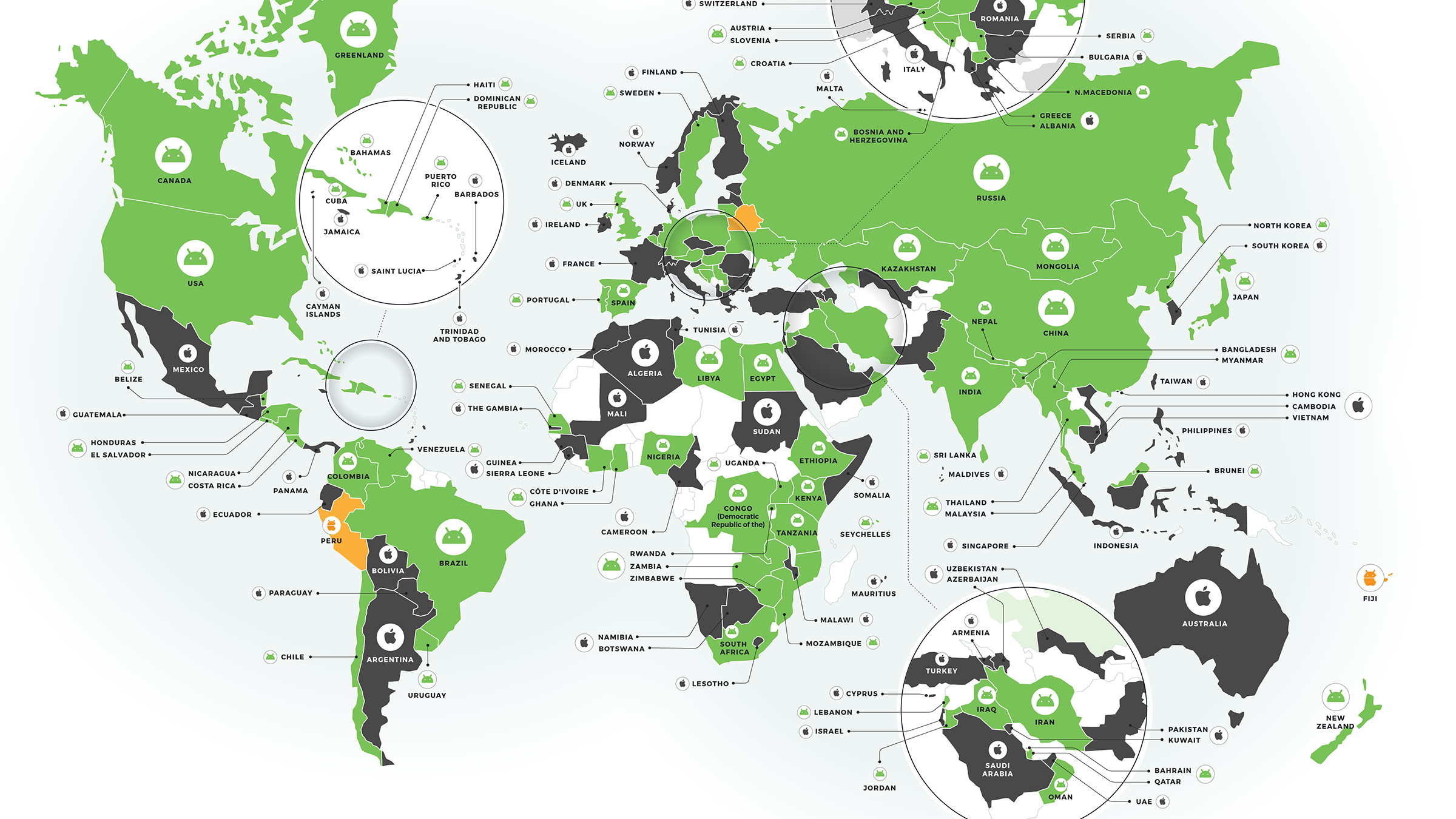
A global survey shows the majority of countries favor Android over iPhone.
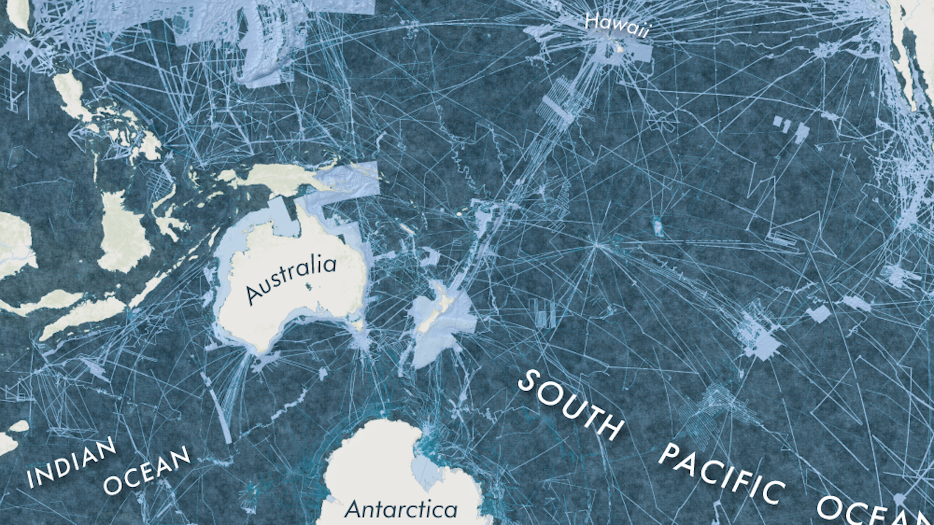
By the end of this decade, Seabed 2030 wants to produce accurate maps for the remaining 80 percent of the ocean floor.
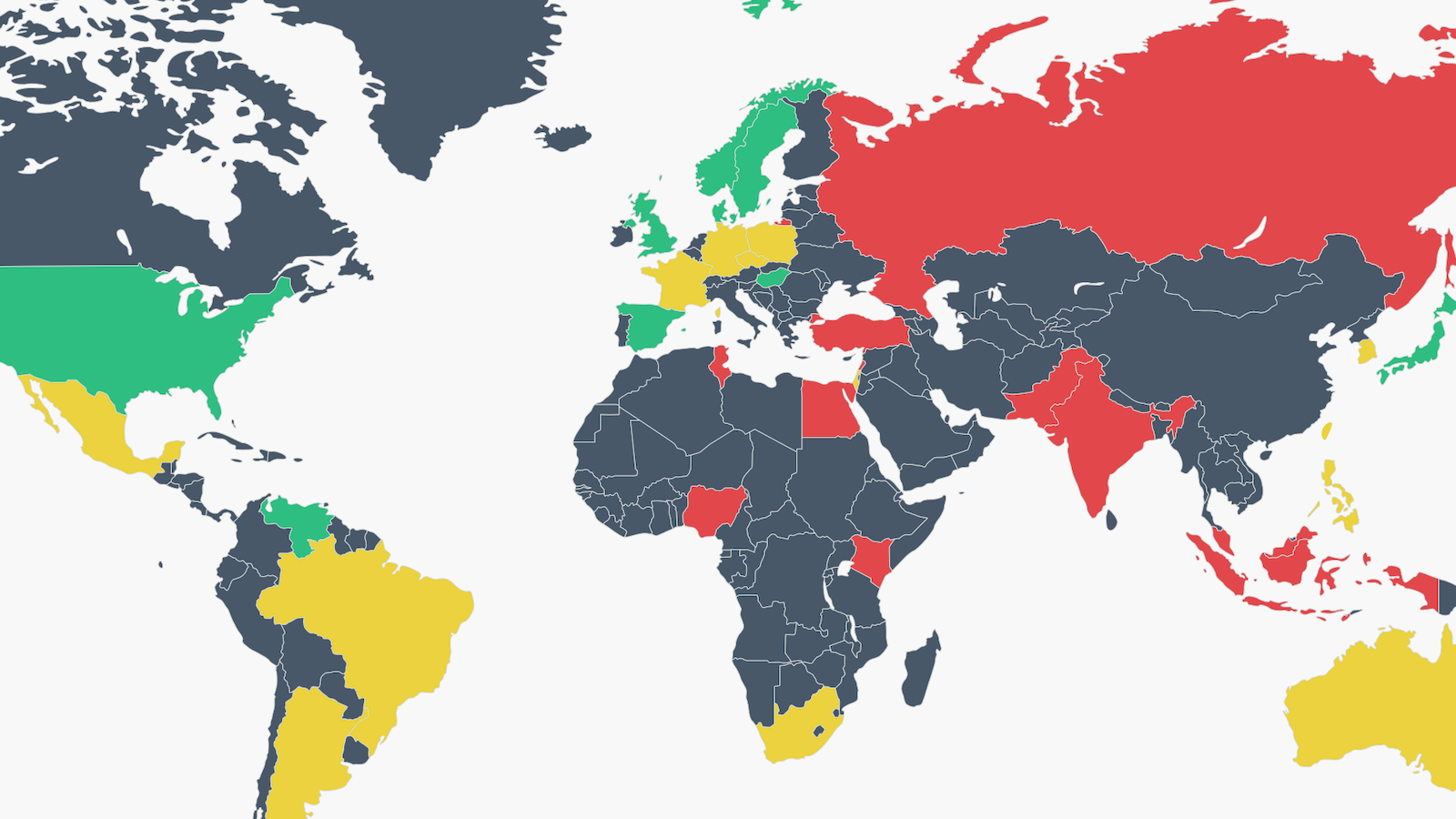
In some countries, people want more freedom of speech. In others, they feel that there is too much.
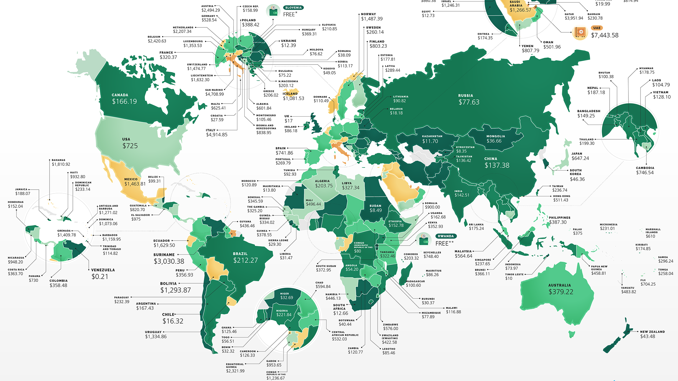
UAE is the world’s most expensive country to start a business, but it’s free in Rwanda.

The first of many dodecahedrons was unearthed almost three centuries ago, and we still don’t know what they were for.
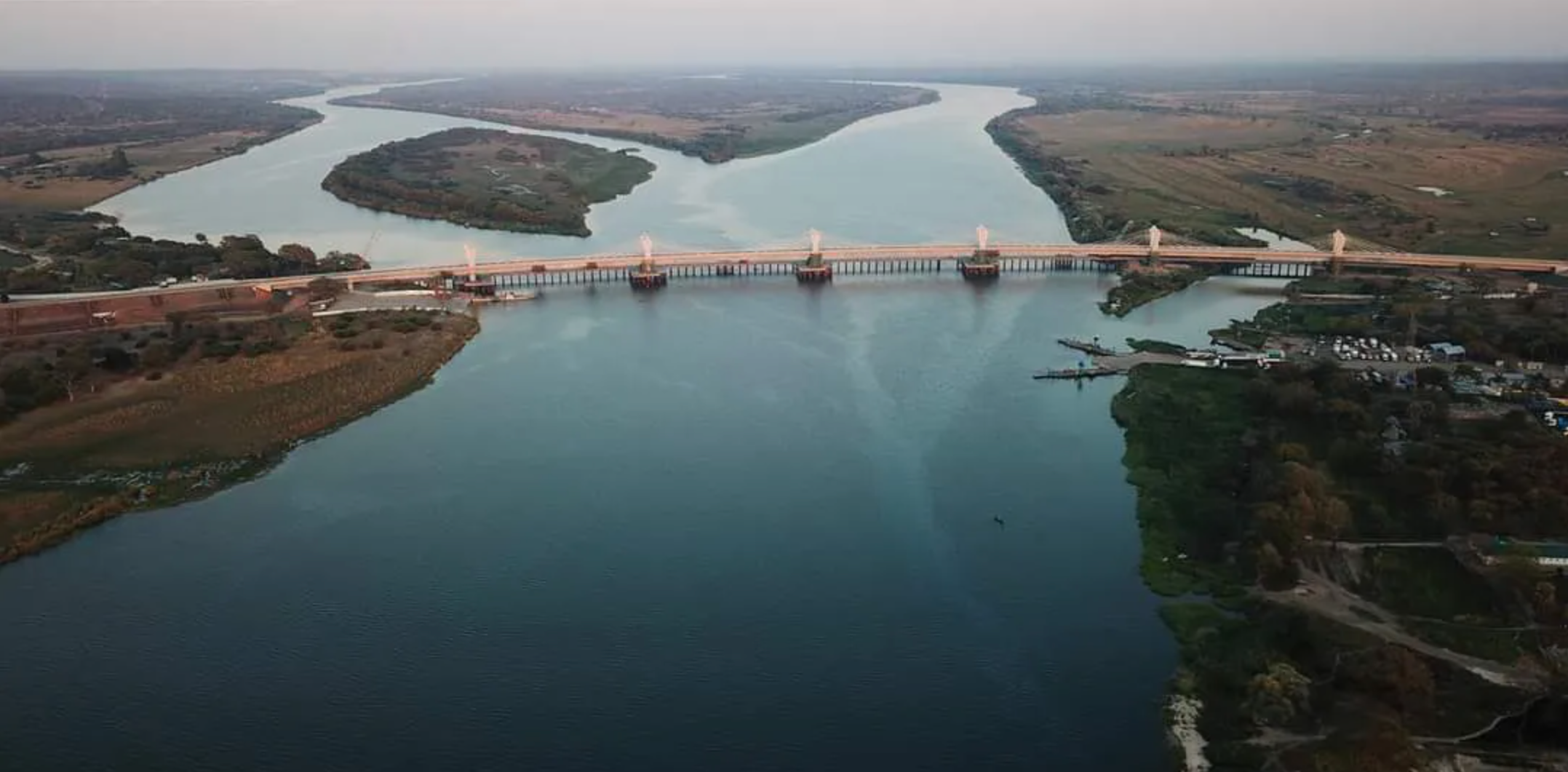
The Kazungula Bridge connects Zambia and Botswana, barely missing Namibia and Zimbabwe.
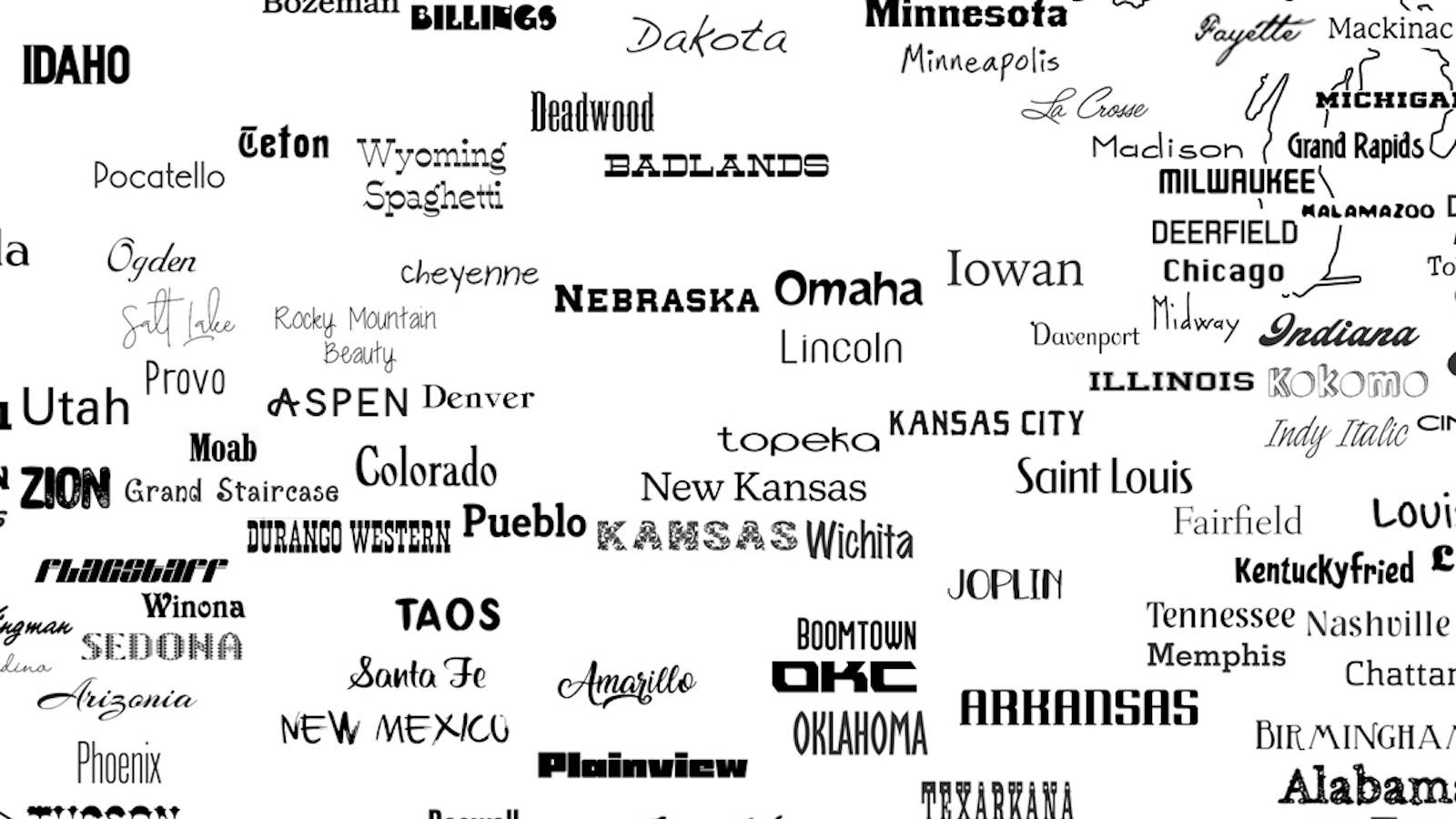
At least 222 typefaces are named after places in the U.S. — and there’s still room for more.
A cartogram makes it easy to compare regional and national GDPs at a glance.
Thomas Baldwin’s Airopaidia (1786) includes the earliest sketches of the earth from a balloon.
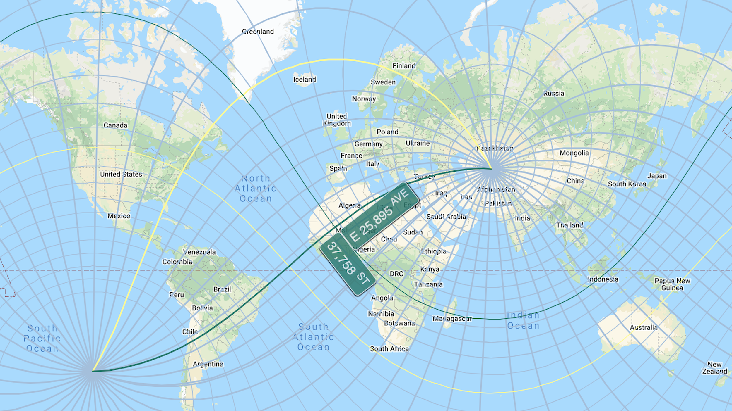
ExtendNY stretches the Big Apple’s gridiron all across the globe – with some bizarre effects
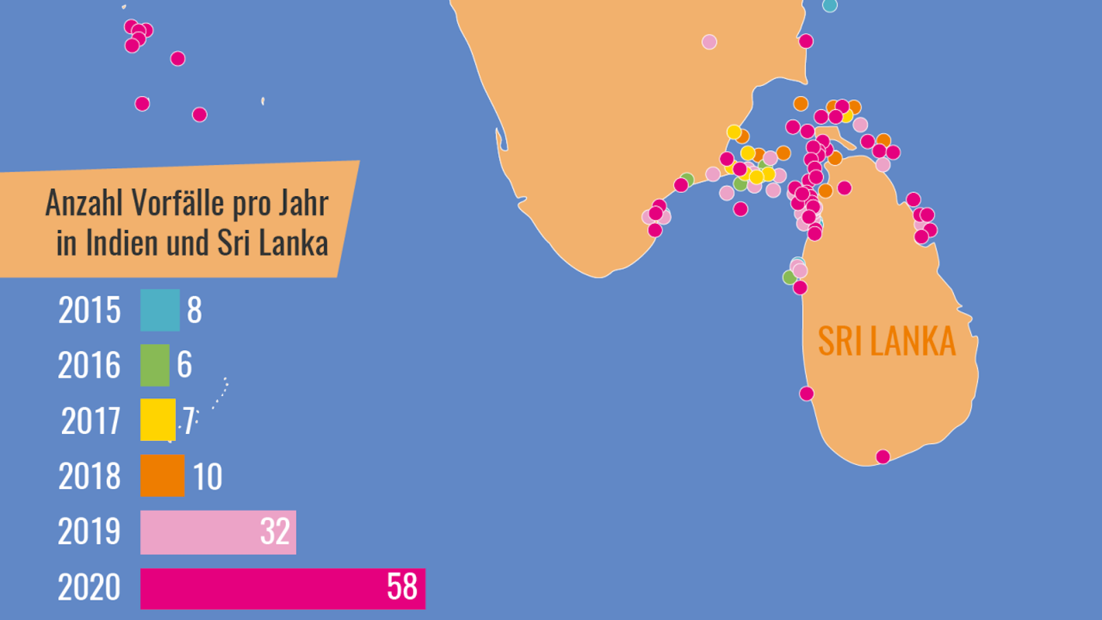
A “seafood mafia” is plying the waters between India and Sri Lanka to satisfy China’s appetite for an increasingly rare delicacy.
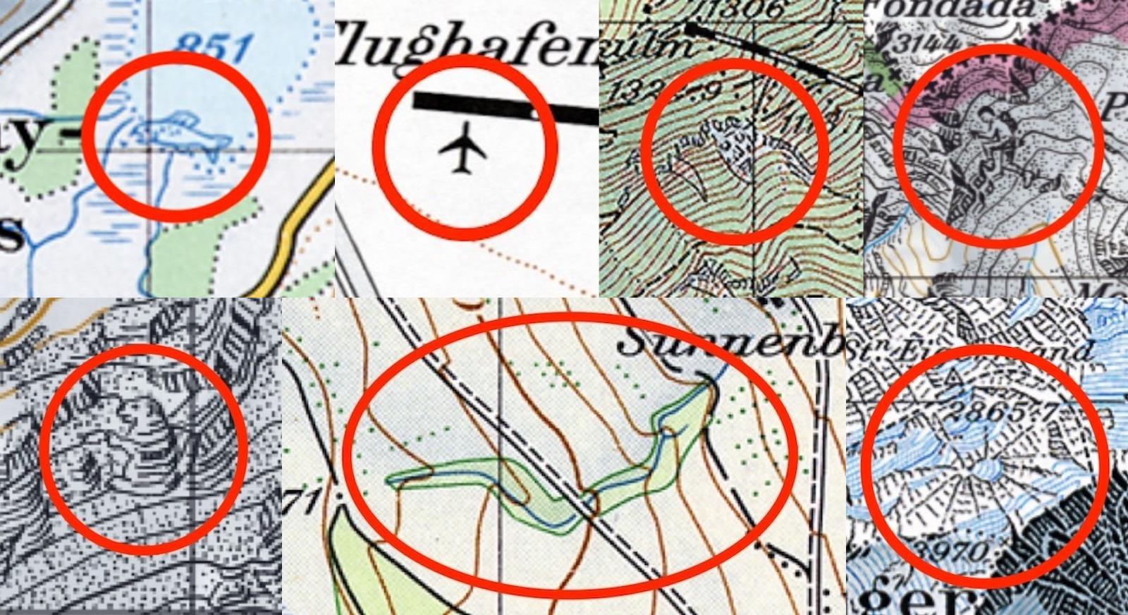
Cartography is serious business in Switzerland — but once in a while, the occasional map gag slips through.
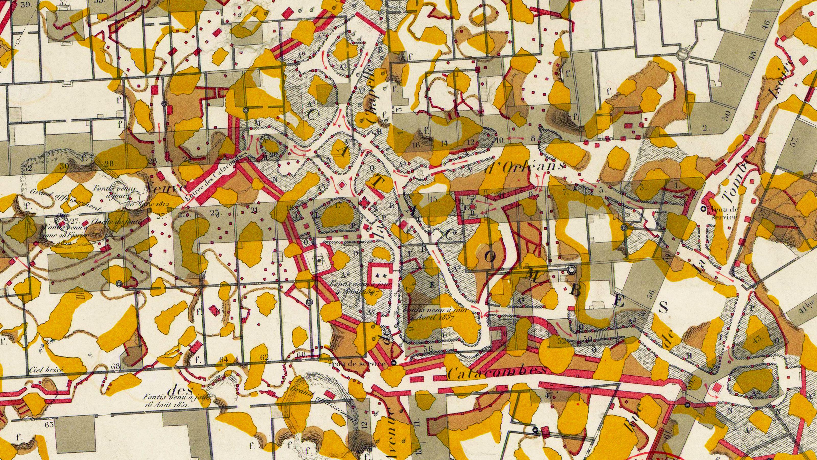
Ancient corridors below the French capital have served as its ossuary, playground, brewery, and perhaps soon, air conditioning.
The unique light signatures of nautical beacons translate into hypnotic cartography.
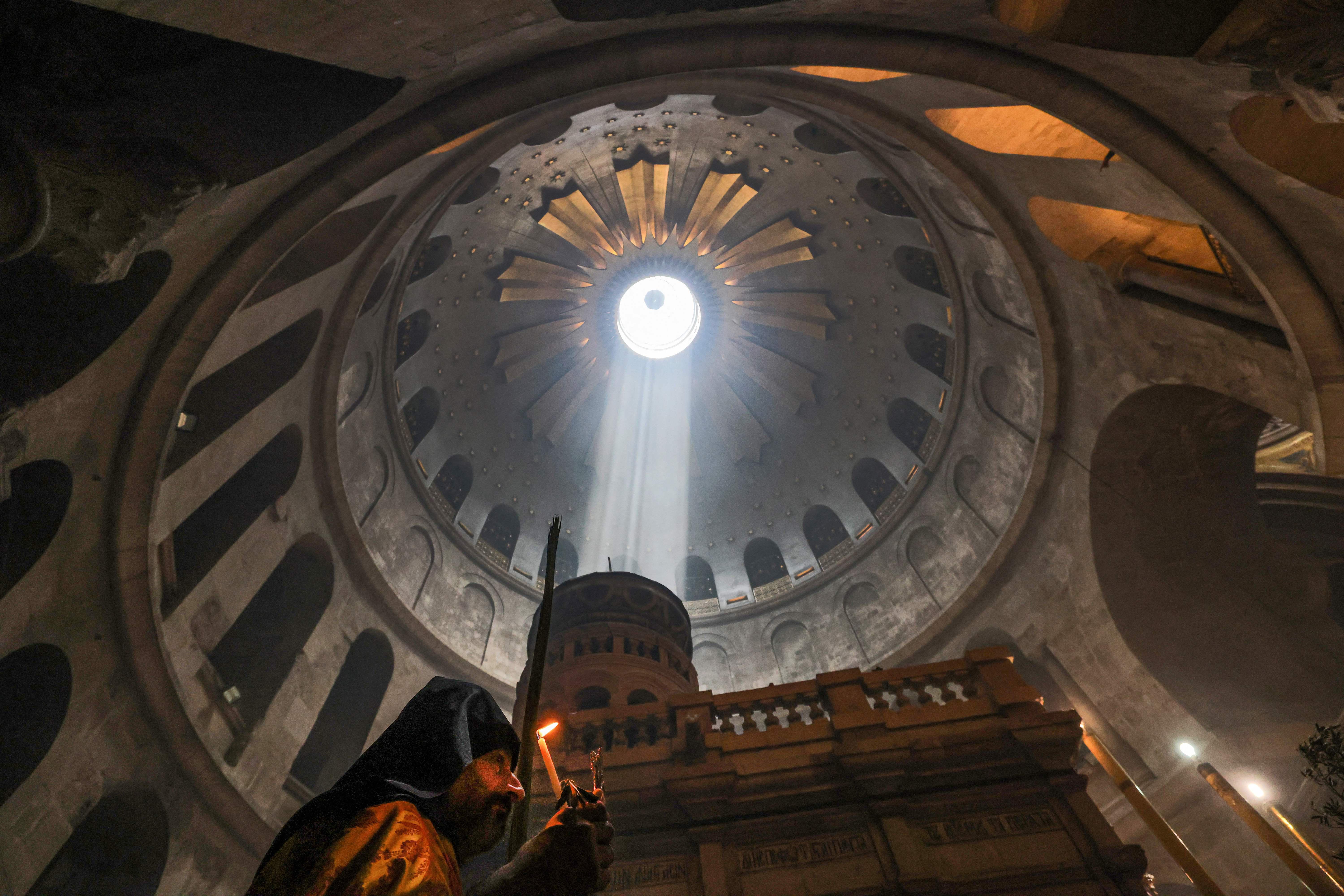
Six denominations share the Holy Sepulcher, but not all between them is peace and love.
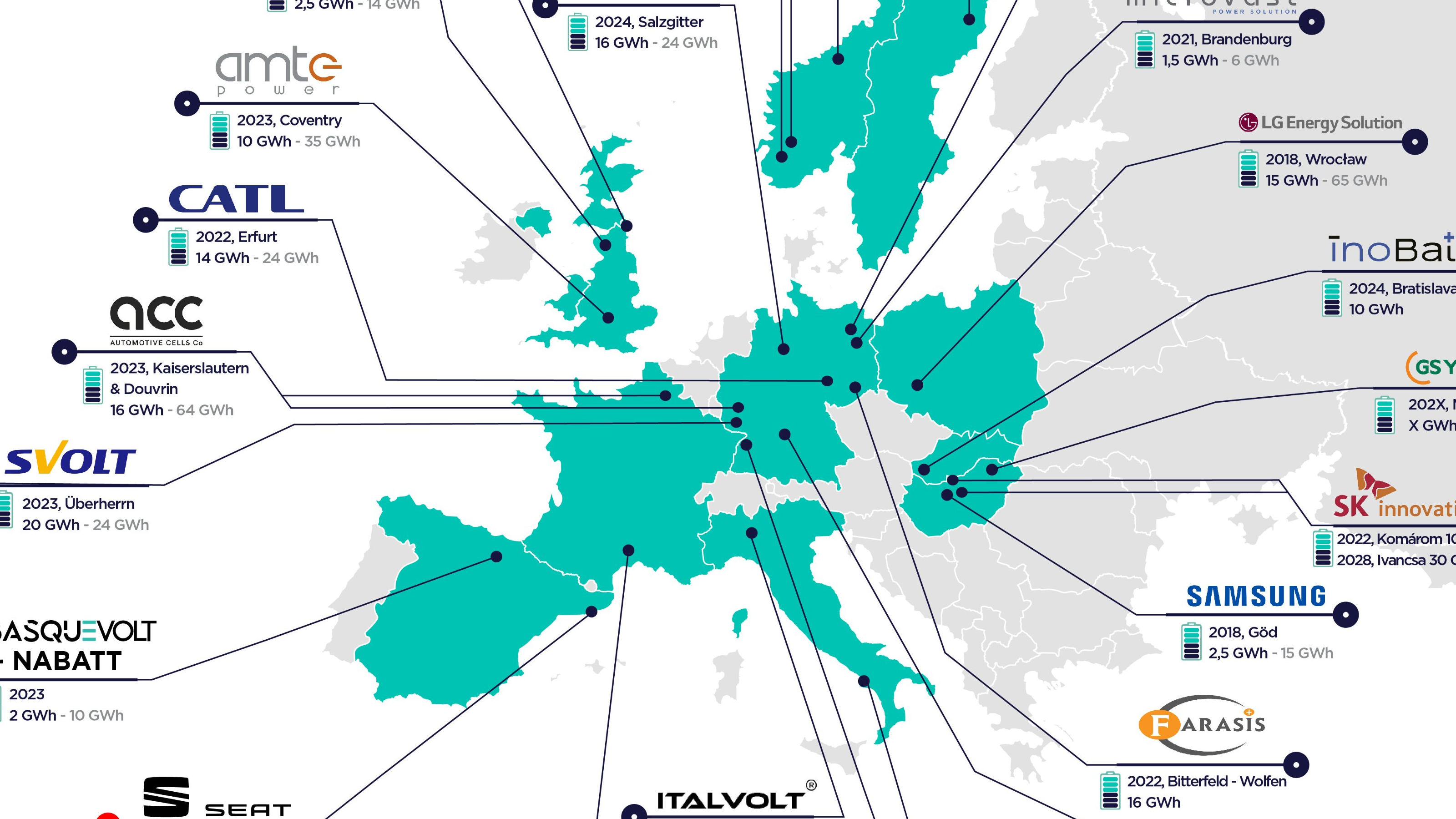
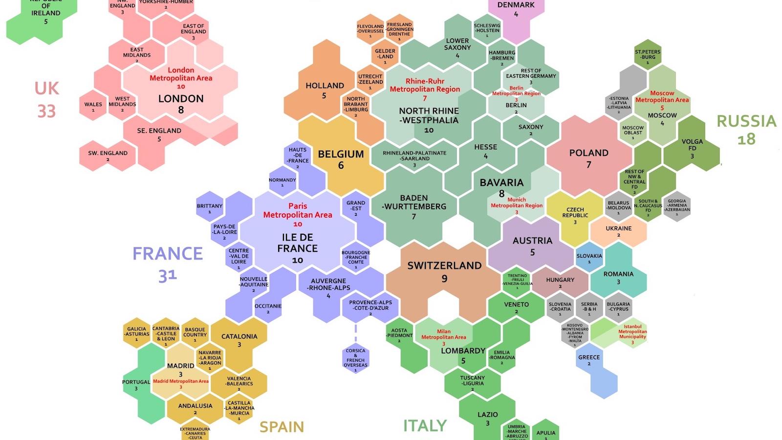
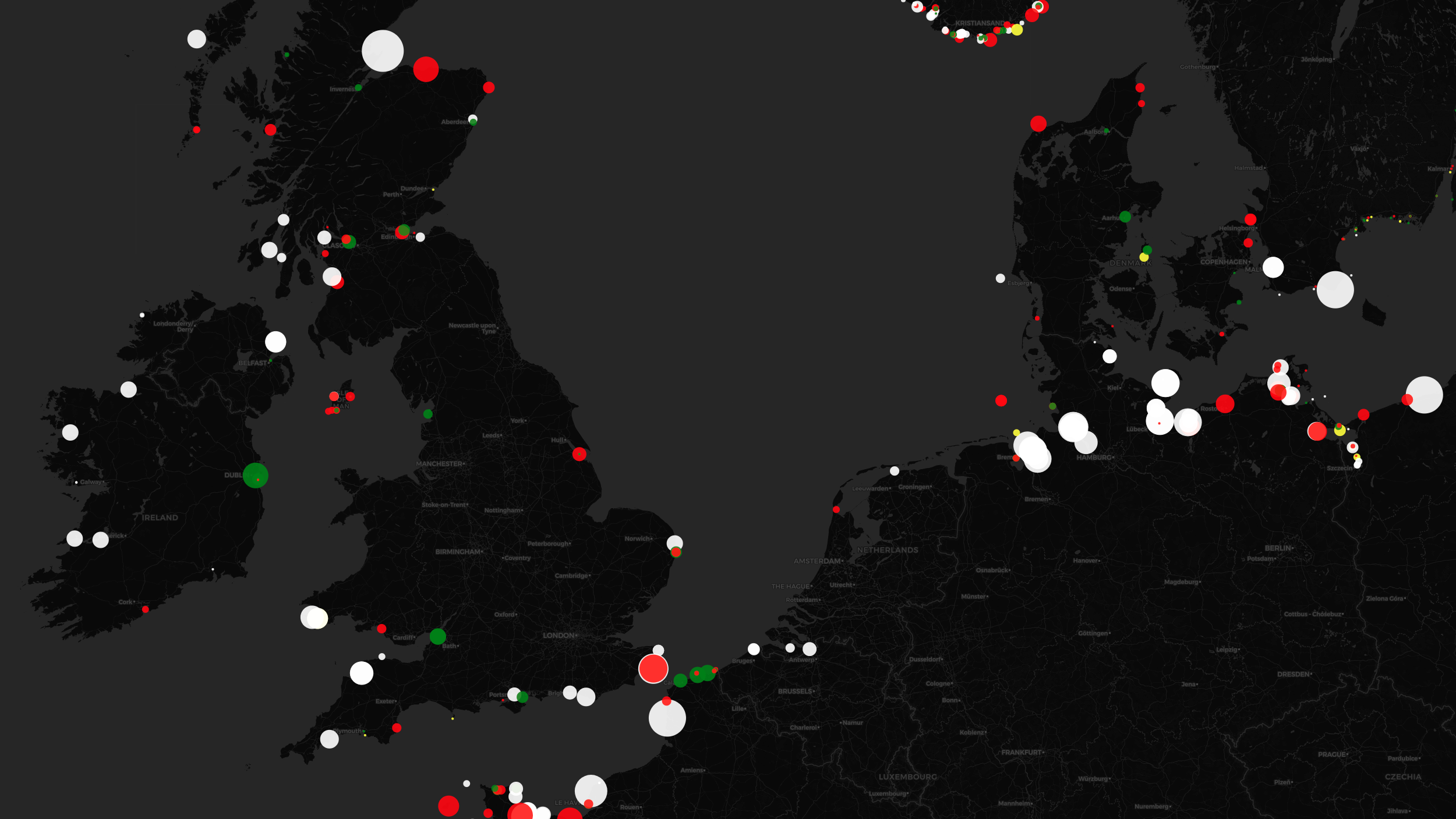
Map shows Europe’s imminent Great Leap Forward in battery cell production
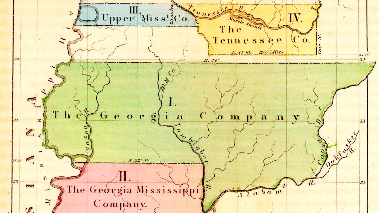
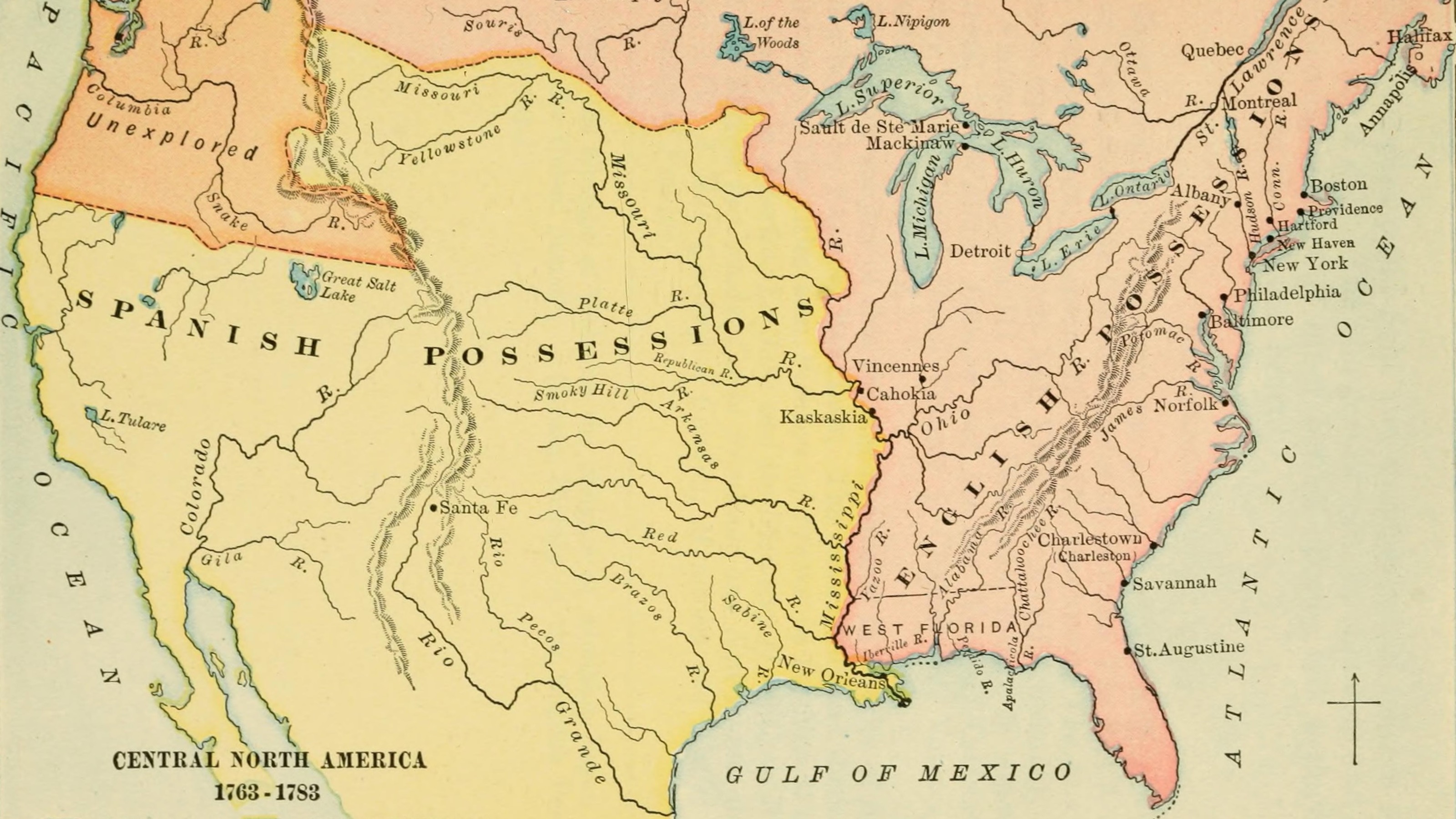
Without the now-obscure land investment affair, Georgia might have been a “super state.”

An artificial island in the North Sea is the biggest building project ever in Danish history – and could pave the way for many more.
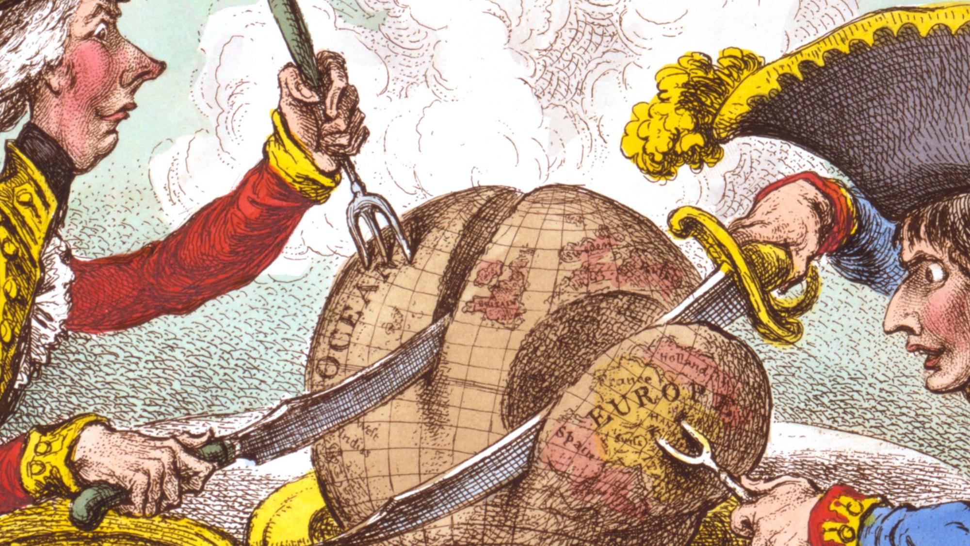
James Gillray’s ‘plumb-pudding’ caricature is “probably the most famous political cartoon of all time.”