strange maps
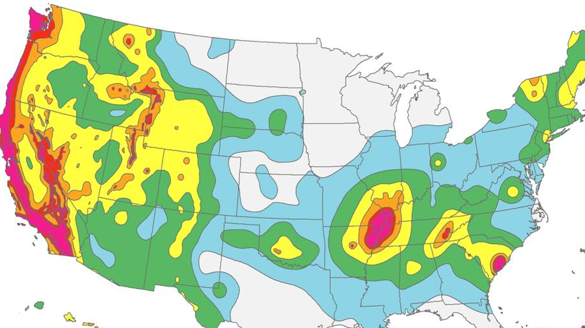
Minnesota earned its ‘blue mark’ in the 1975 Morris earthquake, which had its epicenter in the western part of the state.
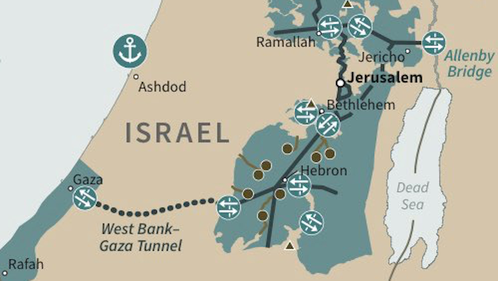
Trump’s Middle East peace plan contains the first map of a Palestinian state that ‘Israel can live with’.
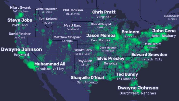
The ‘People Map of the United States’ zooms in on America’s obsession with celebrity
Average waiting time for hitchhikers in Ireland: Less than 30 minutes. In southern Spain: More than 90 minutes.
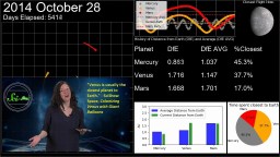
Three scientists publish a paper proving that Mercury, not Venus, is the closest planet to Earth.
▸
with
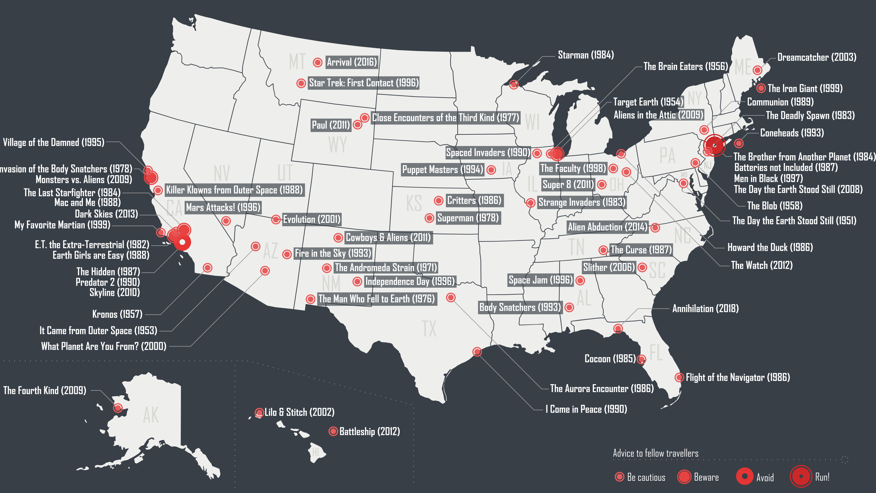
First contact movies had their Golden Age in 1980s America – now they’re going global.
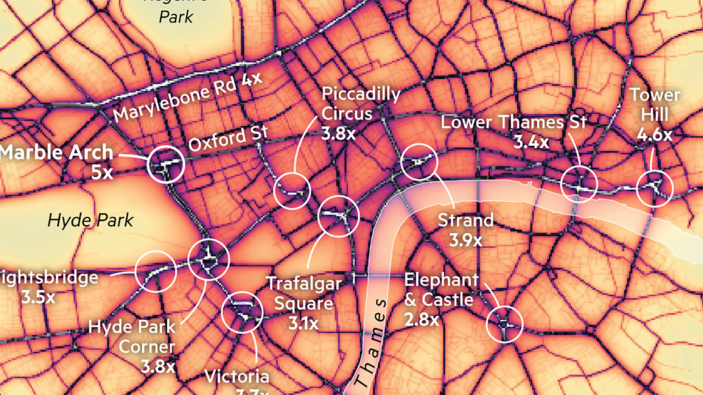
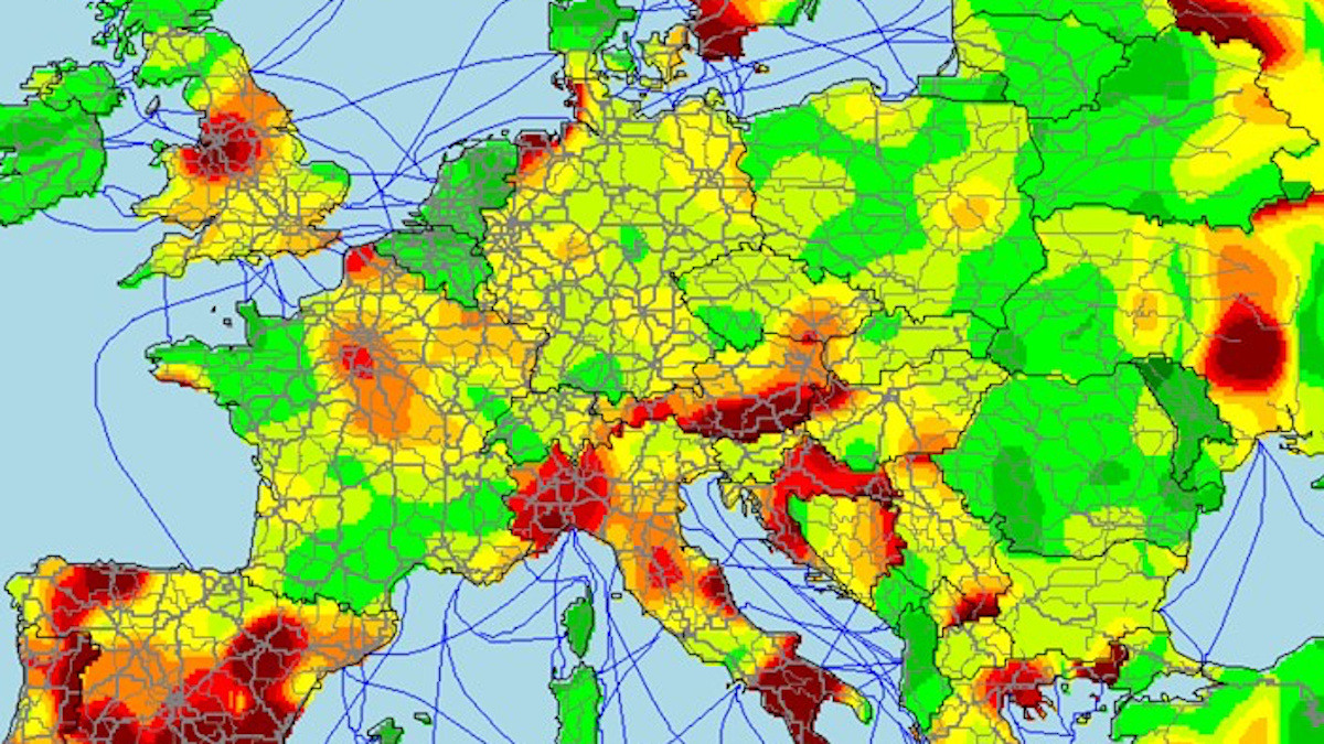
Air pollution is up to five times over the EU limit in these Central London hotspots.
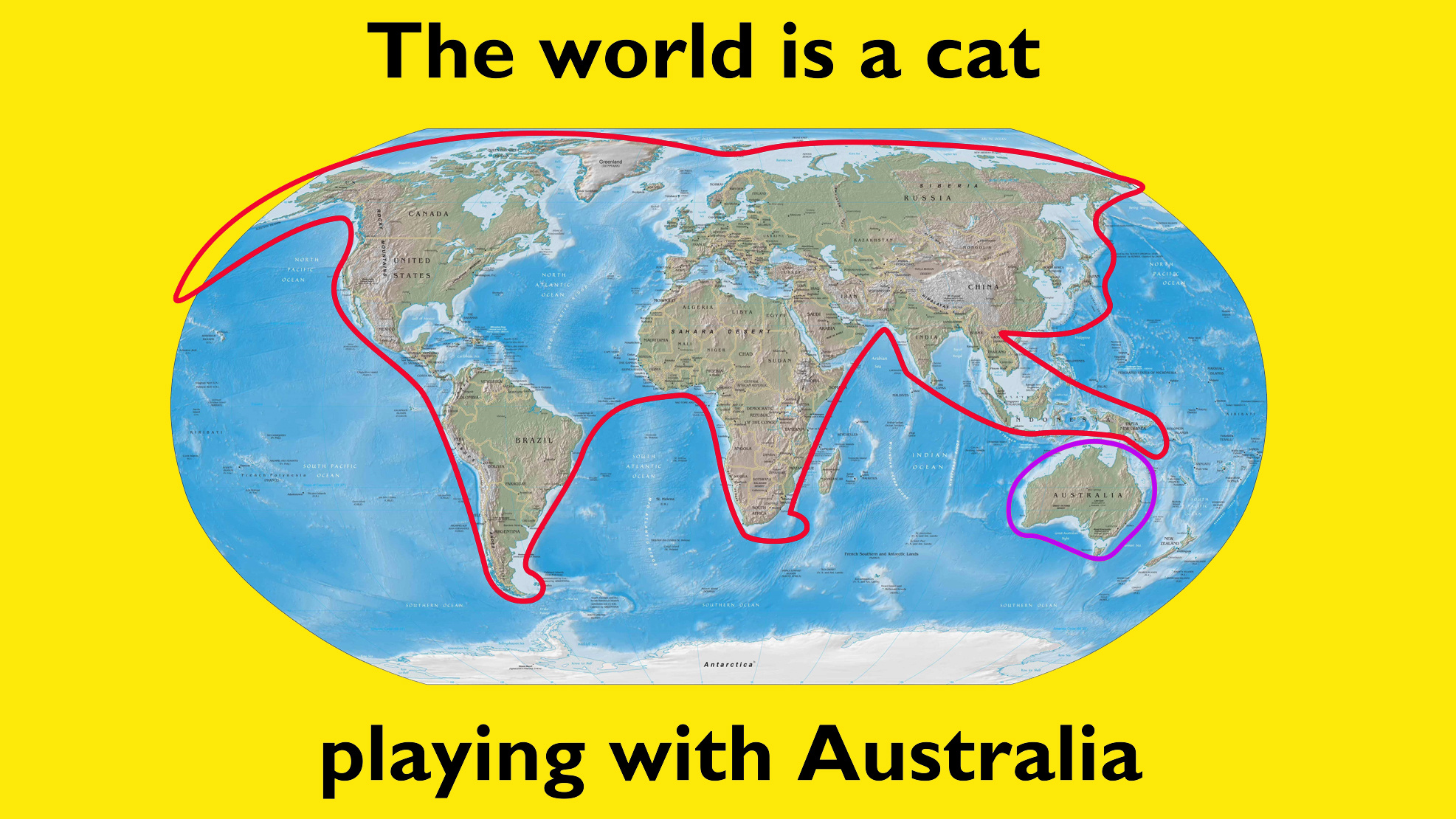
Despite itself, this collection of awful cartography may just make a few useful observations.
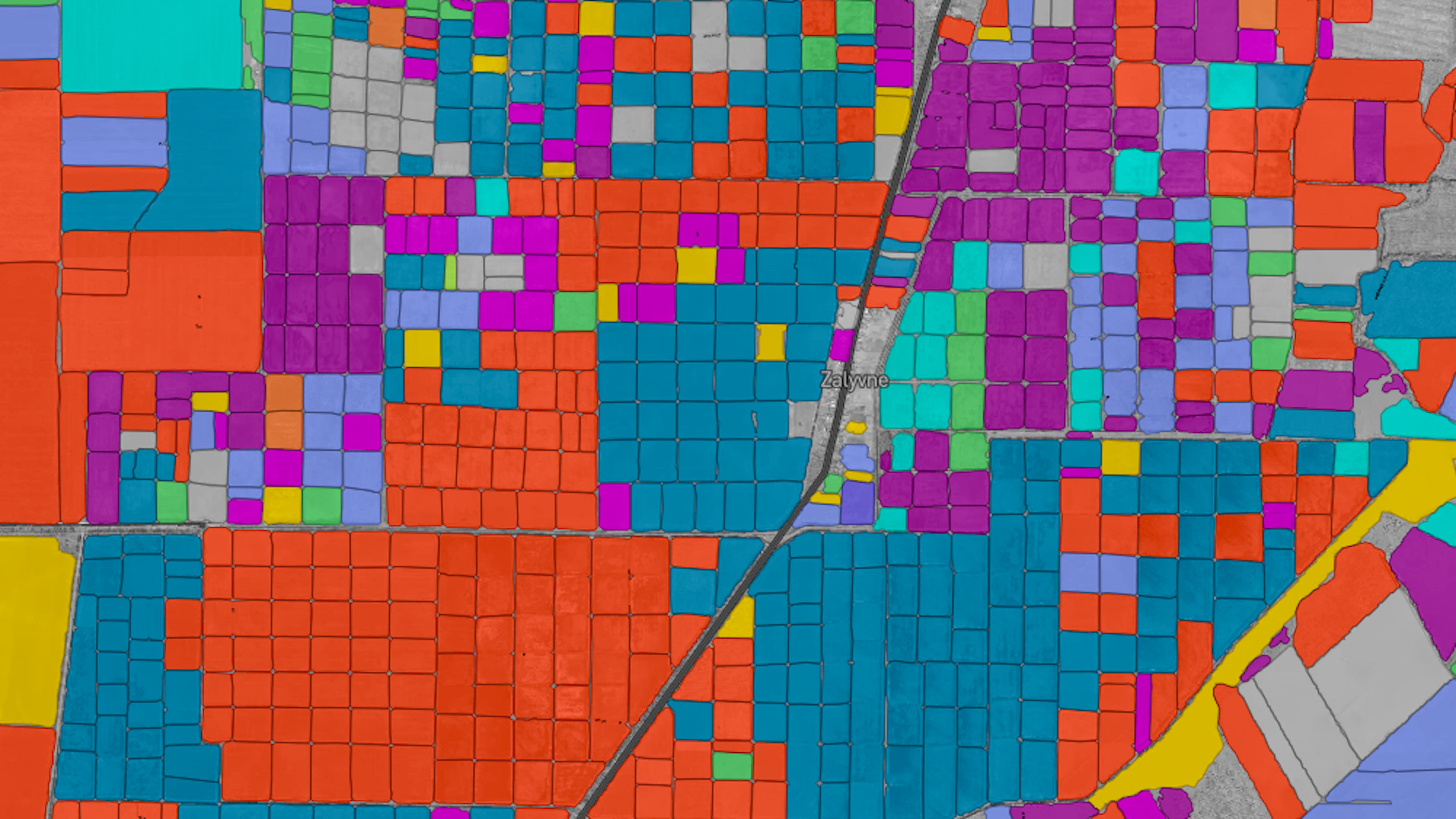
Detailed (and beautiful) information on 57 million crop fields across the U.S. and Europe are now available online.
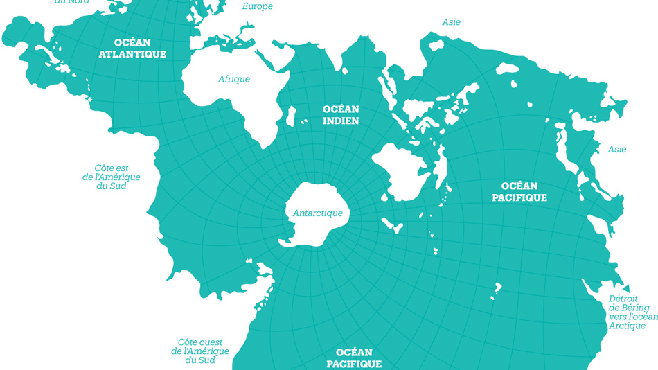
The Spilhaus Projection may be more than 75 years old, but it has never been more relevant than today.
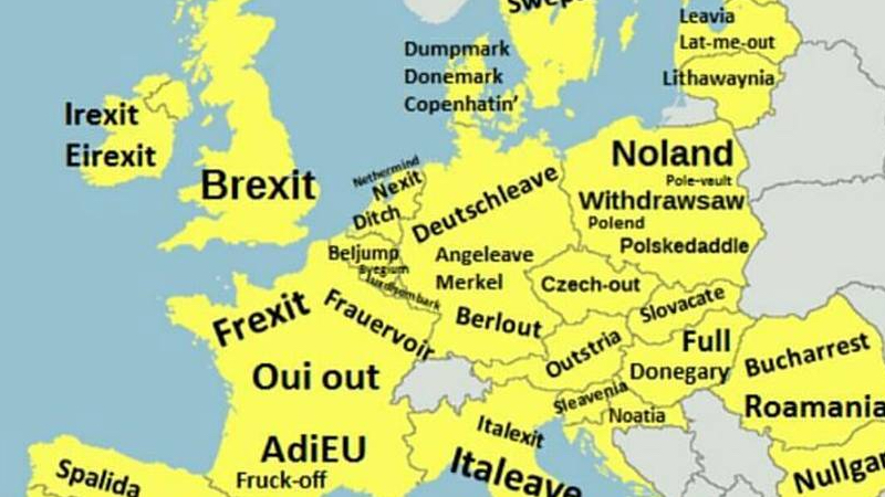
Caught between a rock and a hard place, the EU had better get ready for some of these exit-names
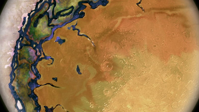
The nearest exoplanet ever has been observed, but not yet seen. Is this what the ‘Earth Next Door’ looks like?