A geography column on history and society.
There is a basic flaw woven into the very fabric of cartography. We trust maps to tell us the truth, but they can’t help lying to us. The lying starts with the standard flatness of maps. How is that a good fit for the roundness of the Earth? It isn’t. Some distortion is already implied.
Map subjectivity is a feature, not a bug
But the bigger lies are those of omission — and inclusion. What is on your map, and what is not? Those are very subjective decisions, made by an invisible cartographer. In other words, all maps offer a skewed, partial view of the world. For mapmakers, that is not a bug, but a feature. For map readers, it should be an incentive for eternal vigilance.
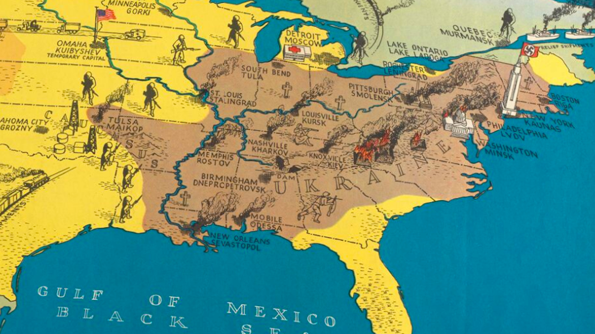
Sometimes, the subjective perspective can be hard to spot. However, few maps are as un-subtle about their prejudices as this comic duo. Made a year apart, showing the same part of the world, and focusing on the same topic — the Communist versus the non-Communist world — they couldn’t be more diametrically opposed if they tried.
All maps offer a skewed, partial view of the world.
On one map, Communism is a virulent contagion, spilling out from its already super-sized home base, threatening to engulf the rest of the globe. How ever is the Free World going to survive? On the other, the Soviet Union and its socialist allies are surrounded by enemy forces, their war-mongering arrows provocatively poking into the soft underbelly of the peaceful Workers’ Paradise.
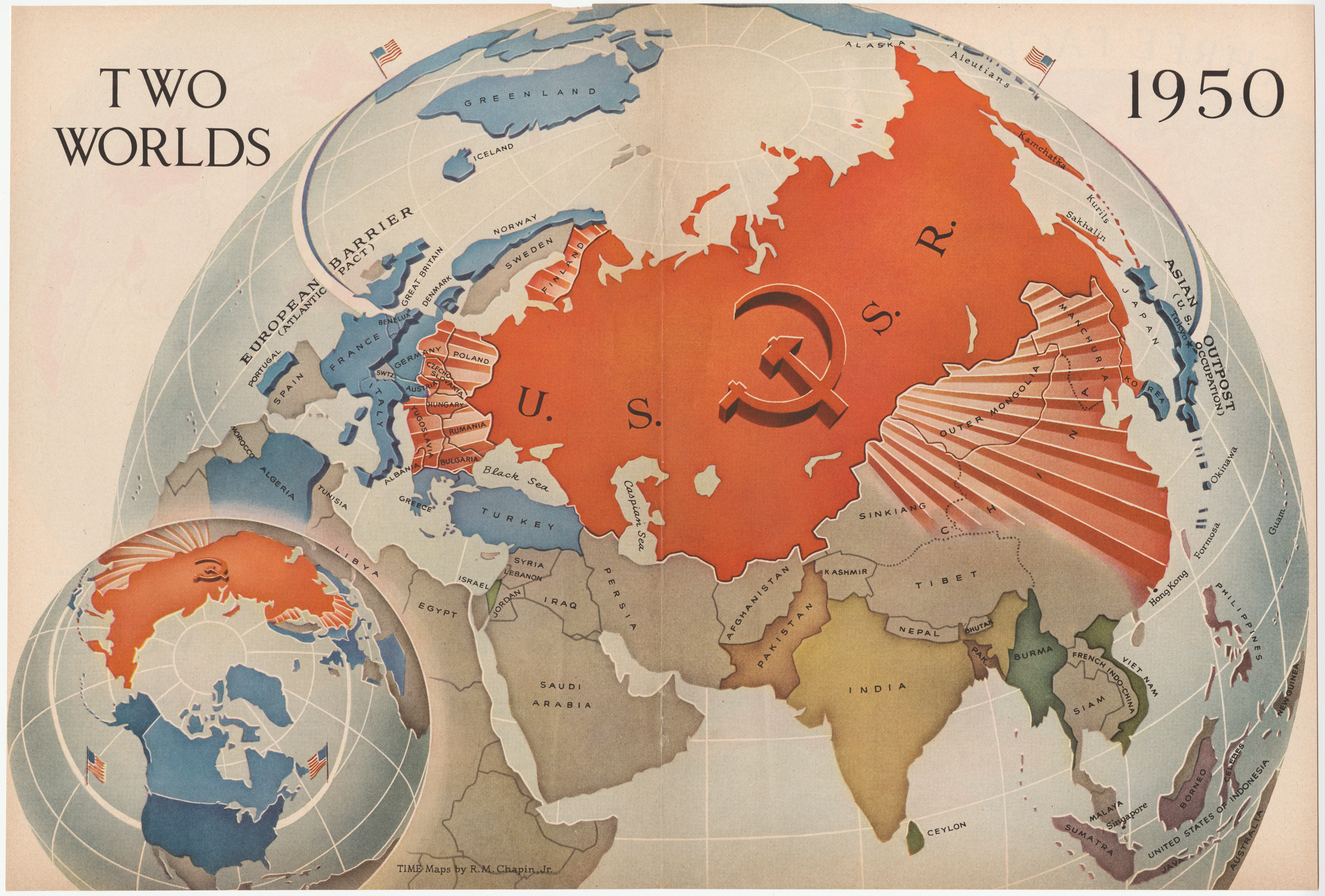
The first map appeared in Time magazine on January 2, 1950. Everything about it serves to highlight the imbalance between the “Two Worlds” mentioned in the title — a huge, contiguous Communist bloc and a scattering of small, pro-Western countries. The map’s projection, focused on the North Pole, underlines the already enormous size of the Soviet Union. The centrally placed hammer and sickle lends an ominous quality to the bold red of the USSR’s land mass.
From it radiate rays that cover the most recent extensions of the Communist realm: Mongolia, most of China, Eastern Europe, and… Finland. (Post-WWII, the Finns were under strong Soviet influence, but largely managed to maintain their independence.) Most of the blue countries are clinging to the western edge of Europe or the eastern edge of Asia. The U.S., the most important, largest, and most powerful member of the fledgling anti-Communist coalition, is purposely pushed away across the horizon.

The map’s intention is clear: to impress on the American magazine-reading audience the strength and size of their ideological opponent in the nascent Cold War.
A mirror world
Examining the other map is like stepping into a mirror world. Here, the Communists aren’t expanding; they’re under attack. The Soviets aren’t the aggressors; the Americans are. The pro-Soviet map is a poster published in 1951 by the French Communist Party. Its title translates as: “Here are the American Bases Around the World.”
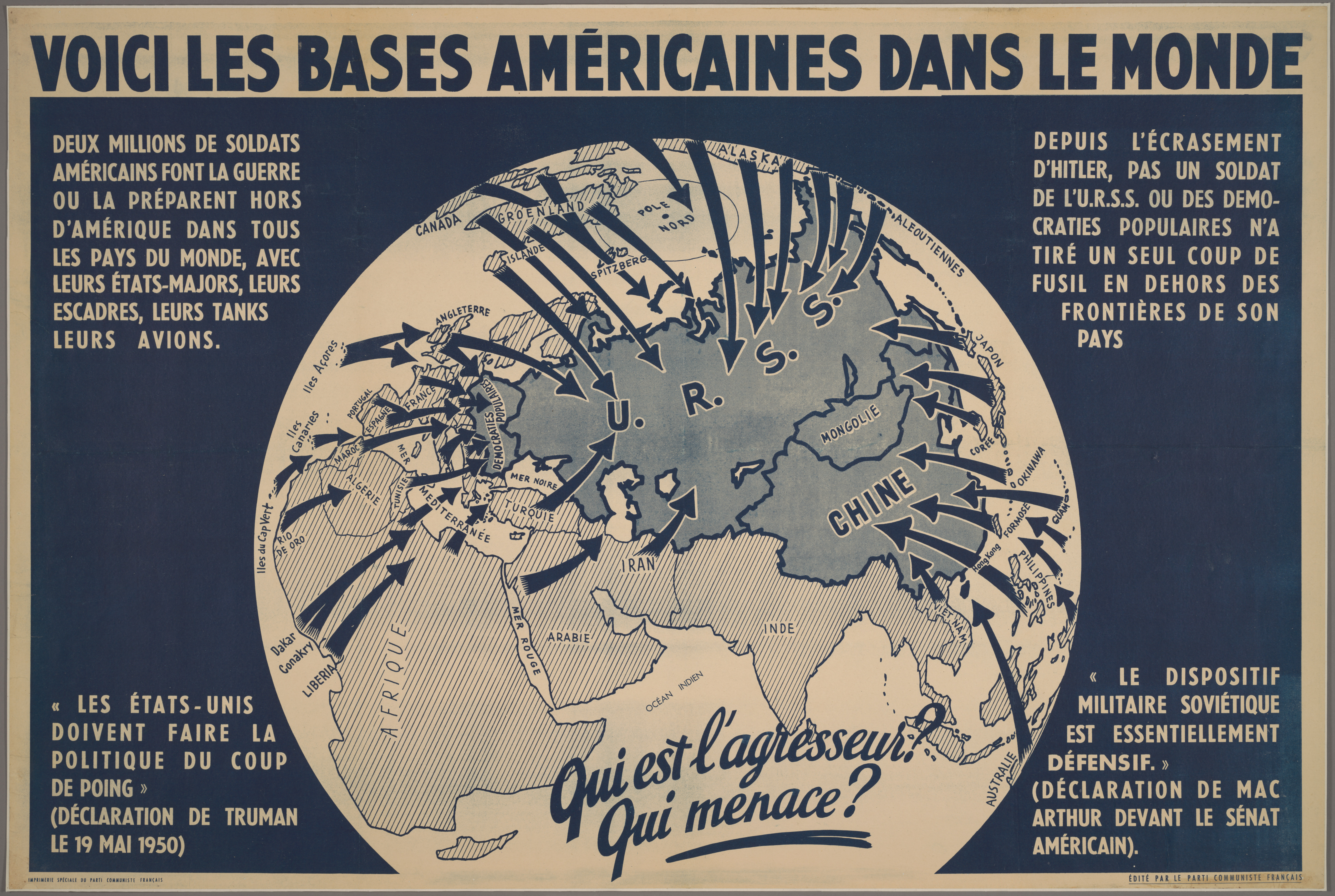
The Soviet Union (U.R.S.S. according to its French acronym), China, and the “people’s democracies” in Eastern Europe are the target of dozens of arrows, coming at the socialist regimes from all directions, including from across the North Pole. Only the People’s Republic of Mongolia is temporarily reprieved from attack, buffered as it is by its two giant neighbors.
Where are those arrows coming from? The map’s legend leaves no doubt:
“Two million American soldiers are preparing for war outside of America in all countries of the world, with their general staffs, their fleets, their tanks and their planes.”
The Red Army and its assorted allies are, in contrast, just too nice for their own good:
“Since the defeat of Hitler, no soldier from the Soviet Union or any of the people’s democracies has fired a single shot outside the borders of their country.”
Always ask: Who made this map, and why?
Both statements are backed up by quotes, respectively from President Truman (“The U.S. policy must be to strike suddenly.”) and General MacArthur (“The Soviet military posture is essentially defensive.”). The script across the map poses the crucial question to its Western audience: Who is the aggressor? Who (is) the threat? Why, it’s the imperialist Yankees, of course. The map clearly says so.
Maps like these were foundational elements of the mirrored worldviews that held sway all during the Cold War. In our own times, that mirror has cracked. The binary logic of the Cold War has given way to a more “multipolar” attitude toward truth.
That makes it rather unlikely to find two contemporary maps that are as neatly opposed as this mid-century pair. But the key lesson stands: All maps lie. Each map is subjective. Always ask: Who made this map, and why?
Strange Maps #1205
Got a strange map? Let me know at [email protected].

The Power of Play