How to Make Maps and Graphs Colorblind People Can Actually Read

Good design is design that can serve all users, regardless of their differences. It is sometimes difficult, however, for designers to remember or imagine that some physical, mental, or environmental conditions may prevent individuals from using a product the way it was intended.
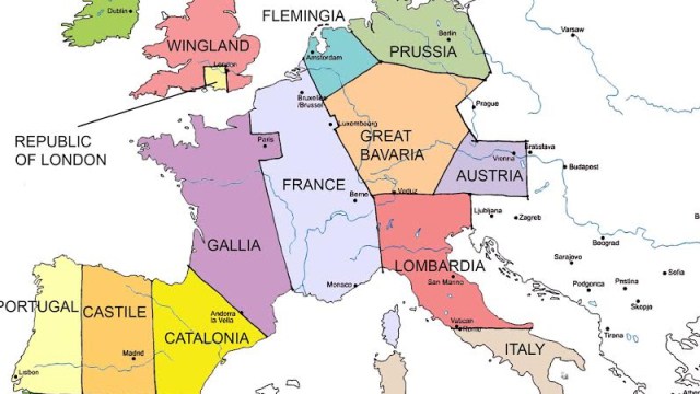
Think about maps, for example. Cartographers rely on colors and symbols as ways to relay information efficiently. However, people who have color-vision deficiencies may not be able to discern between the colors outlining separate geographical areas, which will render the map useless to them. But it’s not just maps, many everyday objects can prove difficult for color-blind people, from traffic lights to pairing the same color socks.
Color blindness, which is not a form of blindness but a deficiency that affects the perception of color, is relatively common. The red-green type, which makes it difficult for individuals to distinguish between shades of red, yellow, and green, is the most prevalent affecting about 1 in 12 males and 1 in 200 females. It is inherited through a gene on the X chromosome, which is why in women, a defect in one X chromosome can be compensated for by the other. Other forms of color deficiency, like the blue-yellow presentation and blue cone monochromancy are much rarer.

So, what can designers and developers do to make their products (especially when it comes to the web) more inclusive? The first step should be to familiarize themselves with the Web Content Accessibility Guidelines (WCAG) 2.0 which provide advice on how to make content accessible to a wider range of people with disabilities, including blindness and low vision, deafness and hearing loss, learning disabilities, cognitive limitations, limited movement, speech disabilities, photosensitivity and combinations of these.
In addition, there are many tools that can help the professional and amateur designer create more accessible products and graphics. One such tool is Vischeck, which lets viewers see how an image or a website looks like to someone who is color blind. Another is Daltonize, which processes images so that their colors become more discernible to color-blind people. Color Brewer is an online tool designed to help people select inclusive color schemes for maps and other graphics. For professional digital designers there is also Stark, a color-blind simulator and contrast checker for Sketch.

If you want to communicate visually and inclusively, don’t pick a rainbow palette from all across the color spectrum. Pick a scheme that progresses from light to dark instead. Image credit: Cynthia Brewer, Mark Harrower and The Pennsylvania State University
Regardless of the tool, what is important is that designers and developers keep in mind that users are very different but they all want their needs met. Following the principles of universal design will help them create products that are accessible to all.
Here’s how font design can make products more inclusive for people with dyslexia.
Neuroscientist Beau Lotto explains how our senses interpret color, and how much we don’t get right about color theory and the perception of reality — whatever that may be:


