A geography column on history and society.

“Rather pleased with this map,” said Erin when she tweeted it on February 2, 2022. This is quite the understatement: Her map went viral almost immediately. Why?
Because the map is an infographic that does a stellar job of answering its own question: Where are Americans born? The graph packs a lot of info, yet it is easy to decipher and can be read in a variety of ways. Its colorful combination of structure and variation is also pleasing to the eye.
Each state is represented by a square of the same size, which tracks data from 1850 to 2020 on where each state’s citizens were born. Dark blue represents the share of citizens born in the state. Light blue is for residents born in a different U.S. state. Orange represents the foreign-born percentage.
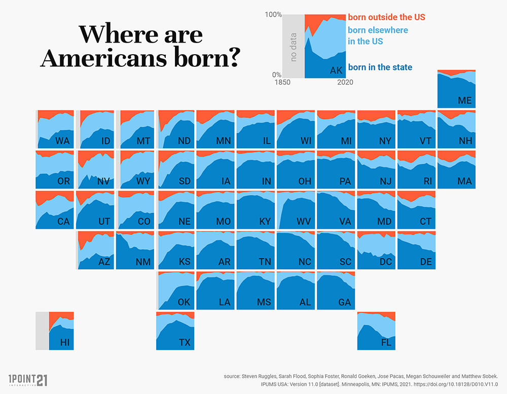
As you witness those shares in each state evolve over time (i.e. from left to right), the composite picture of those 50 states together immediately illuminates trends and outliers, both nationally and regionally.
Interesting findings
The native-born share of the states’ populations tends to be the largest, but not everywhere. Ohio and Pennsylvania have throughout history had consistently large majorities of native-born citizens. That share is consistently low in Nevada (27% native-born in 2020, the lowest in the nation) and Arizona, and more recently in Florida.
The native-born share also tends to be in decline, but not everywhere. The drop has been fairly linear in Delaware and more precipitous in Georgia. But the share of native-borns is actually increasing in Washington state and California, albeit from a relatively low base.

The states with the broadest bright blue bands are the most popular destinations for Americans born in other states. Many are out west, including Colorado, Wyoming, and Oregon. But that share is also increasing in, say, Maine and New Hampshire. It’s relatively narrow in New York and Pennsylvania, for example.
Foreign-born residents make up an important part of many state populations, but not all. There are relatively many immigrants in New York and California, but relatively few in West Virginia and Tennessee. The share is clearly on the increase in states like Florida and Texas, but has been much higher in the past in Rhode Island and Connecticut.
An interesting anomaly: West Virginia didn’t become a separate state until 1863, which is why its “native-born” population before 1870 was 0% (as they were all born in Virginia).
The map was produced to illustrate an article on the blog of the Law Offices of James A. Welcome, which also shows a graph of a single square with the same data for the entire country.

It shows the nationwide decline in native-born state residents between 1850 and 2020 (from 66% to 58%) is only to a lesser degree the result of an increase in immigrants (rising only 11% to 14%), and to a larger one the consequence of a rise in inter-state migrants (23% to 28%).
A caveat: the data for this map comes from the U.S. Census (1850 to 1990) and American Community Surveys (2000-2020). The older data does not reliably include Native or African Americans, and is therefore likely inaccurate.
Strange Maps #1200
For more info, see the map in its original context. Map by Erin. Here’s her Twitter and website.
Got a strange map? Let me know at [email protected].

The Power of Play