That’s Gross: the Four Worlds of Income Inequality
Do you remember the Third World? That’s the Cold War term devised by the West (the First World, obviously) for those countries unaligned with either itself or the Communist bloc (the Second World). There also used to be a Fourth World – the term for underprivileged groups within the First World.
And then of course the Soviet Union collapsed, taking with it to the dustbin of history this neat numerical subdivision of the world.
But here’s another way to quarter the world. Based on World Bank data, Global Finance magazine recently subdivided the world into four income groups.
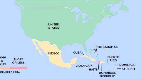
Low-income countries have an annual per capita Gross National Income (GNI) of no more than $1,045. Anywhere between that figure and $4,125, and you’re lower-middle-income. Increase that to any figure up to $12,745, and you’re earning an upper middle income. High-income countries have an annual per capita GNI of $12,746 and over.
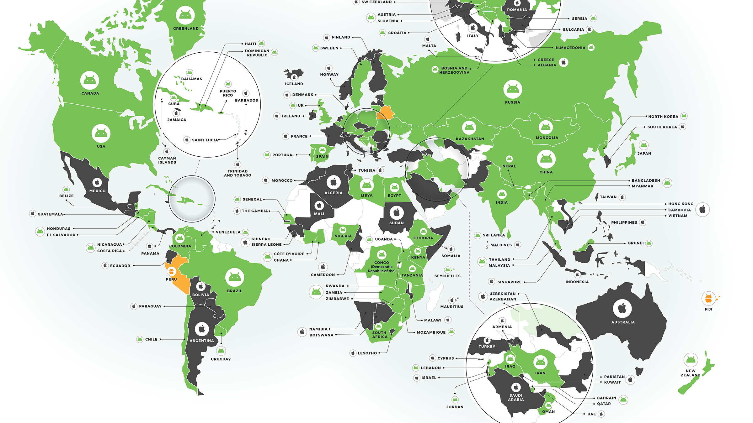
The good folks at Howmuch.net poured all that data into four maps, with four colours that add a bit of unexpected illumination to the world.
Most of North America is green; that’s because the U.S. and Canada fall into the high-income category. The Bahamas adds the only other dash of green to the map. The only country on the other side of the scale is Haiti, in red: the poorest country in the Western Hemisphere. All the others fall into the yellow category – upper middle income.


Small is beautiful, or at least rich: in South America, Chile and Uruguay are the only two countries in the high-income category. Bigger countries like Brazil, Argentina, Colombia and Venezuela are are upper-middle income. But the poorest seven countries on this map are also relatively small. Bolivia and Paraguay have the excuse of being landlocked, but Guyana is poorer than all of its neighbours, while Guatemala, Honduras, El Salvador and Nicaragua form a scrum of relative poverty in Central America.

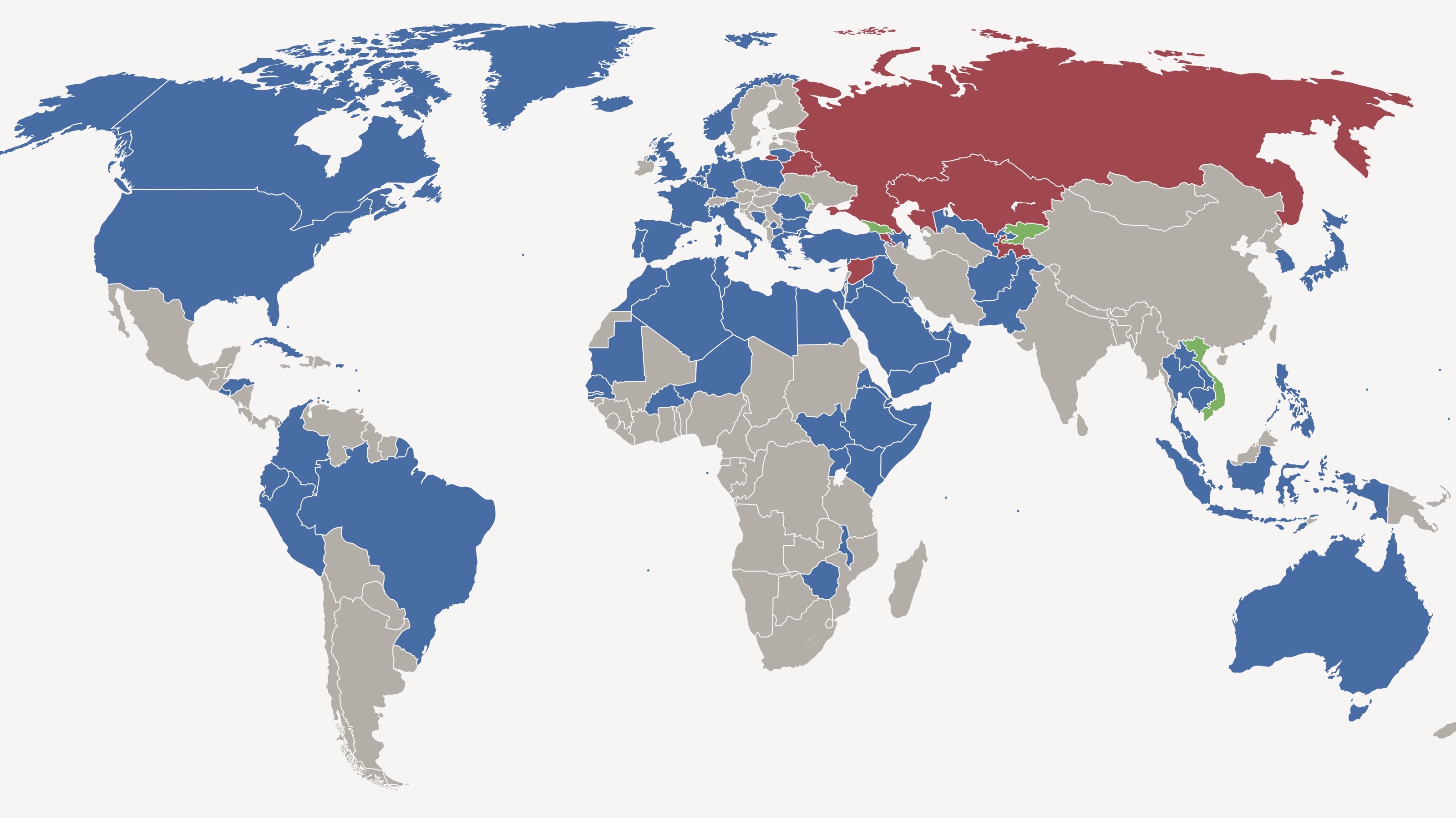
The European map is especially interesting, as it shows which former Communist countries have managed to lift themselves up to a living standard approximating that of the West. The Baltics, Poland, the Czech Republic, Slovakia, Slovenia and Croatia have all joined the green club. Greece also is still a member, surprisingly. The rest of former Yugoslavia, Albania, Bulgaria and Romania fall into upper-middle-income limbo. So does Hungary, which is also a bit of a surprise: weren’t they the first Communist country to experiment with market reforms? Snarky retort: perhaps they succeeded a bit too well. Turkey, Belarus and Azerbaijan are also a member of the yellow club.
Europe’s Haiti is Moldova – the continent’s poorest cousin. But still, in the orange club instead of the red one. Other members are Ukraine, Georgia and Armenia. I wouldn’t have thought things were as bad as that in Ukraine. Or as relatively good as that in Belarus.

Asia’s green club members are all peripheral: Russia, Japan, South Korea, Israel, Saudi Arabia, Oman, the UAE, Qatar and Bahrain. Its poorest countries are rather more centrally located: Afghanistan, Nepal, Bangladesh, Myanmar, Cambodia and North Korea – the DMZ between both Koreas is the only border where a country in the richest club meets one in the poorest club.
Despite years of war and bloodshed, Iraq is member of the upper-middle-income club, showing how relative the average per capita GNI is as a measure of actual wealth. Other members of the yellow club include Iran, Kazakhstan and China. All are richer than India, Pakistan, Indonesia and the Philippines, prominent members of the orange club.

Despite all the optimism about Africa’s economic future, there’s precious little green on the Mother Continent. In fact, Equatorial Guinea is the only green bit – its reputation as a kleptocracy doesn’t bode well for the even spread of that wealth. They don’t call it Equitable Guinea, do they? With poverty still rampant across the continent, the only glimmers of hope are the eight members of the yellow (upper-middle-income) club: Algeria, Tunisia and Libya (really, Libya?) in the north, Gabon in the middle and South Africa, Namibia, Angola and Botswana in the south.

Oceania is mainly green, thanks to Australia and New Zealand (and New Caledonia, piggybacking on France’s green rating). For the rest, Fiji is an island of yellow in a sea of orange (PNG, the Solomons, Vanuatu and Samoa).
Many thanks to Raul Amoros to point out the maps, found here on Howmuch.net. Original article here at Global Finance Magazine.
Strange Maps #773
Got a strange map? Let me know at[email protected].