Nothing Average About London Property Prices
Thinking about buying a house in London? Check this map; check your bank account. Then think again.
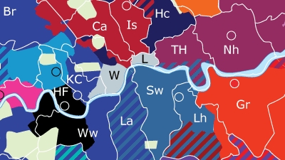
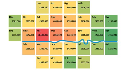
This cartogram shows median house prices in 2014 for each of London’s 32 boroughs (plus the City of London), colour-coded from cheap to expensive in various hues, from dark and light green, over different shades of yellow and orange to red. Representing each of the 33 entities as an equal-sized square while (mostly) maintaining their relative geographical position provides a pleasingly clean overview — aided by the inclusion of the Thames, albeit a bit less curly than in actual fact.
“Median” house prices are not the same as “average” ones. An average property price you get by adding up the price of all houses sold, then dividing the total by the number of houses. A median property price is one where half of the houses cost more, and half less.
The outcome can be very different. If five houses sell for £100,000, five for £1,000,000 and one for £200,000, then the median price of those 11 houses is £200,000. The average price, however, is £518,182.
Median house prices are considered an effective tool for showing property hot spots and cool zones, as they indicate the dividing line between the cheapest and most expensive halves of the property market in any given area.
This map shows a clear dividing line between the inner and outer boroughs of Greater London. While all of London’s boroughs have populations that are roughly in the same order of magnitude – between 150,000 and 300,000 inhabitants — the ones closer to the city centre are generally smaller, and much more expensive.

The median house price in London last year was £340,000 ($520,000), but only 14 boroughs on the outer edge of Greater London (the ones coloured green on this map) had median house prices below that level. The cheaper boroughs are concentrated in Greater London’s east and southeast. The cheapest is Barking and Dagenham, with a median house price of no more than £215,000 ($328,000).
The most expensive part of London is not its historical and geographical centre, i.e., the City of London. Perhaps because that part of the metropolis is a business district rather than a residential area. London’s richest have moved west, to Kensington and Chelsea. The median house price in London’s most expensive borough is £1,198,000 ($1.83 million) — close to six times the figure for Barking and Dagenham.
Nowhere else in the United Kingdom is buying a house as expensive as here. The runners-up aren’t anywhere near as dear — if still eye-wateringly expensive — with Westminster in second place (£857K, $1.3 million), the City third (£724K, $1.1 million), Camden fourth (£665K, $1 million) and Hammersmith and Fulham fifth (£642K, $980K).
Gone are the days when losers like Bottom‘s Richie Rich (1) and Eddie Hitler could afford to live in Hammersmith. Today, they’d probably have to look for a place in the white bits on this map.
Map found here at the London Datastore.
Strange Maps #742
Got a strange map? Let me know at [email protected].
(1) played by the recently deceased Rik Mayall, who lived in Barnes, just across the river from Hammersmith, in the reassuringly expensive borough of Richmond upon Thames.