Vive le tweet! A Map of Twitter’s Languages

What a joy these maps are to behold. It’s as if someone took one of those composite satellite maps – you know, impossibly showing the whole world at night, the darkness broken by hubs and strings of artificial light (1) – and gave it the power of speech.
For the riot of colours on these maps correspond to the diversity of languages spoken, or rather: typed, on Twitter.

The explosive growth of the micro-blogging service’s global popularity is emblematic of a trend affecting the entire internet: it’s becoming less American, and less Anglophone. The most recent numbers I could find, indicate a drop in US-based ‘unique users’ from 62% in June 2009 to just over 50% in January 2010.
In relative terms, the world’s top tweeting nation are the Netherlands, with just over 22% of the Dutch online population using Twitter. The US, at 8%, is far behind Brazil (almost 22%), Venezuela (21%) and Indonesia (19%). So it’s a fair guess that a majority of the 200 million tweets generated every day are in languages other than English.
But which ones? Online language detection is possible due to Google’s open-sourcing of the CLD (Compact Language Detector) software embedded in its Chrome browser, which tells you in what language the web page you are visiting is written – and asks if you want it translated into another one, if it’s not your own.
A guy called Mike McCandless extracted the software, another one called Eric Fischer applied it to Twitter. And hey presto!
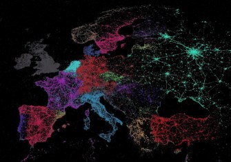
What does this map tell us? First of all, like those world-at-night maps, it shows us where all the people are – at least those tweeting. Western Europe is lit up like a christmas tree – with the Netherlands glowing especially bright. Eastern Europe: not so much. Russia is a spider’s web of large cities connected through the darkness of the vast, empty countryside. In East Asia, Japan, South Korea and Indonesia stand out. India is much darker – but maybe that’s because English, no longer majoritary but still dominant, is rendered in subdued grey.
The Middle East is half-lit, but across the arid dunes of Saudi Arabia rather than along the Fertile Crescent. Africa remains Twitter’s darkest continent. The Americas are illuminated in all the usual places: the eastern half and the western coast of the US, with high densities throughout Central America, the Caribbean and the shores of South America, and low densities in its centre.

But the map most of all tells us which language people are twittering in. This is a fascinating way to compare official and actual language use. Quebec, for example, is an enormous French-speaking territory, almost triple the size of France itself (2). But those Canadians actually practising le tweet in French (3) form a much smaller cluster, huddling around the St Lawrence in a couple of large hubs, with only a few francophone flecks further afield.
The rest of North America is solidly, and massively, anglophone, with only a surprisingly small smattering of Spanish in those areas with large hispanic populations. The US-Mexican border, for all its supposed permeability, is still clearly visible on this map, which shows Spanish dominating most of the rest of the Americas – although Cuba remains as dark as the night.
The fun really begins in Europe, where some of countries just vanish off the map: Belgium tweets in Dutch and French, Switzerland in mainly in German, with a French bit west of the Röstigraben (3). And other countries emerge out of nowhere: Catalans twitter in their own language, not Spanish. German dominates Central Europe, but a surprisingly large chunk of Austria appears to be tweeting in Italian – as do a lot of dots inside France.
Those are the really fascinating bits of this map of Twitter’s languages: the ones that show a divergent reality to the one we find on most other maps – even ‘proper’ linguistic ones: is that blue dot south of Amman really a Danish oasis in the Jordanian desert? Does nobody tweet in Lithuanian? And is that Spanish being tweeted in Bermuda?
Many thanks to J.B. Post, Ken, and Peter Berlich, who sent in the map, seen in its entirety here.
Strange Maps #539
Got a strange map? Let me know at [email protected].
________
(1) A satellite image showing the starkly different levels of night-time illumination in both Koreas was discussed in #218.
(2) Quebec is 1,542,056 km2 (595,391 sq mi), compared to France’s 551,695 km2 (213,010 sq mi)
(3) Or is it la tweet?
(4) See #257.
