2016 Is Going to Be the Hottest Year Ever (According to NASA, NOAA, & Pretty Much Everyone)

If you’ve been outside lately, you’ve probably guessed this yourself. 2016 is on pace to be the hottest year on record.
As reported by the the World Meteorological Organization (WMO), global temperatures in the first six months of this year are shattering records.
The average temperature for the first half of 2016 was 1.3°C, which is 2.4°F warmer compared to the pre-industrial era in the late 19th century when we began this kind of records-keeping.
The same pattern is true for the average ocean temperature which was 1.05°C (1.89°F) above the 20th century average. It beat the previous record set in 2015 (the previous hottest year) by 0.20°C (0.36°F).
Here’s what all this temperature drama looks like, according to the Global Mean Surface Temperature chart from NASA:

And here’s another way to look at this, in terms of how this year stacks up against the previous hottest years:

The Secretary-General of WMO, Petteri Taalas, put it this way:
“Another month, another record. And another. And another. Decades-long trends of climate change are reaching new climaxes, fuelled by the strong 2015/2016 El Niño.”
And if you’re quick to blame El Niño, the climate pattern that developed in 2015 and warmed up the surface waters of the Pacific Ocean, you should consider that it’s just part of the puzzle.
“The El Niño event, which turned up the Earth’s thermostat, has now disappeared. Climate change, caused by heat-trapping greenhouse gases, will not. This means we face more heatwaves, more extreme rainfall and potential for higher impact tropical cyclones,” warned Mr. Taalas.
Indeed, things aren’t looking so good.
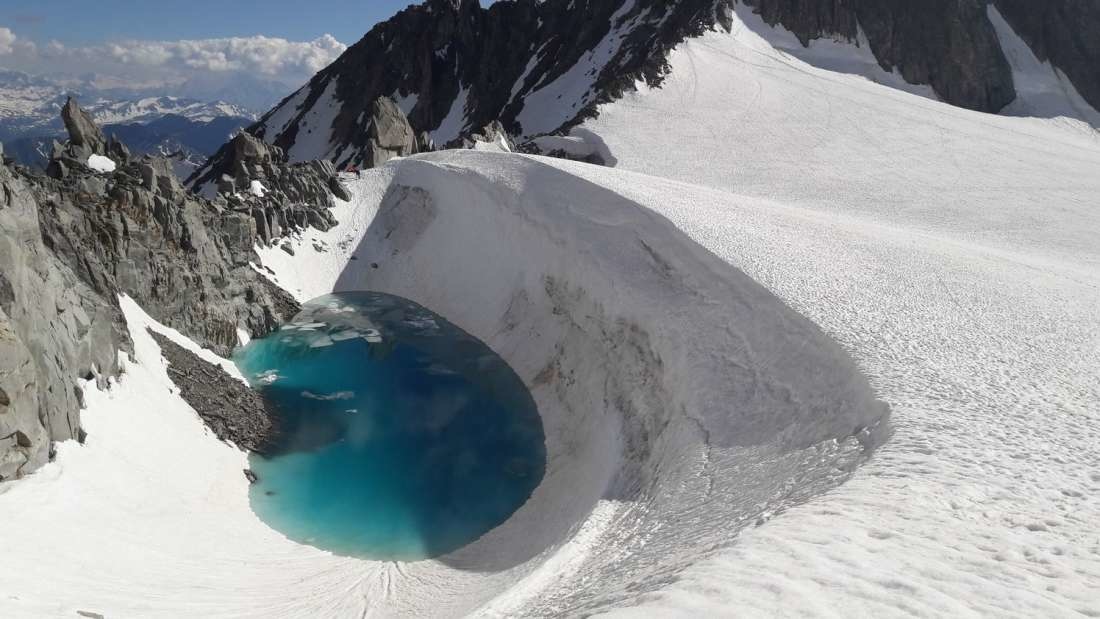
The Arctic Sea Ice is melting at an unprecedented level. When compared to late 1970s and early 1980s, the Arctic sea ice now covers 40% less area (when measured during the summer, its peak melting season).

Chart showing the difference between the 1981-2010 average extent of Arctic sea ice and each year’s maximum extent. Years with a larger extent of sea ice are colored red and years with a smaller extent of sea ice are colored blue. Credit: NASA/Meier
And if you are of the conviction that none of this means anything, here’s another chart to consider – the consistent rise of carbon dioxide levels across the globe:

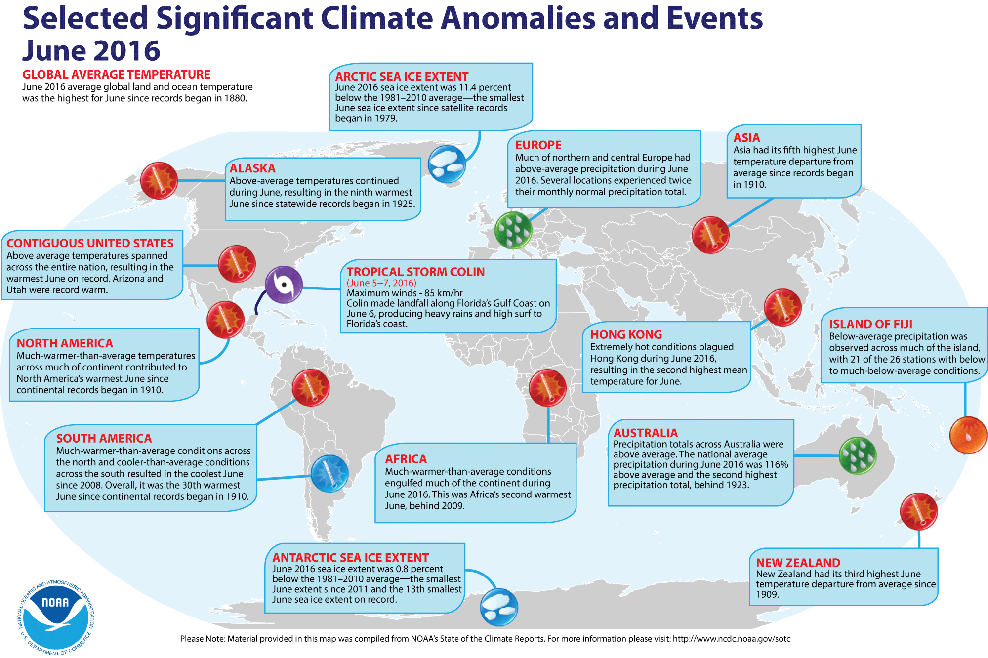
And if you need further proof that all this is causing weather anomalies across the globe, consider this helpful infographic from NOAA (National Oceanic and Atmospheric Administration):