journalism

The independent news collective is teaching a new generation of journalists and citizens to spot the stories in plain sight.
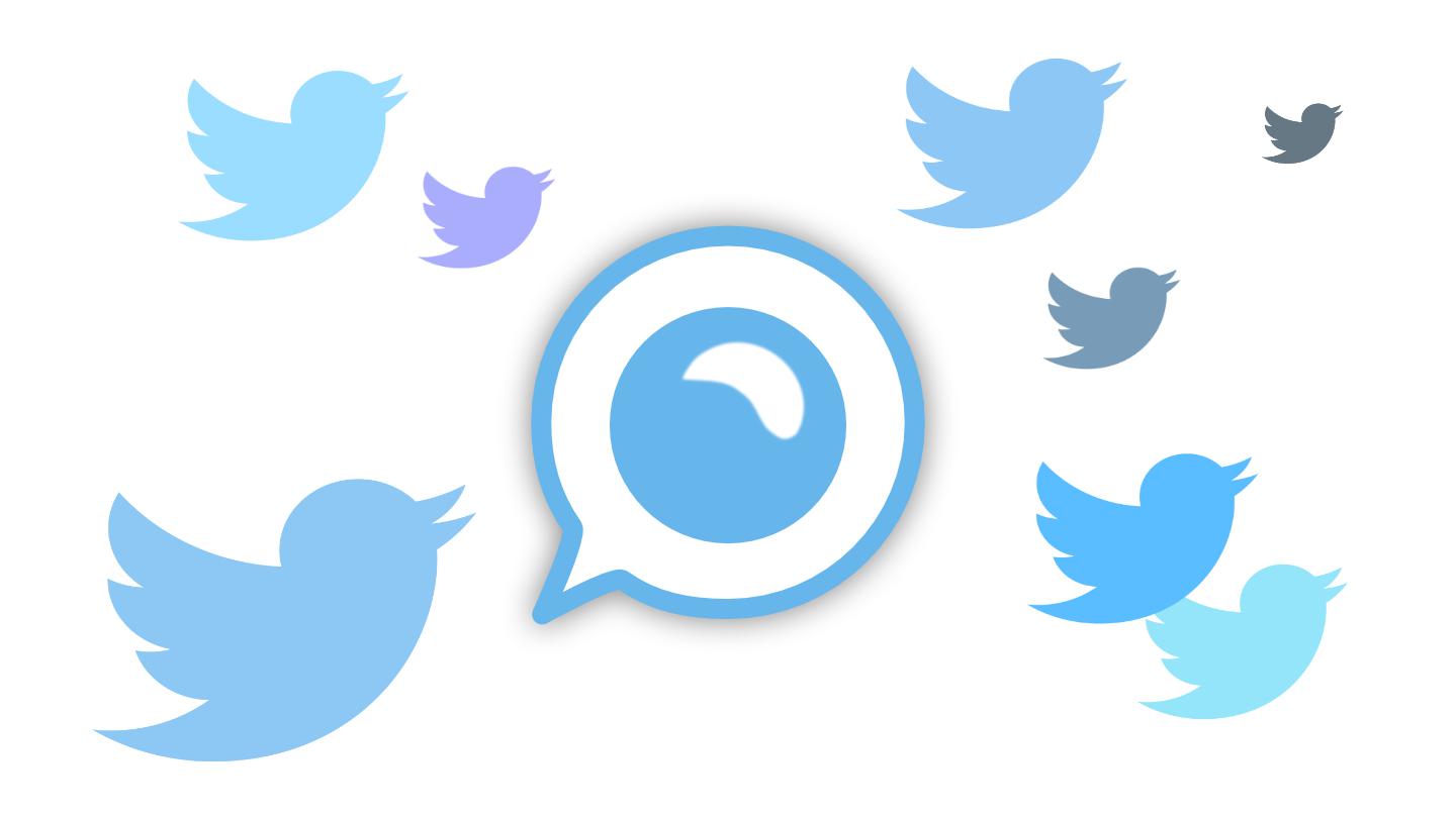
The platform experiments with letting users decide what content needs flagging.
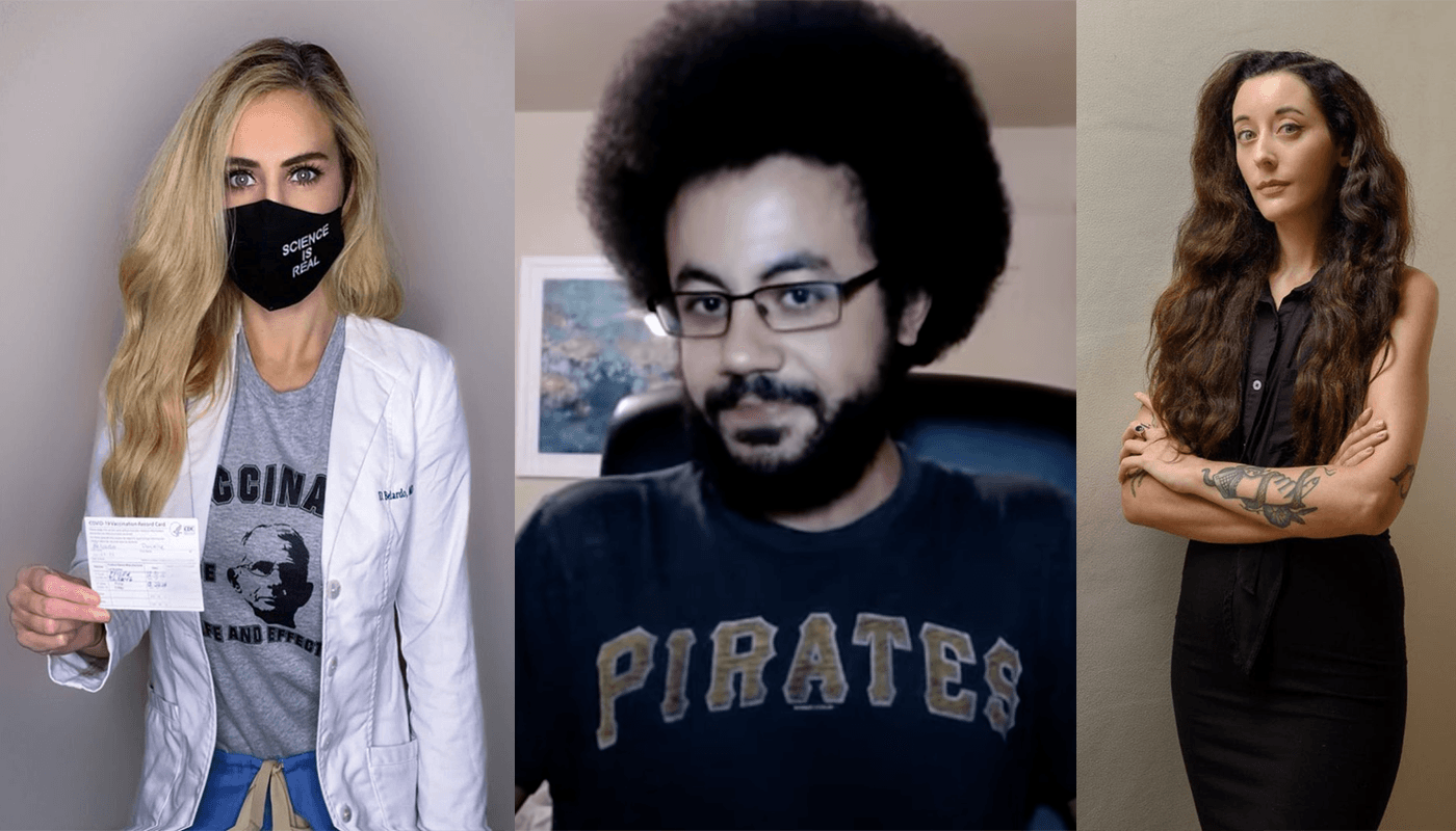
Journalists, doctors, and others you should know.
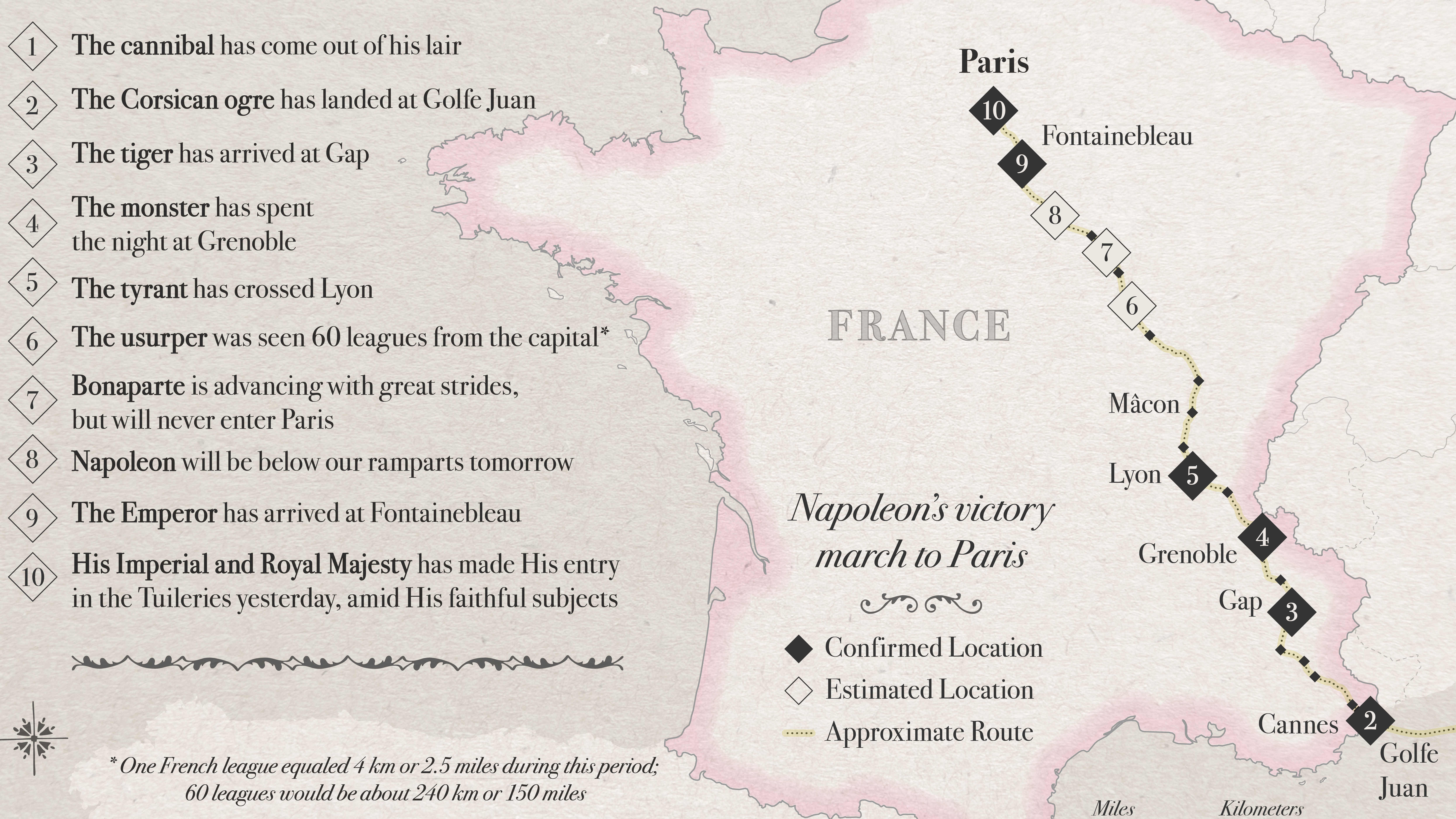
Alexandre Dumas’ famous anecdote about Fake News in the 1800s has a surprising twist.

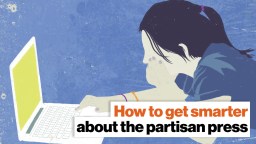
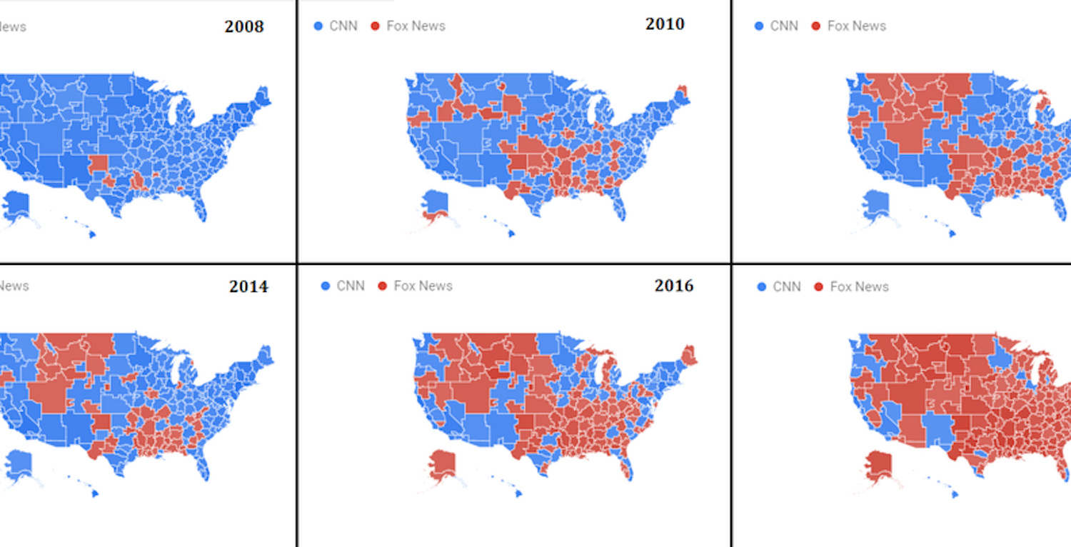
Ad Fontes Media wants to educate readers on where to find reliable sources of news and lessen the heat from the political flame wars.

Here’s how to have a healthier relationship with politics.
▸
3 min
—
with
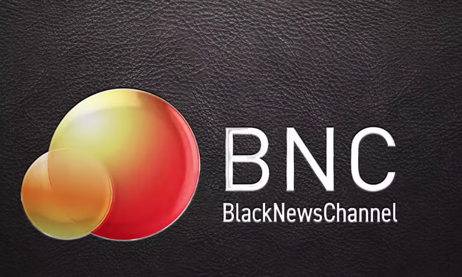
It’s the first American news channel to focus on African-American experiences.

The race to be first in science journalism is hurting science.
▸
5 min
—
with

If you understand when and how to ask questions, you possess an effective inoculation against charlatans.
▸
4 min
—
with
Research has found that previously encountered information feels more “fluent.”
For the third time in U.S. history, the House of Representatives voted to impeach a sitting U.S. president.
The statistics for American adults aren’t that much better.
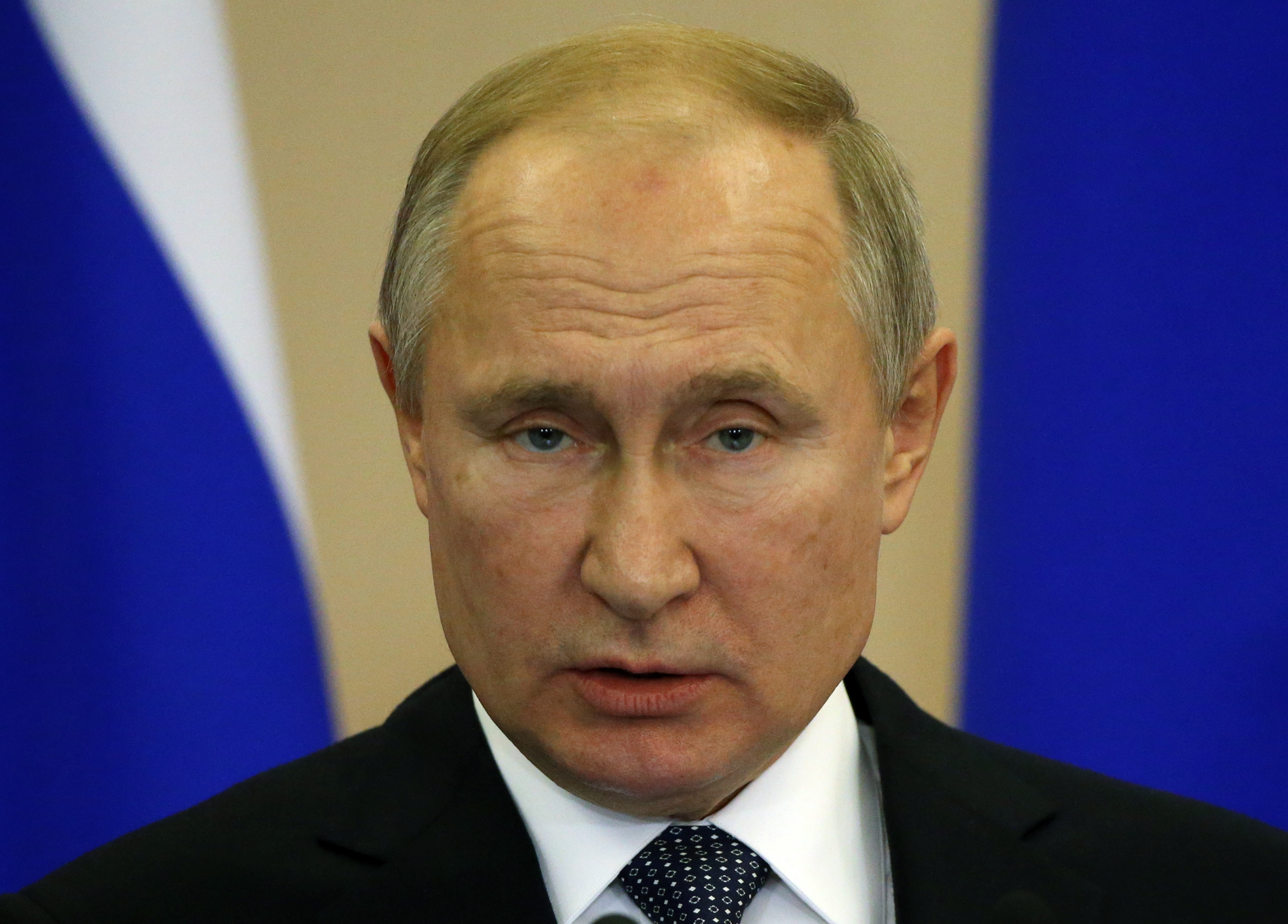
The encyclopedia offers more “reliable” information than Wikipedia, said Russian President Vladimir Putin.
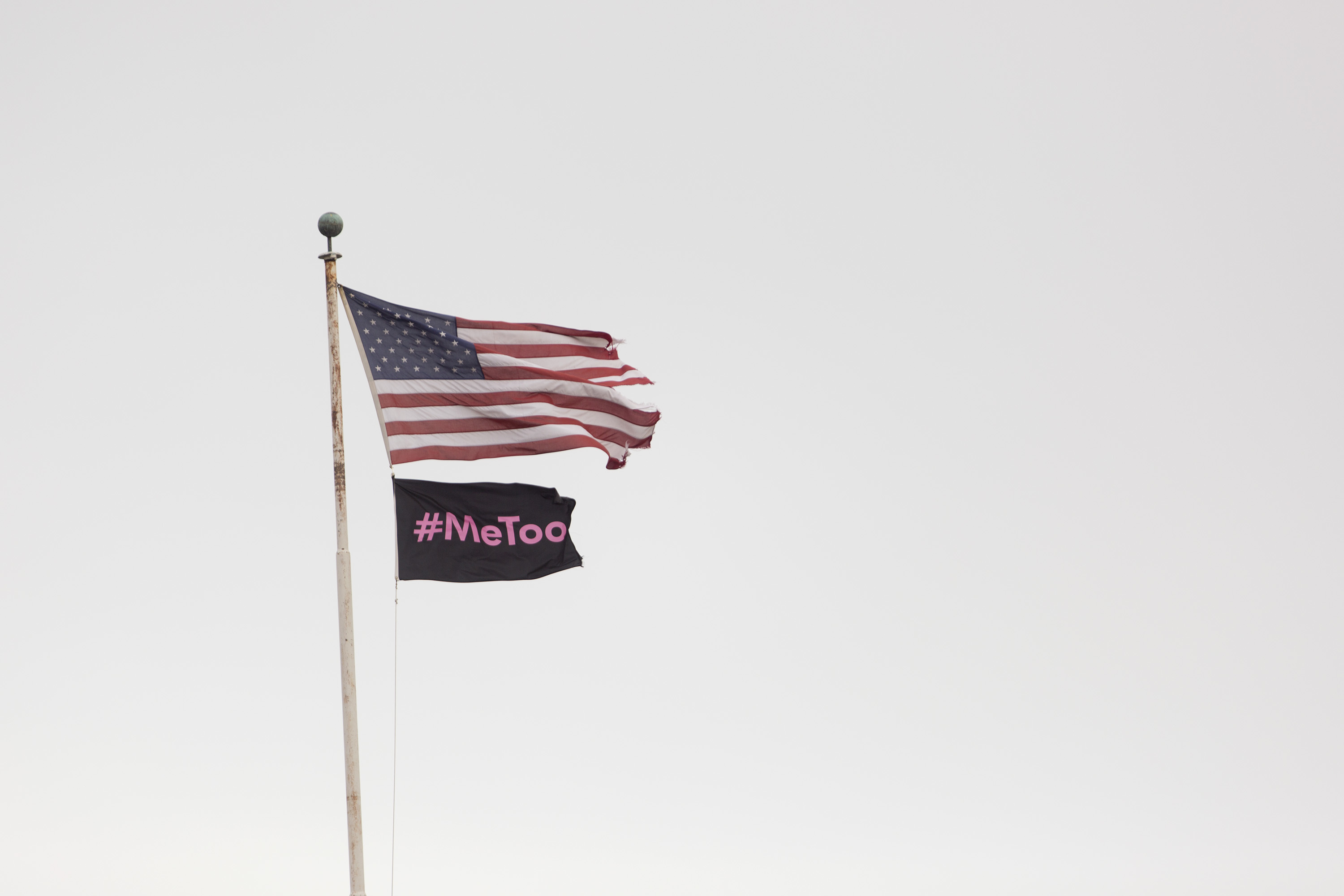
Nearly anything political is now branded with a catchy hashtag.

Is it time media outlets stop publishing the names and photographs of mass shooters?
Americans’ inability to agree on what is true and what is false is a problem for democracy.

When it comes to sniffing out whether a source is credible or not, even journalists can sometimes take the wrong approach.
▸
2 min
—
with
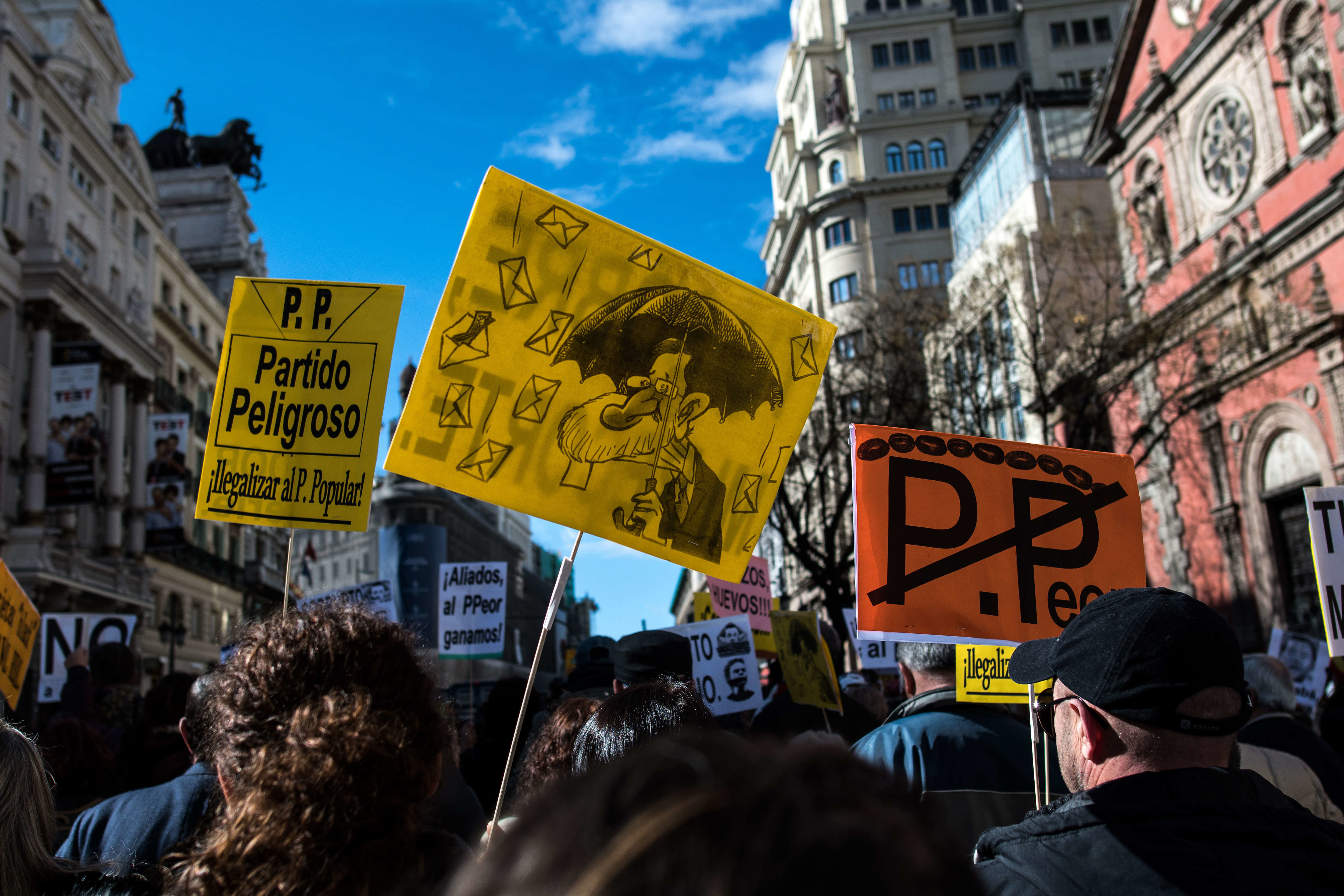
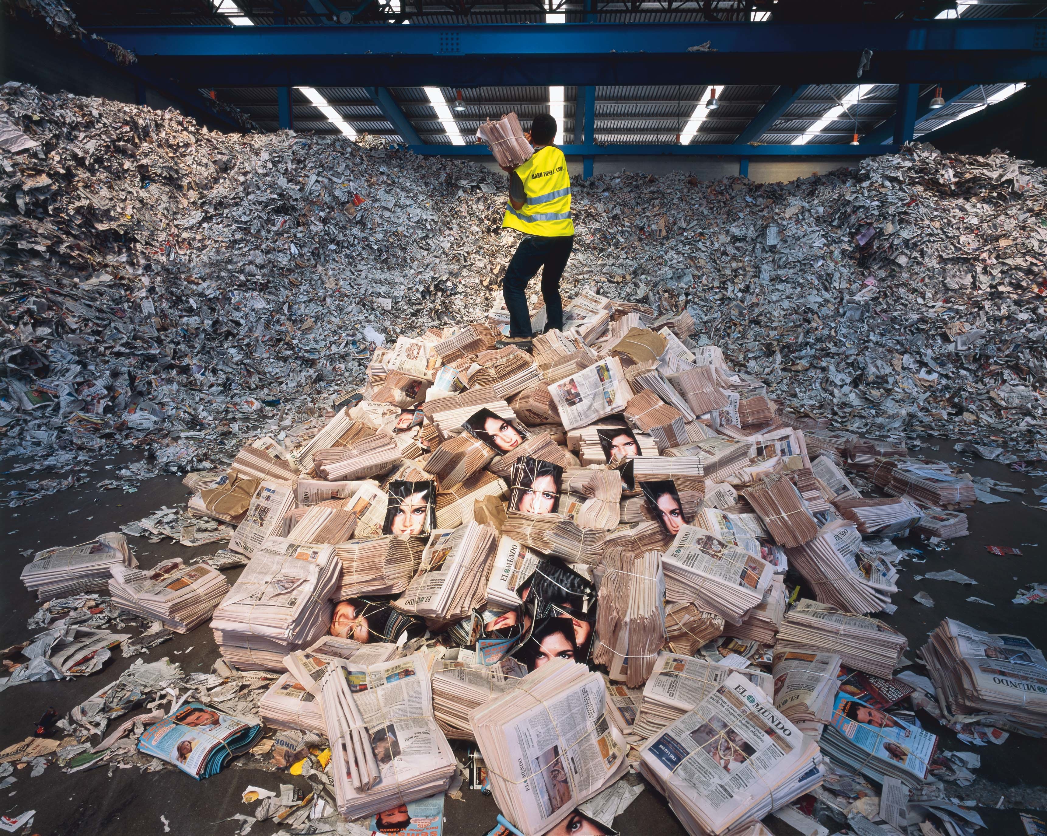
A new book from the former editor of El Mundo describes a culture of corruption in Spain’s press. In exchange for favorable coverage of politicians and corporations, bribes.

Compassion is one of several news values that determine if a story is published.
How do you do justice to the truth in a headline-driven world?
▸
7 min
—
with

Jonathan Rauch explains why the internet is so hostile to the truth, and what we can do to change that.
▸
5 min
—
with
YouTube’s constantly changing hate speech and harassment policies beg the question: Where exactly is the line?

Researchers advance machine learning to create videos of people from single stills and paintings.

Study finds that readers are still the best judge of fake news and misinformation.
Opinion is more compelling than fact. That’s tearing society apart.
▸
5 min
—
with

Why are soda and ice cream each linked to violence? This article delivers the final word on what people mean by “correlation does not imply causation.”
▸
with

Musican. Actor. Fashion Icon. Internet Visionary?
▸
with
Former NYTimes executive editor Jill Abramson dissects the big problem with internet news.
▸
7 min
—
with

News doesn’t sell. That’s lethal to journalism – and democracy.
▸
5 min
—
with