A brand-new blue may be the most eye-popping blue yet
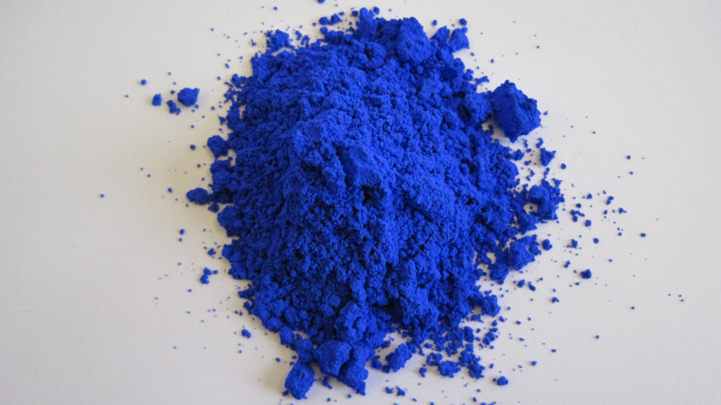
Meet a spectacular new blue—the first inorganic new blue in some time.
Invisible blue
<img type="lazy-image" data-runner-src="https://assets.rebelmouse.io/eyJhbGciOiJIUzI1NiIsInR5cCI6IkpXVCJ9.eyJpbWFnZSI6Imh0dHBzOi8vYXNzZXRzLnJibC5tcy8yNTU0Nzc5OC9vcmlnaW4ucG5nIiwiZXhwaXJlc19hdCI6MTY0MzQzMjQ0Nn0.r4iAspCpkjhfmB6neEna_X52j_sXAZH_nZ3hVOraotw/img.png?width=980" id="263c5" class="rm-shortcode" data-rm-shortcode-id="a250803dd92abeb36e0de300a59a0442" data-rm-shortcode-name="rebelmouse-image" data-width="1440" data-height="960" />So, um the color of the sky is...?
Credit: Constant Loubier/Unsplash
<p>YInMn Blue is the latest character in an odd story: humanity's relationship with the color blue.</p><p>For a long time, humans apparently took no note of blue, which is weird. Though blue isn't especially common in vegetation and stone, there's no other color that so envelops us — in the sky above and on the face of the oceans that surround us. (BTW, the late George Carlin once lamented a paucity of <a href="https://youtu.be/l04dn8Msm-Y" target="_blank">blue foods</a>.)</p><p>There are no ancient European year-old cave paintings with blue pigments, though it does appear in <a href="http://www.visual-arts-cork.com/artist-paints/prehistoric-colour-palette.htm" target="_blank">some African cave art</a>. There's no mention of it in the Bible. Though there are plenty of references in Homer's Odyssey to white and black, and a few to red and yellow, there's no blue. He refers to the color of the sea as "wine-dark."</p><p>Some historians hypothesize that early humans might have been <a href="https://www.abc.net.au/radionational/programs/archived/bodysphere/features/5267698" target="_blank" rel="noopener noreferrer">color-blind</a>, capable only of seeing black, white, red, and eventually yellow and green. Perhaps they just weren't very interested in the idea of color altogether.</p><p>Maybe, though, a more likely explanation is that lacking a concept and a word for blue, ancient people lacked a frame of reference for understanding what they were seeing. <a href="https://www.wnycstudios.org/podcasts/radiolab/segments/211213-sky-isnt-blue" target="_blank">Radiolab</a> did a fascinating episode about this possibility.</p><p>A <a href="https://www.bbc.co.uk/programmes/b013c8tb" target="_blank" rel="noopener noreferrer">BBC documentary</a> found that people from a Namibian tribe with no separate words for green and blue couldn't differentiate green from blue squares, though there's some <a href="https://languagelog.ldc.upenn.edu/nll/?p=17970" target="_blank">controversy</a> about the experiment. What is true, though, is that Eskimos see more types of snow because they have <a href="https://www.washingtonpost.com/national/health-science/there-really-are-50-eskimo-words-for-snow/2013/01/14/e0e3f4e0-59a0-11e2-beee-6e38f5215402_story.html" target="_blank" rel="noopener noreferrer">50 words</a> for it. (The word "Eskimo" groups together the people of the Inuit and Yupik families.) We see just a few.</p>Blue arrives
<img type="lazy-image" data-runner-src="https://assets.rebelmouse.io/eyJhbGciOiJIUzI1NiIsInR5cCI6IkpXVCJ9.eyJpbWFnZSI6Imh0dHBzOi8vYXNzZXRzLnJibC5tcy8yNTU0Nzg1NC9vcmlnaW4ucG5nIiwiZXhwaXJlc19hdCI6MTYzNTU4NjkzMH0.s2wChaijRcw0n0X07MLIsEckXZ5rq6G5ZLEMnlxVVbk/img.png?width=980" id="6e44c" class="rm-shortcode" data-rm-shortcode-id="ce61377449b9427b7af6490ea036dee6" data-rm-shortcode-name="rebelmouse-image" data-width="1440" data-height="960" />Lapis luzuli
Credit: Geert Pieters/Unsplash
<p>While Homer, et al., were stumbling around clueless, it seems that the first folks to get blue were the ancient Egyptians, who were entranced by the semiprecious Afghan stone <a href="https://en.wikipedia.org/wiki/Lapis_lazuli" target="_blank">lapis lazuli</a> about <a href="https://www.dunnedwards.com/colors/specs/posts/color-blue-history" target="_blank">6,000 years ago</a>. They gave the color a name—<em>ḫsbḏ-ỉrjt</em>—and used the stone liberally in jewelry and headdresses.</p><p>The Egyptians even attempted to make paint from the mineral, but failed. In 2,200 B.C. they finally succeeded at producing a light-blue paint, <em>cuprorivaite</em> or "Egyptian blue," from heated limestone, sand, and azurite or malachite. Egypt's precious blue pigments eventually became valued by royalty in Persia, Mesoamerica, and Rome.</p><p>The earliest successful lapis lazuli paint—and ultimately Europe's first great blue—appeared in 6th century Buddhist paintings from Bamiyan, Afghanistan. Imported into Europe in the 14th and 15th centuries, <a href="https://en.wikipedia.org/wiki/Ultramarine" target="_blank">ultramarine</a>—from <em>ultramarinus</em>, or "beyond the sea"—was used only in expensive commissioned artwork until a French chemist developed a cheaper, synthetic version in 1826. True ultramarine was both so coveted and pricey that, according to the <a href="https://mymodernmet.com/shades-of-blue-color-history/" target="_blank" rel="noopener noreferrer">Metropolitan Museum</a>, Vermeer impoverished his family to purchase it, and there's a story that one of Michelangelo's paintings, "<a href="https://commons.wikimedia.org/wiki/File:Entombment_Michelangelo.jpg" target="_blank">The Entombment</a>," was left unfinished because he couldn't afford the ultramarine it required. At the other end of the cost spectrum was the affordable blue dye indigo, made from the plant <em>Indigofera tinctoria</em>, and imported to Europe in the 16th-century.</p><p>Over time, more blues appeared. In 1706, German dye-maker Johann Jacob Diesbach came up with Berliner Blau, or <a href="https://en.wikipedia.org/wiki/Prussian_blue" target="_blank" rel="noopener noreferrer">Prussian blue</a>, accidentally when potash he was using to make red pigment was contaminated with animal blood that paradoxically turned it blue. 1802 saw the invention of cobalt blue, based on the 8th- and 9th-century blue pigments used in Chinese porcelain, by French chemist Louis Jacques Thénard. <a href="https://en.wikipedia.org/wiki/Cerulean" target="_blank">Cerulean blue</a>—from <em>caerulum</em>, meaning "heave" or "sky"—was the last major blue introduced before YInMn Blue. It was invented by <a href="https://en.wikipedia.org/w/index.php?title=Albrecht_H%C3%B6pfner&action=edit&redlink=1" target="_blank" rel="noopener noreferrer">Albrecht Höpfner</a> in 1789.</p>Back to the new blue
<p>The discovery of YInMn Blue occurred when chemistry grad student Andrew Smith was heating manganese oxide to approximately 1200 °C (~2000 °F) to investigate its electronic properties. To his surprise, what emerged from the heat was a brilliant blue compound. <a href="https://chemistry.oregonstate.edu/content/story-yinmn-blue" target="_blank">Recalls</a> Subramanian: "If I hadn't come from an industry research background — DuPont has a division that developed pigments, and obviously, they are used in paint and many other things — I would not have known this was highly unusual, a discovery with strong commercial potential."</p><p>Subramanian knew, he told <a href="https://www.npr.org/2016/07/16/485696248/a-chemist-accidentally-creates-a-new-blue-then-what" target="_blank">NPR</a> in 2016, "People have been looking for a good, durable blue color for a couple of centuries." OSU art students soon began experimenting with the new color, incorporating it in <a href="https://aquarellesdemasbleu.com/" target="_blank" rel="noopener noreferrer">watercolors</a> and <a href="http://www.carolchapel.com/block.html" target="_blank">printing</a>. In 2012, Subramanian's team received a patent for YInMn Blue.</p><p>Bonus: Previous blue pigments are prone to fading and are often toxic. These are problems that don't afflict YInMn Blue. "The fact that this pigment was synthesized at such high temperatures signaled that this new compound was extremely stable, a property long sought in a blue pigment," says Subramanian in the <a href="https://pubs.acs.org/doi/abs/10.1021/ja9080666" target="_blank" rel="noopener noreferrer">study</a> documenting YInMn Blue.</p><p>Subramanian and his colleagues have been developing colors ever since, including new bright oranges, new purples, and turquoises and greens. Currently, they're on the hunt for a chromatic Holy Grail: a stable, heat-reflective, and brilliant, red. It's a challenge. While red is among the oldest colors, Subramanian calls the shade he seeks "the most elusive color to synthesize."</p>Colors evoke similar emotions around the world, survey finds
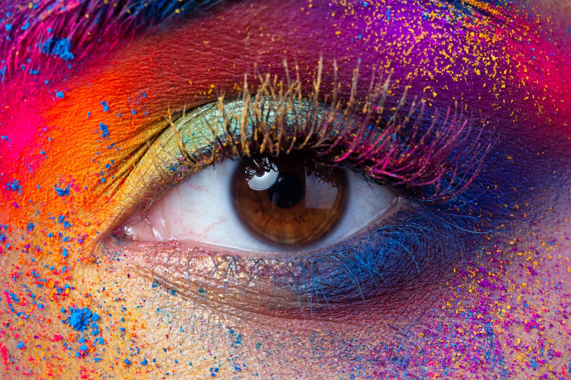
Certain colors are globally linked to certain feelings, the study reveals.
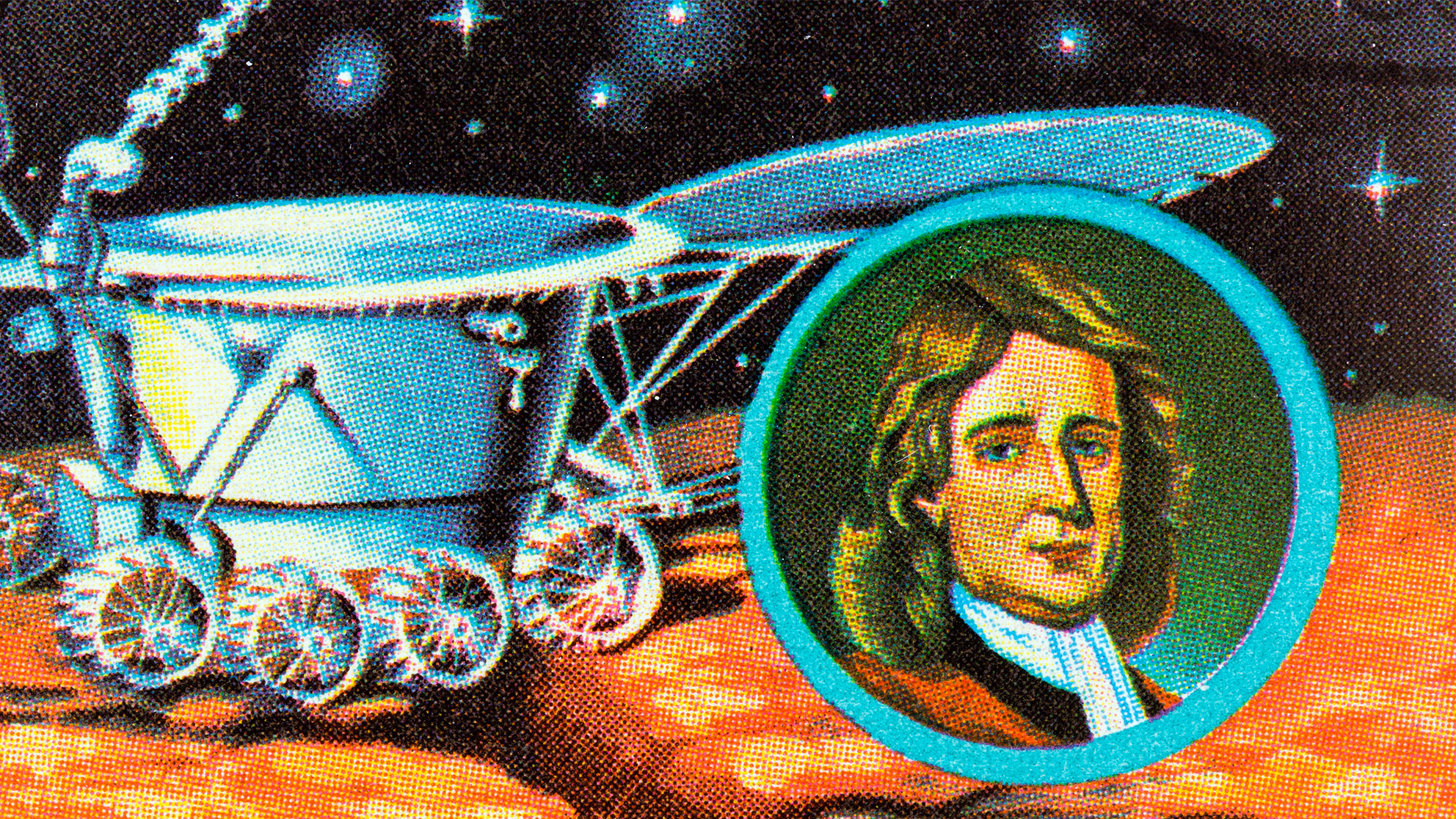
- Color psychology is often used in marketing to alter your perception of products and services.
- Various studies and experiments across multiple years have given us more insight into the link between personality and color.
- The results of a new study spanning 6 continents (30 nations) shows universal correlations between colors and emotions around the globe.
The root of color psychology
<span style="display:block;position:relative;padding-top:56.25%;" class="rm-shortcode" data-rm-shortcode-id="9e40cf62fa8922fcca6c57e2fcb215b6"><iframe type="lazy-iframe" data-runner-src="https://www.youtube.com/embed/OM4fXB23pCQ?rel=0" width="100%" height="auto" frameborder="0" scrolling="no" style="position:absolute;top:0;left:0;width:100%;height:100%;"></iframe></span><p>There is a very likely chance you've even been "fooled" by color marketing in the past, or you've chosen one product over another subconsciously due to colors that were designed to influence your emotions.<br></p><p>Companies that want to be known for being dependable often use blue in their logos, for example (Dell, HP, IBM). Companies that want to be perceived as fun and exciting go for a splash of orange (Fanta, Nickelodeon, even Amazon). Green is associated with natural, peaceful emotions and is often used by companies like Whole Foods and Tropicana. </p><p><strong>Your favorite color says a lot about your personality. </strong></p><p>Various studies and experiments across multiple years (<a href="https://www.researchgate.net/publication/49595886_Personality_Traits_and_Colour_Preferences" target="_blank">2010</a>, <a href="https://onlinelibrary.wiley.com/doi/abs/10.1111/jopy.12087" target="_blank" rel="noopener noreferrer">2014</a>, <a href="http://oaji.net/articles/2015/1170-1448038739.pdf" target="_blank" rel="noopener noreferrer">2015</a>, and more recently in <a href="https://www.verywellmind.com/color-psychology-2795824#modern-research-on-color-psychology" target="_blank" rel="noopener noreferrer">2019</a>) have given us more insight into the link between your personality and your favorite color.</p><p>Red, for example, is considered a bold color and is associated with feelings such as excitement, passion, anger, danger, energy, and love. The personality traits of this color might be someone who is bold, a little impulsive, and who loves adventure. </p><p>Orange, on the other hand, is considered representative of creativity, happiness, and freedom. The personality traits of this color can be fun, playful, cheerful, nurturing, and productive. Read more about color psychology and personalities <a href="https://bigthink.com/mind-brain/color-personality-psychology?rebelltitem=2#rebelltitem2" target="_self">here</a>.</p>Study reveals which colors best suit which emotions around the globe
<img type="lazy-image" data-runner-src="https://assets.rebelmouse.io/eyJhbGciOiJIUzI1NiIsInR5cCI6IkpXVCJ9.eyJpbWFnZSI6Imh0dHBzOi8vYXNzZXRzLnJibC5tcy8yNDYzMTk5OS9vcmlnaW4uanBnIiwiZXhwaXJlc19hdCI6MTYyODc4OTg5OH0.bY-pu-MFNivdJLDJuBp9TBKrhwuy7hngUa1aIWxQMVw/img.jpg?width=1245&coordinates=0%2C93%2C0%2C94&height=700" id="33fff" class="rm-shortcode" data-rm-shortcode-id="1a5d7bb00dac94bd6201616789fb4882" data-rm-shortcode-name="rebelmouse-image" alt="concept of color psychology how colors make us feel color emotions" data-width="1245" data-height="700" />Certain colors are globally ties to certain emotions, the study reveals.
Image by agsandrew on Shutterstock
<p>In this particular survey, participants were asked to fill out an online questionnaire which involved assigning 20 emotions to 12 different color terms. They were also asked to specify the intensity with which they associated the color term with the emotion.</p><p><strong>Certain colors are globally linked to certain emotions, the study reveals.</strong></p><p>The results of this study showed a few definite correlations between colors and emotions throughout the globe. Red, for example, is the only color that is strongly associated with both negative (anger) and positive (love) feelings. Brown, on the other end of the spectrum, is the color that triggers the fewest emotions globally.<br></p><p>The color white is closely associated with sadness in China, while purple is what is closely associated with sadness in Greece. This can be traced back to the roots of each culture, with white being worn at funerals in China and dark purple being the Greek Orthodox Church's color of mourning. </p><p>Yellow is more associated with joy, specifically in countries that see less sunshine. Meanwhile, its association with joy is weaker in areas that have greater exposure to sunshine. </p><p><a href="https://www.sciencedaily.com/releases/2020/09/200910150247.htm" target="_blank">According to Dr. Oberfeld-Twistel</a>, it is difficult to say exactly what the causes for global similarities and differences are. "There is a range of possible influencing factors: language, culture, religion, climate, the history of human development, the human perceptual system."</p>UNESCO Preserves the Works of One of the Greatest Minds in Human History
This polymath's papers—full of personal and scientific revelations—have joined the World Register.
The UNESCO International Memory of the World Register has recently added another batch of genius to its collection of documents: the papers, diaries, books, and notes of Sir Isaac Newton, thereby helping to preserve for all time the works of one of the greatest minds in human history.
Wait, who added what?
The UNESCO Memory of the World Program is a programmed dedicated to the preservation of and access to the documentary heritage of the world. The program has existed since 1992 and has discovered, preserved, and exhibited countess documents of vital importance to the heritage of mankind since then, including the papers of Winston Churchill, the telegram Austria-Hungary sent to declare war on Serbia, and The Wizard of Oz.
So, why add Newton’s stuff?
Isaac Newton discovered and formulated the law of gravity, the classical laws of motion, the nature of color and optics, and invented calculus in his spare time. He invented the reflecting telescope, determined why the planets don’t move in perfect circles, and he later went on to invent the little indentations around the side of coins when he was the master of the mint for Great Britain. His contributions to science are nearly impossible to overstate.
And don’t take my word for it; Dr. Neil DeGrasse Tyson explains here why Newton is the greatest physicist of all time.
Do Our Senses Reveal the World—Or Do They Obscure It?
Our brains didn't evolve to see the world accurately, we only perceive what is useful and apply meaning to it. Neuroscientist Beau Lotto shows us how the sausage of reality is made.
We know the world exists, we just don’t know what it actually looks like—and it's likely that we never will, says neuroscientist Beau Lotto. Humans can only access reality, whatever it may be, through the filter of our sensory organs, which interpret "inherently meaningless" data in ways that are useful for our survival. We don't see the world as it is, we see the world that helps us to live. It can be a concept that's hard to wrap your mind around: how is that chair not as I see it? What color is an apple, really? Lotto calls on two clarifying examples: "Dressgate", which blew people's minds in 2015 and exposed that perception is not objective, and the color spectrum, of which we only see a small slice of. Beau Lotto is the author of Deviate: The Science of Seeing Differently.
Are Yellow or Blue Taxis Safer? Scientists Crunch the Data
If you want to get from A to B more safely, be a little more choosy at the cab rank.
If you’ve taken to the United States streets anytime lately, you may have noticed that most public school buses are a very particular shade of yellow. That shade is called National School Bus Glossy Yellow in Canada and the US, and it was specially designed by Dr. Frank Cyr. He was in charge of developing standards for the school bus. While there was no standard prior to this, many wanted something eye-catching so that every driver knew what vehicles hosted dozens of children on their way to learn. So, in 1939, after a long-awaited conference, they chose yellow.
