Big ideas.
Once a week.
Subscribe to our weekly newsletter.
Each map is worth a thousand pictures
The Data Atlas of the World specialises in simple yet revealing maps of the world.

Cartogram of population sizes per country.
- Few simple things are as expressive as a well-crafted cartogram.
- The Data Atlas of the World provides a simple overview of complex data.
- Based on neutral datasets, this growing collection offers context without bias.
A picture is worth a thousand words, they say. And a map? If it's a good one: at least a thousand pictures. Few simple things are as immediately expressive as a well-crafted cartogram – a map adapted to demonstrate the range of a certain dataset.
For some good examples, head over to the Data Atlas of the World, a growing collection of world maps, each revealing at a single glance the state of the planet, for such aspects as the population density, the distribution of religion, the level of corruption, variations in life expectancy and GDP, and many other parameters.
Here are a few examples:
Country sizes
What if the best cartographic projection is not a map but a cartogram instead?
Image courtesy of Carrie Osgood / Data Atlas of the World
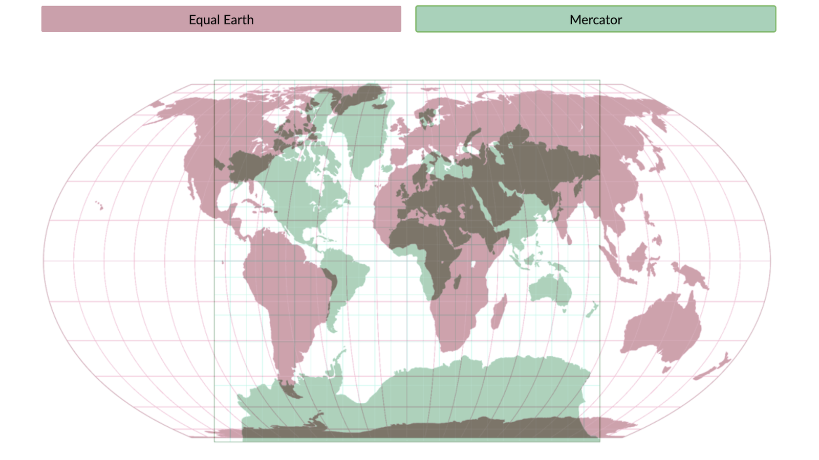
Wait a minute, do we need a special map to show us how big the world's countries are? Don't our regular maps do a good enough job? Actually… No.
The earth is a globe – almost everyone is on board with that (see #1017). That's a three-dimensional object – one dimension more than your standard, flat map. Ergo: any cartographic projection of a globe onto a map will lead to some distortion of geographic fact.
And the Mercator projection, still popular after all these centuries, will do so more than most – especially towards the north and south poles. Check out #954, an earlier post showing you how to drag and drop whole countries on top of each other to get a sense of their actual sizes.
However, this map neatly solves the problem of the missing dimension. It turns each country into a circle corresponding to its geographic size – without the distortive effect of cartographic projection.
Russia clearly is the world's largest country, but not as large as 'Mercator Russia'. The other geographic giants stand out immediately: Canada, the US, Brazil, China and Australia – curiously, all just about of equal size.
Sprinkled across most continents are mid-sized nations like Argentina, DR Congo and India. Only Europe consists entirely of countries that are either relatively small – yes, that includes you, France, UK and Germany – or positively tiny.
Population sizes
Territorial giants can be population mini-mes, and vice versa.
Image courtesy of Carrie Osgood / Data Atlas of the World
Isn't it curious that Argentina and India are in the same geographic size category? Because their population sizes almost couldn't be farther apart: India has 1.4 billion inhabitants, give or take a few million. Argentina only has about 45 million. That's one thirty-first of India's population!
This map reflects that difference. The dataset powering the cartogram isn't area, but population. And it's a whole different world.
A geographic mini-me like Bangladesh now rivals a territorial giant like Russia for size. (In fact, there are now considerably more Bangladeshi than Russians: 165 vs. 146 million). As mentioned, India blows Argentina away. And China is the biggest cheese wheel on this map, about 50 million inhabitants ahead of India – for now.
Canada and Australia, so visible on the previous map, have shrivelled away – totally overshadowed by their respective neighbors, the US and Indonesia. Nigeria is Africa's population superstar, while it's now more obvious which are the so-called Big Five countries in western Europe: the UK, France, Germany, Spain and Italy.
CO2 emissions
Emission levels are a crude indication of economic development – and a more acute one of environmental damage.
Image courtesy of Carrie Osgood / Data Atlas of the World
Here's another way the global cookie crumbles: Carbon dioxide emissions. As a by-product of industrialisation, it's a crude measure of a country's economic maturity.
But as a greenhouse gas, CO2 contributes to climate change. Most countries have agreed to cut back their emissions. In virtual unanimity, the world's countries in 2016 decided to reduce their CO2 emissions.
As this map shows, they've got their work cut out for them. If we look at CO2 emissions in absolute terms, China again leads the world, with the US and India in second and third place.
Put together, Europe's various states put the continent firmly on the world map, with major contributions by Russia and Germany.
Africa's CO2 emissions are negligible by comparison, except for South Africa, the continent's most industrialised economy. In Latin America, only Mexico and Brazil belch out CO2 in world-class quantities.
The emissions of the world's most advanced economies have to start coming down quickly – as per the 2016 Paris Agreement. In the first place, to avoid overheating the planet.
But by extension, the more sustainable methods of energy generation now being developed will also give developing economies a chance to catch up without frying the planet. The alternative? Just imagine each of those circles in Africa swelling to European size. Then we might as well start packing our bags for Antarctica (see #842).
Strange Maps #1022
For these and many more insights into the world today and tomorrow, visit the Data Atlas of the World. The collection grew out of a world map of religions, previously discussed here (see #967).
These and other samples are free to view. More (and more detailed) maps with country labels and data specifics are available behind the paywall.
Got a strange map? Let me know at strangemaps@gmail.com.
- Track the coronavirus spread with this world map tool - Big Think ›
- The Patients Per Doctor Map of the World - Big Think ›
- The World's Data Holes, Quantified - Big Think ›
How New York's largest hospital system is predicting COVID-19 spikes
Northwell Health is using insights from website traffic to forecast COVID-19 hospitalizations two weeks in the future.
- The machine-learning algorithm works by analyzing the online behavior of visitors to the Northwell Health website and comparing that data to future COVID-19 hospitalizations.
- The tool, which uses anonymized data, has so far predicted hospitalizations with an accuracy rate of 80 percent.
- Machine-learning tools are helping health-care professionals worldwide better constrain and treat COVID-19.
The value of forecasting
<img type="lazy-image" data-runner-src="https://assets.rebelmouse.io/eyJhbGciOiJIUzI1NiIsInR5cCI6IkpXVCJ9.eyJpbWFnZSI6Imh0dHBzOi8vYXNzZXRzLnJibC5tcy8yNTA0Njk2OC9vcmlnaW4uanBnIiwiZXhwaXJlc19hdCI6MTYyMzM2NDQzOH0.rid9regiDaKczCCKBsu7wrHkNQ64Vz_XcOEZIzAhzgM/img.jpg?width=980" id="2bb93" class="rm-shortcode" data-rm-shortcode-id="31345afbdf2bd408fd3e9f31520c445a" data-rm-shortcode-name="rebelmouse-image" data-width="1546" data-height="1056" />Northwell emergency departments use the dashboard to monitor in real time.
Credit: Northwell Health
<p>One unique benefit of forecasting COVID-19 hospitalizations is that it allows health systems to better prepare, manage and allocate resources. For example, if the tool forecasted a surge in COVID-19 hospitalizations in two weeks, Northwell Health could begin:</p><ul><li>Making space for an influx of patients</li><li>Moving personal protective equipment to where it's most needed</li><li>Strategically allocating staff during the predicted surge</li><li>Increasing the number of tests offered to asymptomatic patients</li></ul><p>The health-care field is increasingly using machine learning. It's already helping doctors develop <a href="https://care.diabetesjournals.org/content/early/2020/06/09/dc19-1870" target="_blank">personalized care plans for diabetes patients</a>, improving cancer screening techniques, and enabling mental health professionals to better predict which patients are at <a href="https://healthitanalytics.com/news/ehr-data-fuels-accurate-predictive-analytics-for-suicide-risk" target="_blank" rel="noopener noreferrer">elevated risk of suicide</a>, to name a few applications.</p><p>Health systems around the world have already begun exploring how <a href="https://www.ncbi.nlm.nih.gov/pmc/articles/PMC7315944/" target="_blank" rel="noopener noreferrer">machine learning can help battle the pandemic</a>, including better COVID-19 screening, diagnosis, contact tracing, and drug and vaccine development.</p><p>Cruzen said these kinds of tools represent a shift in how health systems can tackle a wide variety of problems.</p><p>"Health care has always used the past to predict the future, but not in this mathematical way," Cruzen said. "I think [Northwell Health's new predictive tool] really is a great first example of how we should be attacking a lot of things as we go forward."</p>Making machine-learning tools openly accessible
<p>Northwell Health has made its predictive tool <a href="https://github.com/northwell-health/covid-web-data-predictor" target="_blank">available for free</a> to any health system that wishes to utilize it.</p><p>"COVID is everybody's problem, and I think developing tools that can be used to help others is sort of why people go into health care," Dr. Cruzen said. "It was really consistent with our mission."</p><p>Open collaboration is something the world's governments and health systems should be striving for during the pandemic, said Michael Dowling, Northwell Health's president and CEO.</p><p>"Whenever you develop anything and somebody else gets it, they improve it and they continue to make it better," Dowling said. "As a country, we lack data. I believe very, very strongly that we should have been and should be now working with other countries, including China, including the European Union, including England and others to figure out how to develop a health surveillance system so you can anticipate way in advance when these things are going to occur."</p><p>In all, Northwell Health has treated more than 112,000 COVID patients. During the pandemic, Dowling said he's seen an outpouring of goodwill, collaboration, and sacrifice from the community and the tens of thousands of staff who work across Northwell.</p><p>"COVID has changed our perspective on everything—and not just those of us in health care, because it has disrupted everybody's life," Dowling said. "It has demonstrated the value of community, how we help one another."</p>Octopus-like creatures inhabit Jupiter’s moon, claims space scientist
A leading British space scientist thinks there is life under the ice sheets of Europa.
Jupiter's moon Europa has a huge ocean beneath its sheets of ice.
- A British scientist named Professor Monica Grady recently came out in support of extraterrestrial life on Europa.
- Europa, the sixth largest moon in the solar system, may have favorable conditions for life under its miles of ice.
- The moon is one of Jupiter's 79.
Neil deGrasse Tyson wants to go ice fishing on Europa
<div class="rm-shortcode" data-media_id="GLGsRX7e" data-player_id="FvQKszTI" data-rm-shortcode-id="f4790eb8f0515e036b24c4195299df28"> <div id="botr_GLGsRX7e_FvQKszTI_div" class="jwplayer-media" data-jwplayer-video-src="https://content.jwplatform.com/players/GLGsRX7e-FvQKszTI.js"> <img src="https://cdn.jwplayer.com/thumbs/GLGsRX7e-1920.jpg" class="jwplayer-media-preview" /> </div> <script src="https://content.jwplatform.com/players/GLGsRX7e-FvQKszTI.js"></script> </div>Water Vapor Above Europa’s Surface Deteced for First Time
<span style="display:block;position:relative;padding-top:56.25%;" class="rm-shortcode" data-rm-shortcode-id="9c4abc8473e1b89170cc8941beeb1f2d"><iframe type="lazy-iframe" data-runner-src="https://www.youtube.com/embed/WQ-E1lnSOzc?rel=0" width="100%" height="auto" frameborder="0" scrolling="no" style="position:absolute;top:0;left:0;width:100%;height:100%;"></iframe></span>The scent of sickness: 5 questions answered about using dogs – and mice and ferrets – to detect disease
Could medical detection animals smell coronavirus?
Why large groups of people often come to the same conclusions
Study confirms the existence of a special kind of groupthink in large groups.
- Large groups of people everywhere tend to come to the same conclusions.
- In small groups, there's a much wider diversity of ideas.
- The mechanics of a large group make some ideas practically inevitable.
The grouping game
<img type="lazy-image" data-runner-src="https://assets.rebelmouse.io/eyJhbGciOiJIUzI1NiIsInR5cCI6IkpXVCJ9.eyJpbWFnZSI6Imh0dHBzOi8vYXNzZXRzLnJibC5tcy8yNTQ1NDE2Ni9vcmlnaW4uanBnIiwiZXhwaXJlc19hdCI6MTYxMjI2MzA4OX0.RLrswIWbuEzHNqsw0F7EUrp9jPn7OulLPqCxcZT11ik/img.jpg?width=980" id="159b8" class="rm-shortcode" data-rm-shortcode-id="0feb15d2d7dde144c710c2f4f1e5350c" data-rm-shortcode-name="rebelmouse-image" data-width="2767" data-height="382" />Some of the shapes used in the experiment
Credit: Guilbeault, et al./University of Pennsylvania
<p>The researchers tested their theory with 1,480 people playing an online "Grouping Game" via Amazon's Mechanical Turk platform. The individuals were paired with another participant or made a member of a group of 6, 8, 24, or 50 people. Each pair and group were tasked with categorizing the symbols shown above, and they could see each other's answers.</p><p>The small groups came up with wildly divergent categories—the entire experiment produced nearly 5,000 category suggestions—while the larger groups came up with categorization systems that were virtually identical to each other.</p><p><a href="https://www.asc.upenn.edu/news-events/news/why-independent-cultures-think-alike-its-not-in-the-brain" target="_blank">Says Centol</a>a, "Even though we predicted it, I was nevertheless stunned to see it really happen. This result challenges many long-held ideas about culture and how it forms."</p><p>Nor was this unanimity a matter of having teamed-up like-minded individuals. "If I assign an individual to a small group," says lead author Douglas Guilbeault, "they are much more likely to arrive at a category system that is very idiosyncratic and specific to them. But if I assign that same individual to a large group, I can predict the category system that they will end up creating, regardless of whatever unique viewpoint that person happens to bring to the table."</p>Why this happens
<img type="lazy-image" data-runner-src="https://assets.rebelmouse.io/eyJhbGciOiJIUzI1NiIsInR5cCI6IkpXVCJ9.eyJpbWFnZSI6Imh0dHBzOi8vYXNzZXRzLnJibC5tcy8yNTQ1NDE4NC9vcmlnaW4uanBnIiwiZXhwaXJlc19hdCI6MTYyMjkzMDg0Nn0.u2hdEIgNw4drFZ2frzx0AJ_MAxIizuM98rdovQrIblk/img.jpg?width=980" id="d3444" class="rm-shortcode" data-rm-shortcode-id="5da57d66e388fad0f1c17afb09af90a7" data-rm-shortcode-name="rebelmouse-image" data-width="1440" data-height="822" />The many categories suggested by small groups on the left, the few from large groups on the right
Credit: Guilbeault, et al./Nature Communications
<p>The striking results of the experiment correspond to a <a href="https://www.nature.com/articles/s41562-019-0607-5" target="_blank">previous study</a> done by NDG that investigated tipping points for people's behavior in networks.</p><p>That study concluded that after an idea enters a discussion among a large network of people, it can gain irresistible traction by popping up again and again in enough individuals' conversations. In networks of 50 people or more, such ideas eventually reach critical mass and become a prevailing opinion.</p><p>The same phenomenon does not happen often enough within a smaller network, where fewer interactions offer an idea less of an opportunity to take hold.</p>Beyond categories
<p>The study's finding raises an interesting practical possibility: Would categorization-related decisions made by large groups be less likely to fall prey to members' individual biases?</p><p>With this question in mind, the researchers are currently looking into content moderation on Facebook and Twitter. They're investigating whether the platforms would be wiser when categorizing content as free speech or hate speech if large groups were making these decisions instead of lone individuals working at these companies.</p><p>Similarly, they're also exploring the possibility that larger networks of doctors and healthcare professionals might be better at making diagnoses that would avoid biases such as racism or sexism that could cloud the judgment of individual practitioners.</p><p>"Many of the worst social problems reappear in every culture," notes Centola, "which leads some to believe these problems are intrinsic to the human condition. Our research shows that these problems are intrinsic to the social experiences humans have, not necessarily to humans themselves. If we can alter that social experience, we can change the way people organize things, and address some of the world's greatest problems."</p>From NASA to your table: A history of food from thin air
A fairly old idea, but a really good one, is about to hit the store shelves.
