How Brexit has changed the mental map of Britain
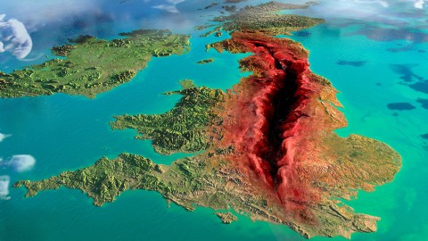
Image source: The Grauniad / Anish Kapoor
- Stumbling from one Brexit delay to the next, Britain is paralyzed by its political division.
- Stark new work by Anish Kapoor reflects on the U.K.’s deep internal divide.
- “Archipelago maps” show Britons living in two separate countries — much like Americans.
March 29th was supposed to be Brexit Day. As clocks struck 11 p.m. across the U.K., the country should have departed from the European Union. Instead, Britain became a country-sized version of Schrödinger’s cat: nobody knows anymore when — or if — the U.K. will actually leave the EU.
Following two years of arduous negotiations, Prime Minister Theresa May finally managed to work out a Withdrawal Agreement with Brussels, only to prove unable to get that deal okayed by her own Parliament. This forced her to ask the EU for an extension of Britain’s exit.
With April 12th the new deadline, Parliament took control of the issue. But the House of Commons couldn’t muster a majority for any of the eight options it considered. Only yesterday, the PM admitted yet another defeat: she asked the EU for another extension, and implored Jeremy Corbyn, leader of the opposition Labour Party, to work with her toward a solution — angering the right wing of her own Conservative Party.

Whose fault is this? Image source: The Guardian / Anish Kapoor
A fault at the heart of Britain
Few expect that a solution is close at hand. Faced with the biggest crisis since the Second World War, the British political class has failed to rise to the occasion.
As former Conservative parliamentarian Ann Widdecombe commented on BBC’s Newsnight earlier this week, “We’ve got the worst prime minister since Anthony Eden (…) the worst leader of the opposition in the entire history of the Labour Party (…) and the worst Parliament since Oliver Cromwell.”
To put that into context: Eden was prime minister in the 1950s, the Labour Party was founded in 1900, and Cromwell dissolved the so-called Rump Parliament by force in 1653.
Britain’s current political paralysis reflects the deep divisions between “Leavers” and ‘”Remainers.” This recent work by Anish Kapoor translates the political into the geological: Brexit as the fault that’s literally tearing Britain in two. Created for the Guardian newspaper, the work’s title refers to the nonsensical terrors contained in nursery rhymes: A Brexit, a Broxit, We All Fall Down.
The artist has updated a tilted orographic map of the Britain and Ireland by adding a violently red gash across the length of the British mainland — roughly from Glasgow in Scotland down to the Mid-Sussex town of Haywards Heath.
Overnight, an impenetrably dark chasm – the artist has a copyright on Kapoor black – has overtaken the familiar landscape and consumed Britain’s spine. The wound on the map seems to be pushing apart what remains of the island in two opposing directions, similar to what the Great Rift Valley and the San Andreas Fault are doing to East Africa and California, but at a much slower pace.
The work thus suggests that Britain’s deep divisions lead not just to paralysis, but eventually to a disruptive cataclysm.
One suggested solution to end the current deadlock would be to have another referendum. That’s anathema to Leavers, who see it as a ploy to reverse the outcome of the first one. Remainers argue that only now do voters know enough about Brexit — talked to death in the years since the referendum — to make an informed decision.
Most Remainers indeed hope for a different outcome, but opinion polls show strong continued support for Leave, suggesting the divide is not merely one of mere political opinion but of a more fundamental cultural outlook. That’s not unlike the divisions between Democrats and Republicans, charted as two distinct archipelagos by Tim Wallace for the New York Times straight after Trump’s shock election victory (see also #810).

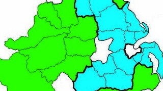
Scotland, Remain UK’s mainland
These maps were developed by the UK division of ESRI, the California-based supplier of GIS software, web GIS and geodatabase management software. They asked themselves the question: What would the UK look like if one only kept the land areas that voted Leave or Remain?
Based on the referendum results and electoral maps, they answered that question: as two very strange and distinct groups of islands. As with Tim Wallace’s original maps (not to mention the earlier example of a Palestinian archipelago – see #370), the design team decided also to provide some names to the new geographic features on the map.
Scotland is the main island of the Remain Archipelago. The next-biggest islands are the larger, southern and western portions of Northern Ireland, and a similarly-sized but much more populous one in southern England, containing London, Brighton and Oxford. Apart from a sizeable chunk of Wales, all the other Remain islands are fairly small (and mainly urban): Norwich, Liverpool and Manchester Islands, to name but a few.

The pro-Leave bits of the UK: mainly England, plus bits of Wales and Northern Ireland. Image source: ESRI UK
England is Leave-land
Because of Scotland’s absence, the map of the Leave Archipelago can zoom in closer on England, where most of the action is. Interestingly, Leave Land is mostly a contiguous zone, as Trumpistan was in Tim Wallace’s maps. This indicates that Leave was favoured by the larger, more rural districts of England.
Whether artistic or statistic, these maps by Anish Kapoor and ESRI UK show a nation beaten out of shape by its deep political and cultural divisions. Neither project reflects the geographic or cartographic state of things, of course. But if, as some predict, Brexit will reawaken calls for Scottish independence, Britain’s exit from the EU could end up altering the actual map of the U.K.
Image of Anish Kapoor’s work found here at The Guardian. Maps by ESRI UK found here at the company’s UK and Ireland site. Many thanks to Gabriel Simunek for pointing them out.
Strange Maps #969
Got a strange map? Let me know at [email protected].