Bar chart races: short on analysis, but fun to watch
- Add movement to a bar chart, and you’ve got yourself a captive audience.
- These so-called “bar chart races” are not popular with data visualization experts.
- But what do experts know? Here are 10 examples of why they’re fun.
I’m not a betting man. But I do enjoy a good bar chart race — a popular way to visually display and compare changing data over time. Bars lengthen and shorten as time ticks away; contenders accordingly hop over each other to switch places in the ranking. Will your favorite keep their lead? Look at that surprise challenger rush to the front! Meanwhile, furious battles are waged for the middle and even the lower spots on the list.
Bar chart races are a spectacular way to animate certain types of information, but the so-called dataviz community is skeptical. Many data visualization specialists complain that bar chart races are like a sugar rush: a lot of entertainment, but very little analysis. Big on grabbing attention, small on conveying causality. Instead of good seats at the data ballet, you get standing room only at the information dog track.
Well, all that may be true. But when is the last time you’ve been glued to a statistic about global coffee production? Bar chart races are fun to watch, not least because you can pick a favorite early on and get to see them win — or lose. In other words, you’re emotionally invested in the animation in a way that’s lacking from static stats.
Bar chart races are used for just about any dataset that can be quantified over time: best-selling game consoles, most trusted brands, highest grossing movies. The most exciting ones, in our humble opinion, are those featuring countries (or, at a stretch, cities). Of course, Strange Maps is a bit prejudiced toward geography. Even so, contests between nations — whether it be the Olympics, the World Happiness rankings, or the Eurovision Song Contest — do tickle the competitive instinct in ways that others don’t.
No need to take our word for it. Here are 10 of the most addictive bar chart races out there. Want to turn these videos into a guessing (or betting) game? Click on each image without reading the spoiler below.
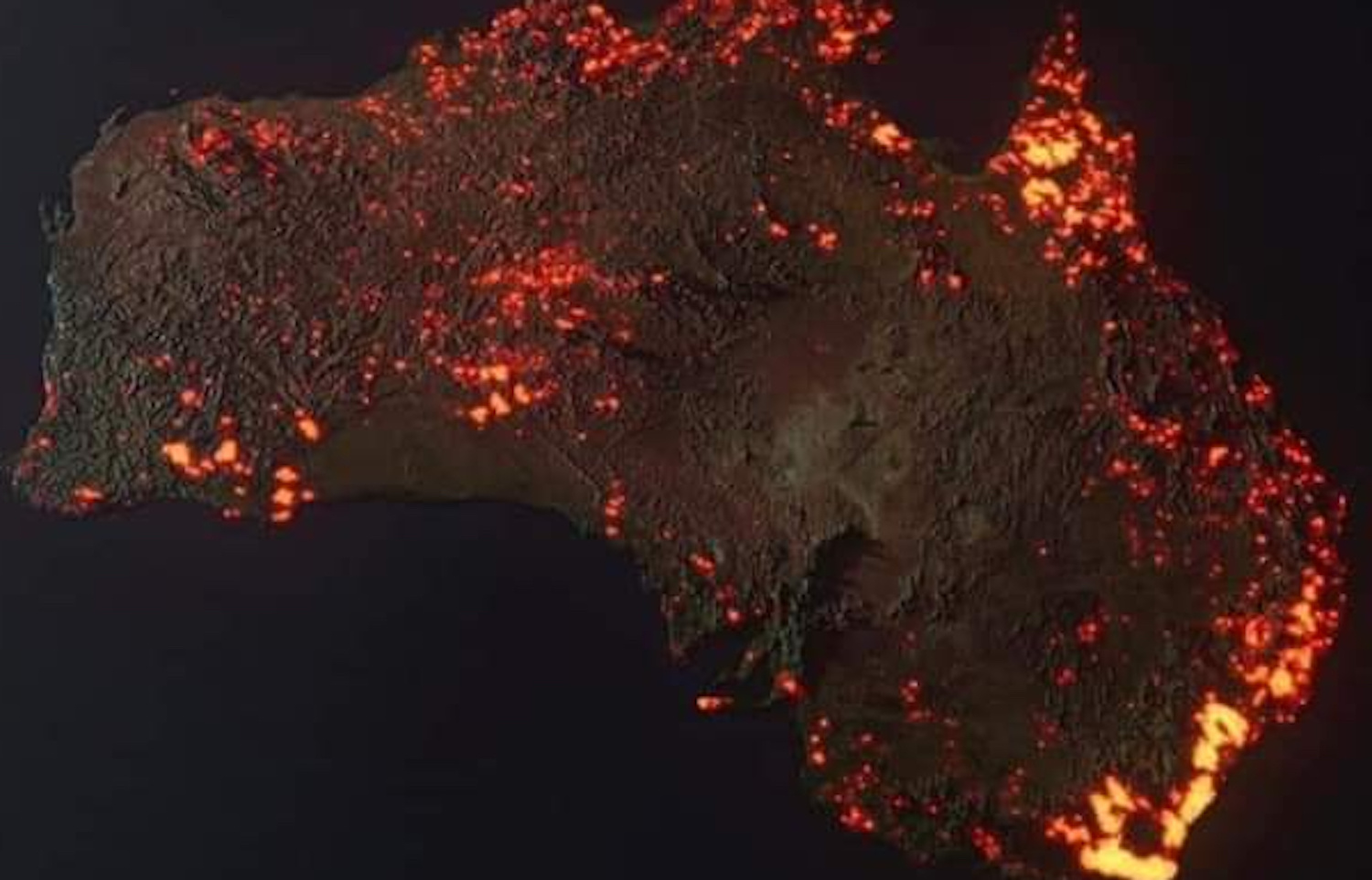
10 most populous countries (1960-2018)
China starts on top, with India and the U.S. in second and third place. And that’s how it stays until the end — with each of the three giants virtually doubling their population. Throughout, India gains on China. It may soon overtake its northern neighbor, but that’s outside the remit of this graph. The more interesting action takes place in the rest of the top 10. The bar chart starts with Italy still in the race, and three other European countries. By 2018, Pakistan, Nigeria, and Bangladesh have risen, the UK, Germany and others have sunk.
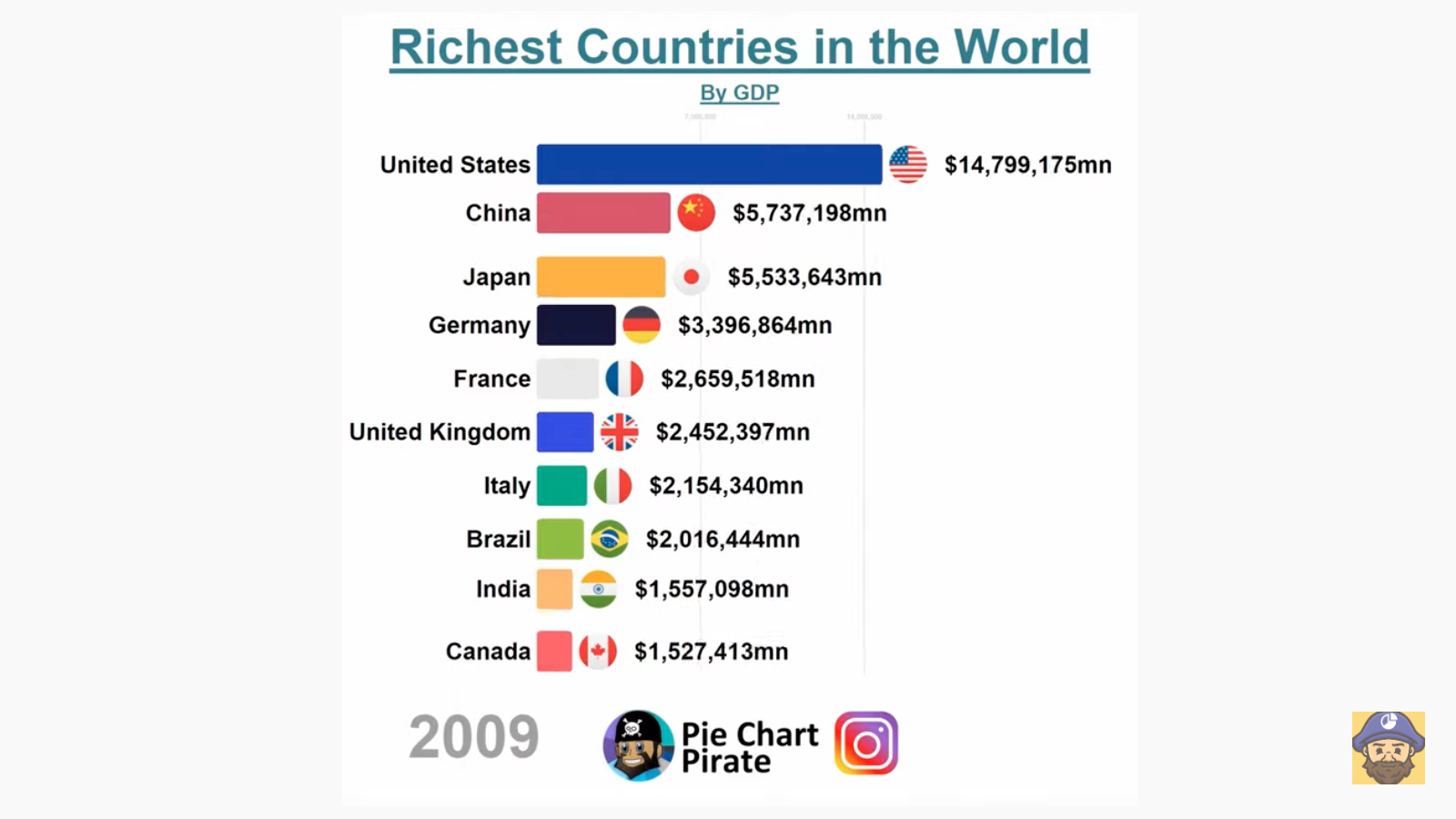
10 richest countries in the world (1980-2018)
The United States is number one, right? Yes, but watch the rest of the field, as national GDPs jostle for position in what may very well be the most consequential of all bar chart races. In 1980, the world economy is firmly in Western hands: the current G7 members (U.S., Japan, Germany, France, UK, Italy, and Canada), plus Brazil, Mexico and Spain. China falls in and out of the top 10 in the 1980s and doesn’t break the top five until 2005. But only four years later, China overtakes Japan as number two, and relentlessly starts adding billions to its GDP. By 2018, the gap with the U.S. is smaller than it’s ever been between Japan and the U.S. Who wins? We’ll need to look out for the sequel.
Army size comparison (1816-2020)
Two years after the defeat of Napoleon, the world’s military superpower — at least in terms of manpower — is… Russia. The nation’s almost 700,000 soldiers equal those of the next four countries combined. The United States? A puny 15,000 men under arms, half the size of the Danish army. But by mid-century, China takes the top spot, briefly overtaken by the U.S. (something to do with the Civil War). Lots of frantic jockeying for position around the World Wars — Germany reaches #1 for a short time. By 2020, Russia is relegated to the sub top, overtaken by India and North Korea.
10 most populous cities (1500-2018)
In 1500, Beijing was the world’s most populous city. Vijayanagar, in India, came second. For a century after 1600, Istanbul is the world’s “It City”. Beijing reconquers the throne and toward the end of the 18th century becomes the first million-plus city. From the 1820s, it is London’s turn — ballooning to 6 million by 1900. In the 1920s, New York takes over, its metro area growing to 13 million before Tokyo races past, somewhere in the 1950s, hitting 38 million by 2018.
Covid deaths per 100,000 people (January 2020 – August 2021)
We live in accelerated times. The outbreak of Covid-19 seems like ancient history. Take a look at this chart. Remember in the beginning when Italy was getting whacked? And what was up with Belgium, and Peru? The U.S. and other countries with high absolute Covid-related mortality figures never made it to the top of this list, whose “per capita” approach arguably is a better reflection of the ravages of the epidemic.
Countries with the most wind energy capacity (2005-2020)
In 2005, Germany is the world’s leading wind power nation, with a capacity double the size of the challenger, Spain. Since, windmills have sprouted up by the thousands around the world, leading to frantic jostling for first place. In 2008, the U.S. was number one in wind power, but only until 2010, when China’s concerted efforts helped it capture the castle. By 2020, China had more than double the capacity of the U.S., in second place. Fortunately, it’s not a zero-sum game: Any extra wind energy capacity lessens the world’s dependence on fossil fuels, which is good. And in just 15 years, the progress has been huge. Italy, in 10th place in 2020, has more capacity than Germany did in 2005, when it was number one.
Nuclear warheads by country (1976-2021)
Which country has the most nuclear warheads? Frighteningly, that question has gained quite a bit of relevance since Russian president Putin threatened using them against countries too actively opposed to his invasion of Ukraine. Nuclear annihilation was supposed to have been the sword of Damocles of another generation. Back in the Cold War, the U.S. and the Soviet Union were locked in a nuclear arms race: In 1976, the U.S. had just under 27,000 nuclear warheads, the Soviets just over 21,000. By 1990, the tables had decisively turned, with the U.S. only having 11,000 compared to the Soviets’ 37,000. Both sides’ arsenals dwarfed those of other nuclear powers, which by that time had grown to include North Korea, India, Pakistan, Israel, and South Africa. Following the collapse of the Soviet Union, both major nuclear powers shrank their stockpiles to about 6,000 each. Unfortunately, that’s still enough warheads to blow up the world several times over.
10 largest coffee-producing countries (1961-2018)
It’s 1961, and Brazil is the world’s reigning coffee superpower, producing more than 2.2 million tons of the beans. That’s roughly double the combined production of the rest of the top 10. Colombia continues to lurch toward the number one spot, and finally manages to overtake the champion by the mid-1970s, although that is more the result of Brazil’s decline than Colombia’s rise. Anyway, the triumph is short-lived and soon reversed. While Mexico and Indonesia are fighting for third, up rises an unexpected coffee giant: Vietnam, in second place by the year 2000 and nestled firmly in second place by the end of the race, inevitably behind Brazil.
Biggest economies in Africa (1960-2020)
You don’t need bars to have an eye-catching chart race. Here’s a dynamic pie chart, showing the evolving relative sizes of Africa’s national economies. In 1960, South Africa (27.8%), Nigeria (15.4%), and the Democratic Republic of Congo (11.8%) account for well over half of the entire continent’s GDP. In the 1980s, the top two countries trade places several times, but Nigeria slides down the ranks in the 1990s. The West African nation stages a comeback after 2000, and reclaims the top spot in 2007, while South Africa flirts with third place.
World population by continent (1500-2100)
Asia has long been the most populous continent. This bar chart race indicates just how long it has been dominant, and how its dominance will end. Starting in 1500, the graph shows Asia representing 59% of the world’s population, versus just 18% for Europe and 13% for Africa. Latin America is at 8%, North America at barely half a percent. Asia peaks around 1800 at just shy of 70%. Europe expands its market share to 26%, peaking just before World War I. By that time, the Americas have just broken the 10% mark for the first time. Asia remains dominant well into the future, but as Africa’s population grows, it loses its majority around 2070, by which time Africa will represent 32% of humanity. The race ends in 2100, with Africa just below 40% and Asia still comfortably above. Europe, North America, and South America together account for just around 16% of the world’s population.
For more background on bar chart races, check out this article at Built In, an online community for startups and tech companies.
Strange Maps #1137
Got a strange map? Let me know at strangemaps@gmail.com.
Follow Strange Maps on Twitter and Facebook.