577 – Broken Letters: A Typogeography of Europe

There are many ways to look at Europe other than as a collection of nation-states. Plenty of other imagined communities lurk beneath the surface of the standard political map. Check out the continent’s alcohol belts [1], have a look at its core and periphery [2], or inspect the languages in which Europeans tweet [3].
What you’d probably not consider, is to study a map of the different alphabets in official use across Europe today. Such a map would be rather uniform: the Latin alphabet dominates the entire continent, with the exception of Greece, which uses its own Greek alphabet, and a number of Slavic countries in the southern Balkans [4] and in eastern Europe [5], which use the Cyrillic alphabet.
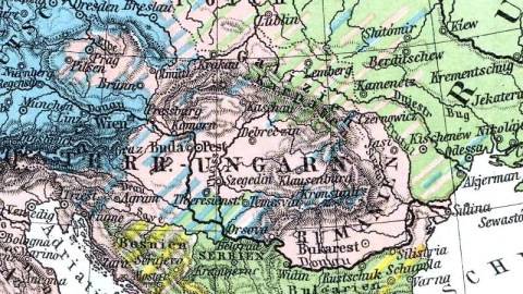
But at the beginning of the 20th century, the picture was much more diverse – at least according to this German map, which shows the distribution of typefaces across Europe in 1901. The most obvious difference with the situation today is the existence of a distinct Deutsches Alphabet (‘German alphabet’), dominating central Europe and some parts beyond.
The German script, called Fraktur (marked in blue), is dominant in the areas where German is spoken, i.e. the German Empire, Luxembourg, the German-speaking areas of Switzerland and Austria-Hungary, plus several German-speaking zones outside of these countries [6]. It is also shown to dominate in Denmark, Norway, and part of the Baltics [7]. According to this map, it also co-occurs in Sweden and Finland, where Antiqua (marked in pink) dominates. Antiqua rules supreme throughout western Europe, holds considerable sway across eastern Europe, except in the Balkans, where Greek, Slavic and Arabic [8] script vie for dominance.
One can’t help feeling a geopolitical undertow below the surface of this typographical map: a bit of both the German exceptionalist and encirclement complexes that were ingredients in the explosive mix that ignited both World Wars. Germany – or at least its alphabet – is shown to be uniquely central, if not pivotal to Europe, yet also surrounded by large western and eastern powers (Antiqua and Cyrillic). However large the area these two control, their dominance is not assured. The map takes great pains to point out their alphabet zones are not homogenous [9]. In contrast, the Germanic core of the Fraktur zone is solid blue [10].
This map is a cartographic time machine, hearkening back to an era in which the typographical was political. Central to the battle of the fonts was Fraktur, but to be calling it an alphabet, as this map does, is a bit disingenuous.
Fraktur is a type of blackletter, sometimes also mistakenly called ‘Gothic script’, which is nothing more than a font variant of the Latin alphabet, as is Antiqua itself (nevertheless labelled on the map in pink as Lateinisches Alphabet [‘Latin alphabet’]).
In fact, both blackletter and Antiqua descend from the Carolingian minuscule, developed in the early Middle Ages. Whereas Antiqua letters [11] are written in a uniformly rounded, flowing style, blackletter type is written in a ‘broken’ style [12]: each letter is composed of strokes that demonstrate abrupt directional changes.
Gutenberg chose blackletter as the type for his Bible (1455), the first book in Europe printed with movable type. Blackletter, which in the words of graphic design guru Steven Heller refers to the fact that “the darkness of the characters overpowers the whiteness of the page”, subsequently developed into a number of typefaces, the popularity of which varied regionally. Textura dominated in England, France, Germany and the Low Countries; Rotunda was prevalent in Italy; and Schwabacher [13] and Fraktur were popular mainly in Germany.
Over time, blackletter – and Fraktur in particular – came to be associated so closely with German culture, language and literature, that it was considered by many to be ‘unpatriotic’ to use any other type, especially Antiqua.
Consequently, German typography became the battlefield of a heated battle of the fonts, the so-called Antiqua-Fraktur-Streit. In its narrowest definition, this dispute raged from the late 19th to the early 20th century; in a broader sense, it encompasses a 200-year evolution from the middle of the 18th century, when Antiqua first was introduced in Germany, to the middle of the 20th, when Fraktur was decisively defeated.
In spite of its name, Antiqua is a relatively new type, distilled from classical Roman and later Carolingian examples at about the time Gutenberg chose Fraktur for his Bible. It became the standard type for Latin texts, and later Romance languages, and also Renaissance and humanist literature. Martin Luther, on the other hand, chose Schwabacher for his Bible, cementing the link between German and blackletter.
At the beginning of the 16th century, German printers developed the curious habit of printing ‘foreign’ (i.e. French, Latin) words in Antiqua, maintaining Fraktur or other blackletter script for the main German text [14] – thus emphasising the difference between ‘German’ and ‘Latin’ scripts.
During the 16th century, as French and Italian switched to Antiqua, Germans debated whether Antiqua was a suitable type for their literature. The dispute became more than a matter of taste when the Renaissance, Classicism and the French Revolution increased the ‘progressive’ profile of Antiqua. The Napoleonic occupiers of Germany ruled by decree – printed in Antiqua; German resistance seized upon Fraktur as an element of national pride and resistance.
Even after the defeat of Napoleon, Antiqua remained the font of French and foreign literature and knowledge, and the type preferred by the cultured classes. German nationalists and traditionalists continued to prefer Fraktur. The struggle between both fonts marked a cultural divide in Germany [15], which came to a head in the 1880s with the foundation of a Verein für Altschrift (pro Antiqua) and a Frakturbund, dividing the nation’s printers, publishers and writers.
The ‘script dispute’ even led to debates in the Reichstag: in 1911, the German parliament decided to reverse its approval of the introduction of Antiqua as a subject in German schools, maintaining Fraktur’s monopoly in the education system.
As a compromise, a new script was developed and propagated – the elegant, but nowadays utterly unreadable Sütterlin script [16]. It was introduced in Prussian schools in a German and Latin variant in 1915, and in the rest of Germany in 1935.
In the popular imagination, and in character with the earlier nationalist-nostalgic preferences in Germany, Fraktur is associated with Nazi propaganda. In fact, Hitlerite Germany had an ambivalent attitude to Fraktur.
In 1933, Nazi Interior Minister Wilhelm Frick was still instructing regional officials that they should maintain a preference for ‘German’ script over the Latin one, and ordered that his ministry would only buy typewriters with ‘German’ characters.
But the Antiqua-Fraktur-Streit would turn out to be just one more losing battle for the Nazis. In 1932, the year before they came to power, only 5% of texts printed in Germany were set in Fraktur. The ‘preference’ enforced by Frick merely managed to increase the share to 50% by 1935 – and it fell again thereafter.
On January 1941, in a stunning reversal straight out of George Orwell’s Nineteen Eighty-Four, Hitler himself mandated a change of preference. A secret circular released by Martin Bormann announced that “to consider the so-called ‘Gothic script’ to be a German one would be false. In reality, the so-called Gothic script consists of Schwabacher Jewish letters. In exactly the same way they would later acquire newspapers, the Jews living in Germany took possession of printing shops, which facilitated the introduction of Schwabacher Jewish letters.”
Labelling Fraktur ‘Jewish’ combined two main strands of Nazi thinking: blatant racism and historical nonsense. The deliberately misrepresented reversal was motivated by the Nazis’ desire to spread their propaganda to the recently occupied countries: “In a hundred years’ time, our language will be the European language. The countries of the East, North and West will have to learn our language if they want to communicate with us. The prerequisite is that the so-called Gothic script be replaced by the one we have until now called the Latin script”.
Both the Fraktur and Sütterlin scripts were mandatorily abandoned by schools and publishers. Neither would ever be reinstated. After 1945, Fraktur was marginalised – to a merely historical role. In Germany, it remains current on Bierhaus signs and on labels for products that want to exude a rustic charm, or a quality grounded in tradition. The latter motive also explains the continued use of Fraktur in newspaper mastheads, also outside Germany. Fraktur enjoys some new-found popularity in certain modern music genres, like metal, rap and gothic. But outside these and other tiny niches, Fraktur as an everyday font for writing and printing is as dead as a dodo [17].
______________
[1] South to north: wine, beer, spirits. See #422.
[2] ‘Core Europe’ contains almost all of France and Germany, but only half of Britain – which sounds just about right. See #22.
[3] Nobody tweets more than the Dutch, apparently. See #539.
[4] in Serbia, Bulgaria and Macedonia, where it is the only official script; in the ex-Yugoslav republic of Montenegro, independent from Serbia since 2006, the government in 2009 introduced a new ‘Montenegrin’ alphabet, to replace the Cyrillic (associated with Serbia) and the Latin (associated with Croatia), even while both officially remain in use; Cyrillic also is the official script of the Republika Srpska, the Serbian-dominated one of the two political entities constituting Bosnia-Herzegovina, while Latin script is official in the other, the Federation of Bosnia and Herzegovina, where Bosniaks and Croats have the upper hand.
[5] In Russia, Ukraine and Belarus. As in the former Yugoslavia, the use of Latin or Cyrillic is a test of allegiance to ‘west’ or ‘east’ respectively in the breakaway republic of Transnistria, the eastern sliver of Moldova. See this post in Borderlines.
[6] Mainly in central and eastern Europe, including an area near Saratov on the Volga, then home to the so-called Volga-Germans, see #149.
[7] Almost (but not quite) coinciding with present-day Estonia and Latvia.
[8] Accounted for by the Ottoman presence in the Balkans up until the 1910s, and the fact that Turkish was written in Arabic script until the 1920s.
[9] Hence the pinpointing of an area in Ireland’s west, where an Irish script occurs, and near the Volga’s lower reaches, home to a Kalmukkian-Mongolian script.
[10] The map happily ignores the fact that Fraktur was almost extinct in Danish and Norwegian print at the time it was published.
[11] A.k.a. roman, as in its best-known example, Times New Roman.
[12] Hence the name Fraktur, and the German synonym gebrochener Schrift (‘broken script’). Parallel to this typographic difference is the evolution in architecture from ‘roman’ (rounded) windows to those with ‘gothic’, pointed arches.
[13] A.k.a. Bastarda throughout the rest of Europe.
[14] Comparable to the present habit in Greek and Cyrillic texts to include ‘western’ words in Latin script.
[15] Goethe liked Antiqua, but had his books printed in both scripts, perhaps to please his mother Katharina, who wrote to him: “I am happy beyond words that your writings […] have not seen the light of day in the Latin script, which I find abhorrent.”
[16] See this Wikipedia article for an overview of the alphabet, and an example of a written text.
[17] See this article for an in-depth look at and some examples of blackletter.


