The surprisingly bitter controversy over American highway fonts
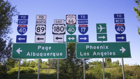
Top photo credit: Joseph Sohm / Shutterstock
If you haven’t been following the American highway roadside sign beat these past few months, it’s entirely possible you’ve missed what’s shaped up to be quite the design controversy. Here are the basic facts:
The Federal Highway Administration has rescinded its approval for the use of an alternative roadside typeface called Clearview, ten years after granting provisional approval for its use. This means the 70-year-old Highway Gothic typeface most commonly seen on directional signage will remain the single standard from here on out.
Signs sporting the now-defunct typeface will remain standing for now, though when it comes time to replace them, the type will revert back to Highway Gothic.
It’s a shocking end for Clearview, a typeface specifically designed to improve on Highway Gothic, and once lauded as “a beautiful example of design as a form of social activism.“
So, what happened?
When it was approved in 2004, Clearview was backed by scientific research that suggested it offered superior readability, especially at night:
“In 1997, Penn State researchers subjected Clearview to a range of legibility tests. The results were unambiguously positive, showing that Clearview increased nighttime reading distance by as much as 16 percent. In 2001, a team led by Texas A&M transportation researcher Paul Carlson independently confirmed that Clearview improved the recognition distance of highway signs by as much as 12 percent, a difference of 74 feet over Highway Gothic.” (Wired)
You can compare the two for yourself. Here’s Clearview:

And here’s Highway Gothic:

You’ll no doubt notice some subtle differences in the shape, spacing, and alignment of certain letters, especially the lowercase e. People who know a lot more than most about road sign font design stress that Clearview’s minor tweaks improve readability. Just ask the guy who helped create it:
Helen Keller can tell you from the grave that Clearview looks better. — Clearview co-creator Donald Meeker, perhaps hyperbolically
But the scientific community over the past ten years hasn’t been as kind to Clearview. Various research since 2004 suggests the improvements attributed to the new typeface may have been correlational rather than causal. New sign materials introduced in 2003 were found to be the main factor in improving readability at night. Additional research seemed to indicate that Clearview’s readability benefits were lost on signs with varying color patterns, in particular dark type on a white background.
You might be able to say that the jury is out on whether Clearview is truly superior to Highway Gothic. Additional research would probably shine a keener light on the matter.
So why did the Highway Administration preemptively choose to put the kibosh on Clearview rather than wait to see if improvements could be made?
CityLaband Wired have each covered the story and arrive at a similar theory: money. From CityLab:
“Jurisdictions that adopt Clearview must purchase a standard license for type, a one-time charge of between $175 (for one font) and $795 (for the full 13-font typeface family) and up, depending on the number of workstations.”
If you’re of the opinion that there is no practical difference between Highway Gothic and Clearview, then the one you can use for free is the obvious choice. Whether or not that’s the case — well, it might not matter anymore.
**
Robert Montenegro is a writer and dramaturg who regularly contributes to Big Think and Crooked Scoreboard. He lives in Washington DC and is a graduate of Loyola Marymount University in Los Angeles.
Twitter: @Monteneggroll. Website: robertmontenegro.com.