How Fonts and Typefaces Stimulate Your Subconscious

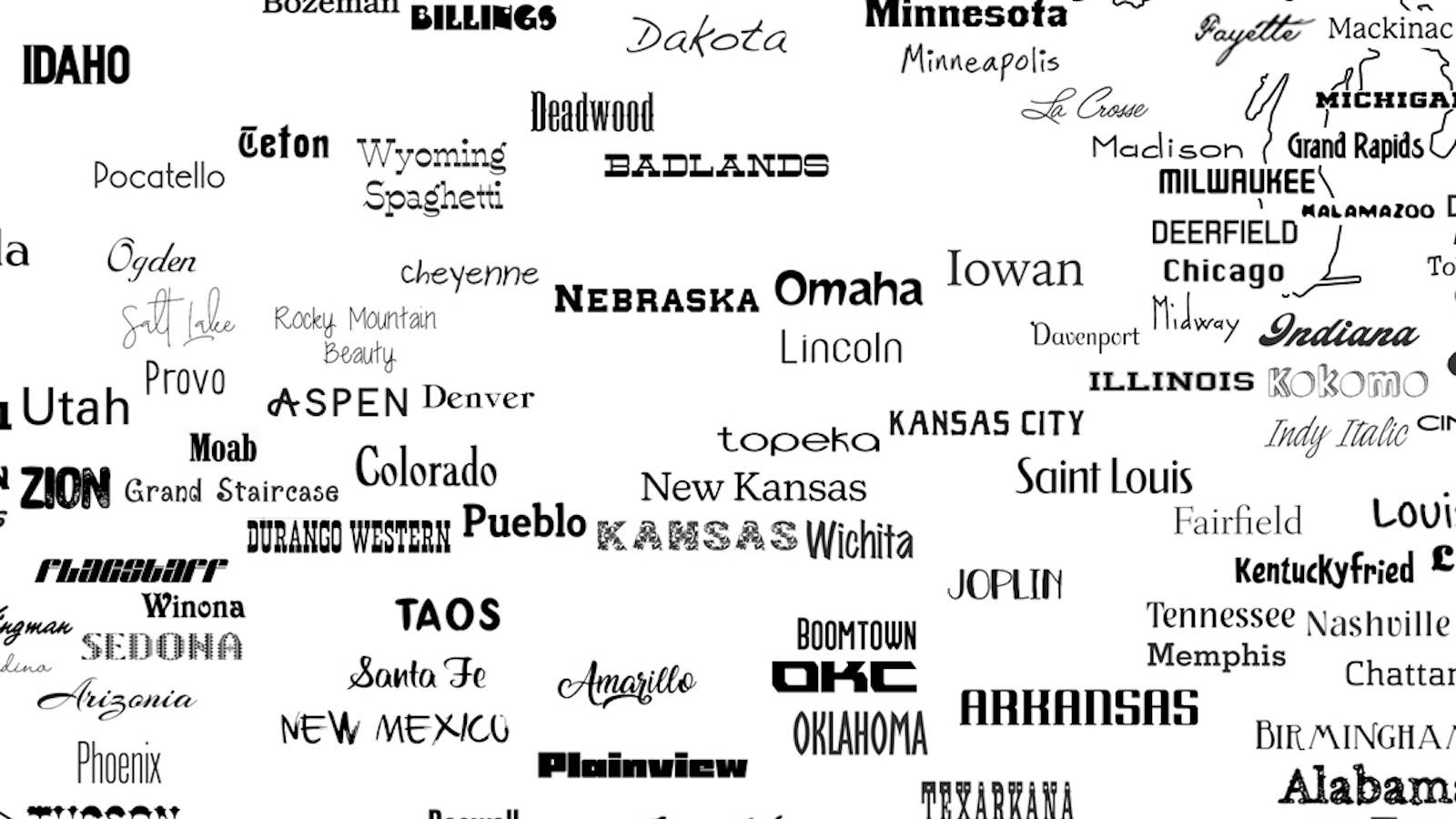
An article about résumé fonts over at Bloomberg has made the rounds this week, riling up loyalists and detractors of several common typefaces. The piece shares the perspective of several designers on which typefaces work best on résumés (Helvetica, Garamond, and Didot in certain situations) and which ones are best left out (Comic Sans, obviously, but also Courier and Times New Roman).
It got me thinking why typefaces hold such sway when the words they convey remain the same. Most of what we perceive subconsciously is the result of priming. We treat fonts and typefaces the same way we treat stereotypes. The reason Comic Sans has become the go-to example for tackiness is because aspects of its use — usually for trivial or childish things — have been exaggerated in a way that keeps us from thinking beyond this base perception. The reason Arial has fallen out of favor is because its long-time ubiquity as the default font for Microsoft Word led to it being seen as boring and lazy.
But our perceptions of typefaces extend much further than association. There’s an entire psychology behind character design: Serif or sans serif, modern or classic, bold or thin. These and their effects all factor into our enjoyment of certain fonts. For example, as pointed out by Urbanfonts, serifs make it easier to read words on a page (naturally high resolution) while sans-serif looks better on a screen. Serifs guide the eye to the distinctions between each letter. Sans-serif type is more versatile, especially in a smaller font size. This versatility and its association with digital media makes sans feel much more modern — and serif types much more traditional.
Vladimir Gendelman of Company Folders has written several informative pieces on font psychology in which he ruminates on how abstractions like trust and personality commonly become associated with typefaces, and even how some folks connect fonts to taste and smell as well (what does Comic Sans taste like?). Gendelman also explains why the Disney logo is so effective even though many kids don’t quite register that the “D” is just a backward “G.” The answer: Gestalt theory.
The key takeaway here is that fonts and typefaces play off our archetypical perceptions of design to influence how we feel. If you’re crafting a résumé for your dream job, think about the values of the person who will be hiring you. A font like Times New Roman might be acceptable if you’re looking to work for the government; it’ll scuttle your chances if you want to go into fashion.
Read more at Bloomberg and Company Folders
Below, author and career expert Michael Ellsberg stresses that a catchy résumé alone isn’t always enough. Most hiring takes part on the informal job market through networking:
Photo credit: aastock / Shutterstock