Branded Data: Visualizing the Internet’s Future
It all started with the humble infographic – those charming representations of well-designed data that are fast becoming ubiquitous across the Web. Infographics, in fact, have become so popular as a way of telling complex stories very elegantly (and generating massive page views) that they’ve spawned a whole new generation of increasingly sophisticated data visualization tools that are making it possible to view the data behind very complex political, financial and socio-economic trends in real-time.
There is simply a staggering amount of data being created each day, and we need new ways to think about who owns all this data and how it should be used. According to Google, every two days, we create as much information as we did from the dawn of civilization up until 2003. That’s approximately five exabytes of data per day. In some cases, individuals own this data, such as when they’re recording their personal habits using a tool like FitBit or documenting their lives using a website like Daytum. In other cases, corporations, nonprofit organizations or governments own this data, such as consumer spending habits.
Perhaps not surprisingly, a number of leading consumer-facing companies are already using similar types of data visualizations to explain new products and market opportunities. As part of its Ecomagination and Healthymagination initiatives, for example, GE now maintains an entire website for data visualizations related to healthcare, energy and the smart grid.
In addition, new data sets are being created by a mix of public and private sector participants to make possible “build your own” data visualizations. New open data services encourage journalists, policy makers and corporate researchers to contribute their premium data to help solve complex societal problems. IBM, Microsoft and Google have been among the pioneers in creating these “open” data repositories. The Google Public Data Explorer, for example, includes robust data sets from providers such as the U.S. Census Bureau, the World Bank and the OECD that users can then manipulate as needed. Google’s latest project is the “Visualize Your Taxes” contest.
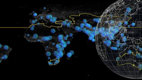
Data, in other words, can be “branded“: This latest data visualization on global warming has been brought to you by…
This is actually a powerful concept: individuals, corporations and government organizations are sitting on vast treasure troves of archived data that can be branded and then digitized as tiny propaganda across the Web to support their own agendas. Think back to your university research papers – didn’t it always seem like a wise, benevolent organization was providing the data? Would you think differently about the data if it were coming from a Big Oil company with an entrenched interest in developing offshore drilling locations? Or if that quirky data visualization on voter habits was being brought to you by your friends at Big Lobbying Association?
They say that history is written by the victors. In the near future, we may say that history has been also been visualized by the data engineers.
[image: Disasters 3 Cropped via mzdoherty]