Dashboard Typeface May Affect Driver’s Safety

Article written by guest writer Kecia Lynn
What’s the Latest Development?
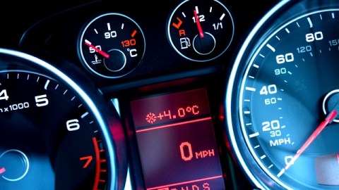
Most people barely give a second thought to the typeface used to design their car dashboards, but researchers at MIT’s AgeLab have found that displays that using the family of typefaces known as “humanist” are much more scannable, to the point where “[m]ale drivers, in particular, can process messages in humanist lettering about 10 percent faster, on average.” In tests using automobile simulators, men took longer to process messages appearing in a typeface belonging to the “square grotesque” family.
What’s the Big Idea?
The amount of time it takes to react to a warning message while in a moving car is a matter of great importance, and although other types of distractions, such as texting, are dominating public discourse, the AgeLab — which has as its focus a population that’s aging as a whole — wanted to examine how to improve a car’s existing features. Director Joseph F. Coughlin says, “Font and presentation of information is going to become more critical in all domains of life…How do we look more deeply at the relationship between technology and the driver?”
Photo Credit: Shutterstock.com


