Ask Ethan: How do scientists color the Universe?
- When we look at astronomical images of the Universe, whether from Hubble, JWST, or any other observatory, they typically show a broad array of colorful features.
- But these color-coded images don’t necessarily show us the same things human eyes would see; instead, they’re optimized to encode important information in an easy-to-process visual format.
- Here’s how scientists “colorize” the Universe in a variety of ways, and what those colorizations tell us about what’s truly present and detectable inside these objects.
For just a moment, I want you to close your eyes and think about the most famous, most spectacular images of the Universe that you’ve ever seen. Did you picture planets or moons within our Solar System? Perhaps you thought of nebulous regions of gas, where new stars are forming inside. Maybe a snapshot of a recently deceased star, such as a planetary nebula or a supernova remnant, is what best captured your imagination. Alternatively, maybe you thought about glittering collections of stars or even entire galaxies, or — my personal favorite — a deep-field view of the Universe, complete with galaxies of all different sizes, shapes, colors and brightnesses.
These full-color images aren’t necessarily what your limited human eyes would see, but are instead color-coded in such a way that they reveal a maximal amount of information about these objects based on the observations that were acquired. Why do scientists and visual artists make the choices that they do? That’s what Elizabeth Belshaw wants to know, writing in to ask:
“When we see stars or galaxies from Hubble and Webb, they are in color. Are they really black, void of color, or are colors assigned? Do the colors say, for example, blue for oxygen or red for hydrogen, etc.? What do the colors mean? Who assigns the colors?”
The goal, remember, is to maximize the amount of information encoded in a way that humans, both amateur and professional, can easily digest. With that in mind, let’s start with the basics: how we actually see in the first place.
As human beings, our eyes are one of the most specialized sensory organs that a living being can possess. At a basic level, our eyes consist of:
- a pupil, which lets light into the eye,
- a lens, which focuses the incoming light,
- a retina, which acts like a screen for that light to land on,
- rod cells, which are sensitive to all types of visible light,
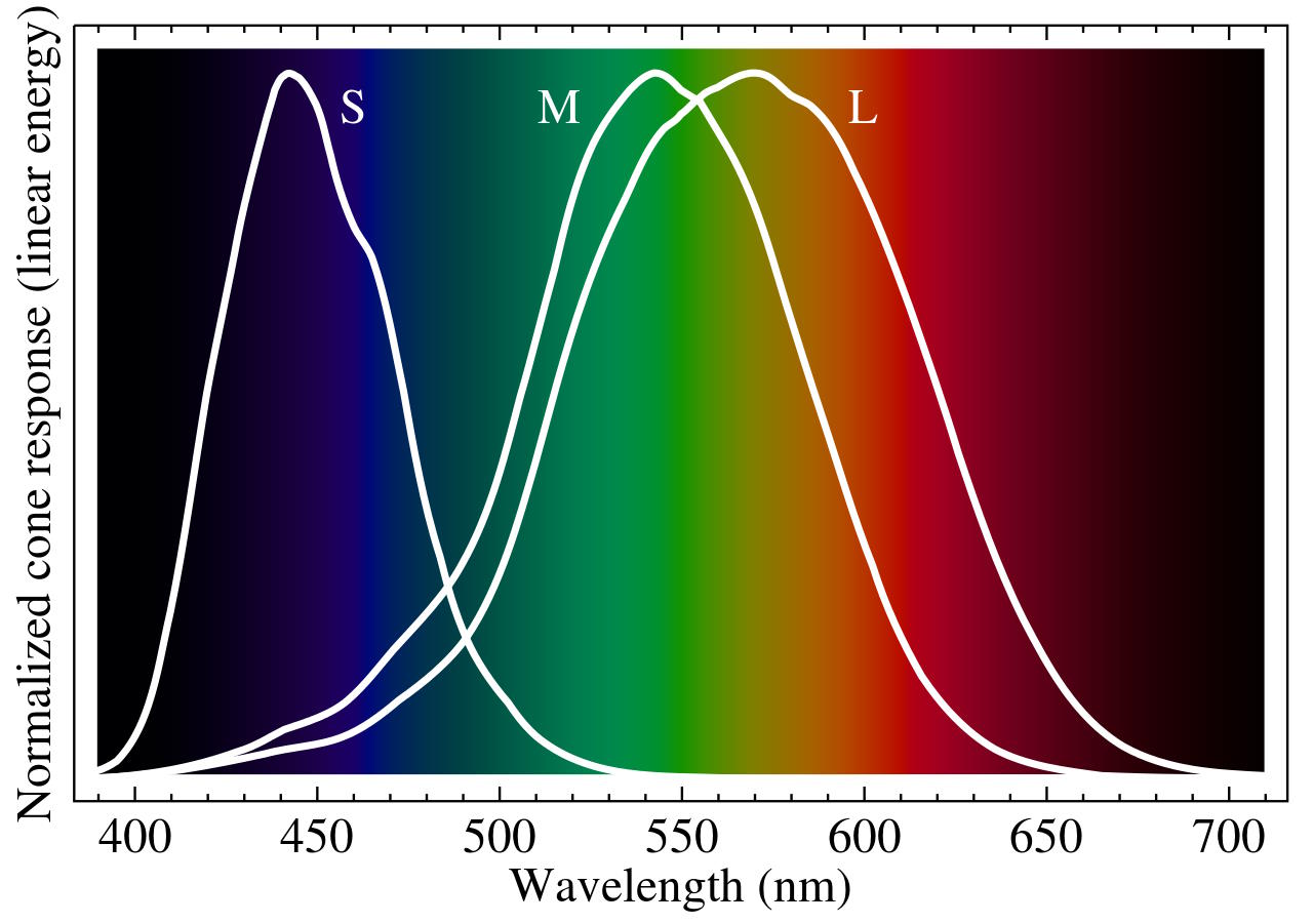
- cone cells, which (in most humans) come in three varieties, and are color-sensitive,
- and our optic nerve, which takes those signals up to our brains,
where our minds then synthesize all of that incoming light into what we commonly perceive as an image. We can wear contacts or corrective lenses (or have laser eye surgery) to augment our own natural lenses, allowing us to better focus the light, but ultimately it comes down to the rod and cone cells to detect that light once it strikes our retina.
Rod cells are sensitive to overall brightness, and work even in extremely faint light, but are relatively insensitive to color. They are why, if you awake during a moonless night and don’t turn any artificial lights on, you can indeed still see, but your vision will be purely monochromatic: devoid of color sensitivity. During brighter conditions, your rod cells move back and your cone cells move forward, enabling us to distinguish between reds, greens, and blues, as the different types of cone cells are sensitive to light of different wavelengths. When those signals (from both rod and cone cells) go to our brains, we interpret those signals as color and brightness, which enables us to reconstruct an image.
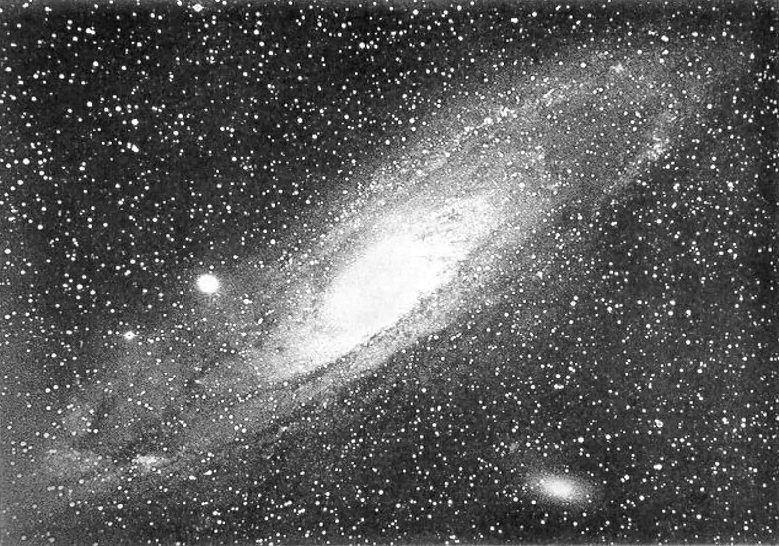
The earliest astronomical images, like the above image of the Andromeda galaxy (from the 1880s), weren’t sensitive to color at all; they simply gathered all of the light that came from an object and focused it onto a photographic plate, where it made a (monochromatic) image. However, humans swiftly figured out a fascinating trick that enabled them to create color images: to filter out certain components of light.
The idea of a filter is relatively simple: you simply allow light in a certain wavelength window (i.e., of a certain set of colors) to pass through, where they’ll be recorded, while all other wavelengths of light are excluded. By setting up filters, for example, for:
- red light, where the long wavelengths that human vision is sensitive to pass through,
- green light, where the intermediate wavelengths that human vision is sensitive to pass through,
- and blue light, where the short wavelengths that human vision is sensitive to pass through,
you can then create three separate images of the same object. When you then project the red-filtered image with red light, the green-filtered image with green light, and the blue-filtered image with blue light, the fact that color is additive allows your brain to interpret a full-color image.

This technique can be applied to paintings, photographs, video projectors, or the LED lights on a modern screen: the science is the same in all cases. However, this is a very restrictive setup, because it’s focused extraordinarily narrowly on constructing images that represent what human eyes see in the world, for humans to then digest subsequently. We can certainly do this in astronomy, as we’ve developed what are known as photometric filters: filters that do something very comparable with the images we’re capable of acquiring of the Universe. Instead of the astrophotography techniques of the 1880s, where we just gathered all of the light from a source across all wavelengths, we can apply filters that restrict the light that comes in to be in a specific wavelength range.
We can do this multiple times across different wavelength ranges, gathering data about the light emitted by various astronomical objects in each filter that we choose. The human eye may only have three types of cone (in addition to just one type of rod) within it, but we are sensitive to millions of colors and tremendous variations in brightness based on the relative response of the various types of cells within our eyes. We often choose to represent astronomical data — particularly optical data acquired by telescopes that are optimized for visible light observations — in ways that very closely approximate “true color,” or what human eyes would see if they, rather than telescopes, were acquiring this data.
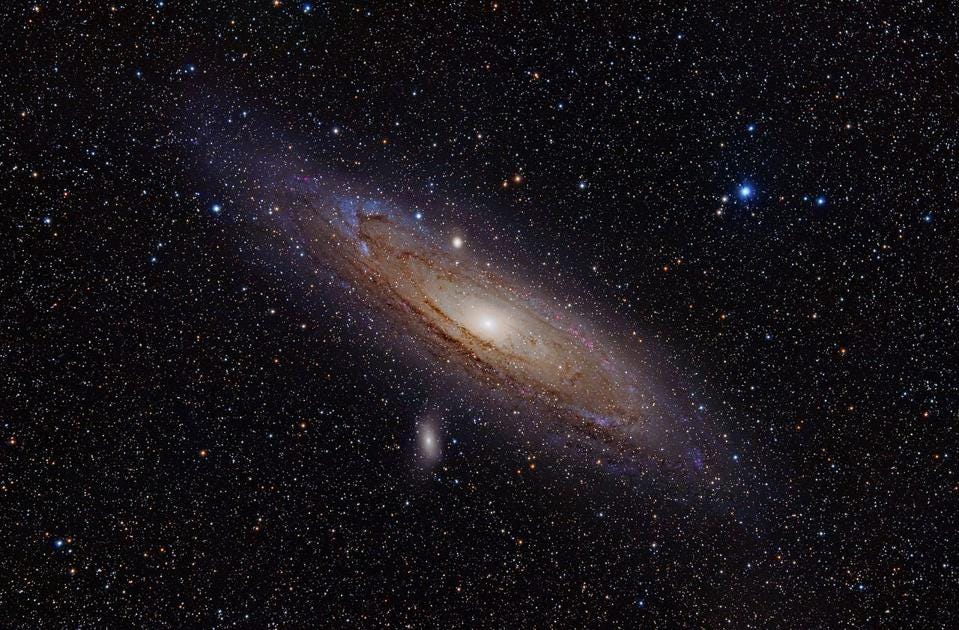
This isn’t the only way to go about coloring the Universe, however, and that’s an extremely good thing. If you’re an astronomer, you have to recognize that sometimes, you want to focus on very specific features, not the standard red-green-blue colors of objects overall. For example, you might want to hone in on the presence of very hot hydrogen gas, or doubly ionized oxygen gas, or some other element or molecule at a certain temperature or in a certain ionization state. Other times, you want to draw out features that might not fall into the visible part of the spectrum at all, but might be a gamma-ray, X-ray, ultraviolet, infrared, or radio signature instead.
In certain cases, you might want a combination of those effects: you might want to use X-ray observations to highlight the presence and abundance of different elements that can be found across a region of the sky, such as finding out how various types of atoms are distributed across an exploded star’s remnant. What’s important to recognize is that we aren’t wedded to this overly restrictive idea of “true color” or “what human eyes can see” when it comes to the objects in the Universe. Instead, we can tweak our color-and-brightness-based representations of any set of astronomical data so that it best displays the types of features we’re seeking to highlight.

In other words, there’s no one “universal” color scheme that we use. This is true even for individual telescopes, like Hubble or JWST. While human eyes may only possess four overall types of light receptor (one rod type and three cone types), enabling us to construct a full-color, brightness-relative image of whatever it is we’re looking at, that doesn’t mean we’re restricted to “seeing only what our eyes can see.”
Instead, what astronomers do is leverage these human capabilities by assigning colors to certain detectable features within an image. For example, JWST often, with the filters that are chosen to view an object, doesn’t even acquire any visible light at all; in its usual use case, it gathers only near-infrared and/or mid-infrared light. Even within its NIRCam (near-infrared camera) and MIRI (mid-infrared instrument) instruments, there are more than 20 different filters to choose from when deciding what type of light we should be collecting.
Frequently, we collect light from far greater numbers of filters than just three of them, even though three is the maximum number of unique cones we have in our eyes. With JWST, Hubble, or any other observatory, we have a choice for how we assign colors to the data (including data from different filters), and making different choices can result in extraordinarily different views of even the very same object.
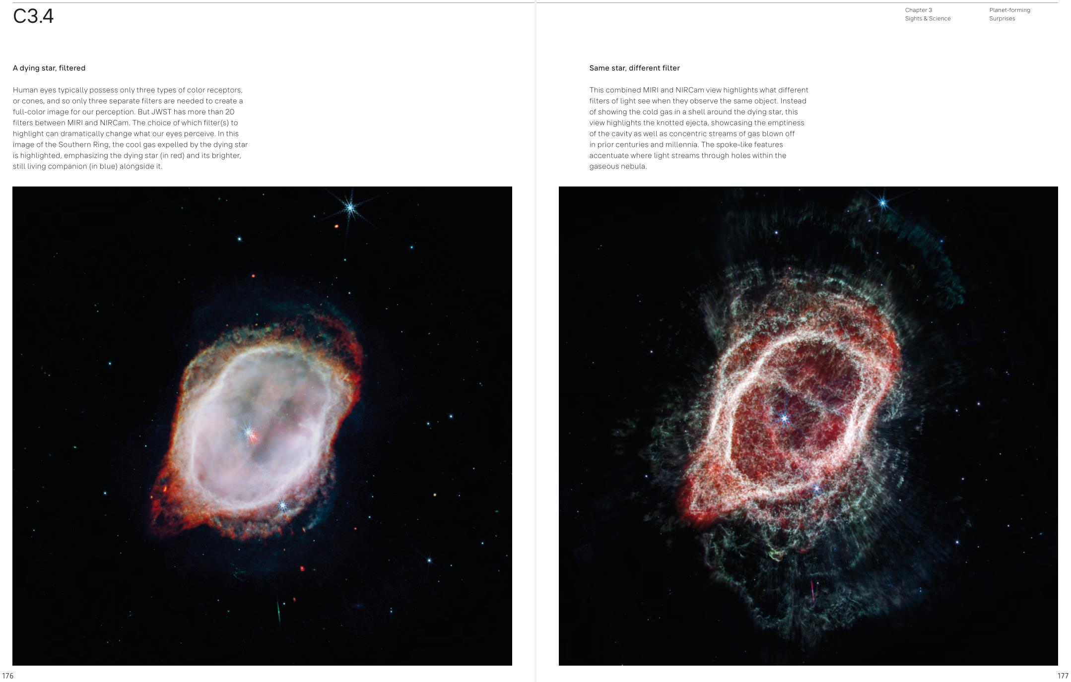
JWST is particularly impressive in this regard. Across all observing modes, there are up to 29 different types of image that can be produced with JWST, depending on which instruments and which filters are highlighted. However, there are some general rules that scientists (and amateurs) who perform the task of image processing generally follow, in order to make certain interpretations of the data easier and more accessible.
Just as human eyes assign:
- bluer colors to shorter wavelengths of light,
- green/yellow colors to intermediate wavelengths of light,
- and redder colors to longer wavelengths of light,
so do most data visualizations. Blue light corresponds, in general, to higher-energy phenomena, while red light corresponds to lower-energy phenomena. This is typically how colors for observatories like JWST and Hubble are assigned: with shorter-wavelength light assigned to blue colors, medium-wavelength light assigned greens and/or yellows, and longer-wavelength light assigned red colors.
It’s by taking these assigned colors, where those colors are used to bring out (or highlight) certain features that they’re assigned to, and then displaying them all together, at once, that we wind up with the final images we’re so used to seeing.

There isn’t a “right way” or a “wrong way” to do this colorization, of course; it’s all a matter of how you want the viewer to visually interpret what you’re attempting to show them. The pros that work on JWST have their own methods that they use, but even among different researchers using JWST data, there’s a substantial amount of freedom to make choices about what aspects to show or highlight. Sometimes, it’s more useful to show separate images that were acquired over different wavelength ranges, as the features they reveal often correspond to very different astrophysical objects and processes.
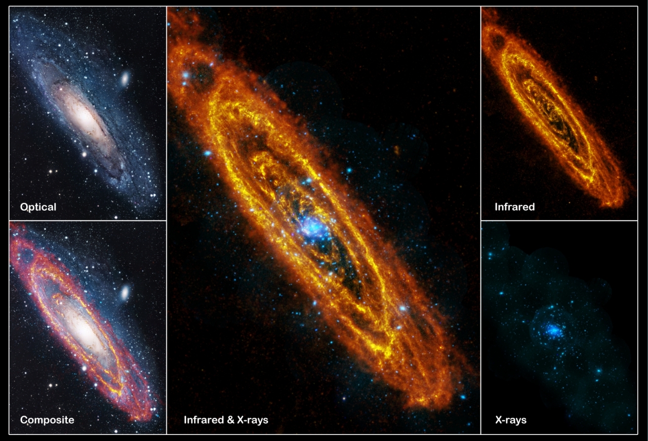
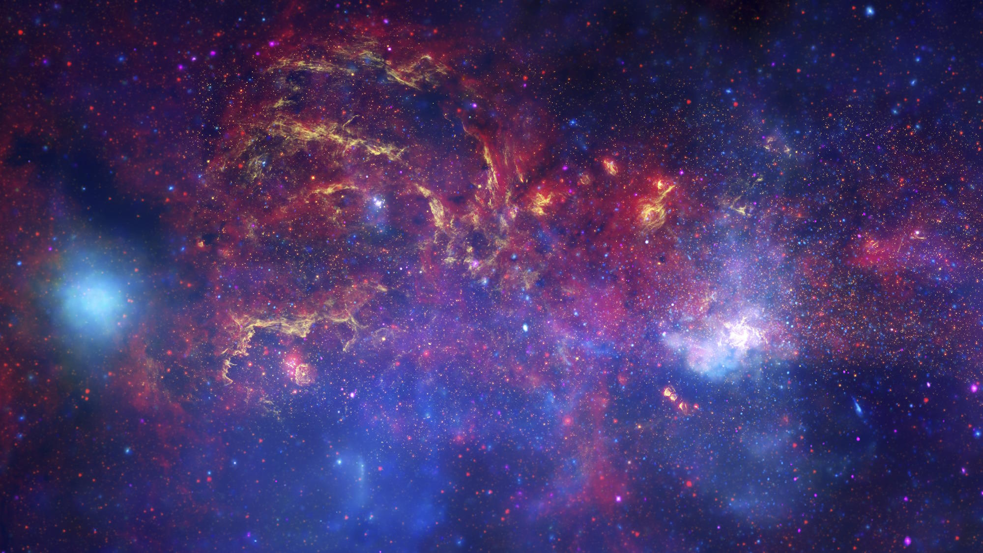
Other times, it’s more profound to show features spanning a broad array of wavelengths all together, as they can paint a more holistic picture of the region of space that you’re examining in detail. Features such as black holes, radio jets, heated dust, magnetically-carved filaments, and much, much more are all at play toward our galactic center, and a single, multiwavelength view can showcase all of those features at once.
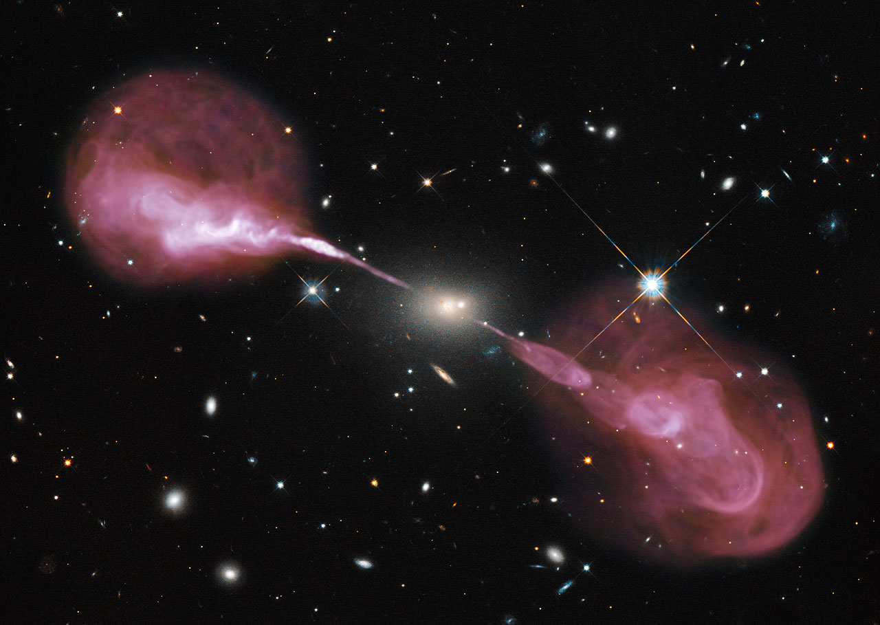
Sometimes, there are features that only appear at very long wavelengths, such as radio wavelengths, that might highlight jets from an active galaxy that spill out into the circumgalactic medium, and you’ll want to show them alongside the host galaxy that spawned them, which might be best viewed in visible light wavelengths. This, too, is a way that light of different wavelengths can be combined for illustrative purposes, even though it’s in a way that our human eyes would never be able to perceive on their own.
And finally, sometimes it’s incredibly informative to show animations that transition between different views, such as the below image of the Phantom Galaxy, Messier 74, which transitions from visible light (Hubble) views to near-infrared (JWST NIRCam) views to mid-infrared (JWST MIRI) views, where each individual view has been uniquely colorized to show — within its relevant wavelength range — shorter-wavelength features in bluer colors and longer-wavelength features in redder colors.

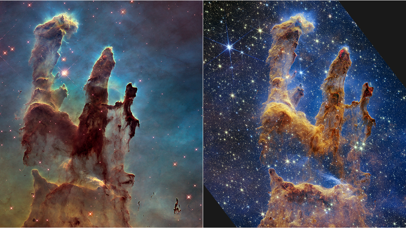
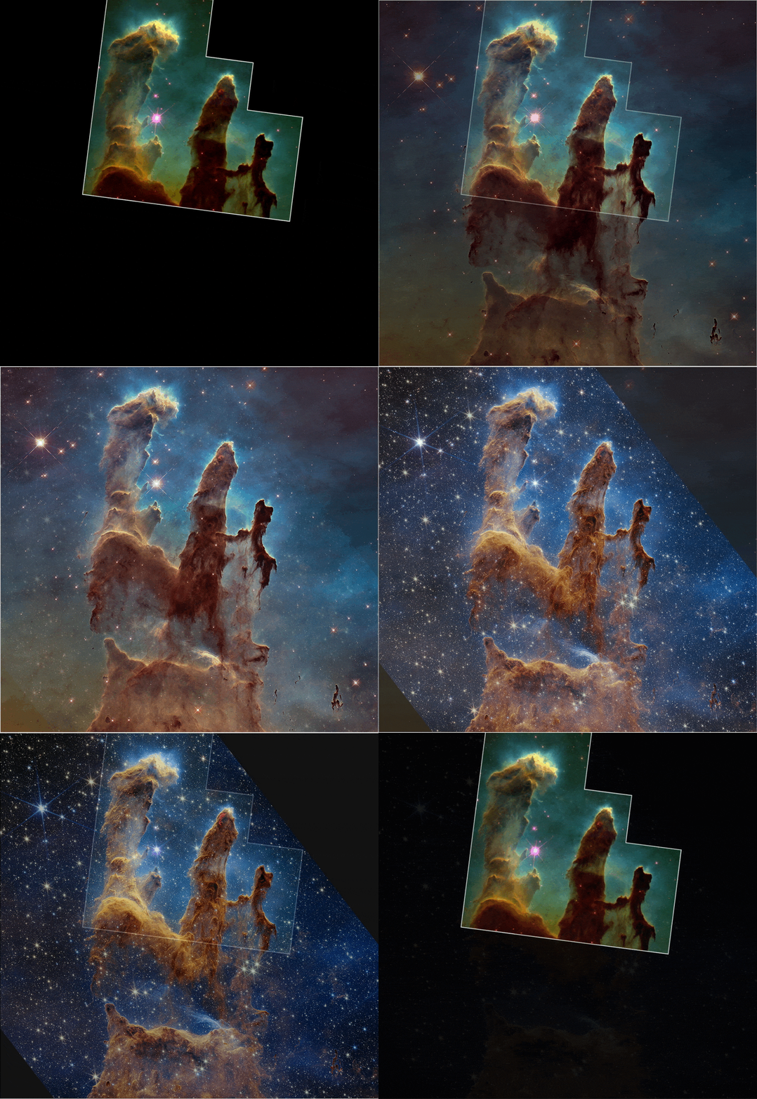
Finally, it’s worth noting that many features that light is opaque to in one range of wavelengths, meaning that light of those wavelengths is blocked and cannot pass through this region of space, allow light to transparently pass through at other wavelengths. The Pillars of Creation, famously, is a region rich in neutral matter, which includes light-blocking dust. That dust is extremely efficient at blocking short wavelengths of light, including visible light.
In 1995, Hubble observed those pillars largely in visible light, and saw those three ghostly pillars with only a few hints of stars inside and nearby.
Then, in 2014, Hubble re-observed those pillars with a new set of cameras, which were capable of seeing a little bit farther into the infrared portion of the spectrum (and with a wider field-of-view), enabling more detailed features and many additional stars and protostars to be revealed.
Finally, in 2022, JWST observed those pillars as well, seeing much farther into the infrared and without any visible light data included in its views at all. The gas and dust of the pillars themselves is therefore revealed in much greater detail, along with an enormous number of much more easily-visible stars.
The overall point is that there’s no one correct, universal “right way” to colorize the Universe. It depends on:
- what features are actually present in the astronomical object you’re targeting,
- what features are revealed and detectable by the observations you’re considering,
- what features you want to highlight for the person who’ll be viewing the image,
- and how closely you’re wedded to the idea of shorter wavelengths appearing bluer and longer wavelengths appearing redder,
as different color schemes can lead to vastly different views of even the exact same data.
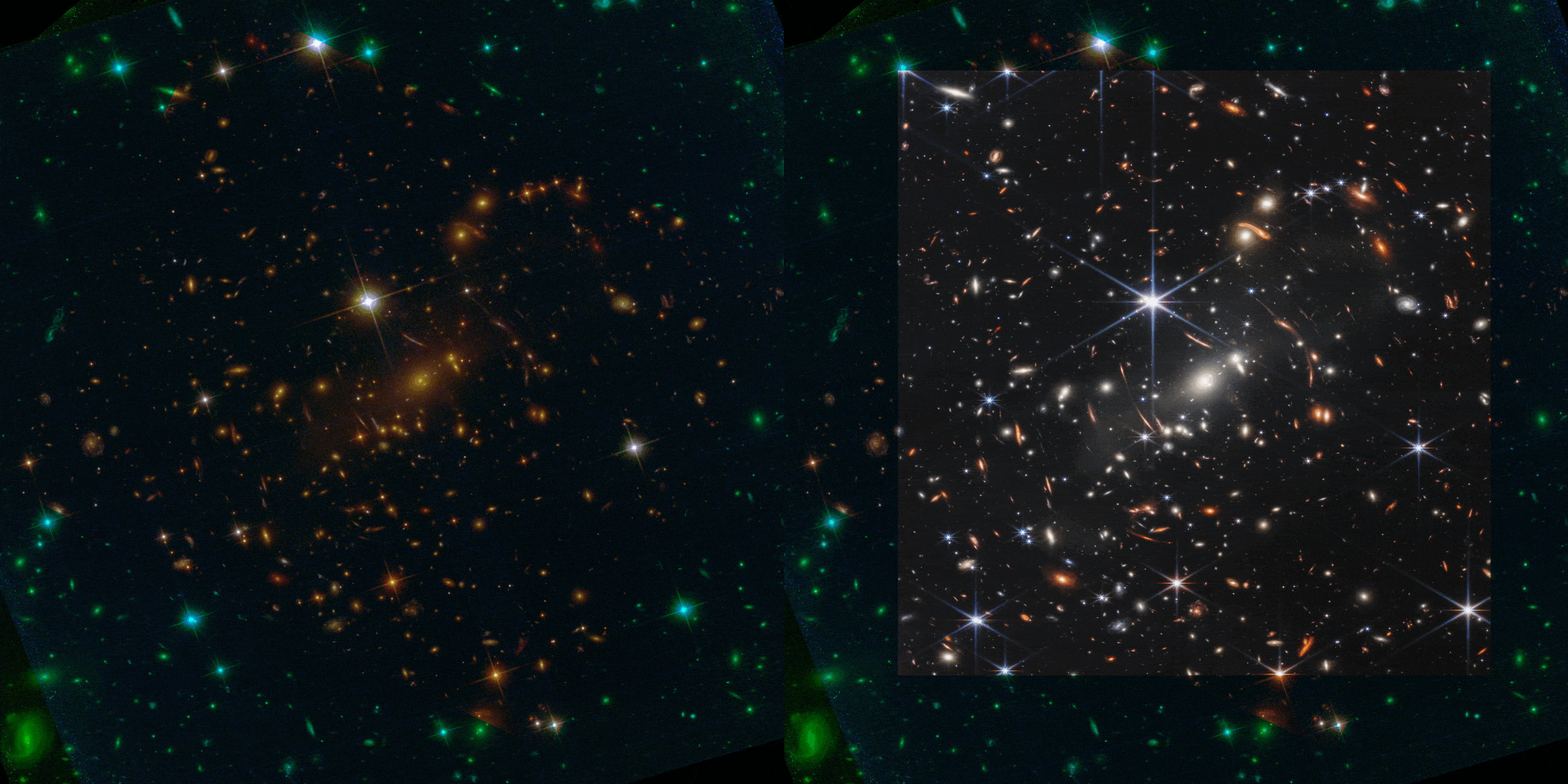
Sometimes, you want element-specific signatures, such as when you map out the presence of neutral hydrogen in a galaxy (and, typically, color it pink) or of doubly-ionized oxygen in a superheated nebula (and, typically, color it green). Other times, you’ll want color-coded signatures that reflect the various energies of the features you’re imaging, with violet and blue colors corresponding to the highest-energy, shortest-wavelength features and with orange and red colors corresponding to the lowest-energy, longest wavelength ones. And still at other times, you’ll want to fuse together observations across many different wavelengths, choosing a color scheme to maximize the contrast between different features.
In cartography, there’s an important saying: the map is not the territory. The saying is designed to remind us that our representation of the world does not necessarily match up, one-to-one and feature-to-feature, with how the world actually is. When it comes to how we color the Universe, we have to remember that each “picture” we see is not a true depiction of how that object is, but is only a representation of that object based on the data that’s been acquired and the colors we’ve assigned to its various features. The important thing is to be clear and consistent about the color scheme we’re using, and to remember the goal: it’s to communicate information about the object in question in a way our limited senses can digest them, not to remain limited to the boundaries of what our senses can typically perceive!
Send in your Ask Ethan questions to startswithabang at gmail dot com!

