Maps: Will Hillary Clinton Beat Donald Trump? Will the UK Leave the European Union?

Both Britain and the U.S. face momentous choices this year. In a referendum on 23 June, British voters will decide whether or not to leave the European Union. And on 8 November, the American electorate will go to the polls to determine who will be their next president: Hillary Clinton or Donald Trump.
Although some may consider both choices to be no-brainers of the “Would you like to shoot yourself in the foot (Y/N)” variety, opinion polls on either side of the Atlantic have been tightening. Neither ‘Brexit’ (a British exit from the EU) nor a Trump presidency seems unthinkable at this point.
These two maps reflect elements of the debate in either country.
The first one is taken from a flyer distributed by the ‘Vote Leave’ campaign in Britain. While economic issues and resentment against the eurocrats in Brussels play their part, immigration is the main element in the Brexit debate.
The ‘leavers’ argue that a Britain outside the EU would be much more capable of controlling its borders than a Britain inside the EU – free movement of EU citizens among its member states is one of the pillars of the European Union.
Each time the Union expands, the spectre of an unfettered influx from the new member states is raised – notably before the accession of Bulgaria and Romania in 2007. This map repeats that exercise with the ‘next wave’ of potential member states. In red, three countries from the former Yugoslavia (i.e. Serbia, Montenegro and Macedonia; Slovenia and Croatia are already in, Bosnia is not a candidate yet) plus Albania.

But the bulk or red territory is taken up by Turkey (the number of ‘potential immigrants into the UK’ is also mentioned: 76 million). Turkey’s two neighbours to the south – Syria and Iraq – are coloured pink, as if their accession to the EU is the next logical step.
Counterweighing Europe’s blood-red spillage to the east is the UK, coloured black as if to negate Europe’s eastward expansion. The message, though not explicitly stated in words, is made clear by cartographic means: Get the UK out of this mess!
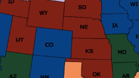
The other map is an interesting piece of electoral cartography: it color-codes U.S. states based on the most recent time each one helped put a Democrat in the White House. In other words: it shows which states would be the most and least likely wins for Hillary (and perhaps the most and least unlikely ones for Trump) and vice versa.
In blue are the 26 states (plus DC) who voted for Obama in 2012. They include Hawaii, the three West Coast states plus Nevada, Colorado and New Mexico, and most of the Midwest and Northeast. One could assume that these most recent Democrat-voting states are the most solidly pro-Democrat ones.

Only two states switched sides in 2012: Indiana and North Carolina (in purple) voted for the Republican Mitt Romney, whereas they had chosen Obama over McCain in 2008. A Hillary win would be less sure here.
The re-election of Bill Clinton in 1996 was the last time these eight states (in green) voted Democrat: Arizona, Missouri, Arkansas, Louisiana, Tennessee, Kentucky and West Virigina. Could his wife pick up these states again after a 30-year hiatus?
In 1992, two more states (in pink) voted Hillary’s husband into office: Montana and Georgia (in pink).
We have to go back forty years for Jimmy Carter, the previous Democrat, to be elected president. And 1976 was also the last year that Texas, Mississippi, Alabama and South Carolina (in orange) voted a Democrat into the White House.
And it’s more than half a century ago – 1964, to be precise – since the remaining nine states (in red: Alaska, Idaho, Utah, Wyoming, North and South Dakota, Nebraska, Kansas and Oklahoma) helped a Democrat gain the nation’s highest office – Lyndon B. Johnson, who had taken over the office after JFK’s assassination a year earlier.
First map found on James Cheshire’s Twitter feed. Second map found here on Maps on the Web.
Strange Maps #788
Got a strange map? Let me know at[email protected].


