Want fewer car accidents? Remove traffic signals and road signs

“When you treat people like idiots, they’ll behave like idiots.”
That was the philosophy of Hans Monderman, the Dutch traffic engineer who became famous not for what he added to road design and urban planning, but for what he removed: curbs, traffic signals, signs. He believed drivers become more alert and cautious when there’s more uncertainty on the road.
“The trouble with traffic engineers is that when there’s a problem with a road, they always try to add something,” Monderman said to Wired. “To my mind, it’s much better to remove things.”
According to the anthropologist James C. Scott, Monderman began with the observation that:
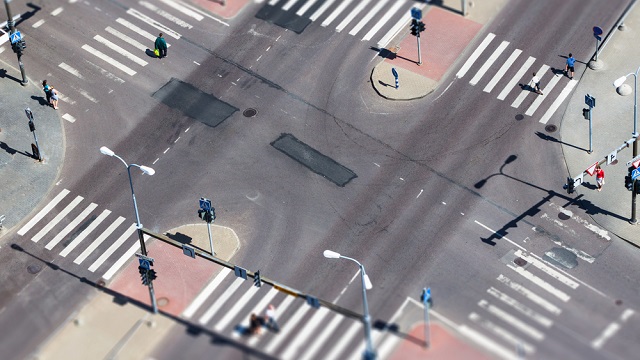
when an electrical failure incapacitated traffic lights, the result was improved flow rather than congestion. As an experiment, he replaced the busiest traffic-light intersection in Drachten, handling 22,000 cars a day, with a traffic circle, an extended cycle path, and a pedestrian area. In the two years following . . . the number of accidents plummeted to only two, compared with thirty-six crashes in the four years prior. Traffic moves more briskly through the intersection when all drivers know they must be alert and use their common sense, while backups and the road rage associated with them have virtually disappeared. Monderman likened it to skaters in a crowded ice rink who manage successfully to tailor their movements to those of the other skaters. He also believed that an excess of signage led drivers to take their eyes off the road, and actually contributed to making junctions less safe.
(The Drachten intersection.)
Monderman’s philosophy, popularly called “shared space,” as coined by the English urban designer Ben Hamilton-Baillie, has been implemented in cities around the world. It seems to be working. Instead of causing chaos and collisions, the “red-light-removal schemes” almost always result in improved sociability and traffic flow, and fewer accidents in some cases. A study of center-line removal in Wiltshire, U.K., for instance, found that people drove more safely without the markings and the number of accidents decreased by 35 percent.
The key to his philosophy isn’t mere anarchy, but rather an understanding of the behaviors that result from the implied context of a road within its community.

(Monderman standing next to a traffic circle, via Jerry Michalski)
In the mid 1980s, Monderman, then a regional safety inspector, was sent to the small village of Oudehaske to see what could be done about vehicle speeds – weeks earlier a car had fatally struck two children. While conventional options at the time might have included speed bumps or more signage – both known in the industry as “traffic calming” – Monderman ultimately suggested making Oudehaske more “village-like.”
It was an intervention based on aesthetics, as Tom Vanderbilt writes:
“The interventions were subtle. Signs were removed, curbs torn out, and the asphalt replaced with red paving brick, with two gray “gutters” on either side that were slightly curved but usable by cars. As Monderman noted, the road looked only five meters wide, “but had all the possibilities of six.” The results were striking. Without bumps or flashing warning signs, drivers slowed, so much so that Monderman’s radar gun couldn’t even register their speeds. Rather than clarity and segregation, he had created confusion and ambiguity. Unsure of what space belonged to them, drivers became more accommodating. Rather than give drivers a simple behavioral mandate—say, a speed limit sign or a speed bump—he had, through the new road design, subtly suggested the proper course of action.”
“Shared space” has been, in effect, the default traffic mode in parts of the world where standardized traffic systems were never implemented. Here’s an example from Ho Chi Minh City, Vietnam:
Ethiopia…
…and Delhi, India.
As Hamilton-Baillie writes in an article for The Guardian:
“The thing about the signals being removed is that the driver is no longer being given a green light. And what the green light does is to communicate to the driver that you’ve got priority here – you should be going ahead and you should be angry if grandma is on the road in front of you.”
Still, the road-death rate per motor vehicle is significantly higher than the U.K. and U.S. in all three of these countries. This, Hamilton-Baillie argues, can be attributed to the relatively recent motorization of the countries, not the danger of Monderman’s ideas.
The extent to which urban planners plan to use shared space in the U.S. remains unclear. Some cities have already begun to experiment with it, like Seattle’s Bell Park. Implementing these ideas on a larger scale could require a fundamental shift in the way we think about cities, and the role individuals play within them.
“Essentially, what it means is a transfer of power and responsibility from the state to the individual and the community,” Monderman said.
—
For those wanting to follow in Monderman’s footsteps, consider this following guide, courtesy of Wired:
HOW TO BUILD A BETTER INTERSECTION: CHAOS = COOPERATION
1. Remove signs: The architecture of the road – not signs and signals – dictates traffic flow.
2. Install art: The height of the fountain indicates how congested the intersection is.
3. Share the spotlight: Lights illuminate not only the roadbed, but also the pedestrian areas.
4. Do it in the road: Cafes extend to the edge of the street, further emphasizing the idea of shared space.
5. See eye to eye: Right-of-way is negotiated by human interaction, rather than commonly ignored signs.
6. Eliminate curbs: Instead of a raised curb, sidewalks are denoted by texture and color.
