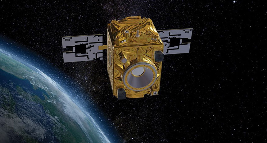
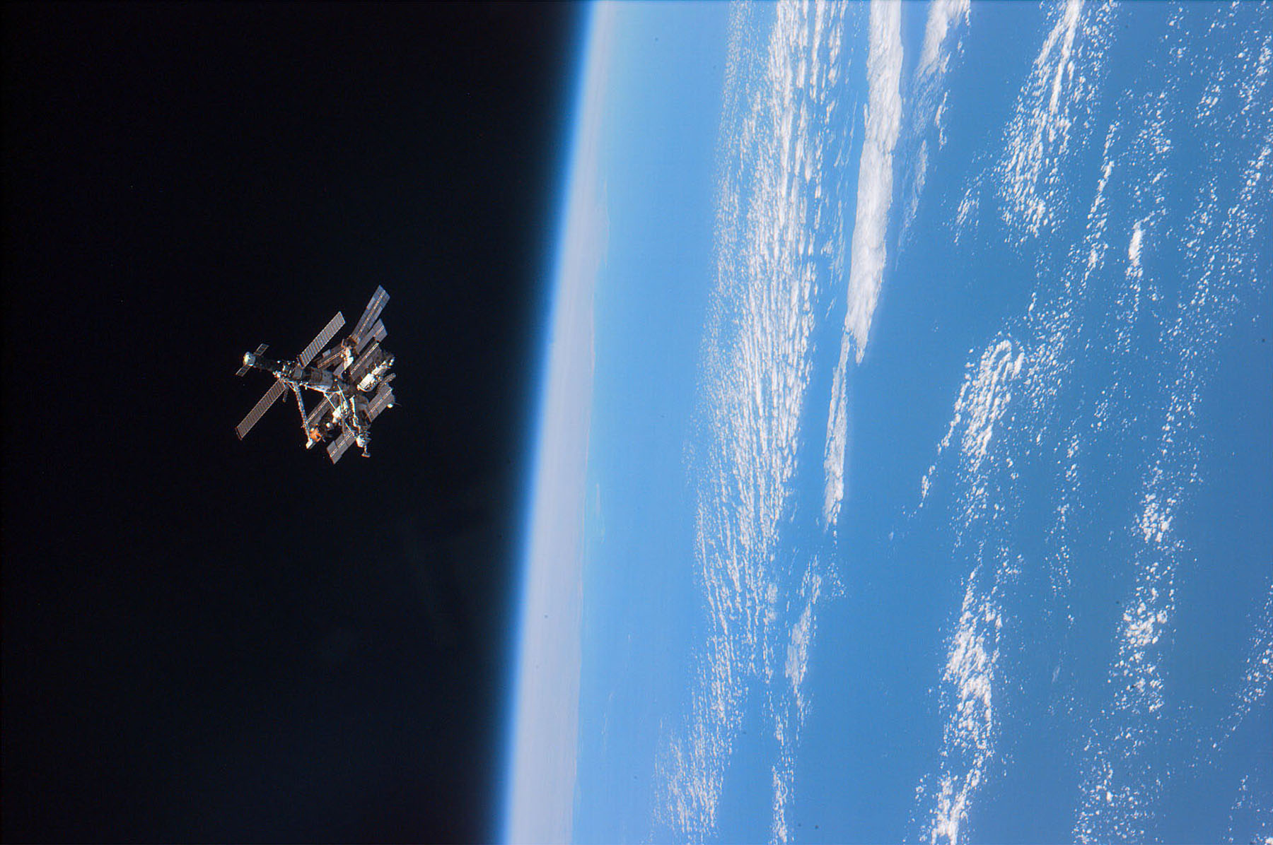
<p class="p1">What does wealth look like… from space? This is the question researchers from Carnegie Mellon University wanted to answer when they built Penny. Penny is an AI built on machine learning using neural networks. Through an <a href="http://penny.digitalglobe.com/" target="_blank">interactive website</a> Penny lets you browse satellite images of New York City and St. Louis and see how different kinds of features make an area look wealthy or poor to the AI. </p> <p class="p3"><span class="s1">To build Penny, the researchers used household income data from the U.S. Census Bureau, mapped it, and overlaid it with satellite imagery. They color-coded areas to represent different income brackets. In the picture below, </span><span class="s2">green represents areas with the highest quartile of annual income (averaging $71,876 and above), red represents areas with the lowest annual income (averaging $34,176 and below) and orange and yellow represent the middle levels of income (averaging between $34,176 and $49,904, and $49,904 and $71,876, respectively).</span></p> <p class="p2"><img type="lazy-image" data-runner-src="https://assets.rebelmouse.io/eyJhbGciOiJIUzI1NiIsInR5cCI6IkpXVCJ9.eyJpbWFnZSI6Imh0dHBzOi8vYXNzZXRzLnJibC5tcy8xODMzOTkwNy9vcmlnaW4uanBnIiwiZXhwaXJlc19hdCI6MTY0MTk5OTgyOH0.5BglqrfdwavejR-Gw3UdvQOMYeR8FOY1ytXUsjiay50/img.jpg?width=980" id="32d6a" class="rm-shortcode" data-rm-shortcode-id="6e9ffc85202253b3f9e9d67bd07d5568" data-rm-shortcode-name="rebelmouse-image"><br><em><span style="color: #737d83; font-size: 13px;">Census data mapped and color coded / penny.digitalglobe.com</span></em></p> <p><span class="s1">The two layers of data — the color-coded map and the satellite images — were then given to a neural network which was trained to predict the average household incomes in any area in the city. </span><span class="s2">The AI looks for patterns in the imagery that correlate with census data. Over time, the neural network learns what patterns best predict high and low income levels. The model can then be used to predict income levels for a place, just by looking at a satellite image. </span></p> <p class="p3"><span class="s2">So, what do wealth and poverty look like from space? Some of the correlations that Penny found were that lower income areas, for example, tend to </span><span class="s3">have baseball diamonds, parking lots, and large similarly shaped buildings (such as housing projects). In middle income areas there were more single-family homes and apartment buildings. Higher income areas tend to have greener spaces, tall shiny buildings, and single-family homes with lush backyards.</span></p> <p class="p3"><span class="s3"><img type="lazy-image" data-runner-src="https://assets.rebelmouse.io/eyJhbGciOiJIUzI1NiIsInR5cCI6IkpXVCJ9.eyJpbWFnZSI6Imh0dHBzOi8vYXNzZXRzLnJibC5tcy8xODMzOTkwOC9vcmlnaW4uanBnIiwiZXhwaXJlc19hdCI6MTY2ODA3OTAxM30.a8LbCWprWvhQ1j3XhXwU1Xp1PPevQfo0xW8RhGgDmoQ/img.jpg?width=980" id="41dc0" class="rm-shortcode" data-rm-shortcode-id="e7c621f4a9e9c019f6baba9387b00536" data-rm-shortcode-name="rebelmouse-image"><br><em><span style="color: #737d83; font-size: 13px;">Patterns of low-income areas / </span><span style="color: #737d83; font-size: 13px;">penny.digitalglobe.com</span></em></span></p> <p class="p3"><img type="lazy-image" data-runner-src="https://assets.rebelmouse.io/eyJhbGciOiJIUzI1NiIsInR5cCI6IkpXVCJ9.eyJpbWFnZSI6Imh0dHBzOi8vYXNzZXRzLnJibC5tcy8xODMzOTkwOS9vcmlnaW4uanBnIiwiZXhwaXJlc19hdCI6MTY0Njg5NzYxMH0.yL_jU3iUn6-QbCCVnyoueF6amdvwqK4eza9dwQdHqpU/img.jpg?width=980" id="ab62f" class="rm-shortcode" data-rm-shortcode-id="7fc2593c35d1469a364baeec130d7433" data-rm-shortcode-name="rebelmouse-image"><br><em><span style="color: #737d83; font-size: 13px;">Patterns of high-income areas / </span><span style="color: #737d83; font-size: 13px;">penny.digitalglobe.com</span></em></p> <p><span class="s4">There has also been other research concerned with estimating wealth from satellite data. Scientists from the </span><span class="s5">University of Konstanz <a href="https://www.sciencedaily.com/releases/2017/04/170425102808.htm" target="_blank">found that</a> </span><span class="s2">it is possible to make inferences about the wealth of a region, as well as individual settlements, by measuring the amount of nighttime illumination.</span></p> <p class="p6"><span class="s7">An interesting feature of Penny is that the tool </span><span class="s8">lets you play around with the landscape of the city, by adding and removing urban features like buildings, parks, and freeways. After making the changes, Penny makes a new estimate on the income bracket of the block.</span></p> <p class="p8"><img type="lazy-image" data-runner-src="https://assets.rebelmouse.io/eyJhbGciOiJIUzI1NiIsInR5cCI6IkpXVCJ9.eyJpbWFnZSI6Imh0dHBzOi8vYXNzZXRzLnJibC5tcy8xODMzOTkxMC9vcmlnaW4ucG5nIiwiZXhwaXJlc19hdCI6MTY3NTExNTY4N30._agbQHhanaIlG4Is9pCfnrIdbO9GP5YwpLpNDmmHgkY/img.png?width=980" id="95e82" class="rm-shortcode" data-rm-shortcode-id="5ed4707b97c7d73f12a2e155cb36c3e1" data-rm-shortcode-name="rebelmouse-image"><br><em><span style="color: #737d83; font-size: 13px;">Penny's interface allows the users to drag and drop urban features on the map. / </span><span style="color: #737d83; font-size: 13px;">penny.digitalglobe.com</span></em></p> <p class="p10"><span class="s2">The researchers are hoping to spark a conversation about artificial intelligence, machine learning, cities, infrastructure, satellite imagery, and big data. The way machines understand these things has increasingly important implications for how we understand patterns of urbanization, wealth, and the human condition.</span></p>
Keep reading
Show less