This amazing map of Lake Michigan was made entirely by typewriter
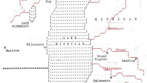
Major Rivers Draining into Lake Michigan, by Daniel P. Huffman
- An old Royal Safari II typewriter was used to make this effective and attractive map.
- Although they’re relatively easy to make, typewriter maps are rare.
- The mapmaker has received numerous commissions; will typewritten maps be the cartographic hype of 2019?
To anyone familiar with North America’s geography, the shape on this map is instantly recognisable. This lookalike of Sweden (1), similarly drooping, is Lake Michigan. What sets this map apart, though, is not its subject, but its presentation.
This lo-fi map somewhat recalls the stock cartography used by newspapers a couple of decades ago, perhaps not just because it shares their minimalist aesthetic; maybe also because it was produced using a technology that became obsolete around the mid-1980s – the typewriter.

Lo-fi method, cool map
Daniel P. Huffman made this on his dad’s Royal Safari II. “I can’t remember why my mind turned toward the thought of the typewriter in my basement,” he writes, “but I always wanted a good reason to use it, so I fell back to my default excuse: maps.”
So, how do you make a typewritten map? Mr Huffman’s instructions are quite simple:
- draw out a grid and plan what characters go in what spaces; and
- spend a bunch of time messing around on a typewriter.
In this case, lines of dots (…) represent water, while asterisks (***) form state borders. The @ sign has been sprung from its prison inside the email address (2) and now marks the location of cities, typed out in the Safari’s elegant Prestige Elite font (3).
City and river names are in lower case, state and lake names are in upper case. The rivers, made up of straight and slanted lines, and their names are in red (yes, kids: typewriters could do two colours). Where it doesn’t slant, the water’s edge is rendered by exclamation marks – adding emphasis to the name of Beaver! Island! in the northern part of the lake.
What makes this map so appealing is that its cartographic effectiveness is achieved, and perhaps even enhanced, by the limited means offered by the typewriter – never intended for something as graphic as mapmaking. As Mr. Huffman points out on his blog, which showcases some of his other self-made maps, “constraints can be freeing.”
That statement is a bit reminiscent, if you will allow the conceit, of Dogme 95, the filmmaking movement started by Danish directors Lars von Trier and Thomas Vinterberg: a radical rejection of special effects and high technology in order to focus on old-fashioned storytelling.
This resolutely spare map took a couple of hours to plan and trace in Illustrator, and then about five hours from testing and false starts to finished product. Since Mr. Huffman, a cartographer and Director of Operations at the North American Cartographic Information Society (NACIS), tweeted the map, he’s received numerous requests to type up similar maps.
Given the visual appeal of this typewritten map of Lake Michigan and its fairly easy (if somewhat time-consuming) method of contrivance, it’s strange that there isn’t a bunch of such maps out there already.
There are a just few hints of typewritten cartography findable online. This entry on Making Maps gives some examples of using typewriter characters for legend-making. An earlier entry on this blog discussed the Chaffinch Map of Scotland, a typewritten poem (#329).
But perhaps the Dogme movement of mapmaking was just waiting for its prototype to take off. If you find (or make) any nice ones, I’ll show them here.
Find the Lake Michigan map here on Mr Huffman’s blog, Something About Maps. Many thanks to Martin Foldager for pointing it out
Strange Maps #950
Got a strange map? Let me know at [email protected].
(1) Lake Michigan and Sweden are but two of many ‘map twins’ around the world. (#675)
(2) “What’s an email address?” the typewriter wants to know.(3) A slab serif monospaced typeface designed in 1953 for IBM by Howard Kettler.
