A geography column on history and society.
All maps lie. They can’t help it: they’re two-dimensional representations of a three-dimensional object — the Earth.
The bigger the area shown on the map, the bigger the lie. The most egregious example is a world map in the classic Mercator projection. It shows Africa and Greenland as roughly the same size, but the mother continent is fourteen times bigger than the Arctic island.
Many cartographers have attempted to solve the problem, the Peters projection being a particularly infamous example. But it’s a bit like trying to square a circle – meaning that it’s impossible: there will always be some distortion.
Or maybe not.
This year, three scientists produced a map of the world they’re calling the Equal Earth Projection, which does accurately reflect the size of all the continents.

The Equal Earth Projection, found here at The Map Room.
The Equal Earth map is an update of the Robinson projection, which was developed in 1963 specifically to reflect the true size of the earth’s land masses. The National Geographic Society adopted Robinson for its world maps in 1988 (replacing the Van der Grinten projection), but abandoned it already in 1998 for the Winkel triple projection, as this did a better job of reducing the distortion of land masses near the poles.

While the Robinson and Equal Earth projections have a similar shape, the latter is slightly wider than the former (1:2.05 vs. 1:1.97). In technical terms, the Equal Earth map is an equal-area pseudocylindrical projection, which retains the relative size of areas.
Equal Earth, developed by Bojan Šavrič, Tom Patterson and Bernhard Jenny, aims to do a better job than Robinson at showing the true size and shape of the Earth’s land masses – while keeping in mind that maps have to have an aesthetic appeal as well. Who would want our planet’s continents to look ugly?

Four world maps, each showing the world in a very different projection. Map found here at the Daily Mail.
Some vindictive cartophiles would answer: Peters, that’s who! The developers of Equal Earth seem to agree:
We created (this projection) to provide a visually pleasing alternative to the Gall-Peters projection, which some schools and organizations have adopted out of concern for fairness.
The Equal Earth map projection has had some success since its first publication earlier this year in the International Journal of Geographical Information Science: NASA’s Goddard Institute for Space Studies used it for a world map of the global mean temperature anomaly for July 2018.
Fairness, however, also requires observers to point out that while Equal Earth may be (subjectively) prettier or (objectively) more accurate than Robinson, it can by its very nature not do what it seems to promise. And what world maps have never been able to do (unless they are globes): that is, to reflect the relative positions and sizes of the world’s land masses with absolute accuracy.
Because all maps lie. And that’s the truth.
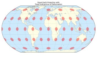
constrast to Robinson, which enlarges areas near the poles), it stretches objects near the equator.
Strange Maps #936
Got a strange map? Let me know at [email protected].

The Power of Play