Chernoff faces: The data-rich maps that stare back at you

- Humans can’t quickly process complex datasets, with one exception: the human face.
- Putting those two facts together, Herman Chernoff proposed using faces to represent data.
- The result? Mixed at best. Chernoff faces are still difficult to read, and they’re often eerie to boot.
We humans are terrible at quickly analyzing complex datasets. There is one notable exception: We have the innate ability to immediately “read” a face. We can recognize them (“Is this my friend’s face?”) and evaluate them (“Is this a friendly face?”). We’re so good at this that we even see faces where none exist — a phenomenon called pareidolia. (Think of the Face on Mars, or Jesus on a tortilla.)
In 1973, Herman Chernoff had a brilliant brainwave: If those two things are true, then why not use faces to represent multidimensional datasets? In an article published that year in the Journal of the American Statistical Association, the Stanford professor suggested that even a simplified drawing of a face could contain up to 18 different data dimensions, merely by varying the shape, size, and position of the eyes, the hair, the nose, the mouth, and so on.
The thinking person’s smiley face
These so-called “Chernoff faces” could have become a staple of data-rich maps and infographics — the thinking person’s smiley face. So why didn’t they? Because as great as they may sound in theory, there are some problems with the idea’s actual execution.
Here’s an early and oft-cited example of Chernoff’s innovation in action: a map of Los Angeles in 1971, dotted with little Chernoff faces, each simultaneously expressing four data dimensions.
- The level of affluence is denoted by the shape of the head: round means high, oval is medium, and the saddle-shaped faces refer to poor neighborhoods.
- The shape of the mouth indicates employment level: smiling means low unemployment, pouting stands for high unemployment, and a flat line stands for somewhere between.
- “Urban stresses” (related to various health, crime, and transportation factors) are reflected by the shape of the eyes and eyebrows: black dots with raised eyebrows mean few stresses, flat eyebrows over small white eyes is for medium, and downturned eyebrows with larger white eyes indicate lots of local issues with those three factors.
- The color of the face refers to the share of residents in a certain area who are white: yellow for high, gray for medium, brown for low.
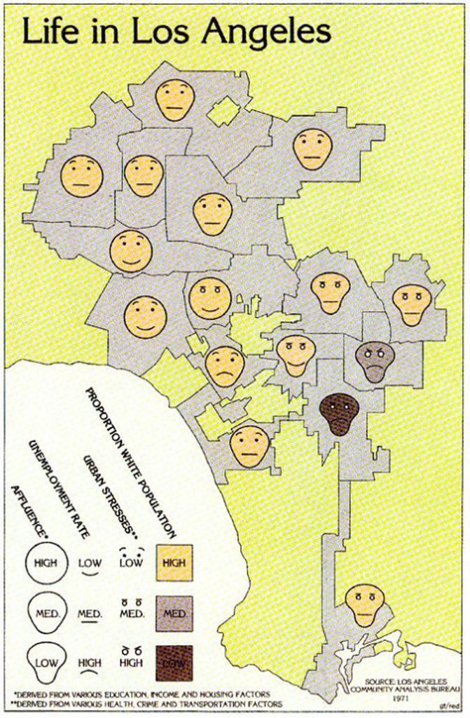
The idea is, of course, that the map shows correspondences between these four data dimensions. And indeed, we see that:
- There is both an ethnic and geographic dimension to affluence, with the four richest neighborhoods all located in west or northwest LA, and all with high proportions of white residents. The poorest five areas are in east or southeast LA, including the only two with a medium to low proportion of white residents.
- Unemployment rates are high in the two least white areas and in only one area with a high proportion of white residents. It is lowest in two of the four richest areas, but also in one of the poorest (but mainly white) ones.
- Urban stresses are lowest in the north and west (and only really bad in one of the two least white neighborhoods).
Face recognition is holistic – and hierarchical
The map presents a nuanced picture of how and where these four factors occur. However, it’s not the Chernoff faces per se that tell us all this. While analyzing the map, our eyes kept drifting back to the legend to make sense of it. Apart from the rather unsubtle link between the map’s color scheme and the ethnic makeup of early 1970s LA, there is very little that the shapes of faces, mouths, and eyebrows instinctively tell us about affluence, employment, or whether a neighborhood is healthy, safe and well-connected.
This disconnect between the intent of Chernoff faces and their effect (or lack thereof) can be explained by how face perception actually works: not by adding up eyes and noses and chins until we have a “hit,” but holistically. We recognize a face as such before we notice its various components. Yet in Chernoff faces, it is precisely those components that take precedence over the whole.
Secondly, and paradoxically, face perception is not only holistic but also hierarchical: some features (eyes and mouth, to name two prominent ones) are more important than others (overall shape, for example). This implies that the data points represented by those more prominent features on Chernoff faces will be perceived more easily, or as more important, than others.
Perhaps the biggest problem with Chernoff faces lies not in how they work (or don’t work) but in their subjective impact on the viewer. Simply put, they’re eerie. Uncanny. Distressing. Hand-crafted to haunt your nightmares.
No wonder: These are faces not doing what faces should. We’re instinctively familiar with the arsenal of nonverbal facial communication. Winks, smiles, and frowns are common rhetorical devices that support (or replace) spoken words. To see them used for other purposes turns them into something sinister, precisely because those faces are so adjacent to the familiar.
Is our judgment too harsh? Let’s give Chernoff faces another chance. Here’s a more recent example, from 2017, dubbed The Emoji States of America. The recognizable contour of the map of the U.S. is made up of 51 emojis, one per state plus one for DC, each expressing no less than six data dimensions:
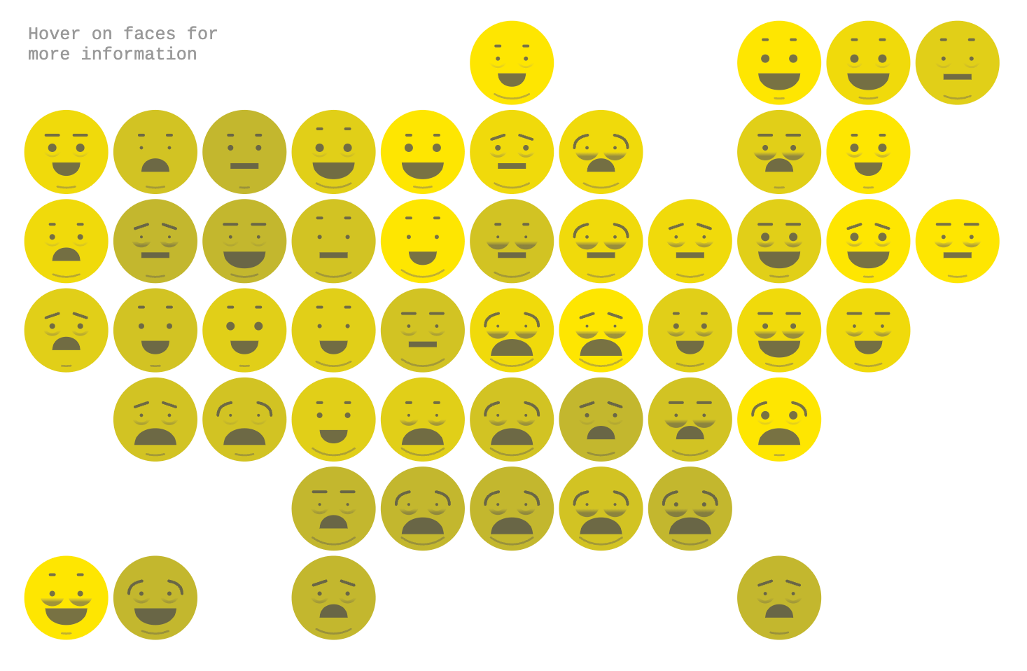
- Face color tells us something about the uninsured rate in that state, from 2.8% in Massachusetts (light) to 17.1% in Texas (dark).
- The taller and smaller the eyebrows, the lower the unemployment rate. Lower and curved is the worst. Extreme examples: neighbors Colorado (2.8%) and New Mexico (6.8%).
- Eye size relates to educational level, more precisely to the share of adults with a bachelor’s degree: lowest in West Virginia (11.7%) and highest in Colorado (24.8%).
- The size of the bags under the eyes tells us how large the share of adults is that report at least seven hours of sleep at night. South Dakota tops that list (71.6%, no bags), and Hawaii comes in last (56.1%, massive bags).
- The mouth speaks of poverty. Mississippi, with its large, downturned mouth, has the highest share (22%); New Hampshire, with its big smile, has the lowest (8.2%).
- The bigger the chin, the higher the obesity rate, and vice versa. The rate is lowest in Colorado (20.2%, no chin), and highest in Louisiana (36.2%, huge chin).
First off, the good news: no more skull-stretching. All faces are nice and round, which means none of these Chernoff faces look like runaways from “The Scream.” This group picture could be an audition for South Park, which, on balance, is less distressing than Edvard Munch’s painting.
Map reading is a voyeuristic activity
But again, the Chernoffian paradigm shows its limitations. The range of facial feature changes is either too narrow or too inscrutable to capture the breadth of the data. Take poverty, covered by only five mouth positions. The large and smaller smile, nearly indistinguishable from each other, cover 20 states between them, and a nearly five percentage point range.
The faces are mere placeholders for the actual data, more usefully revealed by hovering over each state.
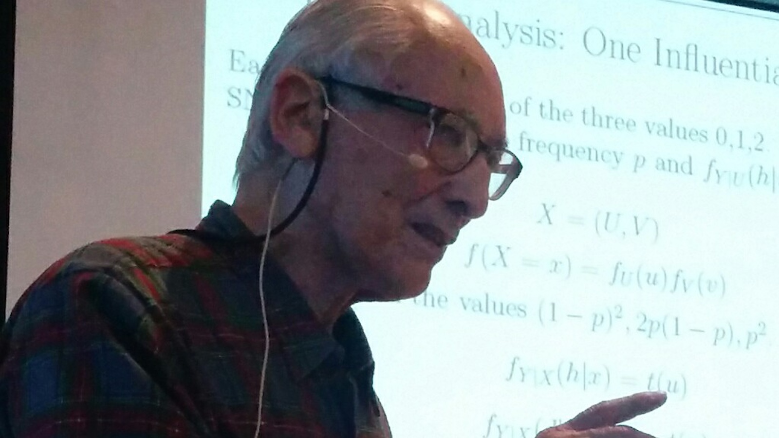
On July 1, 2024, Chernoff faces turned 50 and their inventor celebrated turning 101. Over the many decades of his academic career, he has made various other contributions to statistics and mathematics, including Chernoff bounds and Chernoff’s distribution (both in probability theory).
Which is good, because Chernoff faces are a great idea with limited applicability. As a clever, innovative tool for data presentation, they definitively deserve a mention — and by all means, graphic designers: have a go at it. The result is usually terrible, though, because of the complexity inherent in facial recognition. Not only does that complexity make it difficult for us to interpret the data embedded in those faces, but it leaves us eye to eye with a gang of weird, unsettling mugs. Map-reading is a solitary, almost voyeuristic activity. The last thing you want is the map staring back at you.
Strange Maps #1247
Got a strange map? Let me know at [email protected].
Follow Strange Maps on X and Facebook.

