Yes, websites really are starting to look more similar
David McNew/Getty Images
Over the past few years, articles and blog posts have started to ask some version of the same question: “Why are all websites starting to look the same?“
These posts usually point out some common design elements, from large images with superimposed text, to hamburger menus, which are those three horizontal lines that, when clicked, reveal a list of page options to choose from.
My colleagues Bardia Doosti, David Crandall, Norman Su and I were studying the history of the web when we started to notice these posts cropping up. None of the authors had done any sort of empirical study, though. It was more of a hunch they had.
We decided to investigate the claim to see if there were any truth to the notion that websites are starting to look the same and, if so, explore why this has been happening. So we ran a series of data mining studies that scrutinized nearly 200,000 images across 10,000 websites.
How do you even measure similarity?
It’s virtually impossible to study the entire internet; there are over a billion websites, with many times as many webpages. Since there’s no list of them all to choose from, performing a random sample of the internet is off the table. Even if it were possible, most people only see a tiny fraction of those websites regularly, so a random sample may not even capture the internet that most people experience.
We ended up using the websites of the Russell 1000, the top U.S. businesses by market capitalization, which we hoped would be representative of trends in mainstream, corporate web design. We also studied two other sets of sites, one with Alexa’s 500 most trafficked sites, and another with sites nominated for Webby Awards.
Because we were interested in the visual elements of these websites, as data, we used images of their web pages from the Internet Archive, which regularly preserves websites. And since we wanted to gather quantitative data comparing millions of website pairs, we needed to automate the analysis process.
To do that, we had to settle on a definition of “similarity” that we could measure automatically. We investigated both specific attributes like color and layout, as well as attributes learned automatically from data using artificial intelligence.
For the color and layout attributes, we measured how many pixel-by-pixel edits we would have to make to transform the color scheme or page structure of one website into another. For the AI-generated attributes, we trained a machine learning model to classify images based on which website they came from and measure the attributes the model learned. Our previous work indicates that this does a reasonably good job at measuring stylistic similarity, but it’s very difficult for humans to understand what attributes the model focused on.
How has the internet changed?
We found that across all three metrics – color, layout and AI-generated attributes – the average differences between websites peaked between 2008 and 2010 and then decreased between 2010 and 2016. Layout differences decreased the most, declining over 30% in that time frame.
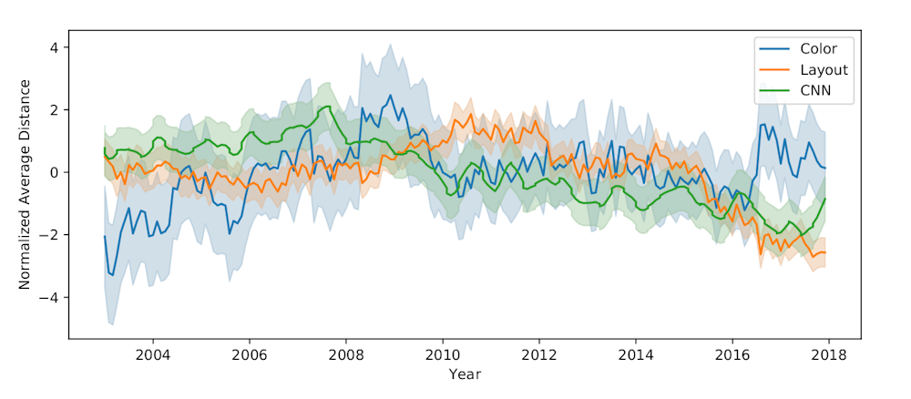
The graph shows website similarity of companies in the Russell 1000. Lower values mean that the sites studied were more similar, on average. (Sam Goree, Author provided)
These findings confirm the suspicions of web design bloggers that websites are becoming more similar. After showing this trend, we wanted to study our data to see what kinds of specific changes were causing it.
You might think that these sites are simply copying each other’s code, but code similarity has actually significantly decreased over time. However, the use of software libraries has increased a lot.
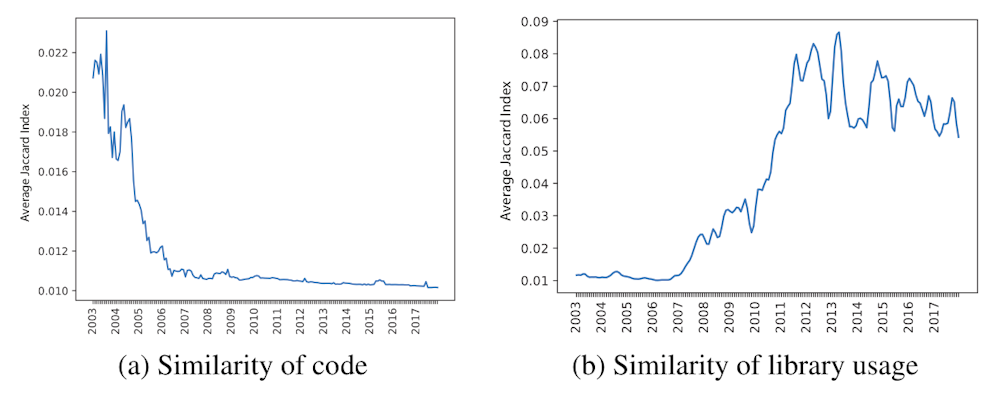
The graph on the left shows a decline in code similarity among Russell 1000 websites, while the graph on the right indicates an increase in library overlap. (Sam Goree, Author provided)
Libraries feature collections of generic code for common tasks, like resizing a page for mobile devices or making a hamburger menu slide in and out. We looked at which sites had lots of libraries in common and how similar they looked. Sites built with certain libraries – Bootstrap, FontAwesome and JQuery UI – tended to look much more similar to each other. This could be because these libraries control page layout and have commonly used default options. Sites that used other libraries, like SWFObject and JQuery Tools, tended look much different, and that might be due to that fact that those libraries allow for more complex, customized pages.
The changes of websites from 2005 to 2016 illustrate what’s happening.
Sites with average similarity scores in 2005 tended to look less similar than those with average similarity scores in 2016.
For example, in 2005, Webshots.com and Yum.com were considered relatively similar, but had somewhat different color schemes and very different layouts. While they both mostly use white, blue and black, the site on the right has a blue background.
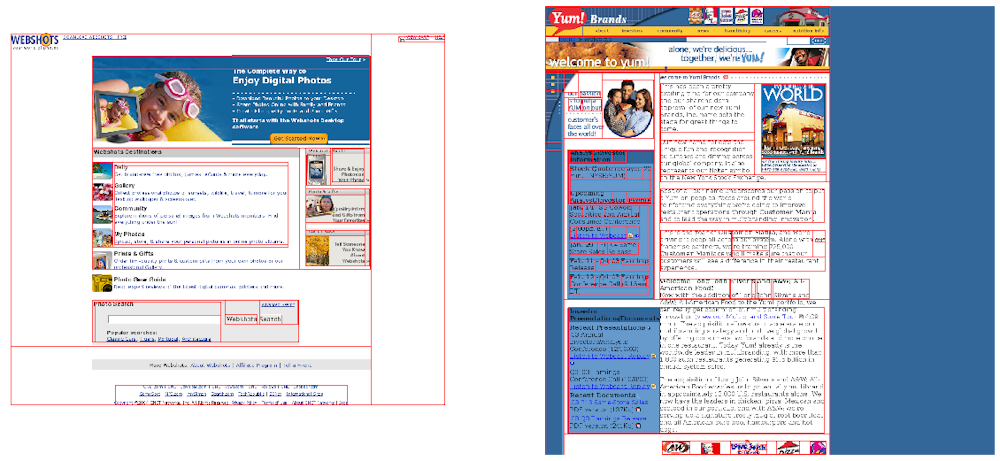
Screenshots from 2006 of Webshots.com and Yum.com. (Sam Goree, Author provided
Two 2016 sites, Xfinity.com and Gilt.com, on the other hand, are even more similar: They both have a menu bar on the top and are primarily white and black with images. These pages have much less text and make better use of the higher resolution monitors that exist now.
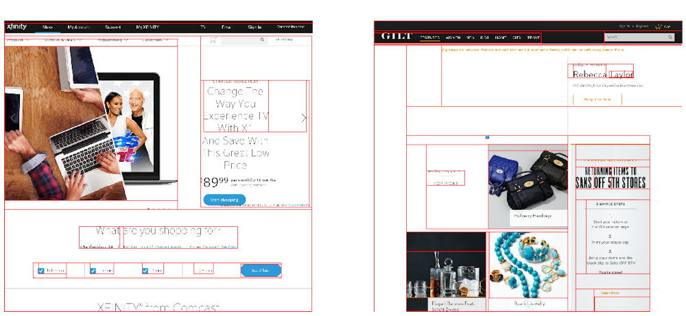
Screenshots from 2016 of Xfinity.com and Gilt.com. (Sam Goree)
Is conformity healthy?
What should be made of this creeping conformity?
On the one hand, adhering to trends is totally normal in other realms of design, like fashion or architecture. And if designs are becoming more similar because they’re using the same libraries, that means they’re likely becoming more accessible to the visually impaired, since popular libraries are generally better at conforming to accessibility standards than individual developers. They’re also more user-friendly, since new visitors won’t have to spend as much time learning how to navigate the site’s pages.
On the other hand, the internet is a shared cultural artifact, and its distributed, decentralized nature is what makes it unique. As home pages and fully customizable platforms like NeoPets and MySpace fade into memory, web design may lose much of its power as a form of creative expression. The Mozilla Foundation has argued that consolidation is bad for the “health” of the internet, and the aesthetics of the web could be seen as one element of its well-being.
And if sites are looking more similar because many people are using the same libraries, the large tech companies who maintain those libraries may be gaining a disproportionate power over the visual aesthetics of the internet. While publishing libraries that anyone can use is likely a net benefit for the web over keeping code secret, big tech companies’ design principles are not necessarily right for every site.
This outsize power is part a larger story of consolidation in the tech industry – one that certainly could be a cause for concern. We believe aesthetic consolidation should be critically examined as well.
Bardia Doosti, David Crandall and Norman Su contributed to this article.
Sam Goree, PhD Student in Informatics, Indiana University
This article is republished from The Conversation under a Creative Commons license. Read the original article.