Skip to content
Strange Maps

Pop by Lat and Pop by Long
The average human lives at 24 degrees north or south from the equator 
Sign up for the Smarter Faster newsletter
A weekly newsletter featuring the biggest ideas from the smartest people

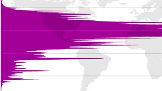
Did you know that almost 90% of the world’s population lives in the northern hemisphere? And that half of all Earthlings [1] reside north of 27°N? Or that the average human lives at 24 degrees from the equator – either to its north or south? Bill Rankin did. Or at least he found out, while producing this fascinating diptych of world maps, plotting population distribution on axes of longitude and latitude. 


These maps have been floating around the internet for a few years now [2]. Like barnacled ships and whales at sea, they show their age by the virtual symbionts with which they are encrusted.

Or in this case, some rather opinionated comments. 

Some commenters find fault with these maps: Exactly what information do they display? It is not population density, so much as population distribution that is shown. From either of these infographics alone, the precise locations of the densely inhabited centres of the world are not readily deducable.

But I side with those who fall for the abstract beauty of these graphs. Divorced from direct geographical (let alone historical and sociological) context, and further divided by longitude and latitude [3], they have an intriguing quality, inviting us to decode them all over again.

Let’s take the Pop by Lat graph, which shows us the distribution of the world’s population per degree of latitude (i.e. north to south).

  • Population-wise, the Earth is indeed visibly, massively tilted towards the north. How much less crowded would the planet be if the northern hemisphere were as populous as the southern one? If the above-mentioned north-south distribution is correct (only 10% living in the South), the grand total would be: 1.4 billion.
  • The only exception to the South’s underpopulation seems to be a massive spike just below the equator. Which cities lie on this latitude? Kinshasa, Jakarta, …
  • Other spikes further south must correspond with Sao Paulo, and with Buenos Aires and the Australian megalopolises [4]
  • The general trend of the graph is to taper out towards the south; at its very end, it does so in a shape remarkably similar to the last piece of (inhabited) land, Patagonia.
  • Considering that habitable zones in theory should be equidistant from the equator, it’s even more shocking how much more people live north of that line. Granted, there is more land. But still. 
  • The European latitudes seem remarkably unpopulated, relative to the ones just to its south. 
  • It’s a fair guess, though, that those spikes are not caused by Africa’s northern shores (Cairo, and by extension Egypt excepted), but by the big population centres on the Indian subcontinent and in China. And by the combined weight of the US and Mexican population.
  • The ‘sweet spot’ where population thrives seems to be between approximately 20°N and 40°N. 
  • In spite of its huge imbalance, the Pop by Lat map still presents a unified image: a giant, if unevenly sloping mountain. The Pop by Long map shows a much less more diverse set of data. Perhaps not surprising, as the constant of climate is no longer a factor, rather than the accident of continentality (if that’s a word).

    • There are three different ‘mountains’, one for America, the second one for Africa/Europe, the third one for Asia/Oceania.
    • The American mountain is surprisingly small. The entire continent holds less than a billion people, out of a total of over seven billion. Euro-Africa tallies close to 2 billion, Asia-Oceania has around 4 billion inhabitants.
    • As large cities are more often than not coastal, it might be thought of as strange that the outer spikes of the American mountain are lower than the inner ones. But those add up the conurbations of the eastern seabord of North America and those of the western coast of South America, which are approximately on the same latitude.
    • The largest spike of the Euro-African continent again seems to correspond to Cairo. And to Moscow, and Johannesburg. Sort of.
    • Europe, Africa and Asia are part of the same ‘world island’, yet are represented by two different population-statistical mountains. There’s a marked valley around 60°E. Not entirely surprising: there’s no land all the way up to Iran, and then mainly empty lands north through western Siberia.
    • The highest peak on the planet – i.e. the most populated latitude, is not much further east. Is that Mumbai, and some of the Pakistani big cities? 
    • Another valley (though not as deep) divides the Indian peak from a Chinese one – not as high, but more consistently so.
    • The final peak slices through Australia, but represents Tokyo rather than the Ozzie megacities.
    • Many thanks to all who sent in these maps, found here on Bill Rankin’s excellent website, Radical Cartography. Do check out his other work, which is fantastic.

      Strange Maps #563

      Got a strange map? Let me know at[email protected].

      [1] Human Earthlings. Sorry, fellow primates (or mammals, vertebrates, animals, or carbon-based life-forms, depending on your willingness to include). 

      [2] Produced in 2008, based on data from 2000. That is quite a long time ago by now – come June 30th, the first eighth of this new century will have past. That is, if you count the start of the 21st century from 1 January 2000 instead of 2001 (oh, let’s not get into that again). Anyways, with a growth rate of about 80 million a year, we passed the 7-billion mark late last year (the title was granted to Danica May Camacho, born in the Philippines on 31 October 2011). Despite official UN ‘approval’ of Danica’s title, other claimants were born in Kaliningrad, the US, and India.

      [3] Previous commenters have rightly remarked that on my trouble keeping east and west (and left and right) apart. This particular form of orientational dyslexia extends to longitude and latitude. I try to avoid the confusion by remembering that a person can be so-or-so many feet or metres long, and that this height is usually measured when the person is standing up. Longitude thus applies to the lines that are vertical on a standard map.

      [4] or is that megalopoles? Or does that word describe megalomaniacs from Poland?

      Sign up for the Smarter Faster newsletter
      A weekly newsletter featuring the biggest ideas from the smartest people

      Related
      The integration of artificial intelligence into public health could have revolutionary implications for the global south—if only it can get online.

      Up Next