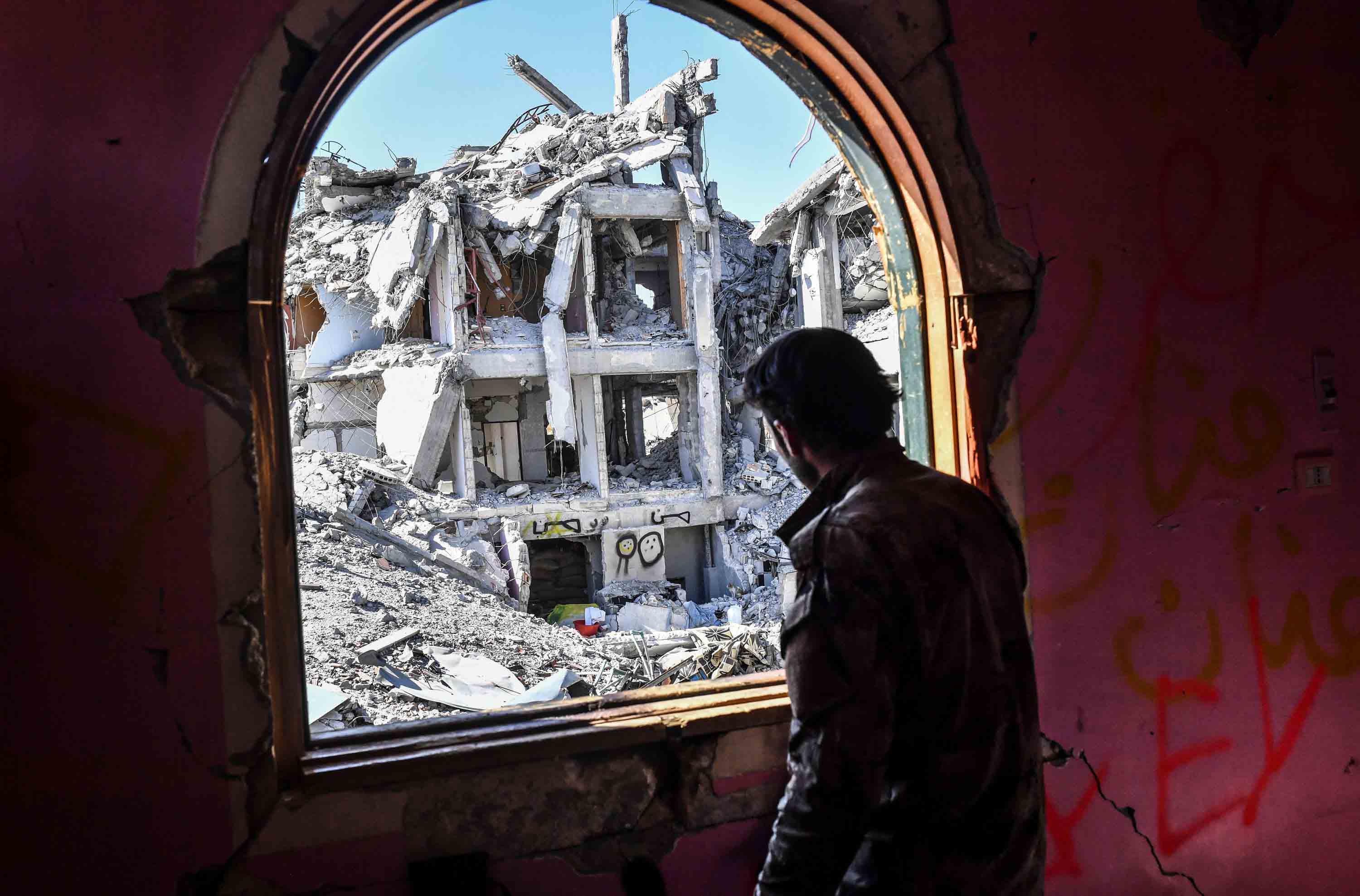
The Syrian civil war no longer dominates the headlines. It has, in fact, almost completely dropped off the radar. Why? It’s too complex and has gone on too long. Fighting has already lasted two years longer than World War II. And with the near-elimination of the (so-called) Islamic State in Iraq and Syria (ISIS), the darkest shade of evil has disappeared from the many-sided conflict.
Meanwhile another civil war, in Yemen, is deteriorating into a man-made famine that has already killed 85,000 children and threatens the lives of up to 14 million people. Plus, even more than usual, there’s plenty of domestic violence and insanity to fill the news bulletins and stretch our attention span.
But the fighting in Syria is not over. At least not yet. This video, recapitulating the movements of the front lines over the past 22 months, does indicate that the Syrian war is moving into an end phase.
Running from 1 January 2017 to 4 November 2018 at the rate of 10 days per second, the video shows what atlases are too slow and sluggish to record: the shifting fronts in Syria’s civil war, and thus the changing fortunes of its various combatants.
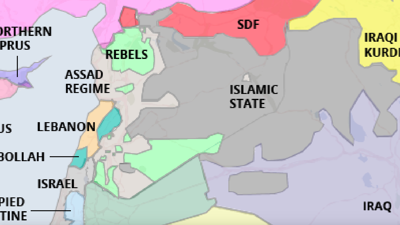
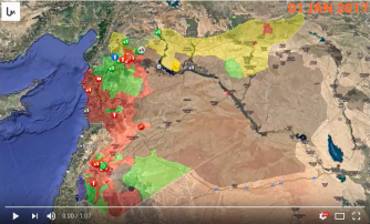
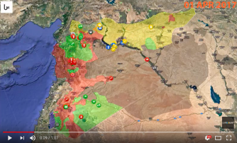
The area colors denote who’s boss, the icons encode acts of war: airstrikes, shootings, road blocks, drones, shellings, armored vehicles (and their color, again, who is responsible). A note on territorial colors:
- Red is for the Syrian regime, led by president Assad (and supported by the Russians and Iranians).
- Green is for the various rebel factions (some supported by the West and/or the Saudis and various other Sunni Arab regimes).
- A duller (less visible) green is for Turkish troops and their local allies, in a zone in Northern Syria.
- Yellow is for the Kurdish forces (receiving some support from the U.S. and other Western powers).
- Grey is for ISIS (the territorial embodiment of the fundamentalist Islamic desire to re-establish a Caliphate).
- Blue is for the Golan Heights, Syrian territory occupied (since 1967) by Israel.
This corresponds largely with icon colors, except that blue here denotes Coalition strikes (and a strange coalition it is: encompassing both Israel and Saudi Arabia, plus U.S. and other NATO forces).
Frenzied iconstorms point to where the war is waged at its most intense. Bits of territory change color as they change hands. Below are seven stills, each three months apart, giving an overview of what’s happening.
At the start of 2017, the Islamic State has not just the color but also the size of an elephant, dwarfing all other players on this map. ISIS holds about half of Syria’s territory, mainly in the centre and east. It even spills over into Iraq, of which it occupies the western third. One major caveat: a large part of the territory held by ISIS is uninhabited desert. Most Syrians live in the coastal zone, disputed between the Syrian government and the ‘official’ rebels.
Another caveat: we just passed IS’s high-water mark. At the start of April, while IS has maintained its territories in Iraq, everyone has been nibbling at its lands in Syria. The Kurds are moving south, towards the Euphrates (that ribbon cutting through the emptiness of eastern Syria). The Syrian government has advanced towards Palmyra, in the empty centre of Syria. And the rebels have eliminated an IS pocket in the south.

By mid-2017, the Kurds have firmed up their presence north of the Euphrates, taking IS capital Raqqa and eliminating a rebel patch on the wrong side of the river. The Syrian regime has expanded its territories in the south and north. All (mainly) at the expense of IS. The rebel areas in the southwest and northwest of the country seem pretty resistant to intrusion by the regime – and unable to expand at its expense.

The main feature is the large intrusion of regime forces into IS territory – but remember, this is mainly empty desert. Equally portentous is the fact that the pockets of rebel territory in the east keep shrinking.

By the new year, Syrian president Assad’s forces have pushed the rebels out of more areas in the south, and the Kurds have pushed down along the east bank of the Euphrates all the way to the Iraqi border. The river is now essentially a border between the Assad regime and the Kurds.

Turkish troops and their allies take the Kurdish-controlled exclave of Afrin, leading to a massive flow of refugees. The Kurds receive no international support: none of their western allies are keen to engage directly with the Turks.

The regime is mopping up resistance, eliminating smaller rebel enclaves while the two main ones retain their size. Kurds reduce the IS pocket on their side of the river, but IS territory expands a little again on the other bank, the regime side.

This is what the map of Syria looked like early November 2018, and the situation hasn’t substantially altered since then. The various parties have consolidated their territories: Kurds and allies generally control everything east of the Euphrates,
Turkish-backed rebels hold a northern patch, adjoining the only major territory still held by the ‘official’ rebels, around the city of Idlib. The rest is controlled by the Assad regime and its allies, save for two patches of desert: a V-shaped zone where IS clings on to life, and a circular area on the border with Jordan.
The borders of these various zones have achieved a measure of fixity over the past months. Barring any major offensive by the various exhausted parties, they may even achieve a degree of permanence.
Perhaps the final map of Syria—final enough to make it into an official atlas — will look something like this: a Kurdish zone in the east, Turkish occupation in the north, with perhaps one or two rebel pockets bordering Turkey and Jordan, and the rest at the command of Assad, undefeated but not entirely victorious.
The video is the result of meticulous record-keeping by Live Universal Awareness Map (Liveuamap), an independent organisation dedicated to factual and impartial map-based reporting.
Liveuamap was founded in 2014 to inform the world about the conflict in Ukraine. Its combination of chronology and cartography, aimed at bringing “clarity and transparency of information” to readers around the world, has proved popular. The site has since expanded to cover a total of more than 30 regions and topics.
That being said, this video is a bit… off. Summarising almost two years of bloody conflict in a one-minute video, complete with generic rock music soundtrack, feels callous to say the least — a ‘gamification’ of large-scale suffering.
But perhaps this too is part of the brutality of war: death and misery turned into a database. And we know our way around Big Data much better than Stalin did. “One death is a tragedy; a million is a statistic”, the Soviet dictator famously said. This video takes it one step further, turning tragedy into animation.
Here is the main site for Liveuamap — still focused on the conflict in Ukraine. Here is their Syria map. Here is a direct link to the animated map shown above.
Strange Maps #949
Got a strange map? Let me know at [email protected].