The New York Times was a failing newspaper before changing its business model to muckraking on Trump. Fox News had to drop its “Fair and Balanced” motto because that’s false advertising. CNN should be renamed the “Know-Nothing Network.” Info Wars‘ listeners are freakin’ certifiable.
If you’ve spent any time on social media, or in the inescapable presence of extended family, you’ve heard someone slagging on the news sources they disagree with. Their main grievance is, of course, how biased and unfair those news sources are when compared to their reliable, fact-based preferences.
While a mere annoyance in that moment, such mindsets have become a widespread social ill. We as a society require a consensus of truth to make sound social decisions, and the news is one of the gatekeepers to the facts required to build those truths.
When news content begins to prioritize opinions and tribalistic tendencies over journalistic integrity, it clouds the entire media landscape with suspicion, deepens political polarization, and allows readers to sidestep unwelcome evidence with alternative narratives.
Such a state is pernicious at the best of times, but in dire times, such as the coronavirus pandemic, the spread of unreliable information can be of fatal concern.
How do we reach a consensus on which sources prioritize facts and which are designed as filter bubbles of confirmation bias and self-righteousness?

Ad Fontes Media‘s answer: research, analysis, and one interactive chart.

The extreme bias and partisanship of the 2016 election led Vanessa Otero to create the first Media Bias Chart.
Creating the Media Bias Chart
In 2016, amid chants of “lock her up!” and reprimands of that “basket of deplorables,” patent attorney Vanessa Otero decided there was a real problem with how we consume news.
“[W]e have a big problem in our news media landscape: too much junk news. Junk news is like junk food, and just like junk food has caused massive health epidemics in our country, junk news is causing a massive polarization epidemic,” Otero writes.
Otero analyzed news sources for bias and reliability, and then charted her results. Her side project became the first version of the Media Bias Chart. In 2018, she founded Ad Fontes Media as a public benefit corporation—naming the company after the Latin phrase meaning, “back to the source.” After a successful crowdfunding campaign, Otero gathered additional analysts to perform deeper dives into news content.
Today, her Media Bias Chart has reached version 5.1. Each score is now backed by an analysis of multiple articles, a weighted average of those raw article scores, and multiple analyst rankings from people across the political spectrum. (The Ad Fontes website hosts an in-depth look at its rubric and methodology here.)
“I want to make news consumers smarter and the news media itself better, and those things are both really lofty, but I think it’s doable,” Otero told Newsy during an interview. “There are folks who, if they had this information, would make better choices as consumers of media first and then citizens.”
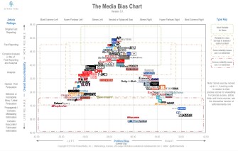
Click on the image to zoom in and get a better view. The Media Bias Chart, version 5.1, charts reliability and bias in about 90 popular news sources.
(Photo: Ad Fontes Media)
Triangulating the news landscape
The chart splays a cavalcade of news media logos across its grid to form a giant triangle. At the top-middle stands the news sources that are balanced and highly reliable. As we slide down the left and right sides, we fall deeper into the realm of partisanship and mudslinging.
The chart’s y-axis measures reliability on a scale of 0–64. According to the Ad Fontes website, a reliability score of 24 or higher is considered acceptable, while a score of 32 or higher represents good reliability.
The chart’s x-axis measures from -42 to 42. Scores closer to zero equate to neutral, balanced views. The more a news organization shows a conservative bent, the more their score pushes right of zero, maxing out at 42. The more a news organization shows a progressive bent, the more their score pushes left of zero, maxing out at -42.
For those fuming that progressive news is measured by “negative” numbers while the right is seen as “positive,” chill! That’s just how x-axes work.

John Daniszewski, vice president and editor at large for standards of the Associated Press, and Kirill Kleymenov interview Russian President Vladimir Putin in 2013.
Who is the fairest (and most balanced) of them all?
According to the Media Bias Chart, the most balanced news sources are Associated Press and Reuters. The Associated Press earned a reliability score of 51.98 and a bias score of -1.06; Reuters earned a reliability score of 51.64 and a bias score of -0.95.
As the website notes, these scores don’t mean that every article is a piece of investigative journalism. But on average, these two sources produce quality, fact-based journalism.
The least reliable sources of news are the National Enquirer and World Truth.TV, the latter of which proudly proclaims itself alternative news based on the “sacred knowledge.” They sport a reliability score of 9.65 and 7.41 respectively, though neither is particularly biased.
The most biased conservative sources were found to be the Gateway Pundit and InfoWars, scoring 28.55 and 31.05 respectively. Conversely, the most biased progressive sources were the Palmer Report and Wonkette, scoring -29.37 and -31.15.
Here’s a quick rundown of a few noteworthy news sources. Bias scores are on the left, reliability on the right:
- The New York Times – (-4.01, 47.5)
- The Wall Street Journal – (1.89, 48.33)
- The Washington Post – (-4.18, 43.73)
- CNN – (-5.69, 42.22)
- Fox News Channel – (24.56, 23.16)
- Vox – (-8.75, 41.97)
- NPR – (-2.73, 49.9)
- Mother Jones – (-13.92, 37.31)
- The Daily Wire – (16.35, 24.39)
You can check out more scores at the interactive Media Bias Chart here. Expect scores to shift in future versions as more content is analyzed and more analysts can weigh in.
Making better news choices
The Media Bias Chart provides an easy way to digest an otherwise complex media landscape. The website also rates weekly articles, so readers can examine how different news sources spin the major story of the day.
However, it is only one tool that looks toward a particular bias spectrum in our media. There are more. New York Times columnist David Leonhardt identifies six forms of media bias. In addition to the right and left political biases, he showcases the centrist bias (both sides must always be equal in blame regardless of the circumstances), the affluent bias (national journalist tend to be more affluent than the average), the newness bias (events that are new seem more important), and social biases (sexism, racism, ageism, and so on).
To detect bias and skewed information, the media watch group FAIR (Fairness and Accuracy in Reporting) recommends asking following questions of news content and the sources containing them:
- Who are the sources?
- Is there a lack of diversity?
- From whose point of view is the news reported?
- Are there double standards?
- Do stereotypes skew coverage?
- What are the unchallenged assumptions?
- Is the language loaded?
- Is there a lack of context?
- Do the headlines and stories match?
- Are stories on important issues featured prominently?
We can’t afford to digest news with passive acceptance. Like Otero, we need to develop personal methodologies for analyzing a source’s reliability and distrust for biases, especially those that make us feel that twinge of personal satisfaction.

The Power of Play