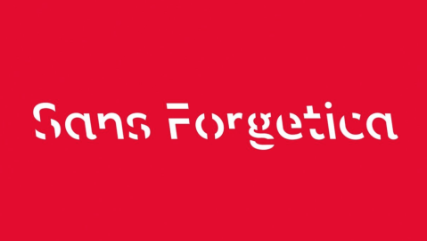
The font that can improve your memory
Big Think photoshop
- A font has been developed with the aim of improving your memory.
- 57% of respondents were able to remember text written in this font.
- It’s free to download.
Graphic design students, psychologists, and researchers at Australia’s RMIT has created a font with the aim of improving memory retention. It’s been dubbed Sans Forgetica.
The letters slant to the left. There’s a gap left in each letter. When 400 students were tested on their ability to retain a text written in both Sans Forgetica and Arial, Sans Forgetica edged Arial out 57% to 50%.
How do these results sit within the already existing context of font, learning, and memory retention?
It’s tricky to say: while you can fool yourself into paying attention by saying to yourself — in effect — ‘I’m going to pay attention now’ — which seems analogous to what Sans Forgetica is setting out to do — the research looking at the connections between fonts and memory currently seems to suggest a few things: (1) even though small fonts and large fonts can have a positive impact on your memory retention, it appears that adults and children look at large font words as an indication that they will remember something better than not — regardless of whether or not they actually remember it; (2) when test subjects were exposed to blurred words and clear words in 2012, there was “no difference in recall for clear and blurred words,” although assessments of those words favored clearer typeface in what this particular test called a ‘Judgement of Learning’; and — perhaps most directly relevant to our interests here — (3) in 2011, college students “who read about fictitious animal characteristics in a disfluent (Comic Sans MS or Bondoni MT) typeface remembered more of the characteristics after a 15-minute delay.”
What does the study mean by the use of the word ‘disfluent?’ Disfluency is — per DSM-IV — “disturbance in the normal fluency and time patterning of speech.” That typically means stuttering, but there’s more than one way to use the term. You can ‘create’ disfluency by changing what a font looks like. You experience disfluency if you have difficulty processing certain kinds of information, or when you realize that you’re not pursuing the path of least cognitive resistance. For our purposes here, it pays to think of ‘disfluency’ as something visual that makes the eye and brain say, ‘Hold on just a second.’
What uses can a font like ‘Sans Forgetica’ have in the real world? Well, consider the original map of the London Underground and the work Harry Beck did to simplify, clarify, and delineate what was otherwise a tangled confusion of information: not only did he keep the lines equidistant from each other — regardless of the actual distance between one line and the next — but he made the text of each line legible as well. So imagine if Harry Beck took ‘Sans Forgetica’ and applied his sense of design to a CVS receipt or a ‘Terms and Conditions’ notice. Imagine what else might be possible.
It took the small team at RMIT six months to develop Sans Forgetica — it went through three different iterations — and you can download the font for yourself for free here.