The Forever Danger: How to Design a Universal, Timeless Warning

America’s nuclear waste is all dressed up in dry cask storage, with nowhere to go. In 1987, the Yucca Mountain, Nevada, was designated as a “deep geologic dispersal” site for waste generated by the commercial nuclear power industry. Like a boorish houseguest, the industry drinks itself silly with your liquor cabinet, then leaves the party without volunteering to clean up. Which is to say, nuclear waste is the government’s problem.
Yucca is profoundly isolated. It seems a reasonable choice, such as one exists at all, but Nevadans hated the idea. That’s understandable. You’d be hard-pressed to find a more dramatic example of NIMBY than the quest for a region that would merrily entomb lethal radioactive waste. In 2010, after opposition from President Obama and Harry Reid, the Department of Energy withdrew its request for Yucca.
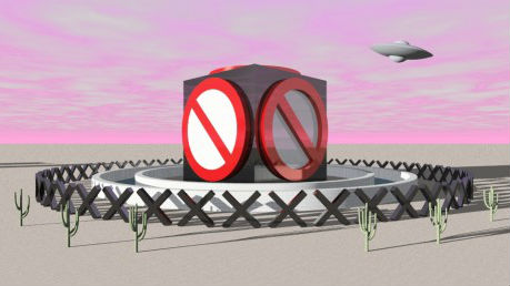
Before then, however, the Desert Space Foundation sponsored a fascinating design competition. In 2002, in anticipation of a Yucca nuclear dumpster, they invited submissions for a “universal warning sign,” to convey that the contents of Yucca were extremely dangerous.
The challenge is that languages decay faster than radioactive waste. Half of our current 6,800 languages may well disappear by century’s end, according to a United Nations report. Nuclear waste has a much longer half-life. It will still be dangerous for many thousands of years.
So the warning sign would have to maintain its intelligibility for at least 10,000 years, or roughly 30,000 human generations. It would have to be decipherable at a time when our symbols and language are apt to be as illegible as hieroglyphs or cuneiform today.
Language is a social act, of collusion and conspiracy. A word’s meaning is acquired and mutated through usage. But compellingly, the competition asked participants to convey meaning without context; in effect, to find an inherent design or aesthetic characteristic for danger.
I was surprised to discover that this is part of an entire field, called “nuclear semiotics.” In 1981, the U.S. Department of Energy and the Bechtel Corporation convened a Human Interference Task Force to contemplate how to warn future generations away from nuclear dumpsters.
A 1982 poll in Germany posed the question, “how would it be possible to inform our descendants for the next 10,000 years about the storage locations and dangers of radioactive waste?”
One reader proposed radioactive cats, or “ray cats,” as harbingers of doom. Since cats have long cohabitated with humans, they could be bred to become bio-billboards, or bio-language. They would change color in the presence of radiation. Human comprehension of the ray cats’ encrypted message would be embedded in folk tales, fairy tales, and other hardy, history-resistant modes of transmission (my son doesn’t think much of this idea. “How would the story go?” he asks. “Beware the Green Cat. There lies the gate to hell?”).
Another designer proposed a bio-code of atomic flowers that would only grow near radioactivity.
Genetic engineering in these examples allows us to use biological entities as an eternal, universal language, rather than using language to explain biology. We’re not deciphering nature’s code, but writing it, for our own purpose.
The winning entry in the Desert Space competition did likewise. Ashok Sukumaran proposed to engineer Yucca cacti that will glow cobalt blue, varying in intensity according to radiation levels. This would alert visitors to the danger—or perhaps divert interest from the subterranean toxicity with the beautiful, seductive cacti. This warning mimics the natural strategy of the Venus fly trap, whose beauty masks its lethality.
Other entries tried to make Yucca prohibitively eerie. Goil Amornvivat and Tom Morbitzer proposed for the Desert Space competition the “Fields of Asphodel.” They designed a metal meadow of thin, sharp steel blades that would screech hideously when the wind blew through them.
Maybe Stonehenge was in its day the same kind of project—massive monoliths intended to deter, but that lured instead. What prohibits will also seduce; the monumental will convey divinity as plausibly as danger. The danger sign must compel attention, but attention once compelled isn’t easily corralled, selectively, toward intended meanings.
The sacred and the deadly; the sublime and the monstrous, are proximate. Without the layers of acquired meaning that set them apart in social context, the two signal in the same way, and their affinity in the imagination is made all the more vivid in this design exercise.
The sacred and the deadly, in the example at hand, are both urgent, imperative mysteries, whose animating powers, while vast, are invisible. We want to impart both the sacred and deadly to future generations, but their shared monumentality and inherent mystery conjoin them perilously. They inspire similar kinds of “universal” signs and aesthetic expressions, to elicit similar reactions–of wonder, curiosity, and enthrallment.
The universal warning sign also forces us to think about what we put our faith in as truly timeless. What lasts, or what comes closest to the eternal human condition? Cats? DNA? A social order that would still include hierarchies, since one response to the 1982 German competition proposed the creation of an exclusive “atomic priesthood” of quasi-sacred keepers of the knowledge of radioactive sites? Or, archaeology and the persistence of intellectual curiosity and disciplines, since many of the entries embed the current radiation symbol (which was itself first doodled haphazardly in 1946 at the University of California Radiation Laboratory) on the assumption that future generations will have the historical knowledge that this was used as a danger sign in 20th-century society.
I noticed how little faith competitors placed on the persistence of the flash drive. Computer technologies and modes that saturate communication in 2013 aren’t imagined to have the decipherable staying power of folklore, biological forms, genes, cats, or intellectual disciplines. Data storage modes are so rapid-cycling. They’re rendered ruthlessly obsolete in a year, to say nothing of 10,000. My son’s never seen a floppy disk. He knows it only as the “save” symbol on his computer, the thing itself entirely supplanted and survived by its icon.
Signs, symbols, and customs often outlast the antecedent that gave them meaning. They become in the great post-modern term, “free-floating signifiers.” My son clicks on the residual save icon but has never seen a disk. Thousands of years from now, if the universal warning sign succeeds, our descendants might recoil from the bright green cat, or sidestep the Field of Screeching Metal, and have no idea why they do it.


