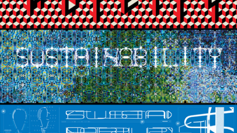
Designing “Sustainability”

In 2007, papermaker Stora Enso commissioned six leading designers – Paula Scher, Marian Bantjes, Christoph Niemann, Bruce McCall, Michael C. Place and Winterhouse – to create a series of posters around the word “sustainability.” The six took wildly different approaches, from the aesthetically minimalist to the conceptually complex, each brining their own signature style to the project.
Bantjes’ design, for instance, uses a large number of archival photos from the Library of Congress to construct two variable repeating patterns, interwoven into the typographic treatment.

It’s about time, families and preserving things for generations. It is, in my humble opinion, my best work to date.” ~ Marian Bantjes

Last month, Design Observer, who orchestrated the effort for Stora Enso in 2007, set out to counter the irony of promoting sustainability via a thousand printed posters by releasing the designs as free hi-res digital downloads – well worth the click-through.
The question, of course, is whether prettifying the word “sustainability” and crafting some sort of creative narrative around it does anything in the way of actually promoting sustainable practices. But this is the fundamental hiccup of cause marketing – the disconnect between badges and behaviors – and until someone figures out a way around it, we might as well enjoy a set of gorgeous prints.
Maria Popova is the editor of Brain Pickings, a curated inventory of miscellaneous interestingness. She writes for Wired UK, GOOD Magazine and Huffington Post, and spends a shameful amount of time on Twitter.


