Hertzsprung-Russell diagram: the most important graph in astrophysics
Credit: David Nash / The Astronomy Nexus
- The invention of spectroscopy and photography converted astronomy into astrophysics.
- With these new tools, astrophysicists gathered untold amounts of data on stars.
- When these stars were plotted on a graph, amazing patterns emerged.
Like people, stars are born, live, and then die. But how do scientists know that stars are born and die? Where did that knowledge come from? After all, for most of human history, many people thought that stars were eternal and unchanging. What was it that set astronomers on the path to seeing stars as something bound by time and change? The answer comes in the form of a simple and beautiful diagram first made 100 or so years ago.
Astronomy becomes astrophysics
By the end of the 19th century, new tools were being added to telescopes that turned astronomy into astrophysics. The most important of these was the spectrograph, which let astronomers see how much energy a star emitted at different wavelengths (or colors). It’s also what allowed astrophysicists to conclude definitively that the sun is a star.
Photography also revolutionized the field by providing a permanent record of observations so that they could be compared and correlated with other photographed observations. Using the spectrograph and photographic plates, astrophysicists began to amass a huge storehouse of data on stars.
At observatories in Europe and the U.S., the spectra of hundreds of thousands of stars were taken. Later these spectra were sorted into different classification “bins” based on patterns found in the way that stars emitted their energy at different wavelengths. (It’s worth noting that this sorting work was both challenging and exhausting and, in many cases, was done by bright young women who were not allowed to be formal astronomy students.) After the work was done, the classification bins for the spectra eventually were recognized to be associated with the star’s surface temperature.
Photographic data also allowed the stars to be sorted in another way, in this case, based on their brightness, which was a measure of the total energy they radiated into space.
What all this means is by the first years of the 20th century, astronomers had something new and tremendously valuable: a big, hard-won treasure trove of stellar data giving each star’s temperature and brightness. Now the question was what to do with it.
The Hertzsprung-Russell diagram
The simple answer to this kind of question in science was the same then as it is now: make a plot and see what happens.
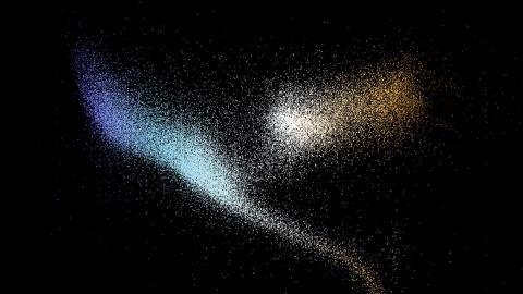
Each of about 100,000 stars was placed on a two-dimensional graph. The temperature was on the horizontal axis, and the brightness was on the vertical axis. That’s basically what Danish astronomer Ejnar Hertzsprung and American astronomer Henry Russell each did, independently of each other, to create what is now called the Hertzsprung-Russell (HR) diagram.
So, what does “interesting” in this kind of plot mean? Well, I can tell you what would not be interesting. If stars just appeared randomly on the plot — as if someone had taken a shotgun to it — that would not be interesting. It would mean that there was no correlation between brightness and temperature.
Intriguing patterns
Thankfully, a shotgun patten is definitely not what astronomers saw in the HR diagram. Instead, most of the stars collected on a thick diagonal line stretching from one corner of the plot to the other. Astronomers called this line the Main Sequence. There were also other places, outside the Main Sequence, where the stars collected. What astronomers were seeing in their data was the unmistakable indication of a hidden order.
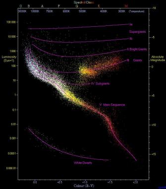
The patterns in the HR diagram told astrophysicists that something was going on inside stars. The Main Sequence, for example, told astrophysicists that a strong link must exist between the energy stars pumped into space and how hot their surfaces got. That link implied that there was hidden physics tying stellar energy output and stellar surface temperature together in a powerful chain of cause and effect. If they could understand that chain, they could answer the 2500-year-old holy grail of astronomy questions — what makes stars shine?
It would take another 50 years after the first HR diagrams appeared before astrophysicists could really see how the Main Sequence and other patterns were a direct consequence of stellar physics in the form of stellar aging over time. For that, they would need the invention of nuclear physics and a theory of thermonuclear fusion. We’ll take up that story in another post.
For today, it’s enough to marvel at how the simple act of throwing a bunch of stars onto a plot unveiled a hidden pattern that could not have been seen otherwise. That pattern was a clue, a hint of which direction to face, spurring scientists forward eventually to unlocking the mystery of the stars.
