A weekly newsletter featuring the biggest ideas from the smartest people
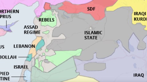
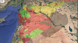
Could this map be any more different from the previous one discussed on this blog? That one dealt with the water, wetlands and shifting shorelines of Louisiana. This one zooms in on lines in the sand of the Middle-Eastern desert.
Yet both maps do something similar: knowing that our current maps no longer reflect reality, they replace their conventional wisdom with a new cartography, based on the new facts on the ground.
For Louisiana, that means a shoreline that bites much deeper inland. For the Middle East, the effect is arguable even more dramatic: this new map charts the emergence of a handful of new statelets, and the dismemberment of a few older ones.
The Middle East has been in turmoil since the so-called Arab Spring of 2011, with the Syrian civil war as its bloodiest consequence. Other countries in the area too have been shaken to their foundations by a wave of popular uprisings, terror attacks and military interventions. However, the old borders have generally held firm – except in Syria.
Here, the colonial-era boundary system known as Sykes-Picot has broken down, apparently permanently: few can envision a return to a unitary Syrian state – or a unitary Iraqi one, for that matter.
The Syrian central government (in light grey), based in Damascus, controls a coastal strip of territory in a patchwork shared with a number of rebel forces. The interior of the country is lost to government control, except a single light grey island in a sea of dark grey (for IS): the besieged city of Deir ez-Zor.
The ‘official’ rebels (in green) control a fragmented archipelago of territories, spread across the north, middle and south of the country – also concentrated in the east, but without coastal access. Aleppo, in the north, is on the front line between government and rebel forces, with horrific consequences for the city and its people.
Large parts of northern Syria are controlled by the Syrian Defence Forces (in red): a contiguous zone in the northeast, and a smaller zone in the northwest. Both are separated by the zone of contact between Turkey and Islamic State, although that zone has gotten a bit narrower since the takeover by the SDF of Manbij. The SDF, by the way, are mainly Kurdish forces, and the area they control is often referred to as Rojava – Kurdish for ‘West’.
The Islamic State controls not only the largest part of Syria, but has also spilled over into Iraq, where it dominates mainly Sunni areas in the centre, up to and including the city of Mosul in the north. The IS’s territory is surrounded by enemies, but has the advantage of being contiguous, with the exception of two exclaves, one in southwest Iraq, and another one in southeast Syria.
What remains of Iraq is controlled in the south by the Shiite-dominated government in Baghdad (in light blue), and in the North by the Iraqi Kurds (in yellow).
The map also reflects the mainly unrecognised secession of Northern Cyprus (in dark blue), and the de facto secession of Hezbollah-dominated areas within Lebanon (in green) – both facts on the ground predating the Syrian conflict, and likely to survive it.
So, is this the map that will replace the ones in our current atlases? Perhaps not. Borders are likely to shift some more before the war is well and truly over. Few of the surrounding powers seem keen on letting the Islamic State survive – the same goes the other way, too, but the former outcome seems more likely.
But even if this map proves to be no more than a snapshot of a fleeting moment in time, it is still more useful to keep in mind than the map in your atlas when you need a frame for the news from that part of the world.
Map found here at Middle East Eye, and produced by Thomas Van Linge, one of the select few citizen-cartographers that map the shifts in the lines of control that snake across Syria and Iraq. More on that here at Newser. Follow Van Linge’s Twitter @arabthomness.
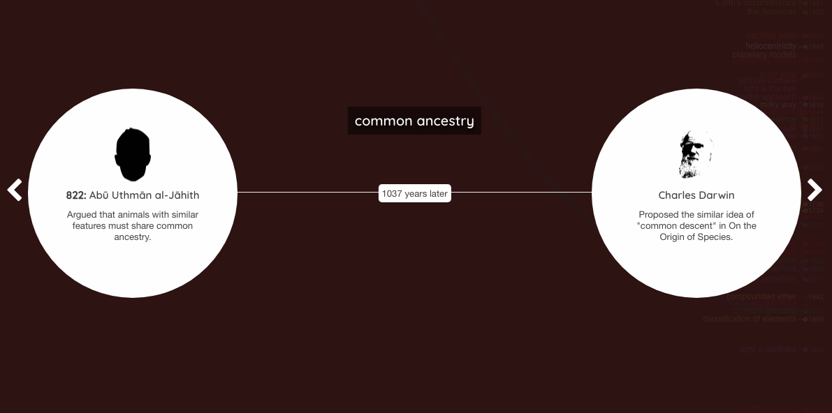
The West has been doing well scientifically for a few hundred years now, but it took almost a thousand years for it to catch up to the Middle East. Here are ten of the biggest discoveries the Islamic world got first.
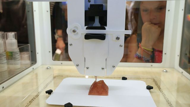
By definition, innovation brings disruption. 3D food printing is converging with the demography and culture of convenience. From fast moving Millennials, to Boomers who seek hassle-free living, 3D food printing may change not just how we eat, but how we buy what we eat. What might the convergence of this new technology and the disruptive demographics of convenience mean for the future of the grocery store?