Upside Down or Downside Up, this World Map Looks True in Both Directions
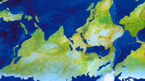
This is a map that takes some time to get your head around; quite literally, because to appreciate it fully, you need to consider it both with its north side and its south side up [1].
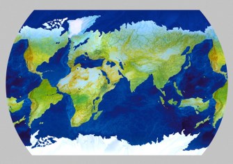
The world, ‘upside up’.Image: https://pata-atlas.jimdo.com/
To spare you the risk of neck injury, we’re providing both versions: first with north on top, then south. And what do you know? There is no right side up — or rather: there is no wrong side up. For this is a planisphere [2] palindrome, a planet-chart that can be ‘read’ the same way ‘upside up’ and upside down.
This is very strange. The size and distribution of the world’s continents and oceans is random, the result of millions of years of continental drift. That process is still ongoing [3]: the way the world looks like on our maps is but a snapshot, even if it feels like an eternity from our human perspective.
It would seem impossible to find a pattern with global consistency in that random jumble of land masses and water bodies. A map showing the overlap of antipodean dry lands [4] doesn’t seem to indicate any, at least. But the Italian artist Giacomo Faiella did find such a pattern.
In the ‘upside up’ version, the continents are a solid, walkable blue, the seas are a foamy yellow-white, and the north pole the frozen colour of ice. The map is centred on China, with Europe and Africa pushed to its western edge, and the Americas near its eastern rim.
Colour codes are relative, as shown by our immediate re-interpretation of them in the ‘downside up’ version. Here, the continents are the different hues of grass, from green to dry; the ocean is navy blue and it’s the South Pole that is frozen, while the North Pole has reverted to open water. In this map, the longitudes of Europe and Africa retain retain the centrality that they are traditionally accorded in Western cartography, while East Asia and the Americas are pushed to the edges.
It’s fascinating to see how Mr. Faiella has managed, with some cajoling of geographic veracity, to find correspondences between features on the opposite sides of the world.
The Mediterranean Sea in the ‘up’ version is Australia in the ‘down’ one (and vice versa, of course). That little fleck to the south of Australia that represents Tasmania? That’s the Adriatic Sea in the other map, between Italy and the former Yugoslav states.
The Black and Caspian Seas to the Mediterranean’s east transform into the main western islands of the Indonesian archipelago: Java and Sumatra, respectively. The Red Sea becomes the Philippines, the Persian Gulf the Thai-Malay Peninsula. India, that triangle pointing south, transmogrifies into the adjacent Bay of Bengal, a triangle pointing north.
Fantastically, miraculously, South America becomes the North Atlantic ocean, and the North America continent changes into the South Atlantic. Two dots vaguely reminiscent of the Great Lakes become the (much smaller) Falkland Islands [5].
The two islands of New Zealand transform into the North Sea and the Baltic Sea, with the Cook Strait between both islands becoming the Jutland [6] peninsula of Denmark. The Japanese archipelago corresponds with a string of Africa’s Great Lakes, while Madagascar has a ghostly pendant in the Sea of Okhotsk.
And on it goes — we’ll leave you to work out the other correspondences. Like we said, some geographic cajoling has taken place. Australia and New Zealand are nowhere near as close to South America; nor are North America and northern Europe attached to Greenland. You have to squint a little, but this works as a world map. It’s incredible that it works as two world maps.
Many thanks to Mr. Faiella for sending in this map. Find out more on his map-based art at his Pataphysical Atlas.
Strange Maps #594
Got a strange map? Let me know atstrangemaps@gmail.com.
[1] Modern maps are usually oriented towards the north, in the tradition of Ptolemy’s Geographia. However, for sacral reasons, maps in the Middle Ages often had east ‘up’ – hence our word ‘orientation’.
[2] Planisphere describes the representation of a globe on a flat surface – i.e. a world map; but also the parking disk-like instrument made up of two adjustable disks rotating on a pivot, used to calculate which stars and constellations are visible in the night sky at any particular time.
[3] It’s no coincidence that the eastern shoreline of South America ‘fits’ with that of western Africa’s: both land masses once were part of Pangaea, the single supercontinent that broke up about 200 million years ago. The Atlantic Ocean continues to widen at an annual rate of 25 millimetres (about an inch) — about the rate your fingernails grow. Back in 1968, an Air France commercial dreamed of the time when it was still no wider than a river. See #474.
[4] See #104.
[5] or las Malvinas. A bit more on Anglo-Argentinian animosity in the Antarctic and its periphery in #591.
[6] Where does Jutland begin, and where does it end? See #46.

