16 Maps for 2016
‘Tis the season for overindulgence. So, since we’re approaching the 16th year of the 21st century, here are 16 strange maps for your perusal — each accompanied with the briefest of legends, to avoid indigestion.
Map Baubles, a How-To
It’s too late to hang these cartographic ornaments in this year’s Christmas tree; on the other hand, you now have almost a year to make the perfect ones for next year’s festive season. Essential instrument: a circle punch. And some old maps. Just keep your hands off ours!

Image found here on A Diamond in the Stuff.
Hitler Defeats Stalin
Oh no, he didn’t. But what if he had? It’s the “Dewey Defeats Truman” of Nazi Germany’s Eastern Front, so to speak. As postulated in #186, the Nazis were bad planners for the future; there is very little cartographic evidence of how they saw Europe (or the world) after their victory. Here, however, is a map purportedly showing their plans for the Soviet Union after the successful conclusion of Operation Barbarossa (as they code-named their invasion).
Not an original, but apparently based on plans drawn up by Nazi ideologue Alfred Rosenberg, the map shows a rump Russia (in black), deprived of access to the Baltic and Black Seas. This “Muscovy” is walled in by Nazi-controlled territories — Baltikum, Greater Belorussia, Greater Ukraine, Greater Caucasia, and Ural. Turkestan and Siberia are vast, post-Soviet successor states to the Soviet Union in the south and east.

Welcome to the Swahilisphere
Swahili may not be one of the world’s 23 biggest languages (see farther down this list), but it is a major vehicular language in a large part of Africa. Recent estimates put the number of native speakers at 15 million, with over 150 million speakers in total. It is used across a region that on a conventional map is riddled with colonial borders, divided into countries with English, French, and Portuguese as official languages.
To see the Swahilisphere represented as a united bloc is not only instructive, but also possibly prescient: Five of the nations on this map — Rwanda, Burundi, Uganda, Kenya, and Tanzania — are currently negotiating to form an East African Federation. Perhaps one day it will encompass a much larger area, united by the same language.

The Mysterious Grand Circle
What connects the Great Pyramid of Giza with the giant statues of Easter Island, the Nazca Lines and Machu Picchu in Peru, the ruins of Persepolis, and half a dozen other ancient sites across Asia and Oceania?
They are all aligned in a straight line spanning the globe, forming a circle centered on a point in southeastern Alaska. The distance from each of the sites to that Alaskan axis point is exactly one quarter of the circumference of the Earth.
But what does this so-called Grand Circle mean? That there once was a planetary civilization that chose to mark its existence by building these monuments? Or that humanity has a knack for finding patterns where none were intended? See also #594.

Image found here at World Mysteries.
Math Appeal
This map, produced in 1927 for the Rockefeller Foundation, shows the location of the European centres of mathematical research at that time. Except for some outliers in Sweden, Denmark, Hungary, and Austria, which all seemed to focus on analysis (image resolution is not optimal), academic research into maths is a race between the Big Four (Italy, France, Britain, and Germany), with some residual efforts being made by a Little Three (Netherlands, Belgium, Switzerland).
Most French work is concentrated in Paris, and on analysis. In the UK, Oxford and Cambridge excel, to the detriment of London and Edinburgh — both of which focus on applied mathematics. Naples, not Rome is Italy’s maths capital. In a polycentric Germany, Göttingen seems the centre of mathematical efforts, neatly divided among all six categories mentioned in the legend.

Google Searches
U.S. states now not only have their own state flags, mottos, and birds, but also their favourite Google searches. In 2015, Californians seemed obsessed with Dieselgate, while New Mexicans were concerned about Pluto, and its status as a planet. Pope Francis was a big hit in Delaware, but Kaley Cuoco took Nebraska. Ohio went for “legalize weed,” while South Carolina was most curious about “Trump for President.”

Image found here at Maps on the Web.
Adam’s Bridge
Sri Lanka is an island, but hasn’t always been one. In 1480, a cyclone destroyed its land link to the Indian mainland. What is left is still called Adam’s Bridge (or Rama’s Bridge), in recognition of the ancient connection. This is what it could have looked like before that storm, almost five and a half centuries ago.

Image found on Twitter @onlmaps.
What War is Good For
War is hell. But thence to claim, as the song does, that it is good for absolutely nothing, is unfounded. Victory over the enemy is such an overriding necessity that it is the mother of many inventions, some as immediately useful as the Gatling gun, others only as loosely connected to the business of warfare as nylon stockings. Airplane technology improved by leaps and bounds during the Second World War, as shown by this map, detailing the rapid expansion of Allied airplane ranges over the course of a few short months.
As late as May 1943, the farthest range available was 175 miles, which took Spitfires taking off from Britain only as far as Amsterdam. In June of that year, the Thunderbolt extended the range to 230 miles, covering most of the Benelux and a good chunk of northern France. Only two months later, the addition of a belly tank got the Thunderbolt over Germany proper, as deep in as Hanover, Kassel, and Frankfurt. In November of that year, the Lightning could reach Berlin, 520 miles from the British mainland.
In just half a year, Allied aircraft had tripled their attack range. By December — or is it March 1944 — the Mustang could roam as far as 600 miles, all the way to Milan or Prague.

Image found on Twitter @onlmaps.
An Accurate Map of Delhi
Even with a map in hand, it takes a while to get your bearings in a new city. Your standard map will only show the names and locations of roads and neighbourhoods, not their reputations and specialties.
This map may be a good way to get acquainted quickly with India’s capital. It provides helpful labels as to the location of jobs (in Okhla), slums (just across the river in Shahdara), where rich girls live (GK), and where they shop (Saket). Apparently, the CP district is “where everyone meets and plans to go somewhere else.”
Some designations (and destinations) remain a bit mysterious for non-Delhians (or non-Indians): HKV is “not a village”; Random Sarai is where students prepare for IITJEE; and Sarojini Nagar is “Lajpat Nagar’s Sister.” And what’s with the “state dharma” in JantarMantar and the “national dharma” at India Gate?
This is, of course, a map for the already initiated. The only way for outsiders to get the in-jokes is to go check them out for themselves.

Image found here at ScoopWhoop.
Web Service Metro
Even digital illiterates know that 404 goes with Not Found. But few outside the select crowd of IT initiates will realize that the famous error message is part of a digital map, combining numbers and statements into interconnecting pathways. The 100 line connects informational codes; 200 are success codes; the 300s refer to redirection; while the 400s and 500s entail client and server errors, respectively. Some examples:
The resulting metro-like map is embellished with neighbourhood names like Swagger Market, IoT Square and Analytics Road — all probably meaningful and/or funny to insiders.

Ottoman Alpha and Omega
The Ottoman Empire was one of the largest and longest-lasting empires the world has ever seen. This map contrasts its modest beginnings in the 14th century at the gates of Constantinople, with its apex in the 17th century, when it controlled ample parts of three continents.

Image found here on Twitter @Ottoman11Empire.
Countries Poorer than Moldova
In spite of the daily litany of war, terror, and degradation, there are indications of deeper, less-reported trends toward less violence and hunger, and a more equitable world. Even this map could be seen as evidence that wealth is slowly being spread more evenly across the world. It shows Europe’s poorest country (Moldova, in red) and the countries elsewhere in the world that have an even lower GDP, per capita (in purple), nominal (in blue), or both (in black).
While most African countries and the entire Indian subcontinent are still lingering at a below-Moldovan GDP, almost the entire American continent is doing better (save Honduras, Nicaragua, and Haiti). As well as the entire Middle East (except Yemen), all of North Africa, and a number of important sub-Saharan nations (including Nigeria, Angola, and South Africa), and Asian giants such as China and Indonesia.

The Rhodes Colossus
Cecil Rhodes could never have imagined that one day he would be trending on Twitter. The hashtag #RhodesMustFall finally achieved its goal in April this year, with the removal of his statue from the campus of the University of Cape Town. The campaign was echoed by students in Oxford, demanding the removal of a Rhodes statue from Oriel College.
A century ago, the public image of Rhodes was not that of a racist imperialist, but rather of a driving force behind Britain’s imperial project. He wanted to establish a British presence in Africa “from the Cape to Cairo,” as shown by this map. The image also ironically refers to the Colossus of Rhodes, one of the wonders of the ancient world.

Image found here on Wikipedia.
Immigrants Taking Over Paris
Unease over immigration is nothing new. This map of Paris, from 1923, shows how much of a constant it is — but also how its focus shifts. The map is titled: The Conquest of the Capital by the Provinces of France. It shows, in their regional dress, which provincials are taking over which parts of Paris.
The size of the figures (all male; did they leave their women behind, or didn’t they count?) corresponds to the size of the “invading” cohort. The biggest ones originate in the Auvergne (212,400 invaders in clogs), Brittany (145,500 knickerbockered barbarians), Île de France (141,000 suited blowers of smoke-rings), and Bourgogne (113,500 wine-guzzlers in cummerbunds).

Image found here on Twitter @renaud_epstein. Another version of this scare-mongering map at #360.
Mandarin Matters
Up to 90 percent of the 7,000 languages still spoken today could be extinct by the year 2100. The future belongs to the languages on this infograph — the most spoken native tongues on Earth, each with at least 50 million speakers.
Although English has developed into something of a planetary lingua franca, its global dominance has a fragile foundation. With 334 million native speakers, it is a distant third to Chinese, with 1.19 billion, and easily surpassed by Spanish, with 399 million. Other big hitters are Hindi (fourth with 260 million), Arabic (fifth with 242 million native speakers), and Portuguese (sixth with 203 million).
Interestingly, there are more speakers of Bengali (seventh with 189 million) than Russian (eighth with 166 million). Japanese (ninth with 128 million) is the smallest of the triple-digit languages, a club that will probably soon be joined by Lahnda (i.e., Punjabi; 10th with 89 million). Only three of the other 13 “smaller” big languages are European (French, German, and Italian); the other 10 are all Asian (admittedly ranging as far apart geographically as Turkish and Korean).
Each language area is subdivided to show the relative populations of speakers per country. Bengali is neatly divided between India and Bangladesh, while Japanese and Hindi are almost entirely contained within their “home” countries. Most others fall somewhere in between.

Image found here at the website ofAlberto Lucas Lopez. For a map with a similar approach to a different subject (GDP), see #747.

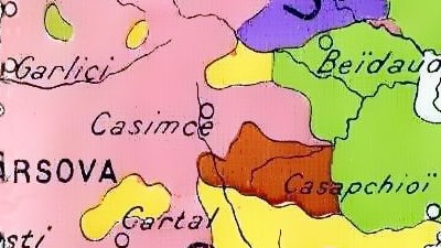
Colourful Dobruja
In French cuisine, a macédoine is a salad of different vegetables or fruits. The term reportedly derives from the fact that Macedonia’s many ethnicities presented such a colourful hodgepodge on 19th century maps. Judging from this map, the varied dish might also have been called a dobroudja. That’s the French word for a region on the western shore of the Black Sea.
Dobruja stretches from the mouth of the Danube in the north to Bulgaria in the south, encompassing Romania’s entire coastal zone. This map, dating from 1913 or shortly thereafter, shows the six most prominent ethnicities present in Dobruja at the time: Romanians dominate in the north and centre, Turks and Tatars in the south. Bulgarian zones dot the southern and central zones, with scattered groups of Russians (north), Germans (centre), and Gagauz and Greeks (south).

This image found here at Wikimedia Commons. For more on the fascinatingly obscure Gagauz, see #415.
Strange Maps #756
Got a strange map? Let me know at[email protected].


.JPG)