Strange Maps
A special series by Frank Jacobs.
Frank has been writing about strange maps since 2006, published a book on the subject in 2009 and joined Big Think in 2010. Readers send in new material daily, and he keeps bumping in to cartography that is delightfully obscure, amazingly beautiful, shockingly partisan, and more. "Each map tells a story, but the stories told by your standard atlas for school or reference are limited and literal: they show only the most practical side of the world, its geography and its political divisions. Strange Maps aims to collect and comment on maps that do everything but that - maps that show the world from a different angle."
featured


All Stories
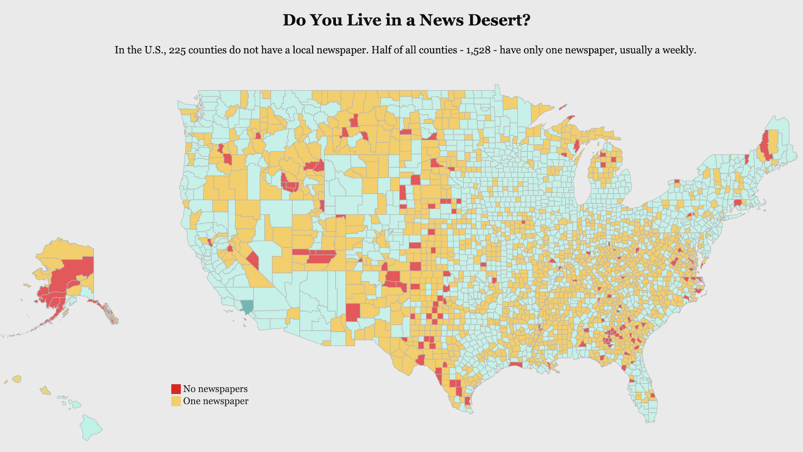
Most counties in the U.S. have only one local newspaper, often one that publishes weekly instead of daily.
Across the subterranean United States, not all rocks were created equally.
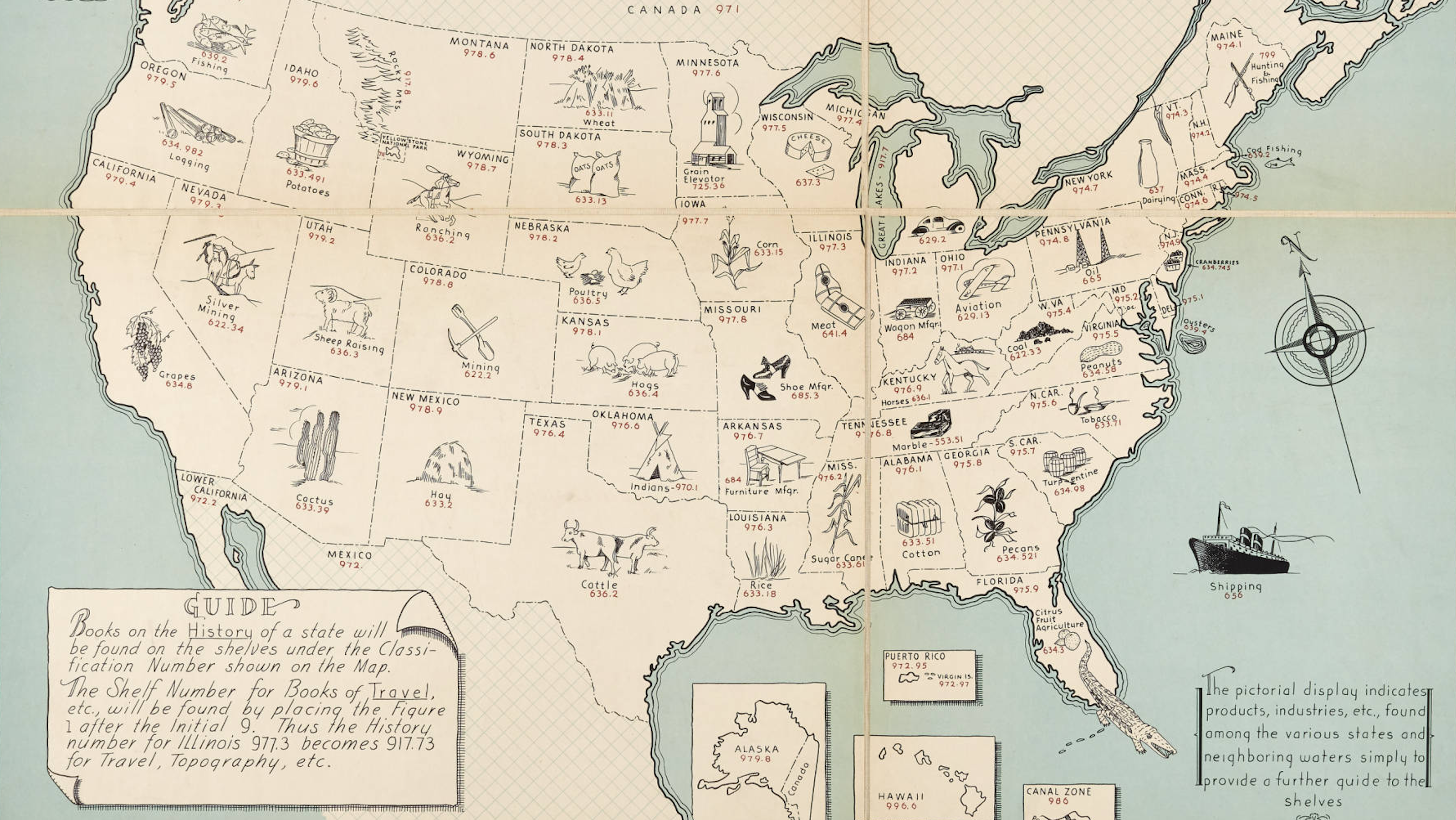
This map samples some of the digits that make up the DDC system, invented by the brilliant but flawed Melvil Dewey.
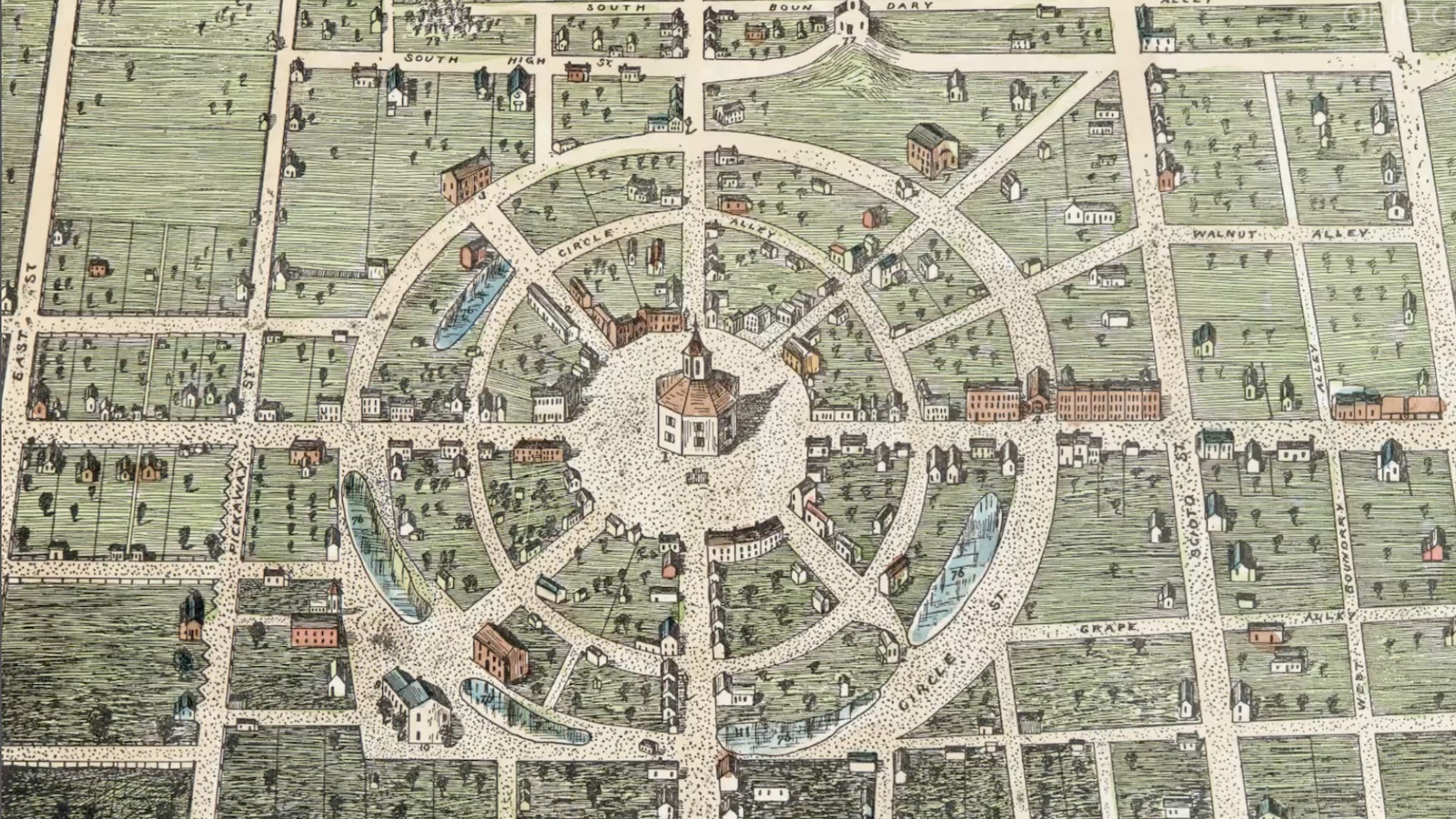
A small Ohio town tried to escape America’s addiction to rectangular grids. It didn’t last long.
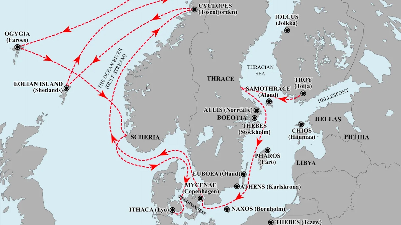
The Trojan War was fought in Finland and Ulysses sailed home to Denmark, says one controversial theory.
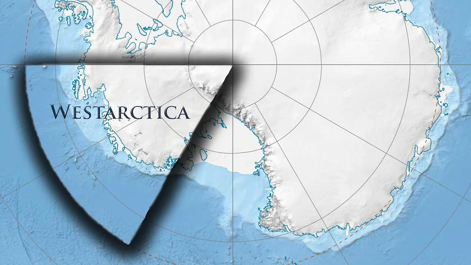
The Antarctic Treaty of 1959 prohibited nations from making new land claims on the continent. But it never mentioned claims from private individuals.
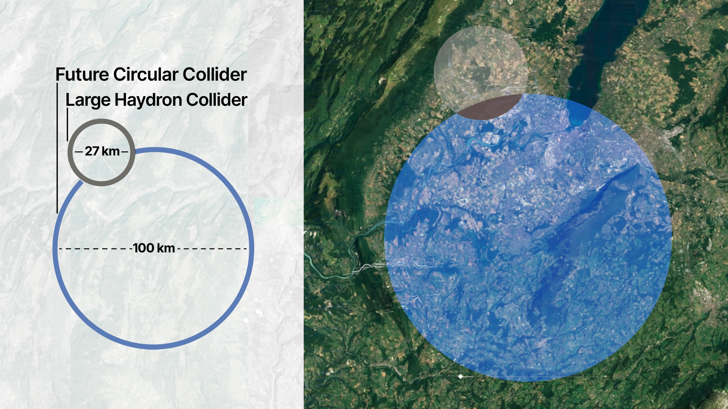
The $21.5-billion project could involve tunneling hundreds of feet under Lake Geneva.
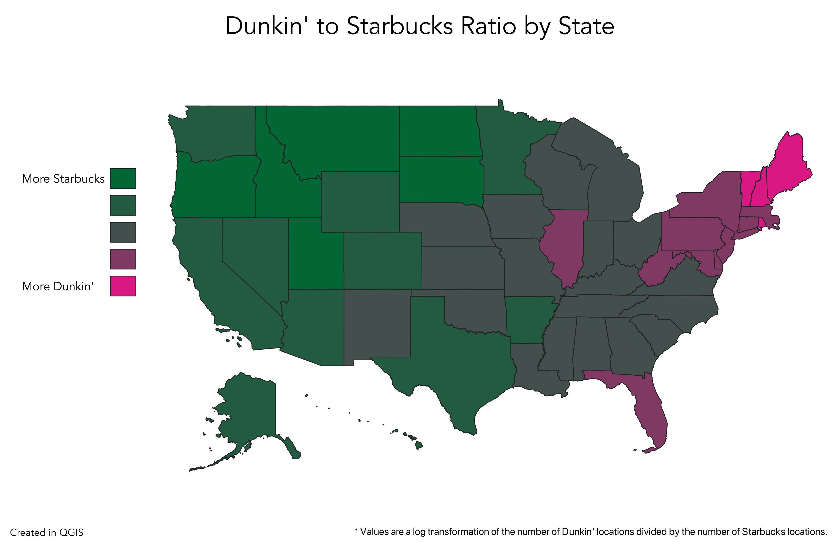
Economics and religion help to explain the gap.
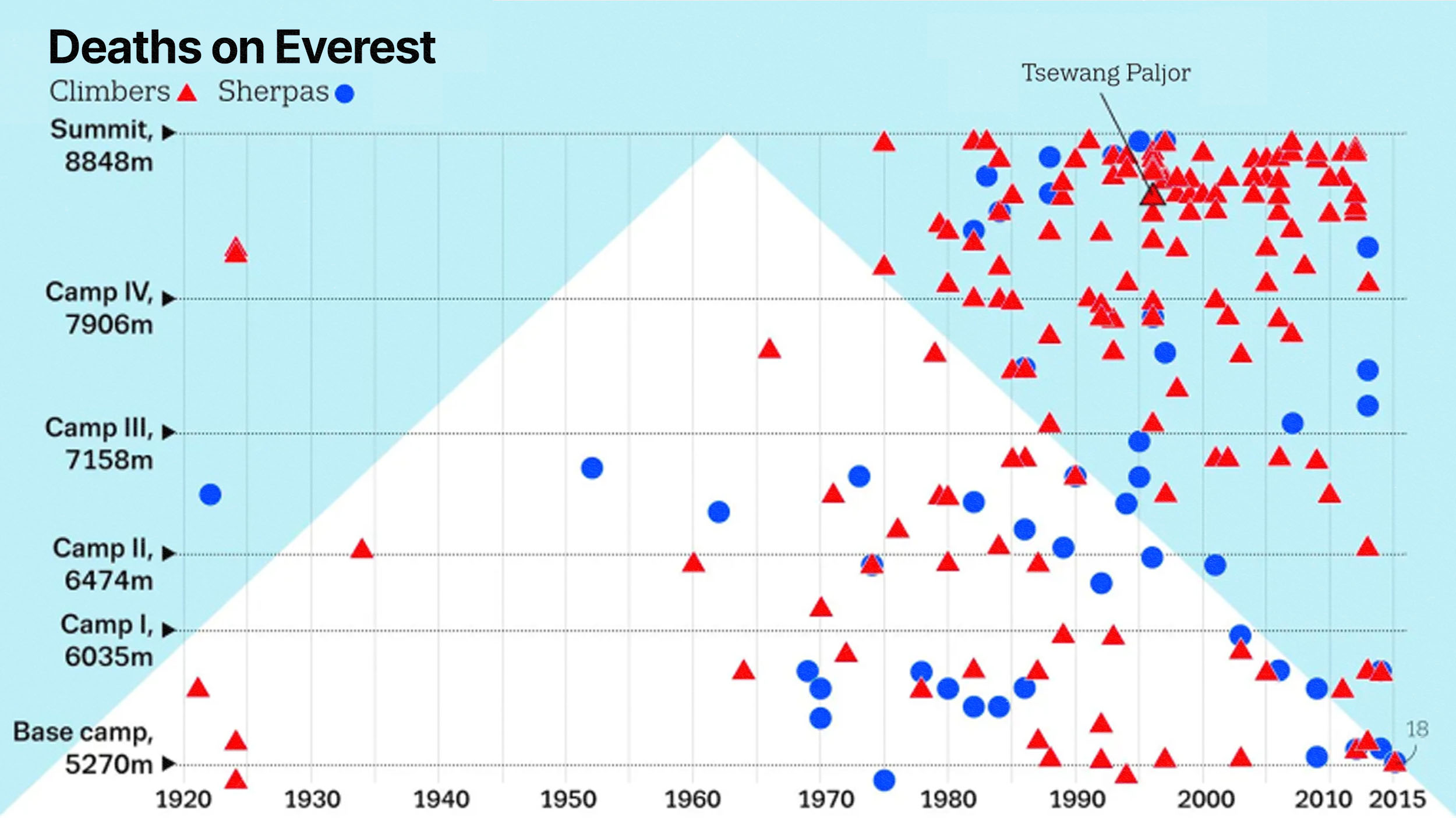
The world’s highest mountain is also the world’s highest cemetery, with some bodies serving as creepy landmarks for today’s climbers.
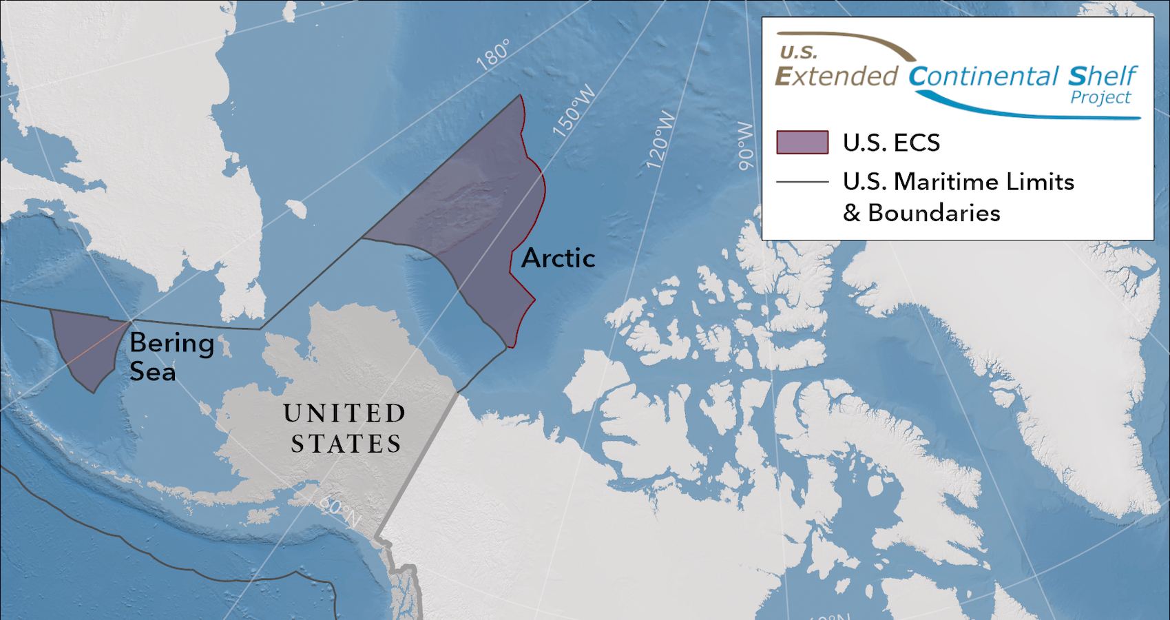
No shots fired. No flags raised. And no dry land gained. Still, the U.S. effectively grew by the size of about two Californias in December.
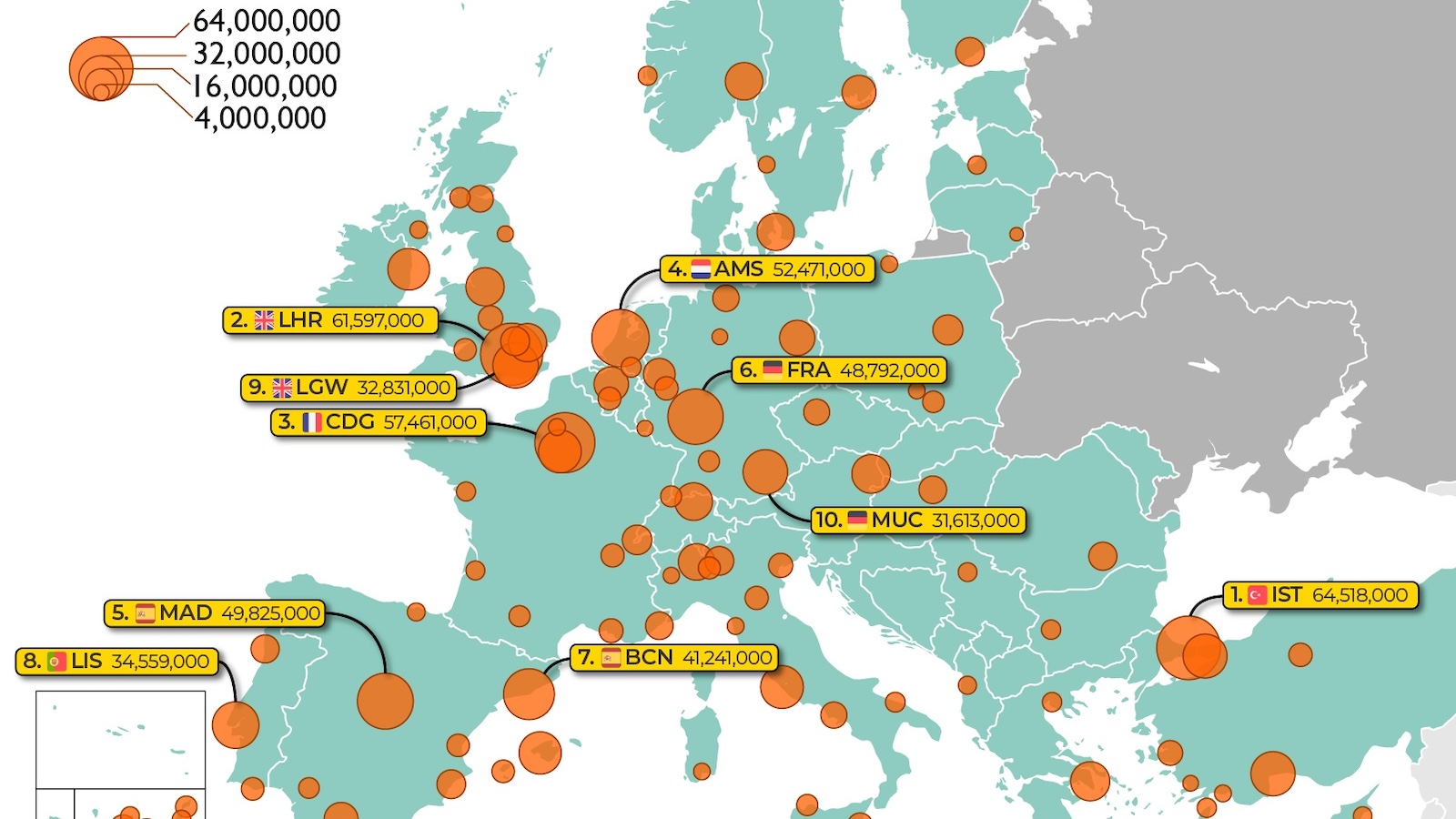
London’s busiest airport seems to be rebounding well from the pandemic — but Istanbul has better prospects in the long run.
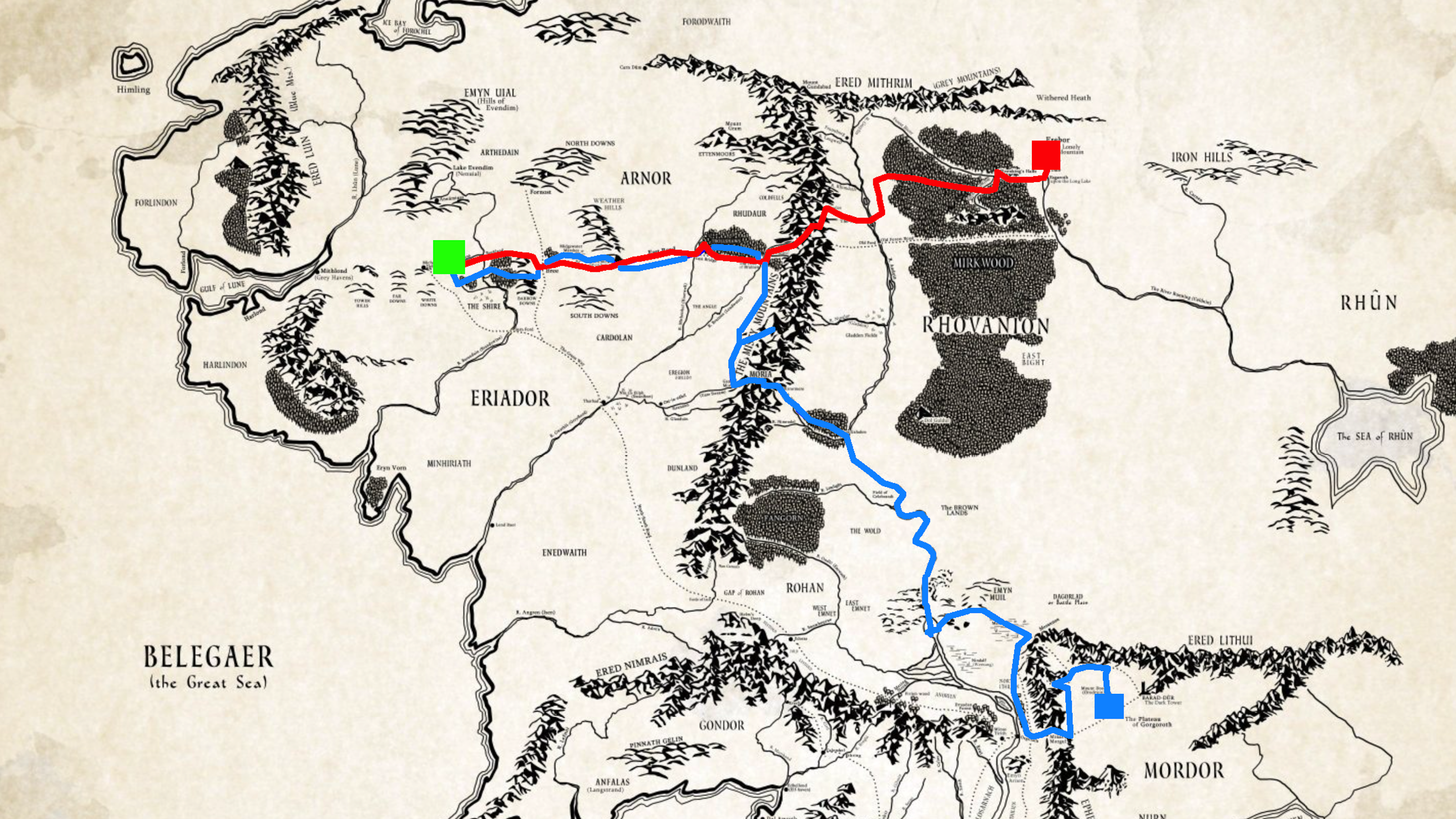
Fantasy, meet statistics: The census comes to Middle-earth!
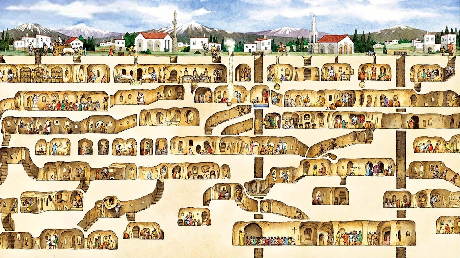
A basement renovation project led to the archaeological discovery of a lifetime: the Derinkuyu Underground City, which housed 20,000 people.
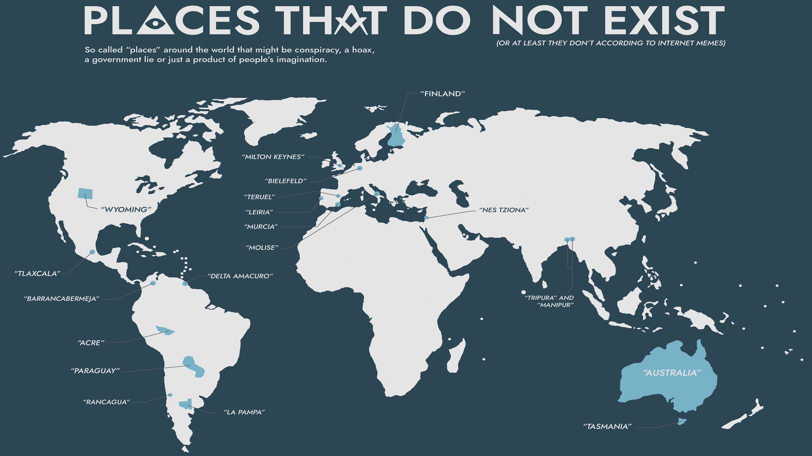
In a remarkably similar way, conspiracy theories around the world cast doubt on the existence of real places.
Thanks to protocols established centuries ago in Europe, world leaders no longer need to worry about having their heads bashed with an axe.
Scientists don't understand why the correlation exists.
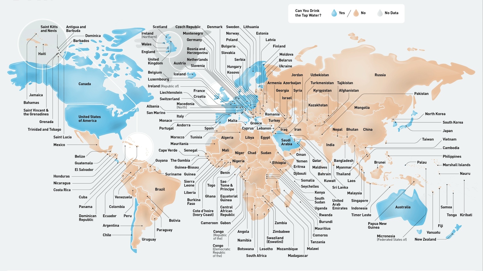
According to the CDC, 50 countries worldwide have drinkable tap water. But look closer, and the picture is more nuanced.
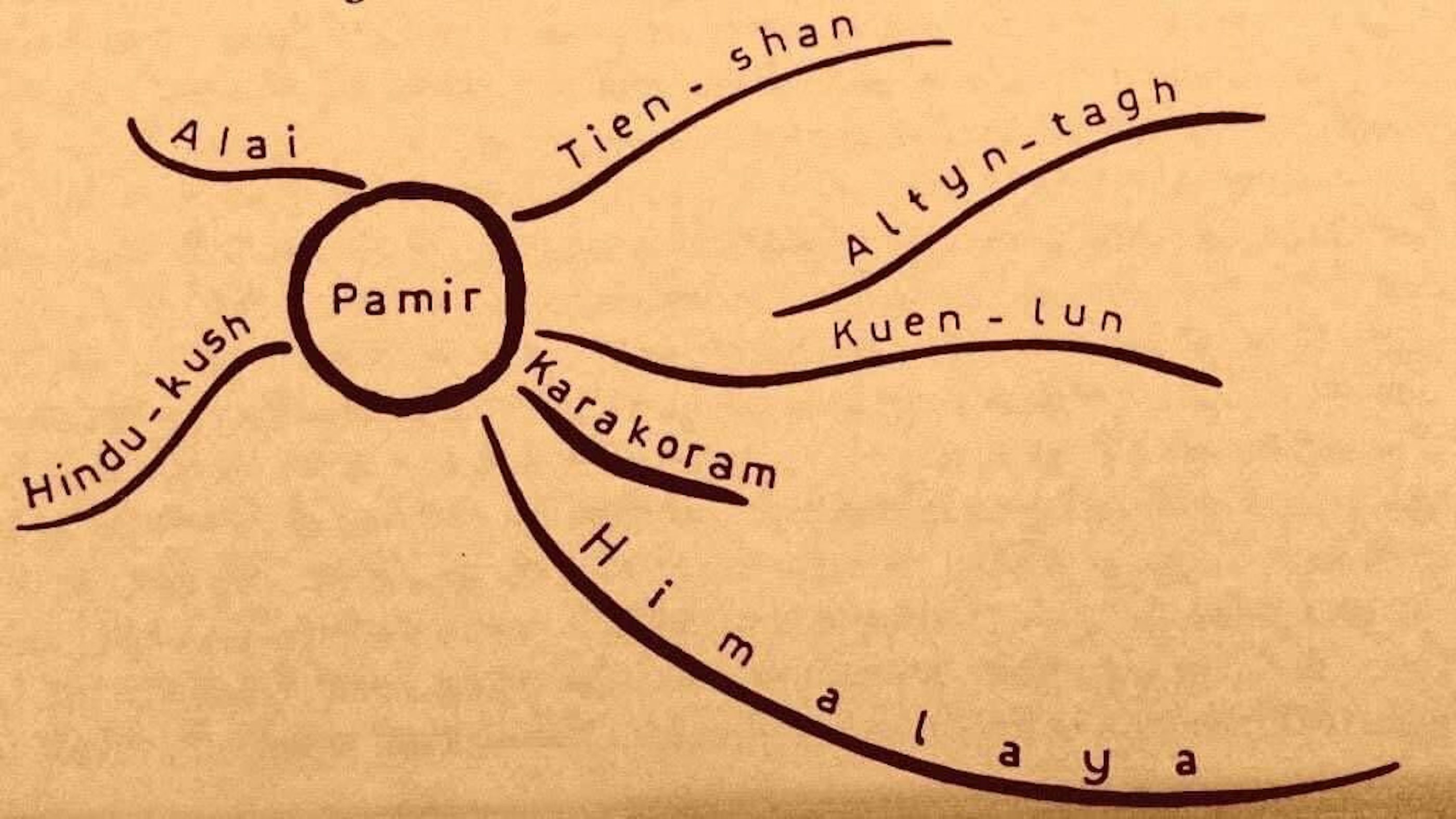
This minimalist map unties Asia’s mountainous geography, centered on the “Pamir Knot.”
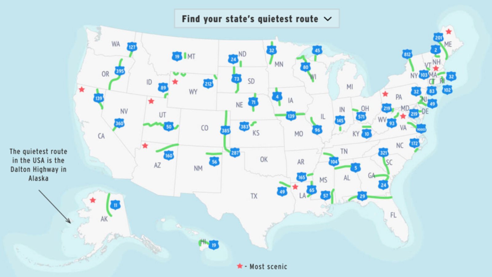
If you find yourself on one of these roads, it might be a while before you see another fellow traveler.
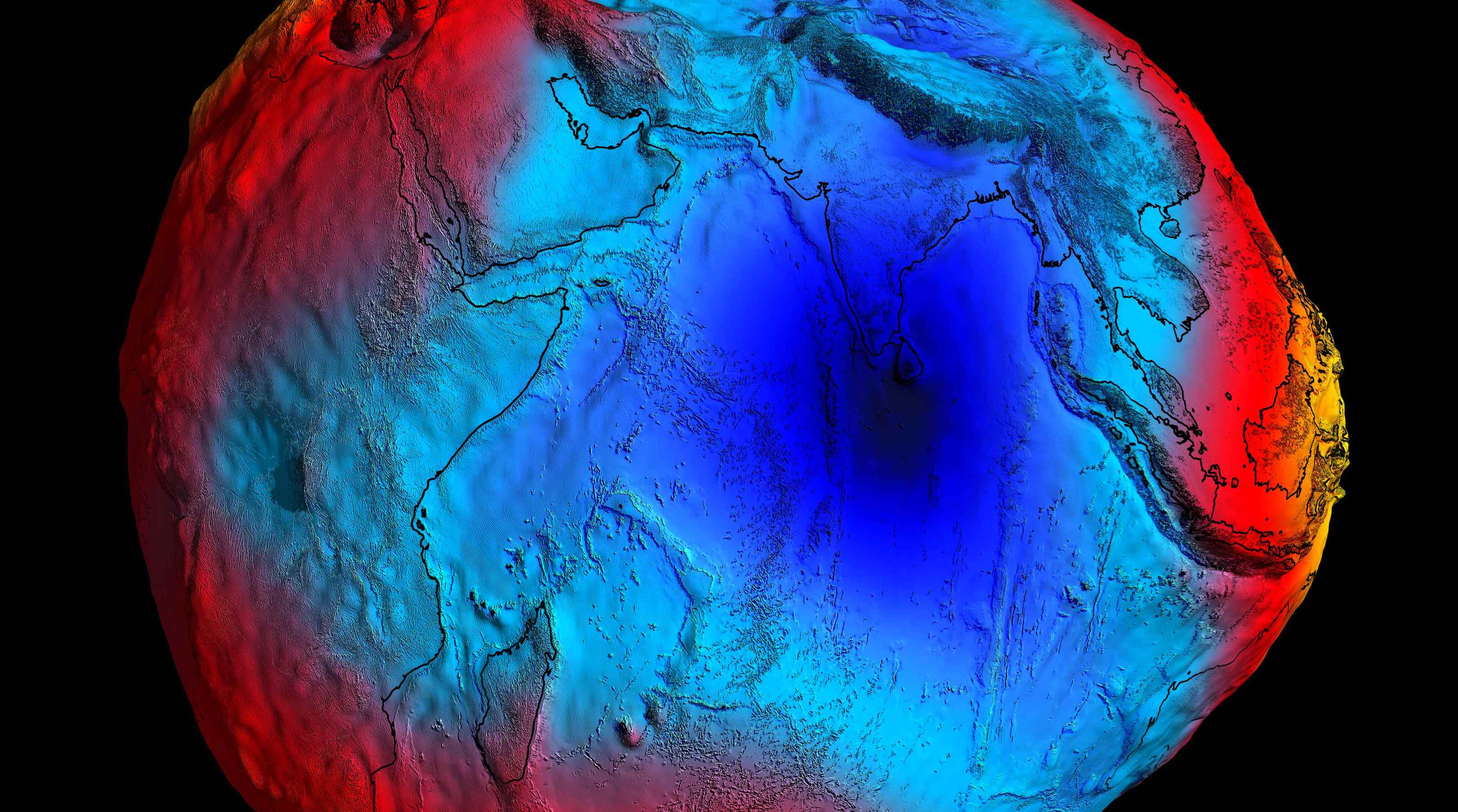
Seventy-five years after the anomaly's discovery, scientists have finally figured out why sea levels are so much lower here.
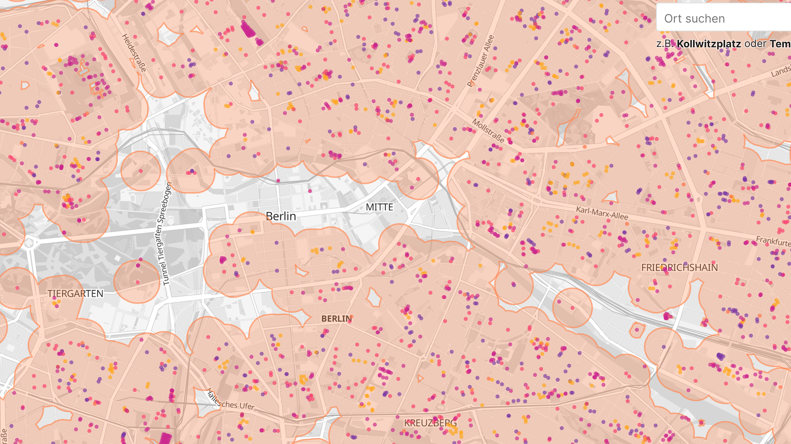
Legally smoking joints in city centers will require alertness and a keen sense of orientation — two things stoners are not known for.
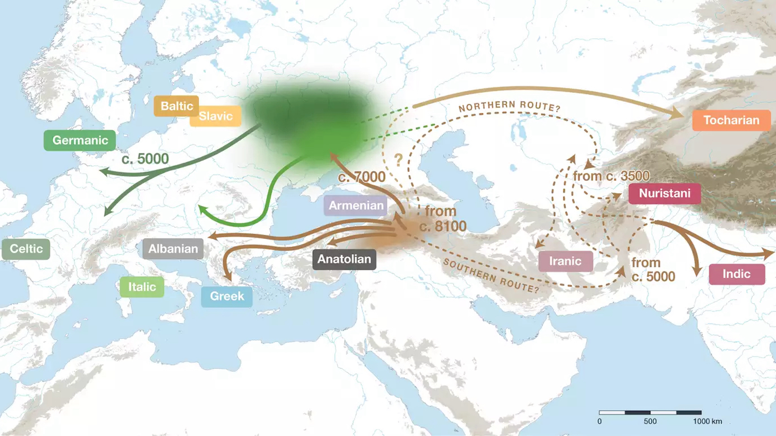
Though over three billion people speak an Indo-European language, researchers are not sure where the language family originated.
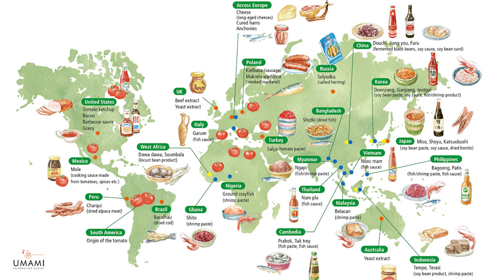
Sweet, bitter, salty, sour. These are the four basic tastes we were taught in grade school. But there is a fifth: umami. And it's everywhere.
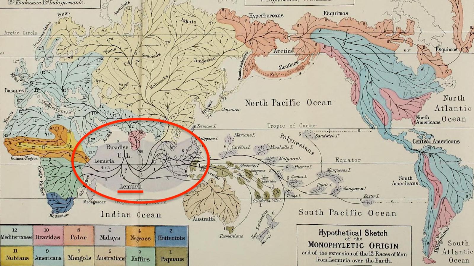
To this day, one cult believes that Lemuria was real, and that its people left us the sacred wisdom to revive their advanced civilization.
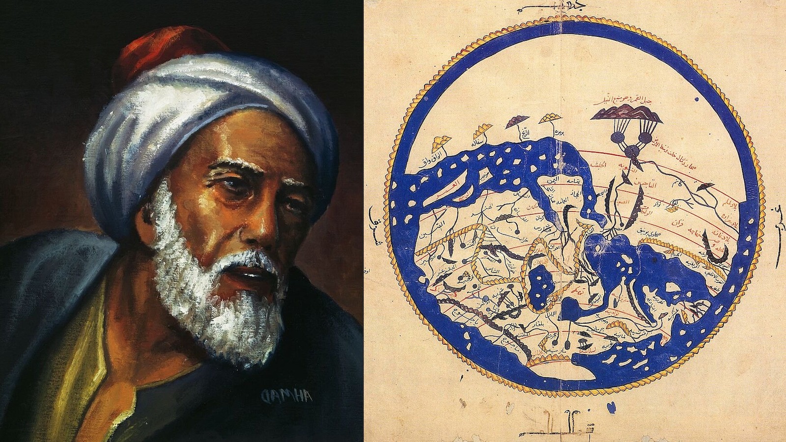
The history of cartography might have been very different if the Latin version of Muhammad al-Idrisi's atlas had survived instead of the Arabic one.
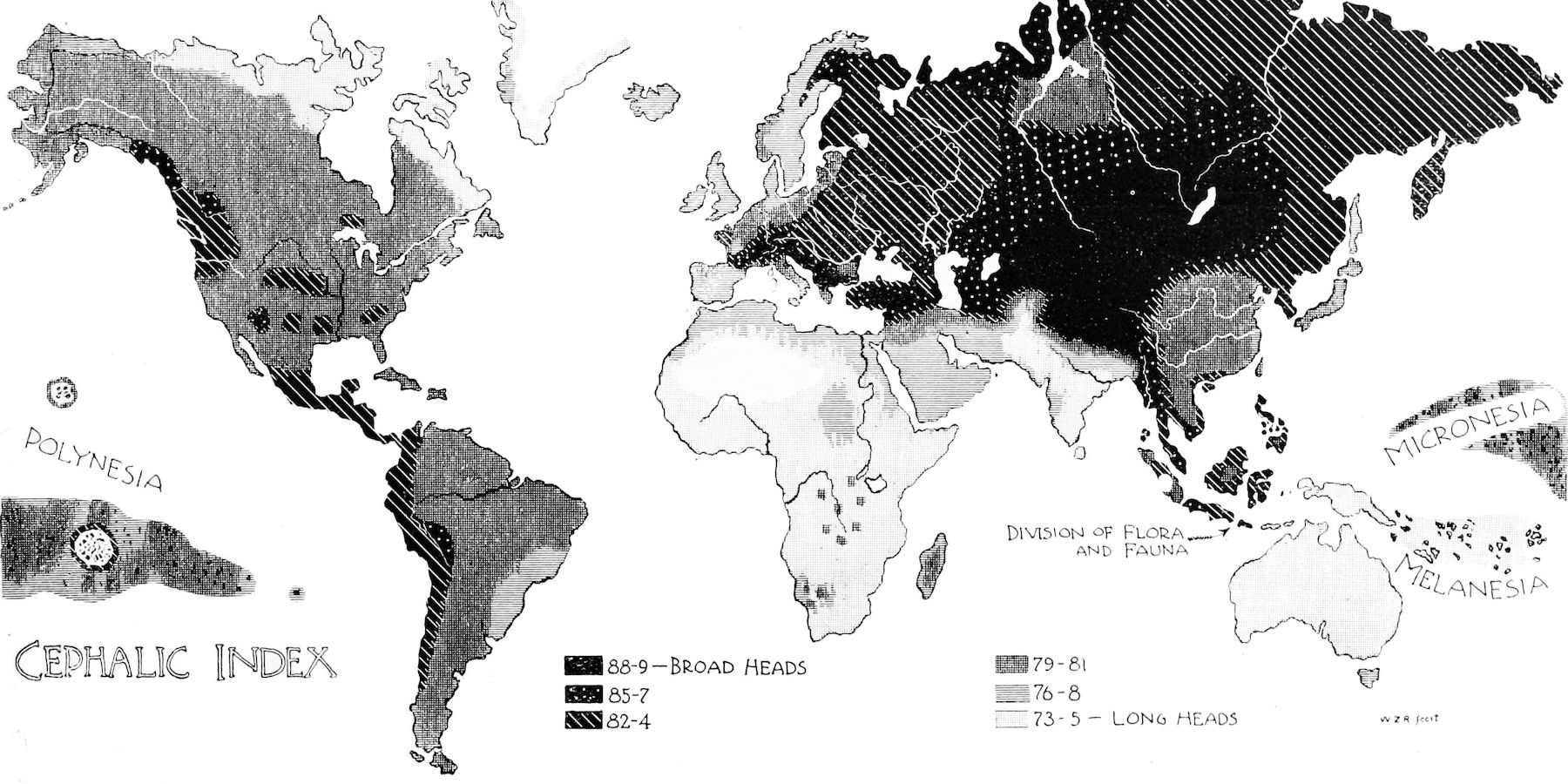
These landscapes — of geographical differences in head shapes — have vanished from acceptable science (and cartography).
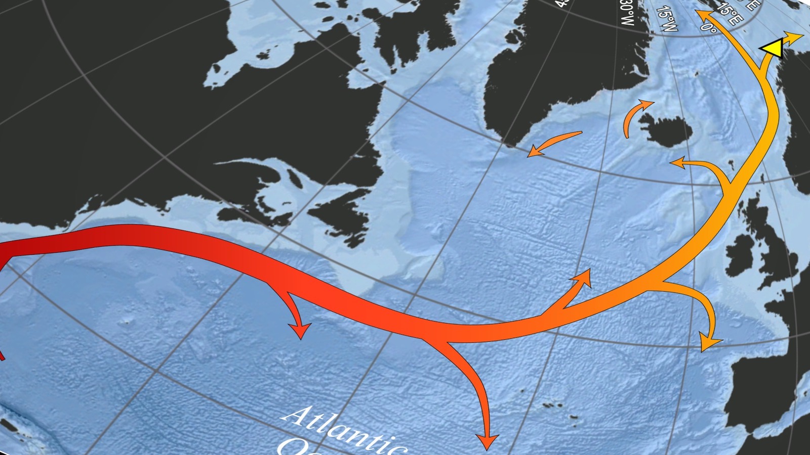
If we're going to discuss oceanography and climate change, we should at least identify the currents correctly.
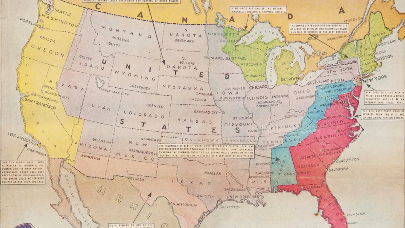
Opponents of America's entry into the looming Second World War believed the U.S. would be dismembered.
The richness and variety of America’s food landscape, in a buffet of maps.
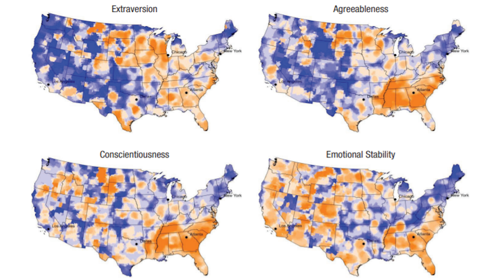
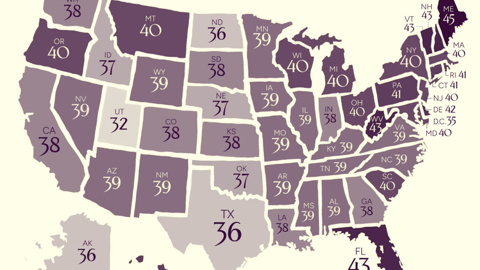
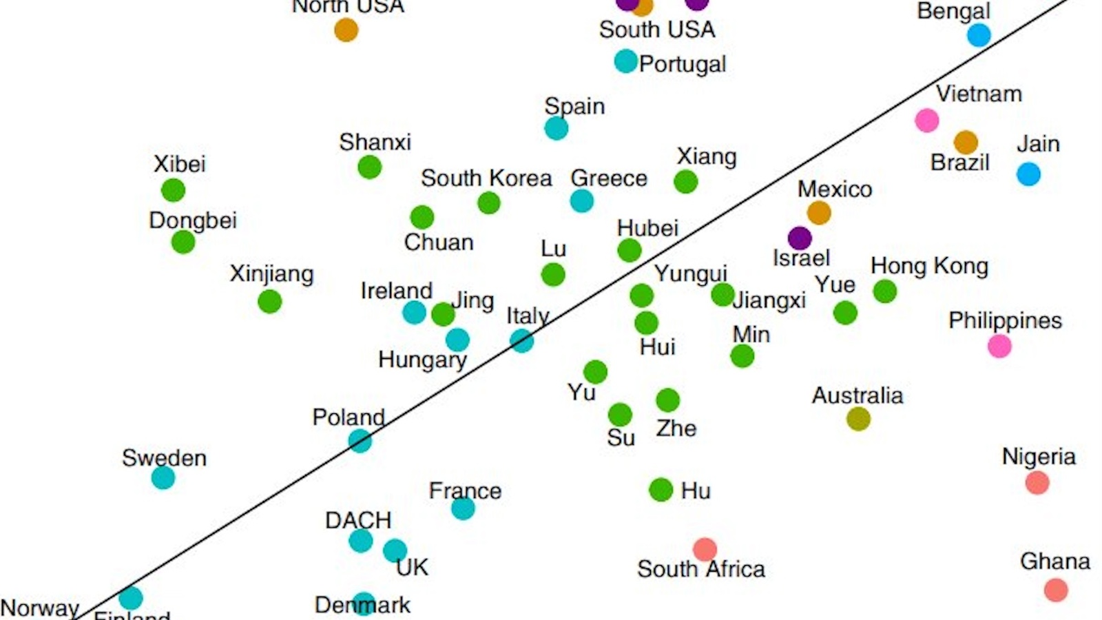
Research suggests there's truth to regional stereotypes in the U.S. — with some caveats.