The World’s Data Holes, Quantified

Finally, a map that focuses on those corners of the world that are usually left out. And quantifies how little we know about them. Most data-free zone: Western Sahara. Where is that? Exactly.
You may not know the word choropleth – from the Greek for ‘many shades’ – but you have seen the principle applied on maps. Any map that variously shades or patterns areas in proportion to a statistical variable is a choropleth map. Except that on a world map, some countries or regions are likely to be left blank.
More often than not, those blank spaces include some or all of the following line-up of usual suspects: Greenland, French Guyana, Western Sahara, South Sudan, Eritrea, Somalia and North Korea.

UN Human Development Index map from 2001. Data holes: Greenland, Cuba, French Guiana, Western Sahara, Liberia, Somalia, Belarus, Afghanistan, North Korea.
These are either highly secretive countries, nations too war-torn and/or chaotic to produce sound statistical data, or territories whose data is subsumed in that of their colonising/occupying power.
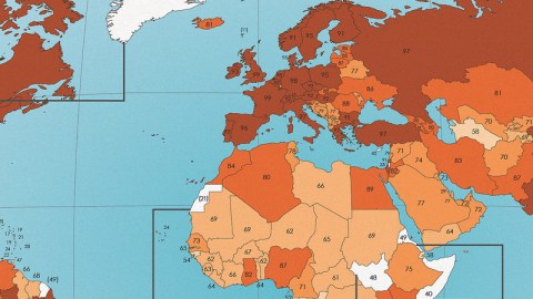
For The Unmeasured World, the mapmaker analysed 100 choropleth world maps, adding up how many times each country contributed data. Not only does this provide us with a ranking of the world’s most notorious data holes, it also reveals a much longer list of data-weak countries.
Let’s start with the world’s worst blind spots:
You will have seen these blind spots stare blankly at your from many a world map. But in a way, these ‘known unknowns’ are the lucky ones. As a close examination of this map shows, there are plenty of much smaller, lesser-known data holes – even if most of the world is doing fairly okay on the statistical front.

Countries in the darkest shade of brown appear in more than 90% of the examined maps. Many countries achieve a near-perfect score, including France and the UK (both 99), Germany and the U.S. (both 98) and India and Russia (both 97).
In Latin America, Mexico, El Salvador, Brazil, Colombia and Chile all score above 90, but the rest of the region lingers in the 80s (Argentina, Peru, Venezuela, among others), the 70s (Uruguay, Bolivia, Costa Rica) or even the 60s (Cuba, Jamaica, Suriname).
With the exception of South Africa (94) and Morocco, Algeria, Egypt, Ghana, Nigeria, Uganda and Kenya (all in the 80s), Africa seems particularly lacking in consistent data. Worst performers, except the aforementioned blank spots, are Equatorial Guinea (52), Lesotho (53), Guinea Bissau (54), Gabon and Congo (both 59).
Even Europe has its data-weak neighbourhoods, mainly ex-Yugoslavia, but also Albania, Moldova and Belarus (all in the 70s). Cyprus, because of its particular status – split between an internationally recognised south and a virtually unrecognised north – scores 42, atypically low for Europe, and is another data hole.
Jordan (82) is doing well in a region stuck in the 70s, except war-torn Yemen (64), outsider Israel (91) and special case Palestine (35) – yet another data blind spot, albeit a tiny one.
Remarkably, Afghanistan (70), although extremely poor and conflicted, is doing a lot better than peaceful, but secretive Turkmenistan (58). In Asia and Oceania, Bhutan (68), Birma/Myanmar (62) and Papua New Guinea (59) stand out as fairly remarkable data holes. But not as bad as tiny East Timor (24) – we almost missed it, just north of Australia. Oh, and look at Brunei (37) a bit further north.
East Timor is another young, poor nation. And Brunei is the personal fiefdom of a sultan who may not value statistical transparency with the same keenness as a democratic government would. At least, that is how we rationalise the low scores of those two countries. But what is Singapore’s (41) excuse? The high-tech city-state surely does not lack in stats, vital and otherwise?
As indicated by the list of nations printed at the bottom of the map, choropleth world maps have a problem with showing data for the world’s smallest nations – and often leave them out. That is why the Caribbean nations generally score pretty bad, and the Vatican appears on only 44 out of a hundred maps. Who would have guessed that the Pope runs a data hole even deeper than South Sudan?
UN HDI map found here at Cool Geography. This map found here on the Map Porn subreddit, where it won the May Map Contest. Congratulations!
Strange Maps #843
Got a strange map? Let me know at[email protected].


