


A geography column on history and society.

If you want to rank the regions and countries of the world, area and population are but crude predictors of their importance. A better yardstick is GDP, or gross domestic product, defined as the economic value produced in a given region or country over a year.
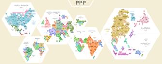
Who’s hot and who’s not
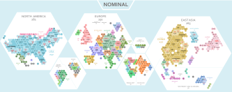
And these two maps are possibly the best instruments to show who’s hot and who’s not, economically speaking. They are in fact cartograms, meaning they abandon geographic accuracy in order to represent the values of another dataset, in this case GDP: the larger a region or country is shown relative to its actual size, the greater its GDP, and vice versa.
So far, so familiar. What’s unique about these maps is how this is done. Both are composed of hexagons, exactly 1,000 each. And each of those hexagons represents 0.1 percent of global GDP. That makes it fascinatingly easy to assess and compare the economic weight of various regions and countries throughout the world.
Did we say easy? Scratch that. GDP comes in two main flavors: nominal and PPP-adjusted, with each map showing one.
Nominal GDP does not take into account differences in standard of living. It simply converts local GDP values into U.S. dollars based on foreign exchange rates. GDP adjusted for purchasing power parity (PPP) takes into account living standards. $100 buys more stuff in poor countries than it does in rich countries. If you get more bang for your buck in country A, its PPP-adjusted GDP will be relatively higher than in country B.

Nominal GDP is a good way of comparing the crude economic size of various countries and regions, while GDP (PPP) is an attempt to measure the relative living standards between countries and regions. But this is also just an approximation, since it does not measure the distribution of personal income. For that, we have the Gini index, which measures the relative (in)equality of income distribution.
In other words, PPP factors in the high cost of living in mature markets as an economic disadvantage, while giving slightly more room to low-cost economies elsewhere. Think of it as the Peters projectionof GDP models.
Who’s number one: the U.S. or China?
The difference is important, though, since the versions produce significantly different outcomes. The most salient one: on the nominal GDP map, the United States remains the world’s largest economy. But on the PPP-adjusted GDP map, China takes the top spot. However, it is wrong to assume on this basis that China is the world’s biggest economy.
As this article explains in some detail, PPP-adjusted GDP is not a good yardstick for comparing the size of economies – nominal GPD is the obvious measure for that. GDP (PPP) is an attempt to compare living standards; but even in that respect, it has its limitations. For example, $100 might buy you more in country B, but you might not be able to buy the stuff you can get in country A.
Both maps, shown below, are based on data from the IMF published in the first quarter of 2021. For the sake of brevity, we will have a closer look at the nominal GDP map and leave comparisons with the PPP map to you.
For the nominal map, global GDP is just over U.S. $93.86 trillion. That means each of the hexagons represents about U.S. $93.86 billion.
The worldwide overview clearly shows which three regions are the world’s economic powerhouses. Despite the rise of East Asia (265 hexagons), North America (282) is still number one, with Europe (250) placing a close third. Added up, that’s just three hexagons shy of 80 percent of the world’s GDP. The remaining one-fifth of the world’s economy is spread — rather thinly, by necessity — across Southeast Asia & Oceania (56), South Asia (41), the Middle East (38), South America (32), Africa (27), and North & Central Asia (9).
California über alles
Thanks to the hexagons, the maps get more interesting the closer you zoom in on them.
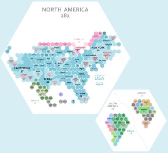
In North America, the United States (242) overshadows Canada (20) and Mexico (13); and within the U.S., California (37) outperforms not just all other states, but also most other countries — and a few continents — worldwide. To be fair, Texas (21), New York (20), Florida (13), and Illinois (10) also do better than many individual nations.
Interestingly, states that look the same on a “regular” map are way out of each others’ leagues on this one. Missouri is four hexagons but Nebraska only one. Alabama has three but Mississippi only one.
The granularity of the map goes beyond the state level, showing (in red) the economic heft of certain Metropolitan Statistical Areas (MSAs), within or across state lines. The New York City-Newark-Jersey City one is 20 hexagons, that is, 2 percent of the world’s GDP. The Greater Toronto Area is five hexagons, a quarter of all of Canada. And Greater Mexico City is three hexagons. That’s the same as the entire state of Oregon.
By comparison, South America (32) and Africa (27) are small fry on the GDP world map. But each little pond has its own big fish. In the former, it’s Brazil (16), in particular, the state of São Paulo (5), which on its own is bigger than any other country in South America. In Africa, there is one regional leader each in the north, center, and south: Egypt (4), Nigeria (5), and South Africa (3), respectively.
Economically, Italy is bigger than Russia
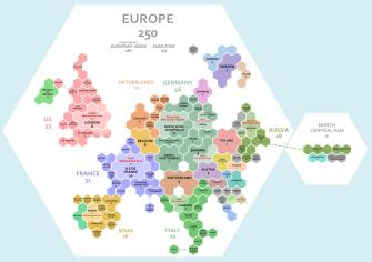
Europe is bewilderingly diverse, so it helps to focus on the “Big Five” economies: Germany (46), UK (33), France (31), Italy (22), and Spain (16). They comprise three-fifths of Europe’s GDP.
Each of these five has one or more regional economic engines. In Germany, it’s the state of North Rhine-Westphalia, and in France, it’s Île de France (both 10). In the UK, it’s obviously London (8), in Italy Lombardy (5), and in Spain, it’s a photo-finish between Madrid and Catalonia (both 3).
Interesting about Europe’s economies are the small countries that punch well above their geographic and/or demographic weight, such as the Netherlands (11) and Switzerland (9).
Slide across to Eastern Europe and things get pretty mono-hexagonal. Poland (7) stands out positively and Russia (18) negatively. The former superpower, spread out over two continents, has an economy smaller than Italy’s. Three individual German states have a GDP larger than that of the Moscow Metropolitan Area (5), the seat and bulk of Russia’s economic power.
China, the biggest fish in a big pond
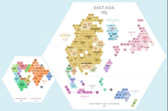
In the 1980s, the United States was wary of Japan’s rise to global prominence. But as this map shows, that fear was misguided — or rather, slightly misdirected. It’s China (177) that now dominates the region economically, putting even the land of the Rising Sun (57) in the shade. South Korea (19) and Taiwan (8) look a lot larger than on a “regular” map, but it’s clear who rules the roost here.
Interestingly, China’s hubs are mainly but not exclusively coastal. Yes, there’s Guangdong (19), Jiangsu (18), and Shandong (13), plus a few other provinces with access to the sea. But the inland provinces of Henan (10), Sichuan (9), and Hubei (8) are economically as important as any mid-sized European country. Tibet (1) and Xinjiang (2), huge on the “regular” map, are almost invisible here.
In the ASEAN countries (36), Thailand (6), Singapore (4), and the Indonesian island of Java (7) stand out. Economically, Oceania is virtually synonymous with Australia (17) — sorry, New Zealand (3).
As for South Asia and the Middle East, India (32) is clearly the dominant player, outperforming near neighbors Bangladesh (4) and Pakistan (3), as well as more distant ones like Saudi Arabia (9), Turkey (8), and Iran (7). But that’s cold comfort for a country that sees itself as a challenger to China’s dominance.
Maps created by Reddit user BerryBlue_BlueBerry, reproduced with kind permission. For a closer look and for detailed rankings of the regions, check out both maps here at the MapPorn subreddit.
Strange Maps #1089
Got a strange map? Let me know at [email protected].

The Power of Play


