135 – Update On the GDP Map of the USA
I’m not in the habit of extensively revisiting strange maps already posted here, as there are so many more out there. But the map of the ‘US States Renamed For Countries With Similar GDPs’ (in the previous post) elicited such a deluge of interesting replies (including several cool spin-off maps) that it merits a second look.
First, a word about its origin. The map was suggested to me by a reader of the blog – the reference can be found at the end of the previous post. Trying to trace back the ultimate original source dead-ends; two fortuitous mails have since shed more light on the origin.
It turns out the map used in post #131 is a ‘remake’ of the original one. That map was entitled ‘The United States of the world’ and appeared in the Toronto newspaper the Globe & Mail, on March 8, 2005. It was sent to me by Ann El Khoury over at peoplesgeography (type in ‘petrol prices’ in the search field at the top of her page and check out the revelatory map of global price differences).
Here is that original map:

The small print at the bottom credits the concept of the map to a political scientist at Brigham Young University. This is contested by Douglas Coupland, who first mailed me to claim credit for the map, and then again after he found the map in his archives to express that he was “amazed and appaled” by the Globe and Mail’s apparent rogue crediting.
Mr Coupland quite adamantly states that he conceived this map, and spent “a lot of time” on the phone with the Globe and Mail’s magazine editor in the process. I have no reason to doubt him, and am very happy to hereby give him due credit – also because he kindly promised to send me another map he conceived.
Until then, let’s have a look at some of the spin-offs this map has generated.
One remark that crops up about the map mentioned above is that it doesn’t compare US economic size with that of its nearest competitors (as they’re all too big to ‘fit’ into just one state’s economy). This alternate map (found here) does just that, comparing the economies of the next four largest GDP countries to multiple states. Thus:

• China’s GDP equals that of California, Oregon, Washington State and Nevada – oh, and Alaska and Hawaii • The UK’s GDP compares to that of New York State, New Jersey, Pennsylvania, Delaware, Maryland and (apparently) Washington DC • Good ol’ Deutschland’s GDP is as big as that of Florida, Georgia, Alabama, Mississippi, Louisiana, Arkansas, Tennessee, Kentucky, North Carolina, South Carolina, Virginia and West Virginia. • Japan gobbles up all the remaining states, being all of New England, the Midwest and the West (minus the ‘Chinese’ coastal states and Nevada)
As remarked in the original post, the GDP comparison map is slightly misleading, since it might compare a state with a small population with a populous country, thus giving a skewed idea of personal wealth in both entities. A more individual criterium of wealth (or at least of development) is life expectancy at birth.
Leonardo Monasterio’s blog, about “regional economics, cliometrics and development” translates the map to that yardstick. Not easy, since “the differences in life expectancies at birth among US states (are) quite small and we had to repeat countries and even include the USA in the map.”

All states seem to be linked to countries that at first glance belong to the developmental top tier – except for Ohio and Delaware, which are on a par with Cuba, a relatively poor country but with excellent health-care.
Mr Monasterio, a Brazilian I’m sure, also posted this map (found here), revisiting the original idea on his home nation – itself a collection of states with greatly varying economic performance. More so than in the US, apparently: the range is from Finland to Sierra Leone. GDP is highest in the southern coastal states, lower everywhere else. This list of Brazilian states, ranked for GDP (found here at Wikipedia, quoting the 2004 GDP in the Brazilian currency, the real: 1 real currently buys you half a US dollar) links the states to the countries that replace them in the map reproduced here below:

1. Sao Paolo (BRL 546.607.616): Finland 2 Rio de Janeiro (BRL 222.564.408): Egypt 3 Minas Gerais (BRL 166.564.882): Kuwait 4 Rio Grande do Sul (BRL 142.874.611): Morocco 5 Parana (BRL 108.699.740): Croatia 6 Bahia (BRL 86.882.488): Ecuador 7 Santa Catarina (BRL 70.208.541): Bulgaria 8 Pernambuco (BRL 47.697.268): Kenya 9 Brasilia Distrito Federal (BRL 43.522.926): Cameroon 10 Goias (BRL 41.316.658): Panama 11 Amazonias (BRL 35.889.111): Iraq 12 Espirito Santo (BRL 34.488.268): Uruguay 13 Para (BRL 34.196.694): Jordan 14 Ceara (BRL 33.261.175): Trinidad & Tobago 15 Mato Grosso (BRL 27.935.132): Bolivia 16 Mato Grosso do Sul (BRL 19.954.505): Uganda 17 Maranhao (BRL 16.547.977): Afghanistan 18 Rio Grande do Norte (BRL 15.906.902): Zambia 19 Paraiba (BRL 14.863.913): Macedonia 20 Sergipe (BRL 13.121.517): Nicaragua 21 Alagoas (BRL 11.556.013): Guinea 22 Rondonia (BRL 9.744.908): Haiti 23 Piaui (BRL 8.611.106): Niger 24 Tocantins (BRL 4.768.864): Mongolia 25 Amapa (BRL 3.720.013): Mauritania 26 Acre (BRL 3.242.123): Central African Republic 27 Roraima (BRL 1.864.318): Sierra Leone
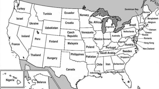
One final map, sent to me by Kanishka Gangopadhyay (brilliant name, that) who rightly remarks that “there’s been some controversy about the US States/Countries map you posted a while ago (…) Apparently someone took it upon themselves to correct it — though I can make no claim as to the accuracy of this map.”

This map was found here. Phew. That’s it, for the time being. If there’s any maps similar in concept to these ones that I missed, please let me know and I will add them to this post.