Why Do We Only Discover Artists When They Die?
You’re an educated person. You know art, or at least more about art than the average person. So, when you heard the news that Ellsworth Kelly, titan of modern American art, had died at the age of 92, after a six-decade career that placed his work not just in countless museums, but in numerous public venues, you felt a little bad when your inner voice asked, “Who?” Don’t feel bad. Kelly’s ego-less, almost signature-less style deserves some blame (if you want to call it that) for his anonymity beyond those in the art “know” as well as the credit for his lasting appeal. But, as the story’s gone for Van Gogh as for so many other artists, now that he’s gone, it’s your best chance to discover Kelly and what made his work so important in American art history.

During World War II, Kelly served as part of “The Ghost Army,” specifically in the 603rd Camouflage Engineers. In the weeks after D-Day, Kelly and other visual artists set up inflatable dummy tanks, fake camps (complete with fake laundry on fake clotheslines), faux artillery, and other deceptions to confuse the enemy trying to desperately hold back the Allied invasion. Strange training for an artist, but Kelly learned the lesson that seeing shouldn’t always be believing. In other words, our desire to find a narrative in what we see sometimes blinds us to what’s right in front of us.
After the war, Kelly returned to Europe and studied art in Paris. “Every night, walking home,” Kelly remembered years later, “I would walk down the outside quay and see the lights from the bridges on the water. I would just stand there and look at those reflections, and I thought: I want to do something that looks like this. But I don’t want to do a pointillist painting. I said, ‘I want to do something that flickers.’” Kelly’s 1951 painting Seine (shown above) “flickers” with the play of light on the water that captivated him on those Parisian nights, but does so by removing the water itself and any associations with a landscape save the name of the river itself. Kelly breaks the image down to its most essential, most evocative, most accessible, most pleasurable components.

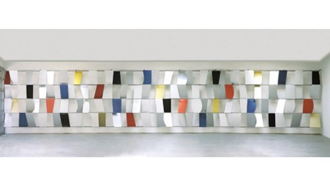
By his 30s, Kelly had already found a place in the upper tiers of American art. The 1959 MoMA exhibition Sixteen Americans — a showcase for up-and-coming talent — placed Kelly’s work alongside that of Jasper Johns, Robert Rauschenberg, Frank Stella, Louise Nevelson, and other future stars. But two years before that recognition, Kelly hit the public stage with his first major public art commission, Sculpture for a Large Wall (shown above). Originally titled Transportation Building Lobby Sculpture after its original location, the sculpture consists of 104 anodized aluminum panels painted red, blue, yellow, or black arranged in four, 65-foot-long rows.
As Philip Kennicott remarked in his elegy for Kelly, “Each panel seemed different from the next, subtle variations on the parallelogram, and yet together they also suggested a kind of language, or code — as though their shapes, colors, and repeating patterns spelled out a basic computer language or proto-digital message.” If you thought Seine looked surprisingly digital for a 65-year-old painting, then Kennicott’s digital connection for Sculpture for a Large Wall should make perfect sense. Just as the first computers visualized the world in rough, essential bits, Kelly did the same thing, but in color and form. Such a realization makes Kelly not just ahead of the curve, but amazingly relevant today, when we’re virtualizing our reality through technology at a speed not just beyond our comprehension but dangerously beyond our imagination. Kelly’s art helps us keep up.

Alas, like a computer, Kelly’s art can lack what we tend to think of as personality. (The man himself was a notable charmer even into his 90s despite health issues.) Early critics saw Kelly as the “anti-[Jackson] Pollock”: a reaction against the rugged individualism (and name branding) surrounding Abstract Expressionism. “I didn’t want an art that was so subjective,” Kelly said in 1996. “I wanted to get away from the cult of the personality.” Instead (as he wrote to friend and avant-garde composer John Cage in 1950), Kelly believed, “We must make our art like the Egyptians, the Chinese and the African and the Island primitives — with their relation to life. It should meet the eye direct.” Works such as 1964’s Red/Blue (from Ten Works by Ten Painters) (shown above) meet us directly without crashing into the same philosophical wall Pollock and the AbExes did when powerful personality met self-destructiveness.
Writing later, in 1969, Kelly remarked that “I felt that everything is beautiful, but that which man tries intentionally to make beautiful; that the work of an ordinary bricklayer is more valid than the artwork of all but a very few artists.” In other words, if we’d just use the beauty already in sight rather than create new forms in our minds, we’d do much better. Kelly saw all post-Renaissance art as “too men-oriented” in contrast to the “object quality” of a pyramid, vase, or Romanesque church. Kelly claimed strenuously that “My work is about structure.” Rather than a reaction to Abstract Expressionism, works such as Red/Blue follow his true influence: “the ‘structure’ of the things I liked: French Romanesque architecture; Byzantine, Egyptian, and Oriental art; Van Gogh, Cézanne, Monet, Klee, Picasso, Beckman…”
Kelly’s art was never all about him, which made it all about us, the viewer. In today’s name-branded, hyper-inflated art world, Kelly’s selflessness seems almost old fashioned. You don’t need any special instruction to enjoy or understand Red/Blue or any of Kelly’s works. Kelly loved to work big and bold — the better to catch the eye. “As [Henri] Matisse would say,” Kelly name-dropped in 2009, “a small patch of any one color is far less intense than a large one of the same color.” Kelly’s the American Matisse in that love of intense color that transcends language and station. Kelly’s an American master because his work embodies democracy in a way too often forgotten today, but sorely needed.
Kelly’s personality-less art never loses the person, however, which makes it often the perfect elegiac approach. As the Whitney’s Chief Curator Scott Rothkopf recalled, Kelly’s Ground Zero (2003) cut through all the political red tape and emotional turmoil surrounding how to memorialize the fall of the Twin Towers on September 11th by attaching a green paper trapezoid to a New York Times photo of the area. Where others planned specific, elaborate designs doomed to inevitably exclude someone, Kelly imagined an inviting, inclusive green space open to all. Similarly, as chief curator at the Smithsonian American Art Museum Virginia Mecklenburg noted, Kelly’s Memorial at the United States Holocaust Memorial Museum speaks simply and eloquently where others struggle. “How do you talk about something of that magnitude?” Mecklenburg asks. “There are either a million words or no words, and he chose no words.” Kelly always managed to “say” more by saying less.

Sadly, but tellingly, Kelly’s Sculpture for a Large Wall, like Spectrum IV (shown above), presently lingers in storage at the MoMA, unseen and unknown. Plenty of Kelly’s work hangs on museum walls, which many have passed, but few have stopped long enough to appreciate, perhaps deceived by the simplicity into thinking it didn’t merit your full attention. If you don’t know Ellsworth Kelly because you were too busy, that’s your fault and your loss. Rothkopf explained it well in saying that “Words like joy, delight and wonder don’t have a lot of currency in serious contemporary art criticism, which tends to prize skepticism and anxiety over supposedly easier pleasures.”
It’s not just art critics that kill joy in the name of complex critique. We’re all guilty of overcomplicating our lives. It’s too late for us to know Ellsworth Kelly the man, but it’s not too late to know Ellsworth Kelly the artist who held onto the joy and vibrancy and beauty of living when such thinking went out of style. Why do we only discover artists when they die? The better question might be why we only discover the beauty that artists like Kelly portray when we approach death, if ever.
