What Makes This 90-year-old Berlin Metro Map So Appealing?
Finding a Strange Map for this blog involves a lot of scrolling – and one full stop. As was the case with this map. Among a crop of merely informative maps and charts, there it was. Yes! It was love at first sight.
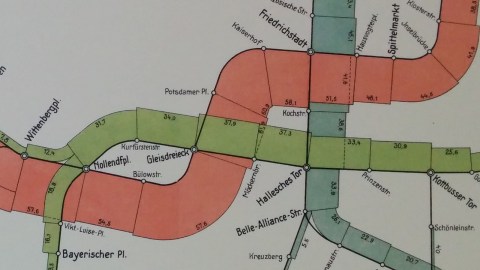
So what are we looking at here? A 90-year-old public transport diagram, apparently. The hand-coloured pastels and the modernist sans-serif font seem contemporary with the year in the legend. Which reads, in German: Traffic volume on elevated and underground railway lines, 1927.
The city is not mentioned, but stops with historically resonant names like Potsdamer Platz and Alexanderplatz provide a hint, even if you don’t know much about German topography: this is Berlin.
Three lines are shown but not named:
→ a red one, with two separate branches originating in the west (at Stadion) and southwest (at Thielplatz). The branches join at Wittenbergplatz, then meander through the city before ending at Nordring in the northeast.
→ the green line follows a similar pattern, with two smaller branches (from Uhlandstrasse in the west and Hauptstrasse in the south) joining at Nollendorfplatz. After a fairly straight course through the centre in direction east, the line bends slightly to the north to end at Warschauer Brücke.
→ the blue line runs from Seestrasse in the north to Bergstrasse in the south, with two spurs in the southern end: from Belle-Alliance-Strasse to the airport (Flughafen), and from Herrmannplatz to Boddinstrasse in the south, and Kottbusser Tor in the north.
The eye-catching, scroll-stopping quality of this map is not its age, nor the pleasing aesthetic of its carefully chosen layout. It’s the animate quality of the lines themselves. They bulk out towards the middle, as if they were a lair of scaly dragons, dug up by accident.

As indicated by the legend, the map aims to indicate the passenger volume for the network shown, hence the bulky middle. The stretches between the stations are volumised according to the number of passengers. The volume of each stretch corresponds to a figure, which represents millions of passengers – presumably for the entire year 1927.

Naturally, passenger numbers are low on the outskirts of the network, and high in the central part. On the red line, between Stadion and Neu-Westend, the figure is only 0.6 million. That’s less than 1% of the passenger traffic between Gleisdreieck and Potsdamer Platz, travelled by 61.9 million passengers – making it the busiest stretch between stations on any of the three lines shown.
The busiest bits of the other lines are between Französische Strasse and Friedrichstadt on the blue line (45.1 million), and 37.9 million between Gleisdreieck and Möckernbrücke on the green line (37.9 million). The figure is lowest for the stretch between Herrmannplatz and Schönleinstrasse (0.4 million). However, the line from that station to Kottbusser Tor is even thinner – and doesn’t even mention a number.
This way of visualising passenger numbers between stations is problematic. For example, the stretch between Bülowstrasse and Gleisdreieck bends to enlarge the area indicating volume, while the stretch between Potsdamer Platz and Kaiserhof bends to reduce its volume area. As a result, the first stretch, with the lower number (57.6 million) appears much larger than the other one, with the higher number (60.9 million).
And that is perhaps why we don’t see more of these scaly-dragon charts to represent volume along bendy lines. But even if it represents an evolutionary dead end, cartographically speaking that is, this map remains an eye-catching, scroll-stopping piece of cartography. Or to put it another, more depressing way: being pretty is no guarantee for survival.
Strange Maps #864.
This map found here on the Twitter account of Lisa Charlotte Rost, a Berlin-based data visualisation professional. For a bizarre Cold War-era map of the Berlin metro system, see #513.
Got a strange map? Let me know at[email protected].