The Map as Persuader
Paul J. Mode is a longtime collector of “persuasive cartography.” A collector of what now?
Here’s a good definition: “A (persuasive) map should be designed to make some one point clear — and other points be left to other maps. (Students and readers) are befogged by the wealth of detail, all of it emphasized equally, in an ordinary map.” That quote, by English socialist mapmaker James F. Horrabin, can be found at the PJ Mode Collection of Persuasive Cartography, hosted by the Cornell University Library.
“Propaganda maps” is another term that has been used to describe the subject of Mode’s collection. But persuasive cartography is a much more inclusive description of the hundreds of maps in the collection. Yes, there are wartime propaganda maps (from several wars; and from various sides), but also maps aiming to influence opinions and beliefs on matters as wide-ranging as slavery, suffragism, alcohol, marriage, religion, and imperialism.
The maps span several centuries and multiple continents, using a variety of ways and means to convey their message: satire and allegory, unusual projections, and striking graphics. They all share the trait suggested by Horrabin: Their primary aim is to send an ideological message, not convey geographic information. These maps are not here to show you around the house, but to sell it to you.
Here are some examples.
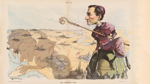
The American Pope
Gone are the days when Catholicism was America’s favourite foreign menace. This cartoon therefore won’t make much sense today — unless you imagine those robes on an ayatollah instead of a cardinal. Then the sense of outrage this map sought to convey might feel a bit more believable.

The cardinal casting his shadow over America is Francesco Satolli, appointed in 1893 as the first Papal Nuncio to the United States. In certain circles, that appointment raised fears that he would meddle in American domestic affairs, especially concerning education (hence all the “public school” flags fluttering in Satolli’s shadow).
The editorial on the back of this map said that Satolli’s appointment made it “just a little more impossible than ever for a man to be a good Catholic and a good American”.
This cartoon was first published in Puck Magazine on September 5, 1894.
China, Cake of Kings
When in doubt, throw in some stereotypes, ethnic and otherwise. The prototypical caricature of a Chinese man is a powerless onlooker while foreign powers carve up China. Great Britain is represented by the old crone, Queen Victoria, in a staring contest with the evil-looking Kaiser Wilhelm II of Germany. Seated on the right is another fine specimen of 19th-century European prejudice, a Japanese samurai — contemplating which piece of the pie he will want to slice off with his sword.
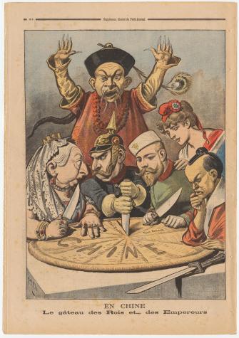
Only two persons look like they’re nice enough to sit next to on the train: Russia, by way of its Czar Nicolas II, and Marianne, the personification of France. Marianne has her hand on the shoulder of Nicolas, her ally. The message: If China needs to be carved up, then best by France and Russia — they don’t look ugly, evil and/or dangerous.
This cartoon first appeared in Le Petit Journal on 16 January 1898.
Who are the Plutocrats?
Popular protests against the 1 percenters seldom use the word plutocracy to describe the state of the world today. It has arguably never been more appropriate: It means “rule by wealth” instead of “rule by the people” (democracy). But the word was appropriated and poisoned by the Nazis, who liked to hurl it at the British and Americans as more venomous synonyms for their capitalist systems.

This leaflet from 1940 turns the tables on Nazi propaganda. The map shows the sumptuous retreats of fascism’s fortunate few: Adolf Hitler’s at Berchtesgaden, the Goebbels estate at Waldhof am Bogensee, Joachim von Ribbentrop’s castle at Fuschl, and Hermann Göring’s Karinhall near Berlin, among others.
In early 1940, the Royal Air Force dropped hundreds of thousands of these leaflets over the Ruhr Valley’s working-class areas. The back reads: “You are told that you are fighting for German Socialism against the Plutocracies, yet while aggregate worker income in Germany has fallen by 11 percent and the cost of living has increased 10 percent, all Nazi leaders are living in elegant castles and country estates.”
This leaflet was produced by the Royal Air Force in 1940.
That Shrinking Feeling
It’s hard to argue with a map, let alone with four of them, which is why this graphic illustration of Palestinians’ loss of land from 1946 to 1999 is such a powerful and popular image.

Critics argue that the sequence misrepresents recent history — the 1947 partition plan shown on the second map was accepted by the Jews, but rejected by the Arabs; and no mention is made of the return by Israel of Sinai to Egypt. But in so doing, the map merely reflects Horrabin’s point on persuasive cartography — it singles out the point it wants to clarify, leaving out other information that might muddy the waters.
The earliest recorded use of the map in print is in a 2003 book by the Rev. Timothy Biles, who attributes it to the UK-based Palestine Solidarity Campaign.
The Sickness Spreads
The sense of dread generated by this map is the diametrical opposite of the Palestinian map. It’s not shrinkage that’s upsetting the balance, but expansion — of the Red Menace, to be exact.

In 42 short years, the Socialist/Communist Conspiracy has conquered one-third of the World, warns the title above four globes, all centered on the North Pole — the better to demonstrate the cancerous growth of communism. From a red dot in Moscow on Map I to the whole of the Russian Empire on Map II, spreading to China and Eastern Europe on Map III.
The menacing arrows on Map IV are aimed at the U.S., and if that isn’t clear enough, there’s this quote from Nikolai (sic) Lenin: “First we take Eastern Europe. Next the masses of Asia. Then we shall encircle that last bastion of capitalism, the United States. We shall not have to attack. It will fall like an overripe fruit into our hands”. The point of the maps: The Cuban revolution is part of the communist strategy plan to encircle and ultimately subject the U.S.
This map was included in Communist Methodology of Conquest, a 1966 pamphlet by Luis V. Manrara for the Truth About Cuba Committee.
All images taken from the PJ Mode Collection of Persuasive Cartography at Cornell University; reproduced under CC BY-NC-SA 3.0 License.
_________________
Strange Maps #735
Got a strange map? Send it to [email protected].