What Does the Internet Actually Look Like?
We think of the internet as something ethereal: its most solid manifestation is a cloud. A magically omnipresent and omniscient cloud, and as such endowed with a status approaching the divine. Just replace ‘God’ with ‘the Internet’ in these Q&As from the Baltimore catechism:
Q. Where is God?
A. God is everywhere.
Q. If God is everywhere, why do we not see Him?
A. We do not see God, because He is a pure spirit and cannot be seen with bodily eyes.
Q. Does God see us?
A. God sees us and watches over us.
Q. Does God know all things?
A. God knows all things, even our most secret thoughts, words, and actions.
It’s a pretty good fit.
The internet brings to mind Clarke’s Third Law: Any sufficiently advanced technology is indistinguishable from magic. But occasionally, the spell breaks. As demonstrated by the massive DDoS attack in October 2016 – the biggest of its kind so far – the internet is fallible, hackable and, as demonstrated here, mappable. Although that is easier done than done right, as shown by this series of maps referenced on The Verge.
The first map shows the geographic extent of that DDoS attack. And it looks, to stay in the religious vein, decidedly apocalyptic. DDoS stands for distributed denial of service, a type of cyberattack that was directed three times that same day at Dyn, a DNS service provider. As a result of the attacks, dozens of major internet platforms including Twitter, Amazon, PayPal and the New York Times went offline throughout North America and Europe.
Responsibility for the attacks was claimed by two groups, Anonymous and New World Hackers, in the latter case as a retaliation for the curtailing of Julian Assange’s internet access. The WikiLeaks founder has been holed up in Ecuador’s London embassy since 2012. In mid-October 2016, WikiLeaks announced and Ecuador confirmed that Assange’s internet connection at the embassy had been severed temporarily due to the release by WikiLeaks of documents “impacting on the U.S. election campaign”. It is unclear whether NWH really was behind the attacks.
What is clear though, is that the attacks were very sophisticated, using the computing power of the Internet of Things, i.e. printers, home routers and other online devices. This map of the attack shows the location and severity of the internet outages on October 20th, 2016.

An angry, almost pulsing red covers the U.S.’s major population centres: the Pacific Northwest, California, central Texas and the Northeast. Less affected areas are shown in softer, more diffuse orangey tones. Europe, less affected, is smudged with a few wisps of yellow. The colour scheme is reminiscent of nuclear contamination maps; or of the burning map of the Ponderosa ranch at the beginning of each episode of Bonanza see (#676).
By covering all that territory in old-fashioned radioactive red, the map fails to convey the post-territorial nature of the internet outage. Some other maps do a better job of decoupling the online geography of the cyberattack from the actual topography of the offline world.

Threat intelligence company Norse frames online attacks with a cartographic interface that is less plague map, more Space Invaders. But the nuclear metaphor is not far off either: attacks resemble missile launches, a hit sets off a circular detonation wave at the target. But this map does provide insight into the origin and destination of the attacks. It is so dynamic and entertaining that you will want to get in on the action, and get your name on the scoreboard.

Content delivery network and cloud services provider Akamai portrays the earth as a giant, abstract hedgehog – each of its spikes sticking up into the sky like a virtual space elevator, its height related to the number of attacks on that particular node in the network.

Website monitor Pingdom dots a world map with the locations of incidents and downtime during the last hour on a rolling basis, each new one lighting up with a flash – again, the nuclear metaphor.

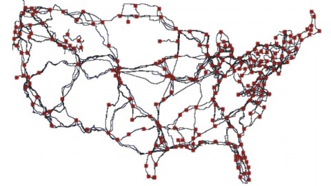
None of the maps above represent the actual infrastructure of the internet itself. But this map, by Telegeography does exactly that. It pinpoints the world’s internet exchanges. An internet exchange, or IX, is a physical location where various internet providers connect their networks to each other. This is where it gets interesting: the internet gets real-world addresses, each one a node in an actual network of cables that traverse continents and dive into the ocean to connect to other continents.

Because the internet grew randomly, there is no overall blueprint of its network – or at least there wasn’t, until recently. Paul Barford, a computer science professor at the University of Wisconsin, took four years to map the location of the physical cables that make up the internet, producing this map in 2015. He and his team assembled this map by digging through public records.
This map of the data-carrying, country-spanning long-distance fiber-optic cable network – red dots show where the cables connect – is a first. Barford hopes that a better understanding of the physical infrastructure of the internet will help make it more reliable and resilient – although such a map could conceivably also do the exact opposite.
Many thanks to Orion Jones for sharing the Verge article. First map from the Wikipedia article on the Dyn cyberattack. Last map from prof. Barford’s paper InterTubes: A Study of the US Long-haul Fiber-optic Infrastructure.
Strange Maps #808
Got a strange map? Let me know at [email protected].