Shrinking, but Still Big: America’s Slice of the Global Economic Pie

The American slice of the global GDP pie is shrinking. In 1960; U.S. GDP represented 40% of the global total. By 2014, that share had shrunk to 22%. The decline is relative — America’s economy is much larger now than half a century ago, but other countries have grown much faster. Most notably China, the economy of which trebled over the same period, from close to 5% back then to around 15% now. And, as shown by this recent Voronoi diagram (1), first published in July 2015, the American slice is still by far the biggest one.

Of course, there are several ways to measure GDP. One could argue that China’s share should be bigger by now, or that it has already overtaken the U.S. It certainly has for industrial output — the middle of the three shades contained within each slide. The U.S. is overwhelmingly a service-based economy (darker shade), with a relatively small contribution by the agricultural sector (lighter shade).
But the point of this cartogram is that it offers the advantage of an at-a-glance overview that is typical for maps, and lacking in mere lists. Here, for comparison, is the ranking of the 38 economies shown on this map:

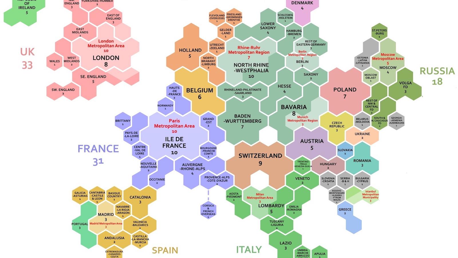
The map shows even more clearly than the above list how the economic power of the European Union, listed here as separate member states, adds up. It’s immediately apparent that the German, British, French, and Italian slices together are bigger than Japan’s, and even China’s. In fact, those four alone amount to 15.8 percent. Add the other eight member states on the list, and the E.U. slice (22.41 percent) is almost as big as the U.S. one. Since there are 16 more European Union members hidden in the Rest of the World slice (8.80 percent), the European Union’s share of this diagram is probably slightly bigger than the U.S. one.
Of course, Brexit will weaken the overall strength of the EU – and of the U.K. itself. In fact, the mere decision of leaving the E.U. has led to a decline in the value of the British pound that has caused Britain to slip one place in the global economic rankings as listed above, with France overtaking it to assume fifth place.
Strange Maps #747
Many thanks to Robert Capiot for sending in this map, found here on howmuch.net.
Got a strange map? Let me know at strangemaps@gmail.com.
(1) For more Voronoi joy, see #657.