665 – Argentina v. Netherlands: Does Size Matter?
Brazil v. Germany: 1-7. After the shock elimination of the Football World Cup’s host country Tuesday evening – by a historical and humiliating margin – one kind of expects as much spectacle and surprise from Wednesday’s other semifinal.
After all, that game will pit another European football giant against another South American one. But giants come in very different sizes, especially in the World Cup of the game some insist on calling soccer. Does a country’s size matter?
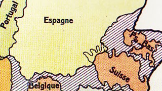
By sheer accident, this old map from the vaults of Strange Maps nicely reflects the size difference between the next match’s opponents, Argentina and the Netherlands.
Not that that is the map’s main purpose. It attempts to capture the hugeness of Argentina by stuffing it with as many other countries as possible – a technique cited before on this blog, with maps designed to impress upon the map reader just how huge Africa is (see #35), or how big Portugal’s pre-1975 colonial empire was (see #390).

According to this map, Argentina comprises 2,789,461 km2. Which is as much as – in fact, even a bit more than – the following 10 countries combined (listed in order of size):
That tallies up to 2,581,349 km2, still more than 200,000 km2 less than Argentina – room enough to stuff another six Netherlands in there. If you’re looking for the original one: that’s the Netherlands right there, close to the northeast corner of Argentina, squeezed between Spain and Switzerland. Belgium is caught between France, Germany and the Iberian peninsula, while Denmark free-floats on the other side of France and Germany, almost bumping in to Norway. Funnily enough, Norway’s extreme north points south here, mirroring Argentina’s half of Tierra del Fuego. The climate of both areas won’t be all that different from each other.
As can be deduced from the shape of Germany (and of France, although that is less obvious on the map), this cartographic comparison was drawn up some time between 1871 (when France lost Alsace-Lorraine to Germany) and 1919 (when it got that border region back). So the area indicated for metropolitan France is somewhat less than it is today. For Germany, the situation is reversed, but more extreme, since it would go on to lose even more territory after both World Wars.
Nor is the area indicated for the Netherlands applicable any longer, but not due to the fortunes of war: the country today measures 41,543 km2, about 20% bigger than on this map, thanks mainly to the land reclamation in the IJsselmeer.
But of course a country’s area is only one measure of its size. Cruciall – for football at least – is its population: the more people to pick from, the likelier you can select a winning team. At the time this graph was made, the Netherlands had 5.8 million inhabitants and Argentina 6.5 million. That not only puts both countries in the same league, demographically speaking, but also allows us to date the map more precisely to around 1905.
In the intervening 110 years, both populations have grown substantially, but not in equal measure. The Netherlands now houses about 17 million people, triple the amount mentioned on the map. Argentina, however, thanks to large-scale immigration (perhaps lured in by maps like these, promising wide open spaces) now is home to 42 million inhabitants – almost sevenfold the previous figure. Does that mean the odds of the Argentinian team beating the Dutch are 7 to 3? Curiously, the Brazilian and German population are in almost the exact same relation to each other (203 vs. 80 million). And look how that turned out.
This map taken here from imgur.

