What Every State in America Is Best at — and Worst At

Are these maps cartograms or mere infographics?
An ‘information graphic’ is defined as any graphic representation of data. It follows from that definition that infographics are less determined by type than by purpose. Which is to represent complex information in a readily graspable graphic format. Those formats are often, but not only: diagrams, flow charts, and maps.
Although one definition of maps – the graphic representation of spatial data – is very similar to that of infographics, the two are easily distinguished by, among other things, the context of the latter, which are usually confined to and embedded in technical and journalistic writing.
Cartograms are a subset of infographics, limited to one type of graphic representation: maps. On these maps, one set of quantitative information (usually surface or distance) is replaced by another (often demographic data or electoral results). The result is an informative distortion of the map (1).
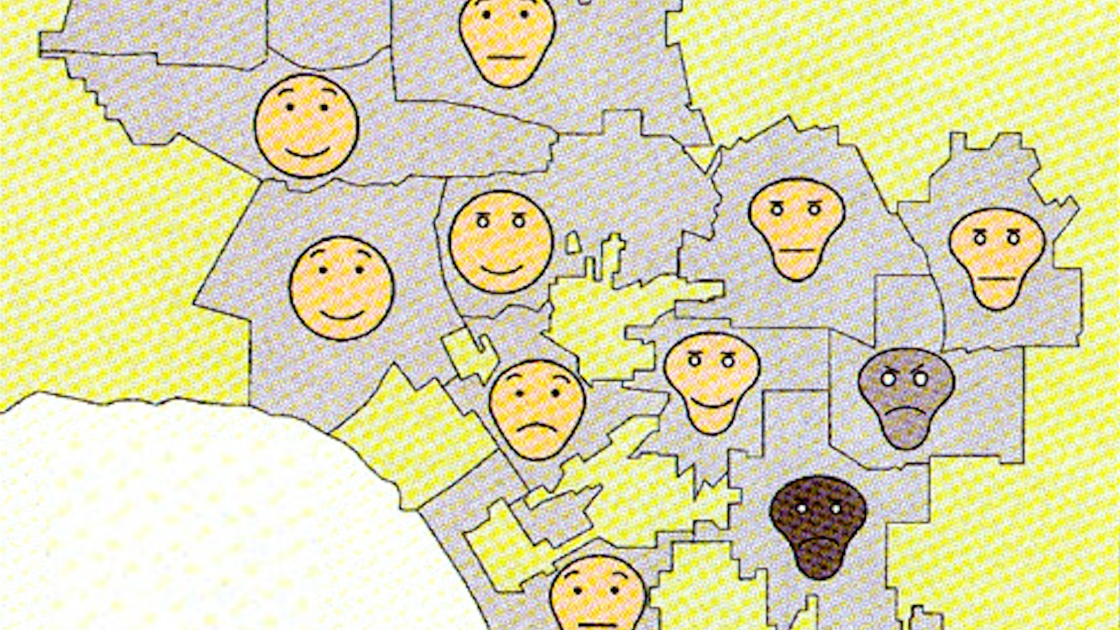
The distortion on these maps is not of the distance-bending or surface-stretching kind. It merely substitutes the names of US states with statistical information relevant to each of them (2). This substitution is non-quantitative, affecting the toponymy rather than the topography of the map. So is this a mere infographic? As the information presented is statistical (each label describes each state as first or last in a Top 50), I’d say this is – if you’ll excuse the pun – a borderline case.
What’s more relevant, from this blog’s perspective, is that it is an atypical, curious and entertaining use of cartography.
The first set of maps labels each and every one of the states as best and worst at something. All of those distinctions, both the favourable and the unfavourable kind, are backed up by some sort of evidence.

The first map, the United States of Awesome, charts fifty things that each state of the Union is best at. Most of those indicators, 12 in all, are related to health and well-being (3). Ten are economic (4), six environmental (5), five educational (6). Three can be classified as ‘moral’, even if these particular distinctions make for strange bedfellows (7).
The best thing that can be said about Missouri and Illinois, apparently, is that they’re extremely average (8). While that may excite few people, it will greatly interest political pollsters and anyone in need of a focus group. Virginia and Indiana are the states with the most birthplaces of presidents and vice-presidents, respectively. South Carolinians prefer to spend their time golfing, Pennsylvanians hunting. Violent crime is lowest in Maine, public corruption in Nebraska. The most bizarre distinctions, finally, are reserved for New Mexico (Spaceport Home), Oklahoma (Best Licence Plate) and Missouri (Bromine Production). If that’s the best thing about those states, what might be the worst?

The United States of Shame again gets most of its data from health stats, detailing the deplorable firsts of 14 states (9). Eight states get worst marks for crime, from white-collar to violent (10), while four lead in road accidents (11). Six can be classed as economic worst cases (12), five as moral nadirs (13), two as environmental basket cases (14). In a category of one are states like Ohio (‘Nerdiest’), Maine (‘Dumbest’) and North Dakota (‘Ugliest’).
All claims are neatly backed up by references, some of them to reliable statistics, others to less scientific straw polls. In at least one case, to paraphrase Dickens, the best of stats really is the worst of stats. Ohio’s ‘shameful’ status as nerdiest state is based on its top ranking in library visits. Yet on the ‘awesome’ map, Ohio is listed as the state with… most library visits.
Juxtaposing each state’s best and worst leads to interesting statistical pairings. But with data as haphazardly corralled together as this, causal linkage should be avoided. Otherwise it could be concluded that:
Yet in some cases, some kind of link can be inferred. New Yorkers use more public transit than other Americans, but are also stuck with the longest commutes.
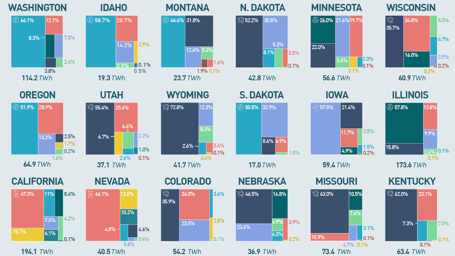
Overall, the lessons offered by cartograms like these are rather anecdotal. That does not detract from the popularity of the format. This exercise in replacing state names with apposite data was adapted for the maps below, which limit the range of their statistics to environment and health (some of the data is in fact the same as on the first map pair).

By limiting the information presented here to subjects relevant to their organisation, the makers of these two maps have produced very effective tools for communicating health and environmental concerns. As with similar rankings, these maps are meant induce the ranked entities to remain Number One in fields of excellence, and to name and shame underachievers into doing better.

The US Maps of Shame and Awesome were created separately, and in that order. The US Map of Shame was first published here on Pleated Jeans. The US Map of Awesome ws published by way of retort here by Political Language. The second map pair published here on Mother Nature Network.
——-
(1) See cartograms of the world’s population (#96), of Ireland as 100 people (#391), and of regional political mentalities in Switzerland (#403). These are cartograms of the surface-distorting type. For distance distortions, see a map of travel distances in the UK (#393).
(2) This is reminiscent of the map of US states renamed for countries with similar GDPs (#131).
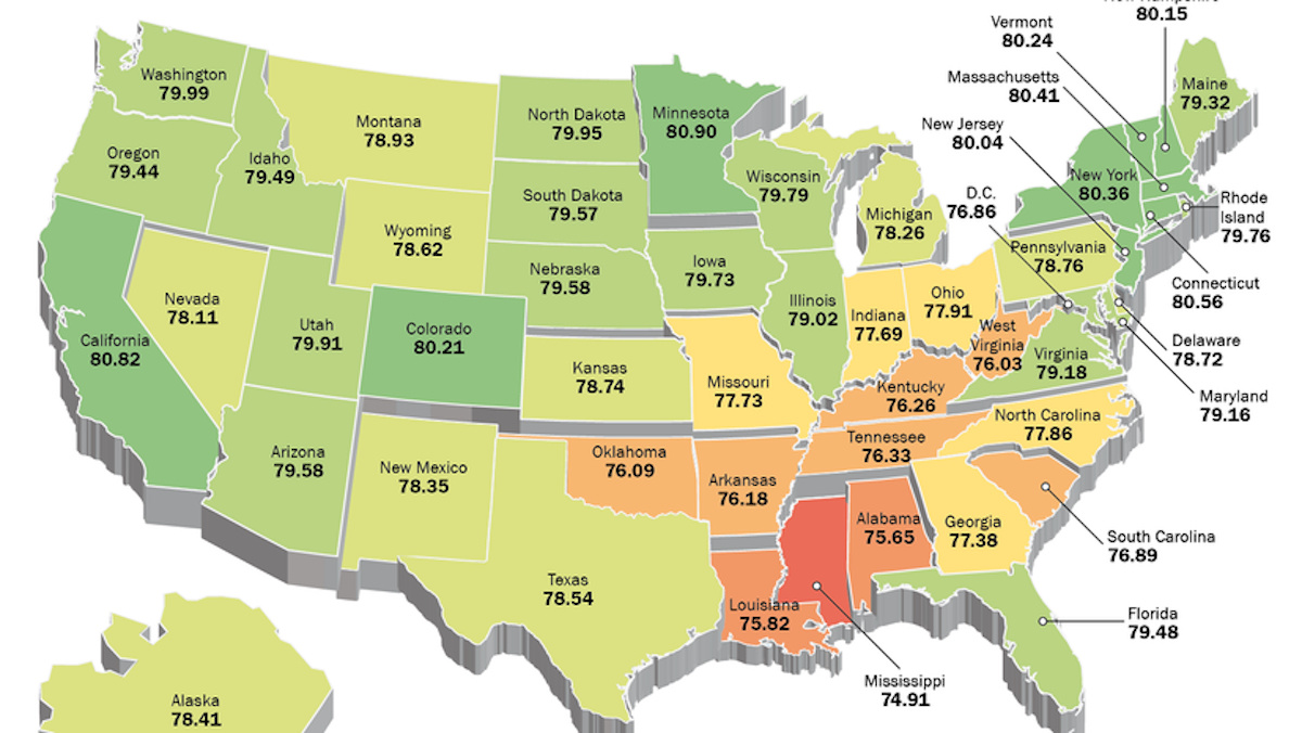
(3) Lowest Infant Mortality (Washington), Highest Life Expectancy (Hawaii), Highest Reported Wellbeing (Utah), Best Heart Health (Minnesota), [Fewest] Sick Days Taken (Iowa), Fewest Mental Health Days Taken (South Dakota), Lowest Obesity Rate (Colorado), Most Breastfed Babies (Oregon), Lowest Suicide Rate (New Jersey – sic), [Highest Percentage] Immunization (Kentucky), Most Retirees (West Virginia), Healthiest [Overall] (Vermont).
(4) Biggest Port (Louisiana), Busiest Airport Hub (Georgia), Highest Per Capita Manufacturing Output (Idaho), Lowest Unemployment (North Dakota), [Highest] Wheat Production (Kansas), Least Poverty (New Hampshire), Safest for Workers (California), Best State to Incorporate In (Delaware), Most Equal (Alaska), Highest Income (Maryland). Five states are best at something educational (6).
(5) Most Windpower Production (Texas), Cleanest Air (Wyoming), Lowest Carbon Emissions (Connecticut), [Most] Transit Use (New York), Lowest Coal Consumption per Capita (Rhode Island), Best Freshwater Access (Michigan).
(6) [Highest Percentage of] High School Graduates (Wisconsin), [Most] Affordable In-State Tuition (Florida), Highest Library Usage (Ohio), Best Value University (North Carolina), [Most] College Graduates (Massachusetts).
(7) On one end of the scale: Most Liberalized Prostitution Laws (Nevada); on the other end: [Most] Churches per Capita (Mississippi) and [Highest] Church Attendance (Alabama).
(8) Political Bellwether and Most Average [State], respectively.
(9) Poorest Health (Kansas), Alcoholism (Arizona), Binge Drinking (Wisconsin), Gonorrhea (Louisiana), Obesity (Mississippi), Most Sickly (Georgia), Stroke (Alabama), Infertility (Vermont), Breast Cancer (Connecticut), Cancer Deaths (Kentucky), Heart Attack (West Virginia), Aids (Maryland), Oldest State (Ohio), Suicide (Alaska).
(10) [Overall] Crime (Nevada), Female Criminals (Oklahoma), Arson (Pennsylvania), Corruption (Tennessee), Rape (South Dakota), Violence on Females (Nebraska), Robbery (Illinois), Identity Theft (Florida).
(11) Drunk Driving (Montana), Fatal Car Crashes (Wyoming), Motorcycle Deaths (Virginia), Worst Drivers (Massachusetts).
(12) Bankruptcy (Missouri), Worst Credit Score (Arkansas), Unemployment (Michigan), [Highest] Cost of Living (Hawaii), [Lowest] Teacher Salary (North Carolina), Corporate Taxes (New Hampshire).
(13) Bestiality (Washington), Homeless population (Oregon), Cocaine Use (Colorado), Anti-social (New Mexico), Porn Usage (Utah).
(14) Air Pollution (California), Least Green State (Indiana).
Strange Maps #517