423 – Flow-Charting the Ring Trilogy

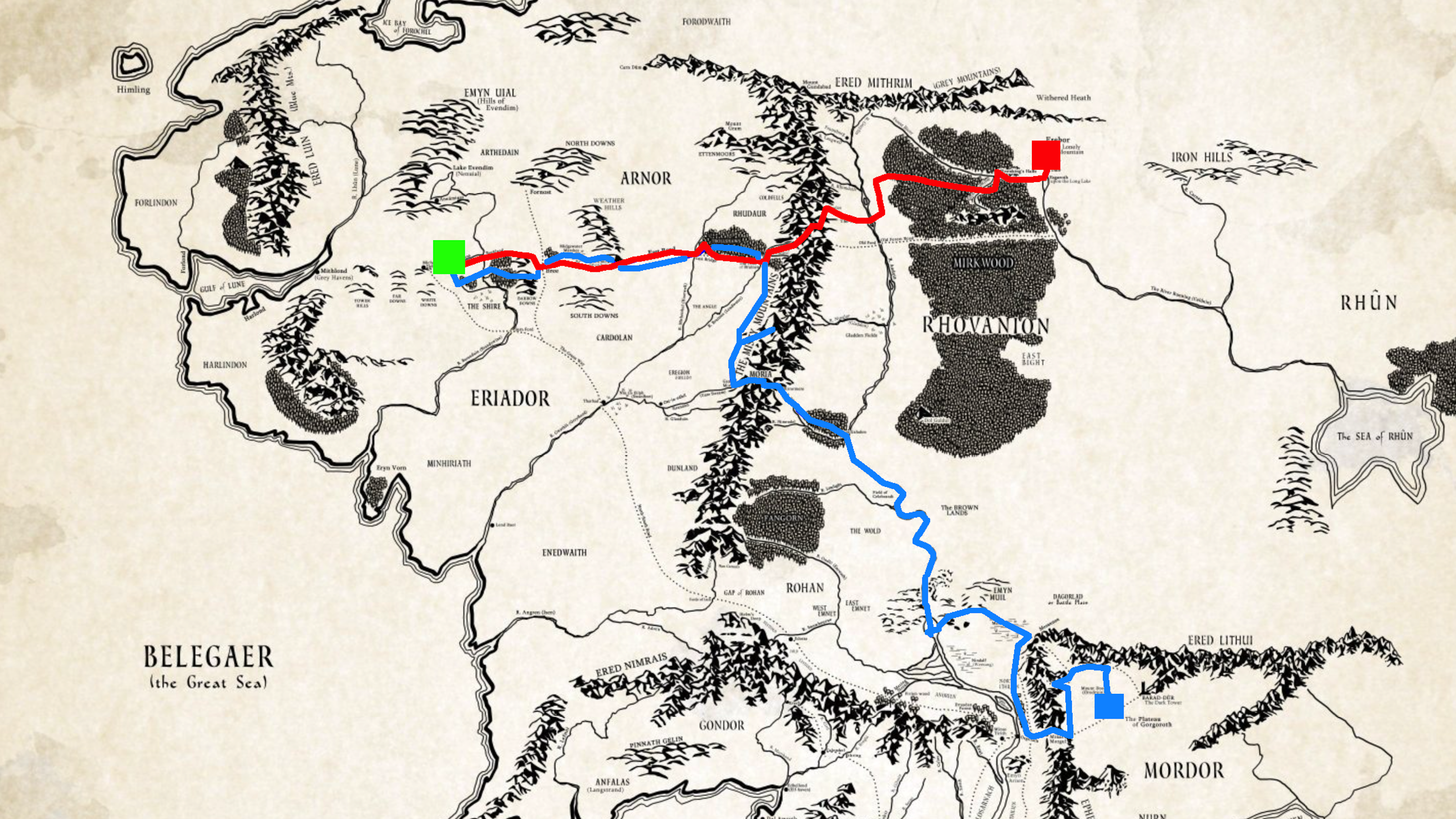
Designed by J.R.R. Tolkien’s son Christopher and included in most editions of the Lord of the Rings trilogy, the map of Middle-Earth is one of the best-known examples of fantasy cartography. The iconic map shows the fictional continent in which the action of the three books takes place, from Forodwaith in the north to Haradwaith in the south, and the Gulf of Lune in the west to the Sea of Rhûn in the east (was Middle-Earth deliberately framed to rhyme?)
Equally delightful, if not as yet as iconic, is this flow chart of Lord of the Rings. It charts the itinerary of the story’s main characters, individually and in group, showing when they meet, separate and rejoin each other. The progression is from left to right, not only in tune with the traditional (Western) reading direction but also mirroring the trajectory in the story itself, which starts in the Shire on Middle-Earth’s western edge and leads to Mordor in the east.
The geographic parallel only partly holds up: at the very end of the story, after they have returned to the Shire, some members of the Fellowship board ships to the west, but their trajectories trail off the map on its top right (i.e. northeastern) corner.
The map is however an excellent tool to identify the different strands of the story as it progresses. The main thread, in yellow, follows the Ring itself: first with Bilbo as Ringbearer and then Frodo, who carries it to Mordor to be destroyed. The trajectories are also colour-coded to identify the different races: green for Hobbits, grey for Wizards, light-brown for Men, dark-brown for Dwarves, light-blue for Elves, dark-blue for Ents. Sauron, the Evil One, is a dark red. Black is for the Orcs, Uruk-Hai and his other minions.
Battles, events and important episodes are indicated by a light grey background; the attack at Weathertop, the Council of Elrond, the Breaking of the Fellowship, the Battle at Helm’s Deep, etc.
This map is one of several movie narrative charts designed by and shown at xkcd, the marvellous webcomic of sarcasm, math, and language (the other charts being of the original Star Wars trilogy, Jurassic Park, Twelve Angry Men and Primer). The excellent work of xkcd often has a cartographic slant (as shown earlier on this blog at #118 and #331). This Lord of the Rings flow chart is reminiscent of the Minard map (#229). Other Tolkien-related maps are to be found at #121 and #204.
Many thanks to all those who sent in this map.
PS – please note, as several commenters have pointed out, that this map is based on the cinematographic work, which is not a literal retelling of the literary original.
